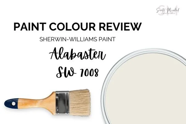
Paint Colour Review - Alabaster by Sherwin Williams
This post may contain affiliate links, which means I may earn a small commission if you purchase through them, at no extra cost to you.
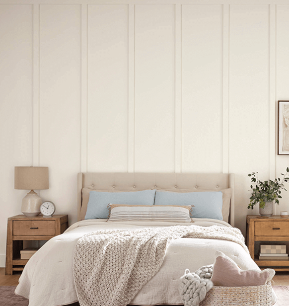
Alabaster by Sherwin-Williams is a very popular choice in interior decorating, for multiple reasons. It is a versatile and timeless white colour that brings out a sense of tranquillity and sophistication. It belongs to the white colour family but has warm undertones, which sets it apart from stark whites.
One of the reasons Alabaster is so popular is its ability to adapt to various design styles. Its soft and creamy appearance looks beautiful in both traditional and contemporary interiors. If you are looking for a more modern vibe, using Alabaster in the background and pairing it with a pop of colour can be a great way to add that bit of personality and life to your interior.
Alabaster’s LRV
LRV (or Light Reflectance Value) is helpful to determine how much light is absorbed or reflected by a paint colour. It is measured on a scale from 0% to 100%, 0% being black and absorbing all light, and 100% being white and reflecting all light. The higher the LRV, the lighter the paint colour.
Alabaster has an LRV of 82, which means it reflects a high amount of light and is therefore considered a relatively bright and light colour. Especially when applied in a room with ample natural light, Alabaster can reflect the light thus creating an airy and bright feel. Another one of Alabaster’s qualities that makes it an excellent colour choice for spaces where you want to enhance natural light, such as living rooms, kitchens or bedrooms. Its creamy look also helps create a warm and open atmosphere without being too stark or cold.
While Alabaster is a versatile colour, natural light, artificial lighting, and the colours of adjacent spaces can influence how it appears in different areas of your home. Remember always to test paint swatches and consider the overall mood and desired ambience you want to create in each room.
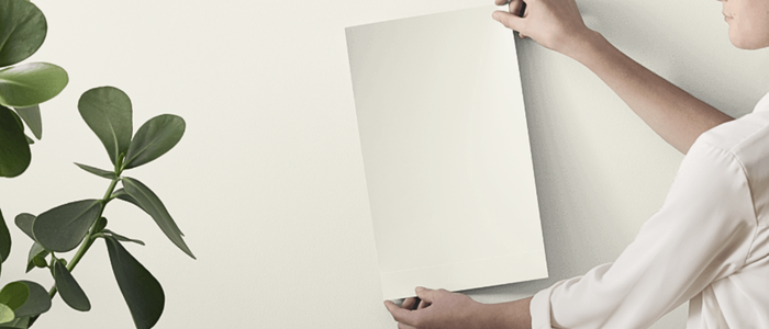
If you’re unsure how this colour will look in your home, it’s always recommended to test it first. Peel-and-stick samples from Samplize are easy to use and move around, so you can see how it behaves in your own home before making a final decision.
→ Try Alabaster in your space with Samplize!
Where can you use Alabaster in the house?
The great thing about Alabaster is you can use it in pretty much every rooms. Its versatility and adaptability make it an excellent colour to apply throughout your home. Here are some rooms where Alabaster can work exceptionally well:
In a living room: Alabaster can create a serene and inviting atmosphere. It can serve as a beautiful neutral backdrop for your furniture and artwork, allowing them to become a focal point. When applied on walls, Alabaster can be complemented with colourful accents such as navy blue and dark greige to add visual interest.
In a bedroom: Alabaster is an excellent choice for bedrooms as it promotes a sense of relaxation and calmness. It creates a soothing environment that can help you unwind and achieve a peaceful night's sleep. Consider using Alabaster on walls, ceiling and trims, or pair it with a warm neutral greige to create a cozy and tranquil bedroom retreat.
In the kitchen: Alabaster can be a beautiful option for kitchen walls or even kitchen cabinets. It brings a clean and fresh feel to the space, making it appear larger and brighter. Alabaster pairs well with a variety of other colours and materials to create a cohesive, elegant and inviting kitchen design.
In a bathroom: Alabaster can also be used in bathrooms. Its warm undertones allow you to create a spa-like atmosphere, perfect in a space prone to relaxation and tranquillity.
In a home office: If you have a home office or a study area, Alabaster can provide a peaceful and focused environment. It helps create a clean and organized atmosphere, allowing you to concentrate on your work. Pair it with natural wood accents and pops of colour to add warmth and personality to your workspace.
In a hallway: Alabaster is an ideal choice for hallways and foyers, as it can brighten up these often narrow and transitional spaces. It sets a welcoming tone and can serve as a neutral backdrop for artwork or accent pieces.
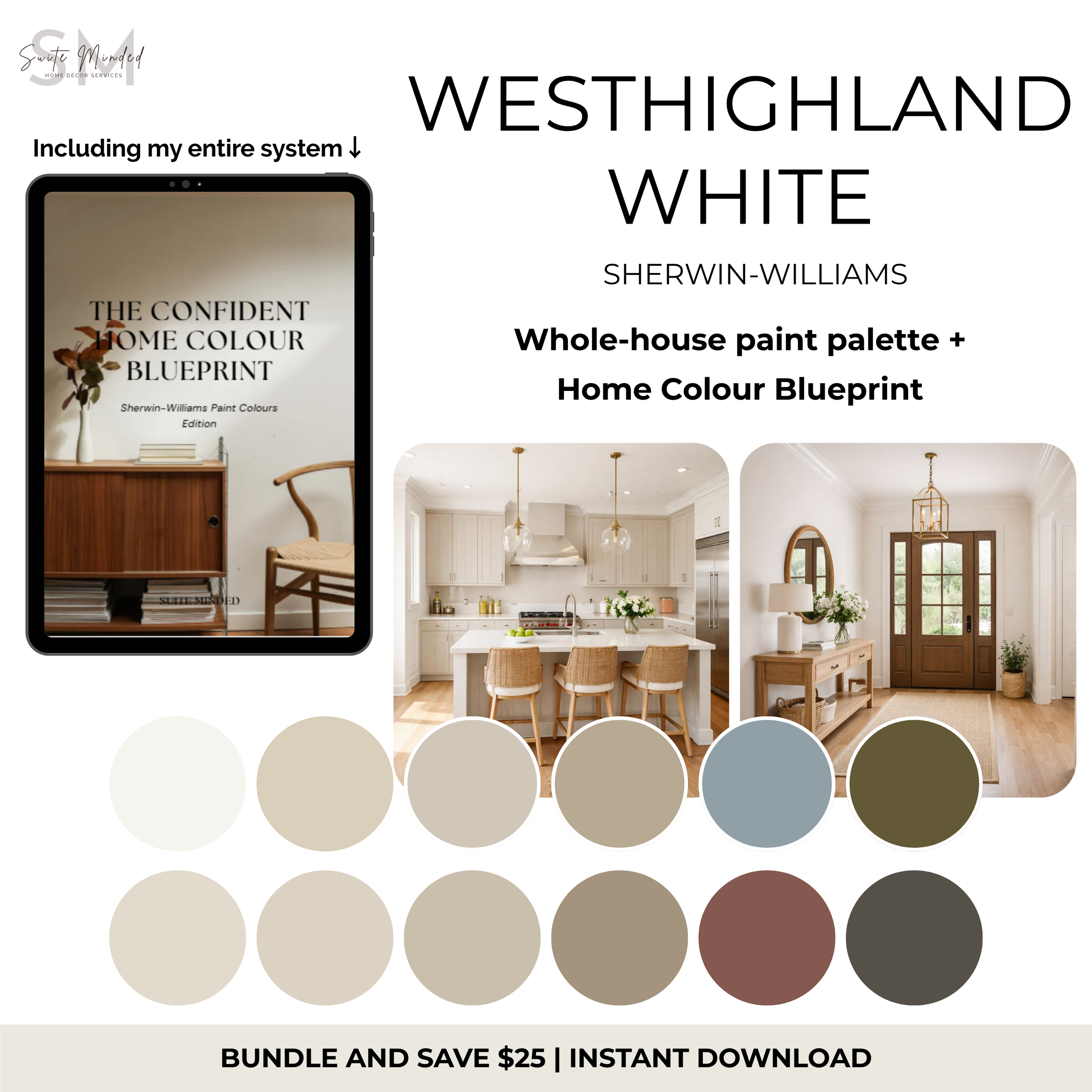
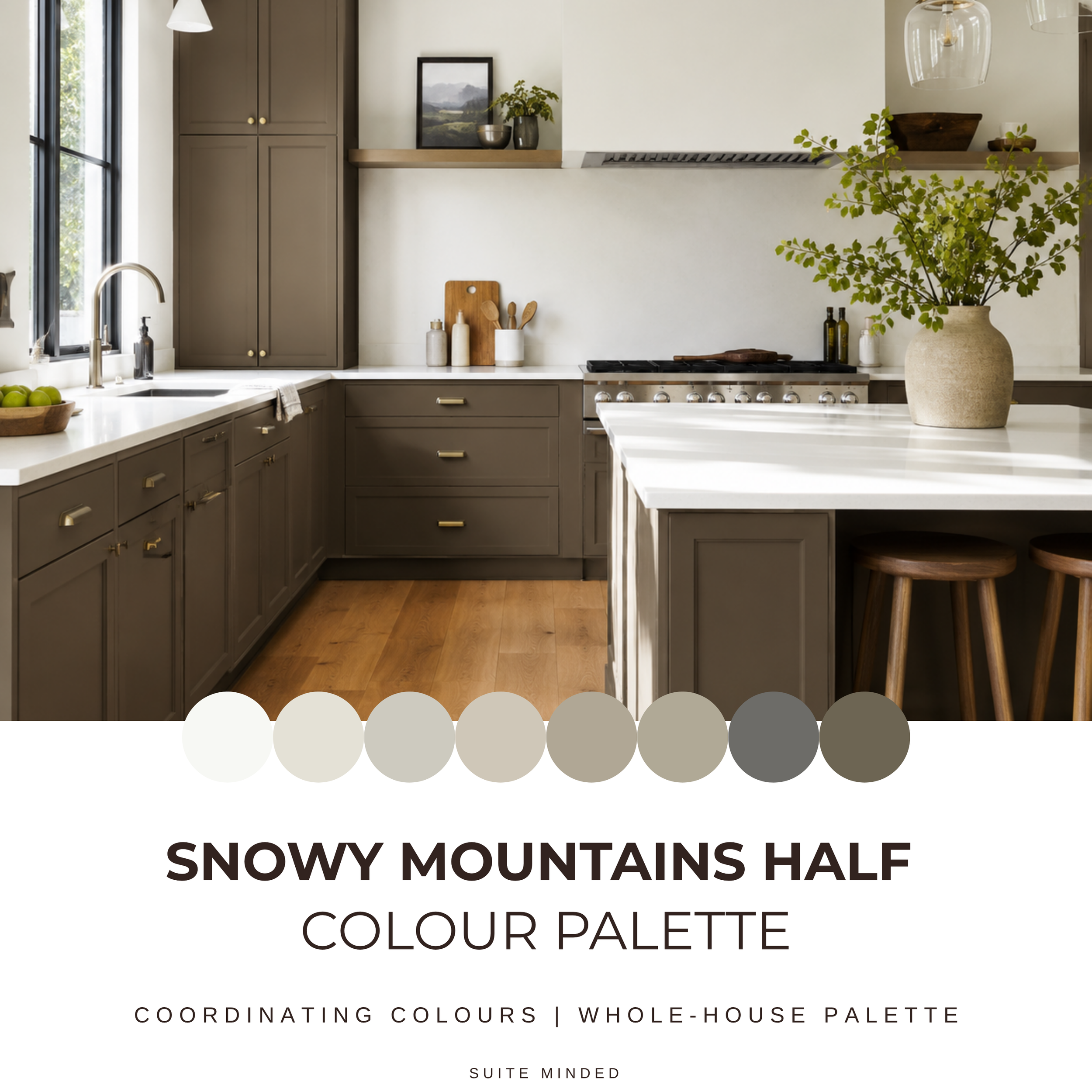
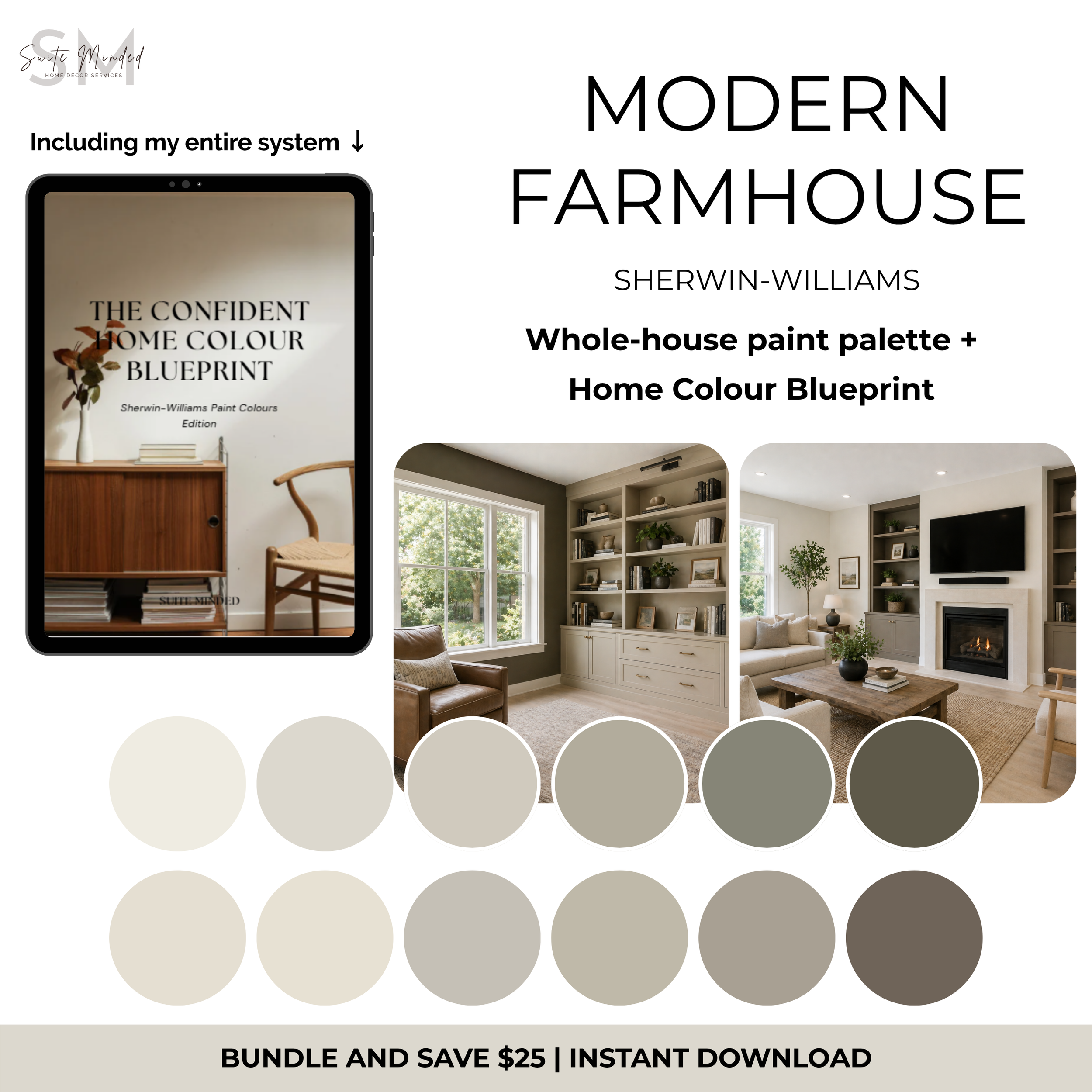
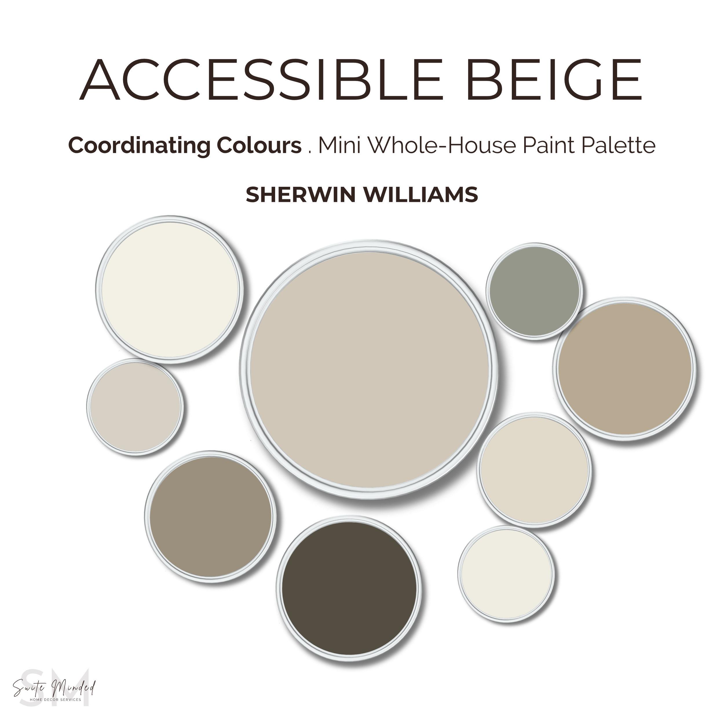
Would love Alabaster in your home, but don’t know what to pair it with? I've created a ready-made whole-house palette around it; it's the easiest way to see how it plays with other colours throughout a home. Have a look at it here!
What coordinating colours to choose?

Alabaster works wonderfully as a neutral base colour that you can use throughout your house. It allows you to experiment with other hues and textures and it pairs well with a wide range of colours, from bold and vibrant tones to soft and muted shades.
When it comes to coordinating colours with Alabaster, you have a wide range of options depending on the desired look and style you want to achieve.
Soft Pastels: Alabaster works beautifully with soft pastel shades to create a harmonious, cohesive and serene ambiance. Consider pairing it with delicate hues like blush pink, light blue, mint green, or lavender.
Neutrals: Alabaster can be combined with other neutral colours to create an elegant and timeless look. Pair it with a shade of greige, taupe, or warm grey to add depth and sophistication to the space while keeping a balanced feel.
Earthy Tones: For a warm and nature-inspired aesthetic, consider incorporating earthy tones with Alabaster, such as sandy beige, terracotta, olive green, or burnt sienna. These colours create a cozy and inviting ambiance that pairs well with Alabaster's creamy undertones.
Jewel Tones: If you're looking to create a more dramatic and luxurious atmosphere, consider pairing Alabaster with tones like emerald green, sapphire blue, or ruby red to add richness and depth to the space while creating a striking contrast with the softness of Alabaster.
Monochromatic Whites: For a clean and monochromatic look, you can combine Alabaster with various shades of white. Experiment with different white tones, such as ivory, cream, or pearl, to create a layered and dimensional effect. This approach can create a serene and cohesive space with subtle variations in colour.
What colour to choose for your trims?
If you use Alabaster on your walls, I recommend using it as a trims and ceilings colour as well in order to create a cohesive and harmonious look.
To create more contrast and bring out Alabaster’s creaminess, you can also try a brighter white like Extra White or High Reflective White also from Sherwin Williams, or Simply White and Chantilly Lace from Benjamin Moore.
Remember, the lighting conditions and surrounding colours in your space can affect how colours appear, so it's always a good idea to test paint swatches and consider the specific environment as well as your intentions with the space before making final colour decisions.
What about hardware and flooring?
When it comes to selecting hardware and flooring to complement Alabaster, you have to consider the desired style and aesthetic of your space. Here are some suggestions:
Hardware:
Alabaster pairs well with classic metals like brushed nickel, polished chrome, or stainless steel. These finishes offer a timeless and sophisticated look that complements the clean and neutral nature of Alabaster.
To add warmth, richness and a touch of elegance, consider using hardware with warm metal finishes such as antique brass, bronze, or copper.
If you have a contemporary or minimalist design style, consider opting for minimalistic hardware with clean lines in polished or matte finishes such as black, brushed black, or satin nickel. These choices can provide a modern and streamlined look.
Flooring:
Hardwood Floors: Hardwood flooring is a classic choice that pairs well with Alabaster. Lighter wood tones, such as oak or maple, can create a fresh and airy feel, while darker woods like walnut or mahogany can add warmth and richness to your space.
Light-coloured Tiles: If you prefer tile flooring, light-coloured options can work well with Alabaster. Light grey, beige, or cream-colored tiles can provide a neutral and cohesive backdrop that complements the softness of Alabaster. Consider selecting tiles with subtle texture or patterns to add depth and visual interest to the floor.
Natural Stone: Natural stone flooring, such as marble or travertine, can add a touch of luxury and elegance to a space with Alabaster walls. White or light-coloured marble with subtle veining can create a sophisticated and timeless look.
Laminate or Vinyl: If you're looking for a budget-friendly and practical option, laminate or vinyl flooring can offer a wide variety of choices. Look for options that mimic the appearance of natural materials like wood or stone.
Remember, the choice of hardware and flooring should align with your overall design style and the mood you want to create in your space. Before making a decision, make sure you consider the level of contrast, texture, and durability you desire, as well as the specific lighting conditions and functionality of each room. It's always recommended to gather samples and compare them in your space to make sure your choices align with your interior and your lifestyle, and you are happy with the result.
Overall, Alabaster is definitely a paint colour to consider for interior decorating. Its soft and inviting nature, combined with its ability to adapt and complement a wide array of colours, makes it an excellent option. Whether you're aiming for a timeless and elegant look or a contemporary and fresh feel, Alabaster can help you achieve the desired atmosphere in your space.
If your heart and eyes are set on Alabaster for your home, check out this colour palette containing 12 coordinating paint colours from Sherwin Williams.
Make sure to check out our other whole house colour palettes to help you get the stress out of selecting a colour scheme for your interior.
Make sure to get in touch if you need help and advice with your interior redecorating needs.
Thank you for the read,
Happy decorating xx
Manon from Suite Minded