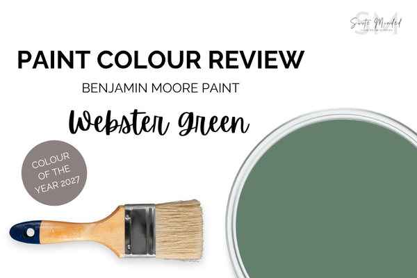
BM Webster Green HC-130: An Honest Review of Benjamin Moore's 2027 Colour of the Year
Benjamin Moore just named Webster Green HC-130 as their 2027 Colour of the Year, a deep, moody green with a touch of blue and an LRV of just 20. It's bold, it's beautiful, and it absolutely demands a little planning before you commit. Here's my full take.
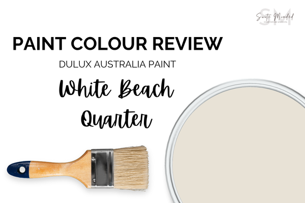
White Beach Quarter by Dulux Australia - Paint Colour Review
Dulux White Beach Quarter is a warm, creamy off-white with a subtle beige undertone and an LRV of 79 - the kind of colour that makes a room feel instantly relaxed and sun-warmed. But there a few things worth knowing before you commit. Here’s my full take.
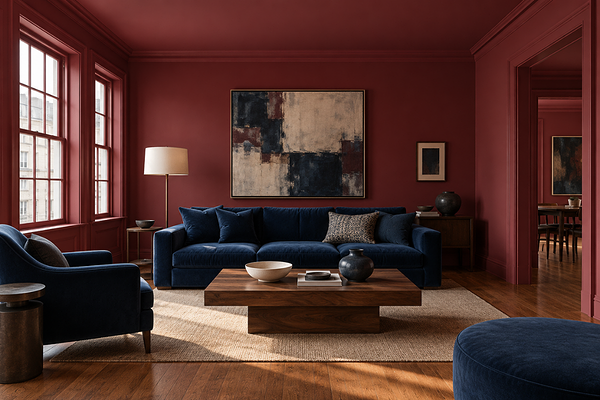
Dulux Australia Colour Forecast 2027: My Full Breakdown of Every Palette
Dulux Australia just dropped their 2027 Colour Forecast, and it's one of the most exciting releases in recent years. Three palettes, three completely different moods, and honestly a really strong collection overall. Here's my take on all of it.
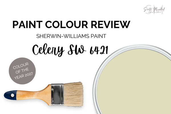
Celery SW 6421: A Complete Review of Sherwin-Williams’ 2027 Colour Of The Year
Sherwin-Williams just announced Celery SW 6421 as their 2027 Colour of the Year - a soft, airy green with a yellow undertone and an LRV of 71. It's fresh, it's approachable, and it's more nuanced than the name suggests. Here's my full take on it.
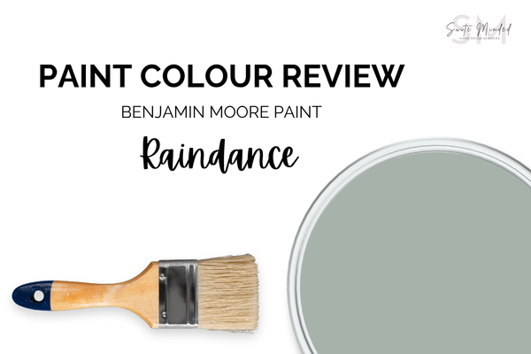
Raindance 1572 by Benjamin Moore - Paint Colour Review
Benjamin Moore Raindance is a soft, muted green with a subtle blue undertone and an LRV of 43.47. It’s the kind of colour that feels instantly calm the moment it goes on the wall. Here's everything you need to know.
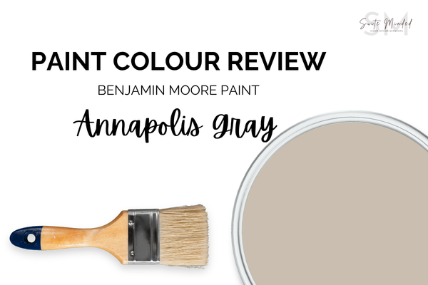
Annapolis Gray HC-176 By Benjamin Moore - Paint Colour Review
Benjamin Moore Annapolis Gray is a muted, medium greige with taupe undertones and an LRV of 50.72. It’s the kind of colour that looks deceptively simple on a chip but does something really beautiful on a wall. Here's everything you need to know before you commit.
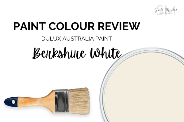
Berkshire White by Dulux Australia - Complete Paint Colour Review
Dulux Berkshire White is a warm, creamy white with a clear yellow undertone and an LRV of 87. It's the kind of white that makes a room feel immediately inviting, but those yellow undertones need to be understood before you commit. Here's the full picture.
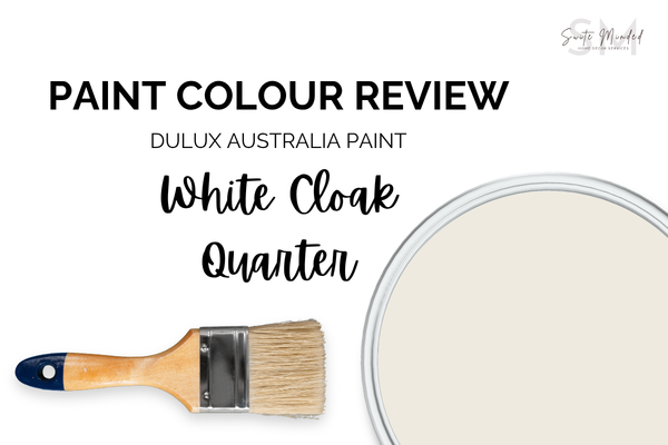
White Cloak Quarter By Dulux Australia: An Honest Colour Review
Dulux White Cloak Quarter is one of the most subtly complex whites in the Dulux range - a soft, warm white with undertones that hold each other in quiet balance. Here's what you need to know before you commit.
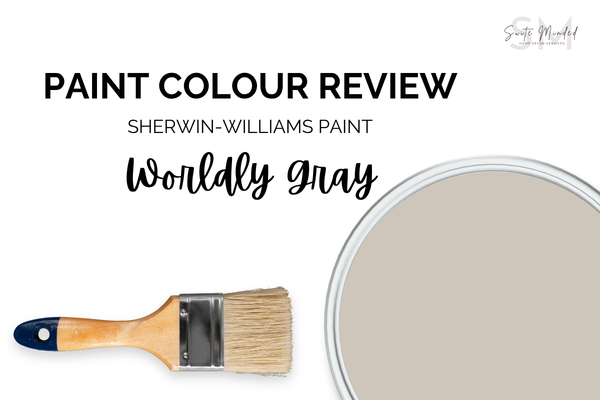
Worldly Gray SW 7043 by Sherwin-Williams - Paint Colour Review
Sherwin-Williams Worldly Gray SW 7043 is a warm greige-taupe with an LRV of 57 and a subtle hint of green hiding beneath the surface. It's one of the more layered neutrals on the market, here's what to know before you commit.

Vivid White by Dulux Australia - Paint Colour Review
Dulux Vivid White is a true, clean white with an LRV of 94, one of the brightest whites in the Dulux range. But 'no undertones' doesn't mean 'no surprises.' Here's what you actually need to know before you use it throughout your home.

Dulux White on White: An Honest Colour Review
Dulux White on White is a bright, high-LRV white with a noticeable blue undertone, which makes it crisp, clean, and contemporary in the right conditions, and unexpectedly cold in others. Here's what you need to know before committing.
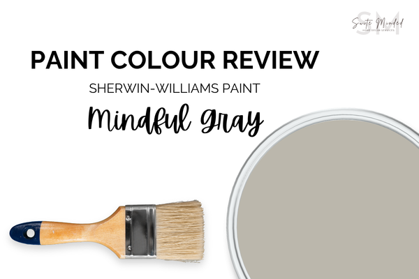
Mindful Gray SW 7016 by Sherwin-Williams - Paint Colour Review
Sherwin-Williams Mindful Gray is a warm, grounded greige that feels effortlessly liveable, but knowing how its taupe undertones behave in different lights is the key to using it well. Here's everything you need to know before you commit.
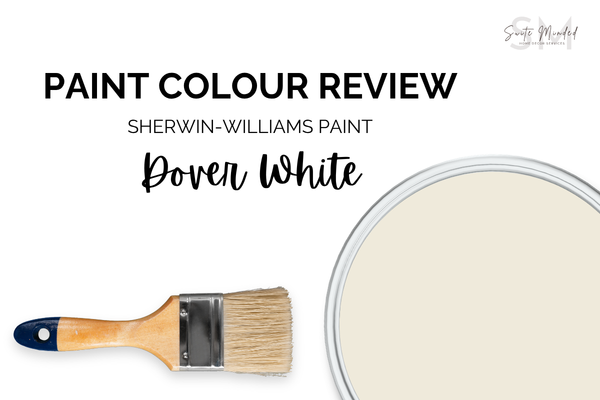
Dover White SW 6385 by Sherwin-Williams - Paint Colour Review
Sherwin-Williams Dover White is a warm, creamy white with a yellow undertone - the kind of white that makes a room feel instantly inviting. But those undertones can surprise you in certain light conditions. Here's what to know before you commit.
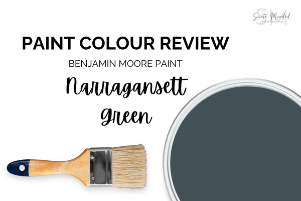
Narragansett Green HC-157 by Benjamin Moore - Paint Colour Review
Benjamin Moore Narragansett Green is a deep, moody teal with an LRV of just 9.14, one of the darkest colours in the BM range. Used well, it's quietly dramatic and sophisticated. Here's what you need to know before committing to it.
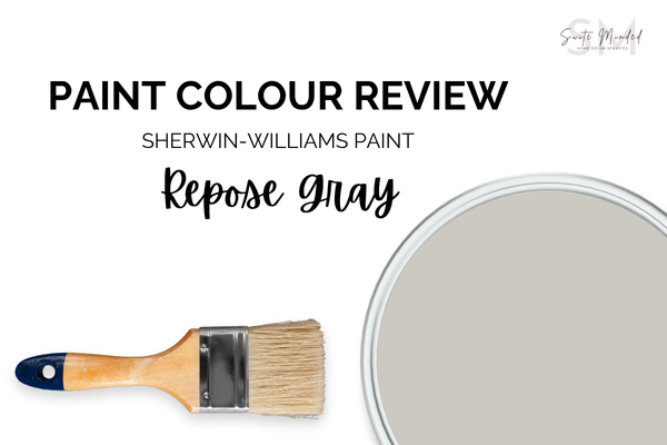
Repose Gray SW 7015 by Sherwin-Williams - Paint Colour Review
Repose Gray is one of Sherwin-Williams' most popular paint colours, but its violet and green undertones mean it doesn't behave the same way in every home. Here's a full breakdown of its undertones, LRV, lighting behaviour, and the trim and coordinating colours that make it work.
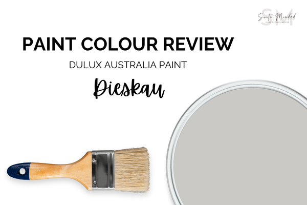
Dieskau by Dulux Australia - Paint Colour Review
Dieskau is one of Dulux Australia's most beloved greiges, but that subtle violet undertone means it pays to know what you're getting into. Here's everything you need to know before you paint.

How to Tell If Your Wall Paint Colour Is Too Cool for Your Space
Wondering why your wall paint colour feels cold, flat, or “off” in your home? Learn the common signs that a paint colour is too cool for your space and what to do instead for a warmer, more inviting home.

The Best Wall Colours To Pair With Dark Timber Floors
Dark timber floors are rich, warm, and full of character. In this guide, I'm breaking down the best wall colour directions for walnut and dark wood floors, from warm whites and soft greiges to muted greens, blue-greys, and earthy terracottas.
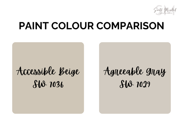
Accessible Beige vs Agreeable Gray: Which One Is Better for Your Home?
Trying to decide between Accessible Beige and Agreeable Gray? This guide breaks down the real difference between these two popular Sherwin-Williams paint colours, including undertones, lighting effects, and designer advice to help you choose the right neutral for your home.
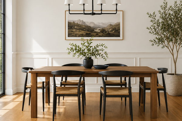
What Is LRV in Paint Colours (And Why Does It Matter?)
What does LRV actually mean in paint colours, and why does it matter so much? Learn how Light Reflectance Value affects brightness, mood, lighting, and the way paint colours behave in your home.