White Cloak Quarter By Dulux Australia: An Honest Colour Review
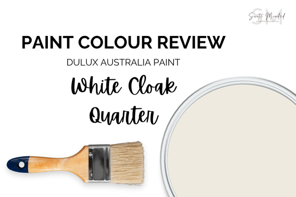
White Cloak Quarter is the kind of white that rewards a second look, and a third. At first glance, it reads as a soft, warm white, but spend more time with it across different light conditions, and a more layered picture emerges: beige, a hint of pink-red, and a subtle green undertone, all held in a beautiful balance that gives the colour an almost chalky depth that simpler whites simply don't have.
Undertones
White Cloak Quarter has different undertones at play: a beige base, a subtle pink-red secondary, and a quiet green tertiary.
The beige undertone is the one doing most of the visible work. It's what makes the colour read as a warm, soft white rather than something overtly pink or green. It keeps the colour grounded and accessible, and is why White Cloak Quarter feels liveable across a broad range of interiors.
The pink-red undertone sits beneath the beige and surfaces most noticeably in cooler, more diffused light, like south-facing rooms, overcast days, or under artificial lighting that leans cool. In those conditions, it can read as a slightly more rosy blush than a neutral warm white.
The green undertone is the quietest of the three. It's what stops White Cloak Quarter from reading as a straightforward pink-beige, and is responsible for that slightly muted, chalky quality that makes it feel sophisticated. Pink and green sit in complementary tension on the colour wheel, and even at the subtle level they operate here, they cancel each other out just enough to keep the overall colour balanced - neither warm nor cool, neither pink nor green, but somehow all three at once.
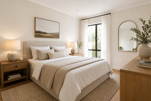
Bedroom with White Cloak Quarter walls
LRV (Light Reflectance Value)
White Cloak Quarter has a Light Reflectance Value or LRV of 84, placing it firmly in bright-white territory, noticeably lighter than a mid-range off-white, but with more body than near-maximum whites like Vivid White (LRV 94) or White on White (LRV 87). That additional depth is part of what allows its layered undertones to show at all.
In practical terms, it means White Cloak Quarter will keep rooms feeling light and open without the potential glare or clinical intensity of a very high-LRV white. It's bright enough to work in rooms with moderate natural light, and warm enough that it won't feel stark or cold in the evening.
How does it look in different light conditions?
Because White Cloak Quarter has three undertones rather than one, lighting shifts its character more noticeably than it does with a simpler white. Which layer comes forward depends heavily on the quality and temperature of the light in your space.
In north-facing rooms, which in Australia receive the most direct, warm sunlight, White Cloak Quarter is typically at its most balanced and beautiful. The warm light activates the beige base, keeps the pink reading as flattering warmth, and allows just enough of the green to surface to give the colour its characteristic depth.
In south-facing rooms, which receive cooler, more diffused indirect light, the pink undertone tends to become more assertive as the beige warmth is pulled back by the cooler light. The green undertone can also become slightly more visible in this orientation, which in combination with the pink can produce a complex, slightly unsettled quality. It's not necessarily unflattering, but it's noticeably more layered, and worth sampling carefully before committing.
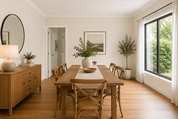
Dining room with White Cloak Quarter walls
In east-facing rooms, the warm direct morning sun gives White Cloak Quarter a soft, honeyed warmth early in the day, and the colour reads as simply beautiful. As the light cools and becomes more diffused through the afternoon, the undertones become a little more present, and the colour takes on a slightly more complex, chalky quality by late afternoon.
In west-facing rooms, the warm afternoon and evening light is very flattering, drawing out the beige warmth. The green undertone stays largely in the background in warm light, making west-facing rooms one of the better orientations for this colour.
Under artificial lighting: warm white globes (2700–3000K) are strongly recommended as they activate the beige layer and keep both the pink and green undertones reading as quiet depth. Cool white or daylight globes (4000K+) are the most challenging choice for this colour as the cooler light suppresses the beige, pushes the pink forward, and can make the green undertone more noticeable too. The result can feel unexpectedly complex and unsettled in the evening. If you need cooler functional lighting in a space like a kitchen or bathroom where this is the wall colour, consider warm globes in any adjacent pendant or decorative fittings to balance the effect.
Best material pairings
White Cloak Quarter pairs most harmoniously with materials that are earthy and organic:
Warm and natural timbers: Honey oak, Tasmanian oak, and warm pine sit beautifully with White Cloak Quarter. The shared warmth keeps the beige layer leading, while the organic feel of the wood grain complements the colour's own complexity.
Warm stone and travertine: Sandstone, travertine, and warm limestone also echo the earthy quality of White Cloak Quarter particularly well. These materials often carry subtle veining and variation in tone that sit harmoniously with a colour as layered as this one.
Aged brass and unlacquered metals: Warm, slightly imperfect metallic finishes like aged brass, unlacquered copper, or antique bronze suit the complexity of White Cloak Quarter far better than polished or overly uniform metals.
Rendered and textured plaster: The softness and subtle variation of rendered or plastered walls suit White Cloak Quarter especially well in Australian homes. The texture catches light differently across the surface, which allows the layered undertones to shift and move throughout the day.
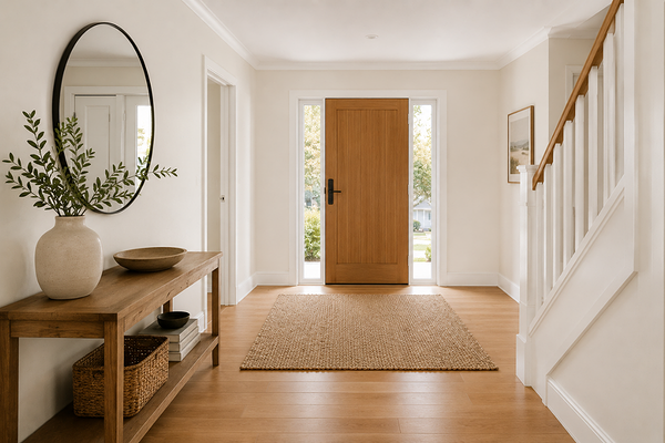
Entryway with White Cloak Quarter walls
Best use cases
Bedrooms: The softness of White Cloak Quarter makes it a genuinely restful bedroom choice, particularly in north or west-facing rooms where the warm light keeps the undertones most balanced and flattering. Paired with linen bedding and warm timber furniture, it creates a beautifully layered retreat.
Living rooms in organic, earthy homes: In a home with natural materials, warm timber floors, and an earthy palette, White Cloak Quarter reads as a sophisticated wall colour.
Hallways and transitional spaces: Its brightness keeps transitional spaces feeling open, while the complexity of the undertones means it reads as something other than a default white - a quality that makes even a hallway feel considered.
Exteriors on warm-toned homes: In the Australian sun, White Cloak Quarter reads as a soft warm white that suits sandstone, terracotta, and warm timber-accented homes beautifully. At exterior scale and in strong light, the undertone balance is at its most harmonious, and the colour holds its own well.
Where to use it with caution: south-facing rooms with cool-toned finishes, where the pink and green undertones may surface more than intended, and spaces with strongly cool-toned stone, stainless steel, or grey-blue finishes, where the warm undertones will create temperature tension.
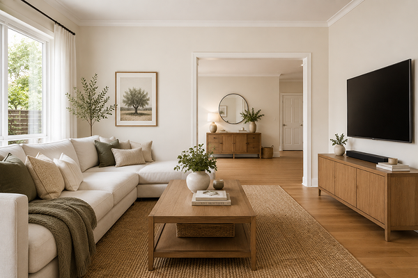
Living room with White Cloak Quarter walls
Best white trim colours
Given the layered undertones in White Cloak Quarter, trim selection requires more care than it does with a simpler warm white. The goal is to find a white that echoes the warmth without amplifying either the pink or the green by contrast.
If applying White Cloak Quarter on all walls, the most reliable approach is to use it on the trims as well, in a semi-gloss or gloss finish. The sheen creates definition while keeping the undertone profile consistent across wall and trim. There's no risk of one colour making the other look pinker, greener, or more yellow than intended.
If you'd like a slightly brighter trim, look for a soft warm white with a beige or very faint cream lean, one that sits a touch higher in LRV but shares the warmth of White Cloak Quarter without its own strong pink or green quality. Avoid cool or blue-based whites entirely, and be cautious with strongly yellow-cream whites too. Alongside a colour this balanced, a strongly warm trim can make the undertones look more prominent by contrast. Consider a white like Natural White or White Polar Quarter.
Best coordinating colours
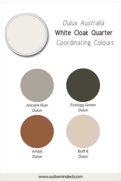
White Cloak Quarter's three-way undertone profile makes it surprisingly versatile as a palette anchor, provided coordinating colours stay within its earthy, organic warmth. Here's what works beautifully:
Warm greiges and sandy taupes: Soft greige and taupe tones echo the beige base of White Cloak Quarter and create a gently layered, tonal palette.
Dusty blush and muted terracotta: Earthy, desaturated pinks and terracottas sit naturally alongside the pink undertone in White Cloak Quarter, used in furnishings or as an accent wall colour.
Warm olive and muted sage: A warm, yellow-leaning olive or sage can create a beautifully cohesive, organic palette. The key is to keep the green warm and muted rather than cool or vivid, so it feels harmonious.
Warm caramel and honey: In timber accents, leather, or woven furnishings, warm caramel and honey tones draw out the beige depth in White Cloak Quarter and add richness to the palette without competing with either the pink or green layers.
Deep warm charcoal: For grounding contrast, a charcoal with warm brown or greenish undertones, rather than a cool blue-grey, anchors the palette without creating temperature tension. Used on cabinetry, a fireplace surround, or a feature wall.
Dusty mauve and warm clay: For a softer, more romantic direction, muted mauve and warm clay tones sit naturally in the same earthy, complex family as White Cloak Quarter.
Final thoughts on Dulux White Cloak Quarter
Dulux White Cloak Quarter is a genuinely interesting white in the Dulux Australia range. Its balance of beige, pink-red, and green undertones gives it a veiled, chalky complexity that simpler whites simply can't replicate. At LRV 84 it sits in a genuinely useful position: bright enough to be practical, deep enough to carry its character.
Because it's so light-sensitive, sampling is non-negotiable - and sampling large! Put at least an A3-sized swatch on your wall and live with it across a full day, including under your artificial lighting in the evening. Pay particular attention to how it reads in your specific orientation and alongside your fixed finishes. In the right conditions, it's a beautiful, sophisticated choice.
Want to know whether White Cloak Quarter is the right fit for your home, or need help building a palette around its unique undertone profile? I'd love to help.
Check out my Colour Review Service if you’d like expert advice on whether this warm, complex white is the right fit for your light and orientation.
Book a full colour consultationif you'd like personalised colour recommendations based on your home, your finishes, and your style.
Thank you for reading, and happy painting!
Manon xx