What Colours Go Best With Honey Oak Timber?
If you have honey oak floors, cabinets, or trim, you’ve probably had this thought before:
“Why does everything I try look… off?”
It’s not always the timber. Honey oak is actually a beautiful, warm material, but it comes with strong yellow and orange undertones, which can easily clash with the wrong paint colours.
The good news? Once you understand how to work with those undertones, your space can feel instantly more modern, balanced, and intentional.
Understanding honey oak and why it’s tricky
Honey oak sits firmly in the warm colour family, with yellow and orange undertones, creating a rich golden warmth.
The problem is, most people try to pair it with:
Cool greys
Stark whites
Blue-based neutrals
And that’s where things go wrong…
When your paint colour fights the undertones in your timber, the entire room feels off, even if each element looks good on its own.
The rule of thumb
When working with honey oak, there are only two directions that truly work:
You either blend with the warmth by leaning into warm tones for a cohesive look;
Or you try to balance it softly by introducing coordinating contrasts to calm the orange.
But you never fight it!
The best colours for honey oak
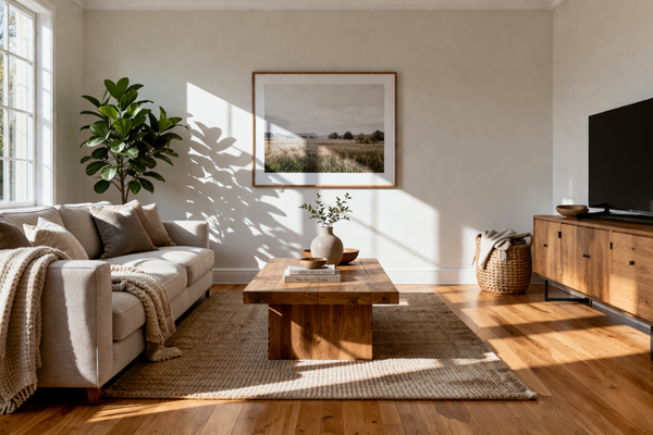
1- Warm whites and soft creams
If you want a light, fresh space without harsh contrast, this is your safest option.
Warm whites help:
Soften the orange tones
Brighten the space
Keep everything feeling cohesive
They are often recommended because they maintain the cozy feel of the timber without clashing. Some examples to consider include:
Benjamin Moore White Dove OC-117 (a soft, creamy white that works beautifully with oak)
Designer tip: Avoid blue-based whites as they can make the timber look more orange.
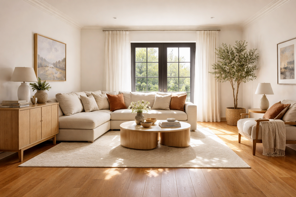
2- Greiges and warm neutrals
This is where things start to feel more modern. Greige (a mix of grey and beige) works well with honey oak because it:
Softens the warmth
Adds a subtle, muted contrast
Still feels grounded and natural
Warm neutrals with green or beige undertones are especially effective at balancing honey oak. For example, consider:
Dulux Australia Grand Piano
→ You may be interested in this article: Revere Pewter HC-172 vs Agreeable Gray SW 7029: Which One Is Right for Your Home?
Designer tip: Look for green, taupe, or bronzy undertones as these help neutralise the orange undertones of honey oak.
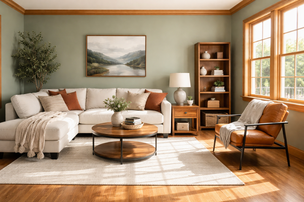
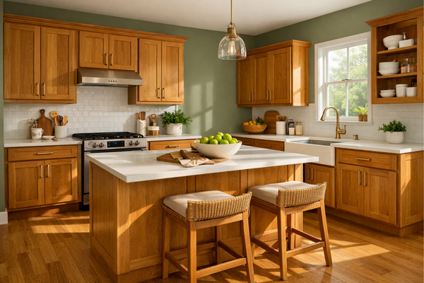
3- Earthy greens (one of the best pairings)
If you want something a little more elevated, greens are incredible with honey oak. Green sits opposite red/orange on the colour wheel, so it naturally helps balance the warmth. Blue-green and earthy greens are often recommended to counteract the orange tones in oak. Some examples are:
Benjamin Moore Saybrook Sage HC-114
Dulux Australia Spanish Olive
Designer tip: These tones are one of the easiest ways to make honey oak feel intentional and modern.
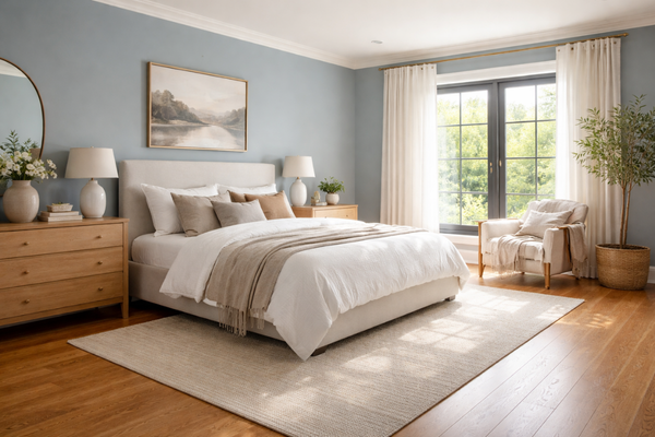
4- Muted blues
Blue can work, but only when it’s softened. The key to choosing the right blue is one that is slightly greyed and muted, not too cool or icy. Cool tones can contrast oak, but they need to be balanced carefully to avoid exaggerating the orange undertone. Some examples to consider are:
Benjamin Moore Smoke 2122-40
Sherwin-Williams Aleutian SW 6241
Dulux Airborne Half
Designer tip: Think dusty, muted, slightly warm blues, not crisp or bright.
Colours to avoid
If you want to save yourself from expensive mistakes, avoid these:
Cool greys: they make the timber look more orange
Stark whites: they create a harsh contrast and highlight yellow tones
Pink or blue undertones: they clash with the warmth and create visual tension
How to use these colours in your home
Instead of trying to use everything at once, think in roles:
Use warm whites → to brighten and unify
Use greige → as your main wall colour
Use green → to add depth and balance
Use a deeper neutral → to create warmth and softness
For example:
Living room → greige walls + green accents
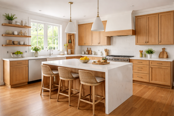
Kitchen → warm white walls + oak cabinetry
Bedroom → neutral base + soft olive tones
Designer tips (that make the biggest difference)
These are the small things that change everything:
Always test samples next to your timber (not on a blank wall)
Use rugs, curtains, and decor to bridge colours
Don’t try to “hide” the oak, integrate it
Surrounding honey oak with other warm tones can help make it feel more intentional and less “loud”.
Honey oak isn’t something you need to fight. Once your colours start working with it instead of against it, the entire space feels calmer, more cohesive, and much more elevated.
Want help pulling it all together?
If you’re trying to choose colours for your entire home (not just one room), this is exactly what I walk you through step-by-step inside my Colour Blueprint.
It’s designed to help you:
Build a cohesive palette
Avoid costly mistakes
Feel confident in your choices
Thank you for reading, and happy painting!
Manon xx