How to Choose the Right White Paint for Your Home (Without Losing Your Mind)

Picking a white paint sounds easy… until you're staring at a wall of 100+ white swatches and they all look the same. But then, somehow, they also don’t.
If you’ve ever thought, “Why is this one white too yellow?” or “This looked completely different in the store,” you’re not alone. White paint is one of the trickiest colours to get right, but it doesn’t have to be overwhelming.
This guide will walk you through how to choose the right white for your home, so you feel confident (and not totally cross-eyed) when it's time to paint.
Why white paint isn’t just... white
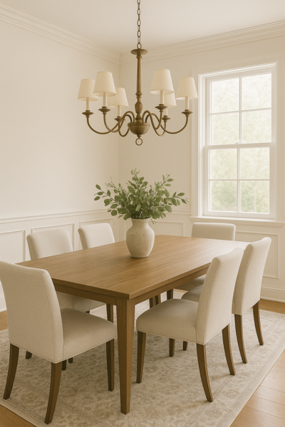
Here’s the thing: most white paints aren’t actually pure white. They have undertones, little hints of other colours like yellow, grey, or pink, and that’s what makes one white feel warm and cozy while another feels cool and crisp.
So, choosing white paint is less about picking the “best” white or the most popular one, and more about picking the one that works best in your space.
Step 1: Get to know the undertones
Warm whites have hints of yellow, beige, or peach. They feel soft, creamy, and inviting, perfect for cozy homes or rooms that need warming up.
Cool whites have undertones of blue or grey. They feel clean and modern, great for bright, airy homes or sleek, minimal spaces.
True whites have very little undertone. They’re super clean and crisp, but can feel stark if your lighting isn’t right.
→ Quick tip: Hold your white paint swatch next to a sheet of white printer paper. You’ll instantly spot if it’s leaning warm or cool.
Step 2: Check your natural light
Lighting can completely change how white paint looks. What looks creamy and soft in one room can look dingy or dirty in another. Here’s a quick cheat sheet for you:
North-facing rooms tend to have cooler, greyish or bluish light → a warm white can balance this out beautifully.
South-facing rooms get warm, golden light all day → a warm white will look even warmer, cosier, and creamier. Or, to tone down the warmth slightly, opt for a cooler or truer white to create a more neutral look.
West-facing rooms are cooler in the morning and warmer later in the day → here, stick with a neutral or slightly warm white to create a gentle, soft, and cosy atmosphere.
East-facing rooms tend to get warm morning light, which decreases and becomes cooler as the day progresses → picking a warm white can create a cosy, enveloping look in the morning, and balance out the cool light in the evening.
→ Quick tip: Paint a sample on multiple walls in the room and watch how it shifts throughout the day.

Step 3: Don’t forget your fixed elements
Look at what’s already in the room, such as your floors, kitchen cabinets, tiles, and benchtops. These things have undertones too, and your white paint should work with them, not clash. You don’t want a warm white that suddenly makes your cool-toned tiles look weirdly pink.
For example:
If you have warm-toned oak floors, a creamy or beige-leaning white will complement them beautifully. But a cool white might look too stark or even clash.
If your kitchen has cool-toned grey stone benchtops, a crisp white with a slight grey undertone will tie everything together. A yellowish white could make those counters look dull or mismatched. It could also bring out any yellow undertones in your white paint.
If you have existing white trim or cabinetry, try to match the undertone and depth; otherwise your new wall colour might make the old white suddenly look dirty or off.
→ Quick tip: Hold your paint sample right up against the fixed element you’re comparing it to. Does it feel harmonious, or does it feel like it’s fighting for attention?
→ Quick tip: Undertone clashes can be quite subtle and barely noticeable sometimes, but they are the main reason white paint can look “off.” When in doubt, stick to undertones that feel consistent across the room.

Step 4: Think about the mood you want
White is a very versatile colour. It can feel clean and modern, warm and relaxed, or bright and breezy, depending on which one you pick. This is where you can trust your gut a little. Colour isn’t just visual, it’s emotional. So ask yourself how you want to feel when you walk into the room.
Cosy and welcoming? Try a warm white with yellow, cream, or beige undertones. These feel soft and relaxed, especially in living rooms, bedrooms, or homes with warm wood features.
Fresh and modern? Go for a cool white with subtle blue or grey undertones. These work well in contemporary homes, with clean lines and cooler finishes like chrome or stainless steel.
Light and bright? Look for a bright white with a high LRV (Light Reflectance Value), meaning how much light it reflects. The higher the LRV, the brighter the paint colour and the more light it will reflect. A white with a high LRV helps bounce light around and makes the room feel more open and airy, perfect for hallways, bathrooms, or small spaces.
Soft and serene? Choose a muted or slightly off-white. Something with a touch of grey or greige can create a calming atmosphere without feeling stark.
Paint has a sneaky way of shifting the whole mood of a room. So if you’re standing in a paint aisle with five white swatches, ask: Which one feels the most like the room I want to create?
Step 5: Always test samples (seriously)
Even if you’ve done all the research, nothing beats seeing the colour in your home.
Here’s how to test like a pro:
→ Grab sample pots of 2–3 whites you’re considering.
→ Paint large swatches (A4 size or bigger) directly on your wall, or on poster board, so you can move them around.
→ Check the colour in daylight, artificial light, and at different times of day.
→ Quick tip: Snap a photo of the swatch at different times of day to see how it shifts!
Step 6: Pick the right sheen
Choosing your white paint colour is half the job. The other half? Picking the right sheen or finish. Sheen affects how your paint looks, how much light it reflects, how easy it is to clean, and whether it hides or highlights imperfections. Here’s a quick breakdown of the main options:
Flat or matte
Best for: Ceilings and low-traffic areas like adult bedrooms or formal dining rooms
Pros: Hides surface imperfections really well
Cons: Harder to clean, so it is not ideal for scuff-prone spots or kids’ bedrooms.
Eggshell
Best for: Most interior walls (living rooms, hallways, bedrooms)
Pros: Slightly more durable and wipeable than flat, with just a hint of sheen
Cons: Not shiny enough for trim or kitchens, but a great all-rounder
Satin
Best for: High-traffic areas like kids’ rooms, kitchens, or bathrooms
Pros: Easy to clean, holds up to moisture and everyday wear
Cons: Can highlight wall flaws a little more than eggshell
Semi-Gloss
Best for: Trim, baseboards, doors, and cabinetry
Pros: Super durable, reflects light, wipes clean easily
Cons: Shows every little bump or brushstroke if your surface isn’t prepped well
Gloss or High-Gloss
Best for: Accent details or bold, dramatic design choices
Pros: Ultra shiny and wipeable, almost like lacquer
Cons: Highlights every imperfection, needs a very smooth surface
→ Quick tip: For a cohesive look, use the same white paint colour in different sheens. For example, flat on ceilings, eggshell on walls, semi-gloss on trim. It creates depth and very subtle contrasts while maintaining the space cohesive, harmonious, and avoiding mixing undertones.

A few white paint colours people love (for a reason)
If you’re overwhelmed by the hundreds of white options out there, here are some tried-and-tested favourites from Benjamin Moore, Sherwin-Williams, and Dulux. These are a great place to start, just remember: always test them in your space before committing.
Benjamin Moore
Chantilly Lace OC-65: A bright, clean white with no noticeable undertone. Crisp and modern.
White Dove OC-17: A soft, warm white that feels welcoming and works beautifully with almost anything.
Simply White OC-117: A slightly creamy white with warmth, but still feels fresh and light.
Sherwin-Williams
Alabaster SW 7008: One of their most loved warm whites. Soft, creamy, and very easy to live with.
Pure White SW 7005: A clean, neutral white with just a whisper of warmth, great for trim and walls.
Extra White SW 7006: A bright, icy white. Very clean and crisp, ideal if you want something really fresh and cool-toned.
Dulux (AU)
Natural White: A beautiful warm white with just enough softness. Very popular for interiors and whole-house use.
Vivid White: The brightest and purest white Dulux offers. Great for modern, minimalist spaces (but can feel stark).
Lexicon Quarter: A cool white with a modern touch. Works well in contemporary homes with cooler tones.
Antique White USA: A creamy, classic white with yellow/beige undertones. Warm and timeless, perfect for traditional or country-style homes.
👉 Always test them before committing. What looks amazing in one home might look completely different in yours.
—————
White paint can be beautiful, timeless, and very transformative, but only if it works with your space. Don’t stress if it takes a little trial and error. The perfect white is out there for you, and once you find it, your home will feel just right.
If choosing paint colours feels too stressful and overwhelming, I’ve got you! Download my free Paint Colour Quick Start Guide to simplify the process, or check out my ready-made Whole House Colour Palettes, curated to take the guesswork out of painting your home.
Thank you for reading, and happy painting.
Manon xx