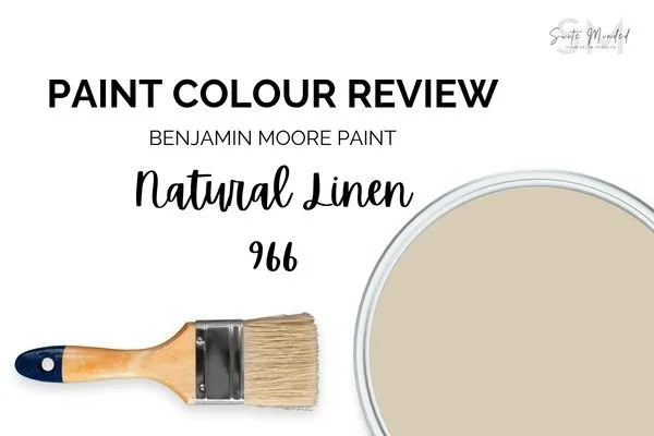
Paint Colour Review: Natural Linen by Benjamin Moore
This post may contain affiliate links, which means I may earn a small commission if you purchase through them, at no extra cost to you.
Have you ever wished for a paint colour that feels like a warm hug? That’s exactly the vibe Natural Linen 966 or CC-90 by Benjamin Moore gives. It’s soft, calming, and just the right mix of warm and neutral, perfect for creating that cosy, lived-in feeling we all crave in a home.
In this post, I’ll walk you through everything you need to know about Natural Linen: its undertones (yes, they matter!), its LRV and what that actually means, how it looks in different lighting, and where it really shines in the home. I’ll also share the best white trims to pair it with, plus some gorgeous coordinating hues to consider if you’re building a palette. So whether you’re painting an entire room, refreshing your walls, or just curious if this colour could work in your space, you’re in the right place. Let’s get into it!
What are the undertones of Natural Linen?
Natural Linen is a beautiful muted tan with a gentle touch of yellow and green, which gives it that soft, welcoming feel. It’s not overly yellow or golden like some traditional tans, and it’s not cool either. Instead, it sits comfortably in the warm neutral family, offering just enough colour to bring depth and some character to a space. This is the king of paint that doesn’t scream for attention, but it definitely makes a room feel complete. Its undertones are especially helpful if you’re trying to warm up a space or balance out cooler elements.
If you’re someone who loves neutrals but wants something a little richer and more organic than your typical off-white, Natural Linen could be the one.

Natural Linen entryway - photo via benjaminmoore.com
What is Natural Linen’s LRV?
LRV (or Light Reflectance Value) helps determine how much light is absorbed or reflected by a paint colour. It is measured on a scale from 0 to 100, 0 being absolute black and absorbing all light, and 100 being pure white and reflecting all light.
With an LRV of 59.84, Natural Linen sits in the light-medium range. It reflects a moderate amount of light, so it won’t make a room feel dark or heavy, but it also has enough depth to stand out in brighter areas. Think of it as a soft, grounding neutral that brings warmth and cosiness without feeling too dark or too bright.
In brighter, sunlit rooms, it can look quite fresh and airy with a soft warmth, whereas in moodier or low-light spaces, it can appear slightly more passive without ever being cold. It is perfect for bedrooms, living rooms, or any space where you want that snug, inviting atmosphere.
One of the most common mistakes I see is choosing a paint colour without testing it first. Colours can look very different depending on your lighting. A peel-and-stick sample from Samplize makes it easy to test this shade at home before committing.
→ Try Natural Linen in your space!
How does Natural Linen look in different lighting conditions?
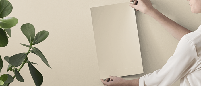
Lighting greatly impacts how a paint colour is perceived within a space, whether it be natural or artificial light. Natural light varies throughout the day making colours look slightly different in the morning and the evening, which is why it’s essential to use samples before fully committing to a paint colour so you can see how colours look at various times of the day and you can decide if a paint colour is the right one for your space.
In natural daylight, especially in rooms that get lots of sun, Natural Linen looks soft and fresh. Its warm undertones come through just enough to keep things cosy, but it still feels light and airy. This makes it a great choice for open living areas, hallways, or anywhere that gets a good dose of natural light.

Living room painted in Natural Linen - photo via benjaminmoore.com
In north-facing rooms or afternoon eastern light, which tend to bring out cooler tones in paint, Natural Linen can look a bit more muted, but its strong tan base helps balance that coolness, so it won’t feel cold or washed out, just a touch more refined and subdued.
In south-facing rooms or afternoon-western light, you’ll see more of its warmth come to life, almost looking beige. The soft neutral tone becomes more prominent, and the space will feel inviting and gently sun-kissed.
Overall, Natural Linen is a true chameleon in the best way: always soft, always warm, but never flat or boring.
Would love Natural Linen in your home, but don’t know what to pair it with? I've created a ready-made whole-house palette around it; it's the easiest way to see how it plays with other colours throughout a home. Have a look at it here!
Where to best use Natural Linen in the house

Entryway painted in Natural Linen - photo via benjaminmoore.com
Natural Linen is one of those beautifully versatile colours that just works, no matter the room. Its warm, soft presence makes it feel welcoming and timeless, which is exactly what you want in a whole-home neutral. Natural Linen creates a relaxed, cosy vibe that’s perfect for gathering spaces such as living rooms or family rooms. It plays really nicely with both modern and traditional decor, and it pairs effortlessly with wood tones, natural textures, and soft furnishings. If you’re craving a calm and restful bedroom, this colour is a dream. It brings warmth without being too heavy and makes a lovely backdrop for layered linens, soft whites, warm greys, or even subtle blush or terracotta accents. Since it has a medium-light depth, Natural Linen adds warmth and personality to transitional spaces like hallways and entryways without feeling dark or overwhelming. It's especially great in areas where you want a soft neutral that ties the whole home together. The quiet warmth of Natural Linen creates a peaceful and focused atmosphere. It’s ideal for spaces where you want to feel grounded but not distracted by overly bold colours, like home offices or reading nooks.
Natural Linen also works beautifully with a variety of flooring types - from warm wood to stone, and even soft greys or greiges - making it an easy, go-to choice for anyone wanting a cohesive, calming palette throughout the home.
Best white trim colours with Natural Linen
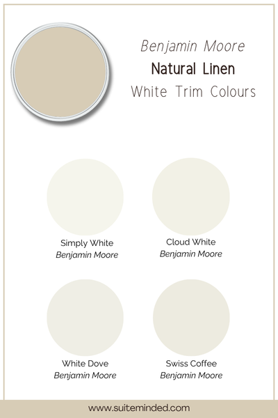
Natural Linen has that soft, warm charm that really comes to life when paired with the right white trim. Because of its warm tones, it looks best alongside soft, warm whites that won’t clash or feel too stark. Here are a few beautiful white paint options from Benjamin Moore that complement it perfectly:
White Dove (OC-17): A timeless, creamy white with just a touch of warmth. It’s a go-to for a reason and works beautifully with Natural Linen without stealing the spotlight.
Cloud White (OC-130): Another soft white that leans ever so slightly warm. It creates a subtle, seamless contrast that’s still crisp and clean without feeling too sharp.
Simply White (OC-117): A brighter white with a hint of warmth. If you want a bit more contrast without going cool, this one adds just enough brightness while still playing nicely with Natural Linen’s tones.
Swiss Coffee (OC-45): A cosy white that leans warm and creamy. If you’re after a softer, more tonal look, this is a lovely option that adds warmth and depth.
Avoid cooler or blue-based whites here, as they can feel a little out of place next to Natural Linen’s gentle warmth. Sticking with warm whites helps create a harmonious, layered look that feels both relaxed and refined.
What about coordinating hues?

One of the best things about Natural Linen is how easy it is to build a palette around it. It’s warm, grounded, and incredibly versatile, which means you’ve got lots of beautiful options when it comes to choosing coordinating colours. Here are some of my favourites:
Soft greens: Gentle green tones like Saybrook Sage or October Mist bring a fresh, calming contrast to Natural Linen. The coolness of green plays beautifully against the warmth of the tan, creating a natural, earthy balance.
Warm greiges: Colours like Revere Pewter or Edgecomb Gray complement Natural Linen’s undertones without clashing. They’re perfect if you want a layered, monochromatic look that feels cohesive and timeless.
Soft clay tones: For a slightly more playful or romantic feel, pair it with warm clay tones like Smoked Salmon. These colours echo the warmth in Natural Linen and add a soft pop without overwhelming the space.
Muted blues: Dusty, soft blues like Santorini Blue can bring a subtle coastal or relaxed vibe when used alongside Natural Linen. The cooler undertones balance out the tan and add a bit of personality to your palette.
Rich, Warm Accents: If you're after contrast, try deeper, earthy tones like Kendall Charcoal or Hearthstone. These deeper hues add weight and drama in all the right ways, such as in accent walls, cabinetry, or furniture.
When you stick with earthy, soft, or muted tones, Natural Linen becomes a perfect base that ties everything together. Whether you're layering in texture, colour, or a mix of both, it's one of those shades that truly plays well with others.
—————
If you’re looking for a soft, versatile neutral that feels cosy, elegant, and effortlessly pulled together, Natural Linen by Benjamin Moore is definitely one to consider. With its warm tones, just-right depth, and ability to play nicely with a wide range of colours and finishes, it’s a timeless choice for creating calm, welcoming spaces.
Still not sure if Natural Linen is the perfect fit for your home? Or feeling overwhelmed by all the colour options out there?
I’d love to help! I offer personalised paint colour consultations and ready-made whole-home colour palettes designed to take the stress out of choosing paint and help you create a space you truly love. Whether you’re starting fresh or just need a second opinion, I’m here to make the process easier and more enjoyable.
→ Check out my colour services here or explore my ready-made palettes to get started!
Thank you for reading, and happy decorating!
Manon xx