Revere Pewter HC-172 vs Agreeable Gray SW 7029: Which One Is Right for Your Home?

Revere Pewter HC-172 and Agreeable Gray SW 7029 are two of those paint colours that look almost identical on a tiny swatch… and completely different once they’re on the wall. Both are hugely popular greiges, and for good reason - they’re flexible, timeless, and work in a lot of homes. But undertones and lighting play a big role here, and that’s where choosing between them can start to feel confusing. Let’s break down how each colour really behaves so you can decide which one makes the most sense for your home, not just in theory, but in real life.
Quick Overview: How Revere Pewter and Agreeable Gray Compare

Revere Pewter HC-172 on kitchen cabinets
At first glance, Revere Pewter and Agreeable Gray both sit in that comfortable “not too warm, not too cool” greige category, which is why they’re often compared. But once you look a little closer, there are some clear differences in how they feel and how they show up on the wall.
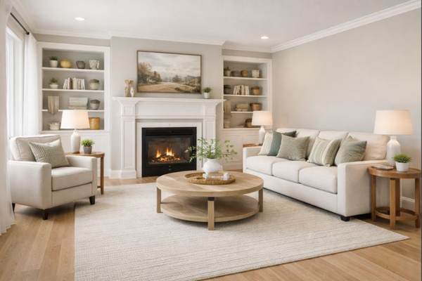
Revere Pewter HC-172 by Benjamin Moore is a warm greige with noticeable green undertones. It has a slightly deeper, more grounded feel and tends to read a bit cozier and more traditional, especially in spaces with warm lighting or wood finishes. Its Light Reflectance Value (LRV) is around 55, which means it reflects a moderate amount of light but won’t feel especially bright.
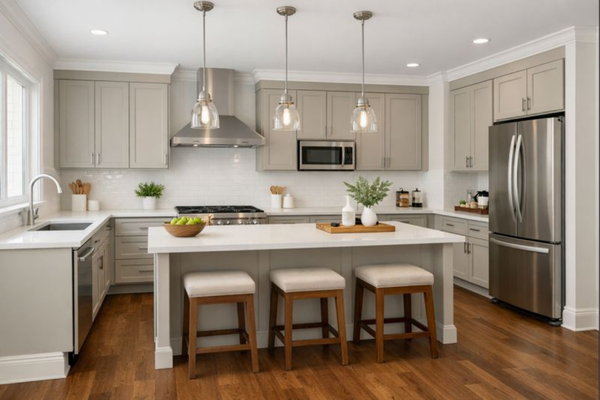
Agreeable Gray SW 7029 by Sherwin-Williams is a slightly lighter greige that leans more toward soft grey with a gentle warmth. It feels cleaner and a touch more modern, and it generally reflects a bit more light than Revere Pewter. With an LRV of about 60, it can help spaces feel brighter and calm, particularly in open-plan areas.
In simple terms: if you’re drawn to a warmer, cozier look, Revere Pewter often feels more at home. If you prefer something brighter and more neutral-looking, Agreeable Gray is usually the easier choice.
Undertones: Where the Real Difference Shows Up
This is where Revere Pewter and Agreeable Gray start to separate, even though they’re both considered greiges.
Revere Pewter has a beautiful beige/grey base with a subtle green influence underneath. Most of the time, it reads as warmth and depth, which is why it feels so cozy and grounded. But in certain lighting, especially in spaces with cooler or indirect daylight, that green-beige mix can become more noticeable and make the colour feel a little heavier or slightly muddy.

Revere Pewter HC-172 on walls
Agreeable Gray, on the other hand, leans more toward soft warm grey with just enough beige to keep it from feeling cold. It has very subtle green and a hint of violet undertones, very well-balanced and not overly pronounced, which makes it feel more neutral and predictable across different rooms. That’s a big reason why it works so well in open-plan spaces where the lighting changes throughout the day.
Agreeable Gray SW 7029
This difference in undertones is also why one person might swear these colours look identical in store, while another feels like they look nothing alike once painted at home. It’s not that one is “better” than the other; they simply react differently to light and surrounding finishes.
Still going back and forth between Revere Pewter and Agreeable Gray? No need to worry, it's usually a sign your space just needs a closer look. The Colour Review is my entry-level custom service for exactly this kind of moment. A little expert input can make all the difference before you buy.
How Lighting Affects Each Colour

Agreeable Gry SW 7029 on walls
Lighting plays a huge role in how both of these colours look, and it’s often the reason people end up loving one and feeling unsure about the other.
In spaces with softer, cooler, or indirect light, Revere Pewter can start to feel deeper and more grey, and that subtle green undertone can become more noticeable. In these conditions, it may read a little heavier on the wall, especially if the room doesn’t get much natural light. Agreeable Gray tends to hold onto its lighter, cleaner look in low-light spaces, which can make rooms feel more open and less weighed down.
In bright rooms or spaces with lots of warm daylight, Revere Pewter often looks beautiful and cozy, with its warmth really coming through in a soft, inviting way. This is where it shines in living rooms and dining spaces. Agreeable Gray will still look light and neutral, but in very bright light, it can wash out slightly and lose some of its warmth.
If your home has a mix of lighting conditions, this is another reason why Agreeable Gray is often seen as the “safer” whole-house neutral, while Revere Pewter tends to work best when you’re happy to lean into a warmer, more classic look in the rooms where it’s used.
Best Uses: Where Each Colour Works Best

Revere Pewter HC-172 on walls
Because these two colours behave differently with light and undertones, they also tend to shine in slightly different types of spaces.
Revere Pewter is a great choice if you’re after a warm, cozy feel and your home has a more traditional or classic style. It works especially well in:
Living rooms
Dining rooms
Hallways and connecting spaces
Homes with warm wood floors, greige tiles, or creamier trim colours
In these settings, its warmth adds depth and makes spaces feel inviting rather than flat.
Agreeable Gray is better suited to spaces where you want things to feel light, open, and flexible. It’s a popular option for:
Open-plan living areas
Kitchens
Hallways and entryways
Because it stays fairly neutral, it’s easier to pair with both warm and cool elements, which makes it a good choice when you want one colour to flow through multiple rooms.
If you’re repainting a single room, either colour can work beautifully with the right lighting and finishes. But if you’re trying to create a cohesive look across several spaces, this is where choosing the right base neutral becomes really important.
Trim and Coordinating Colours
Agreeable Gray SW 7029 on cabinets
Choosing the right trim and supporting colours can make a big difference in how both of these greiges look on the wall.
With Revere Pewter, warmer whites tend to look best. Crisp, cool whites can sometimes make its beige and green undertones stand out more, which isn’t always what you want. Soft whites like Simply White or White Dove pair beautifully and keep the overall look feeling warm and cohesive. For coordinating colours, Revere Pewter works well with warm whites, lighter greiges, and muted greens that echo its natural undertones.
→ Explore the ready-made whole-house colour palette around Revere Pewter HC-172
Agreeable Gray is more flexible when it comes to trim. It works nicely with both soft warm whites and brighter whites, depending on the look you’re going for. Whites like Pure White or Extra White will give a clean, fresh contrast, while warmer whites will keep things feeling softer and more relaxed. For coordinating colours, it pairs easily with other light greiges, soft whites, gentle blues, and even deeper accent tones without clashing.
→ Explore the ready-made whole-house colour palette around Agreeable Gray SW 7029
This is also where a lot of people start to feel unsure; it’s one thing to like a wall colour, but it’s another to know how to build a whole colour scheme around it. That’s why thinking beyond just one paint colour is so important when you’re trying to create a home that feels connected from room to room.
So… Which One Should You Choose?
If you’re still torn, here’s a simple way to think about it.
Choose Revere Pewter if:
You love a warmer, cozier look
Your home has warm wood tones or neutral finishes
You prefer a more classic, timeless feel
Choose Agreeable Gray if:
You want something brighter and more neutral
Your home has a mix of warm and cool finishes
You prefer a cleaner, slightly more modern look
Both colours are beautiful and incredibly popular for a reason. The “right” choice really comes down to your lighting, your existing finishes, and how warm or neutral you want your home to feel overall.
———————
Want Help Building a Whole-House Colour Scheme?
If you love the look of Revere Pewter or Agreeable Gray but aren’t sure how to choose coordinating colours for the rest of your home, I’ve created ready-made whole-house colour palettes that show you exactly which colours work together (walls, trims, and accents included).
And if you’d like a step-by-step system for choosing colours with confidence (not just for one room, but for your entire home), my Confident Home Colour Blueprint walks you through the same process I use with clients and to create my whole-house palettes, so you can stop second-guessing and start feeling confident in your choices.
Thank you for reading, and happy decorating!
Manon xx