How Lighting Affects Paint Colours (And Why Your Walls Never Look Like the Sample)
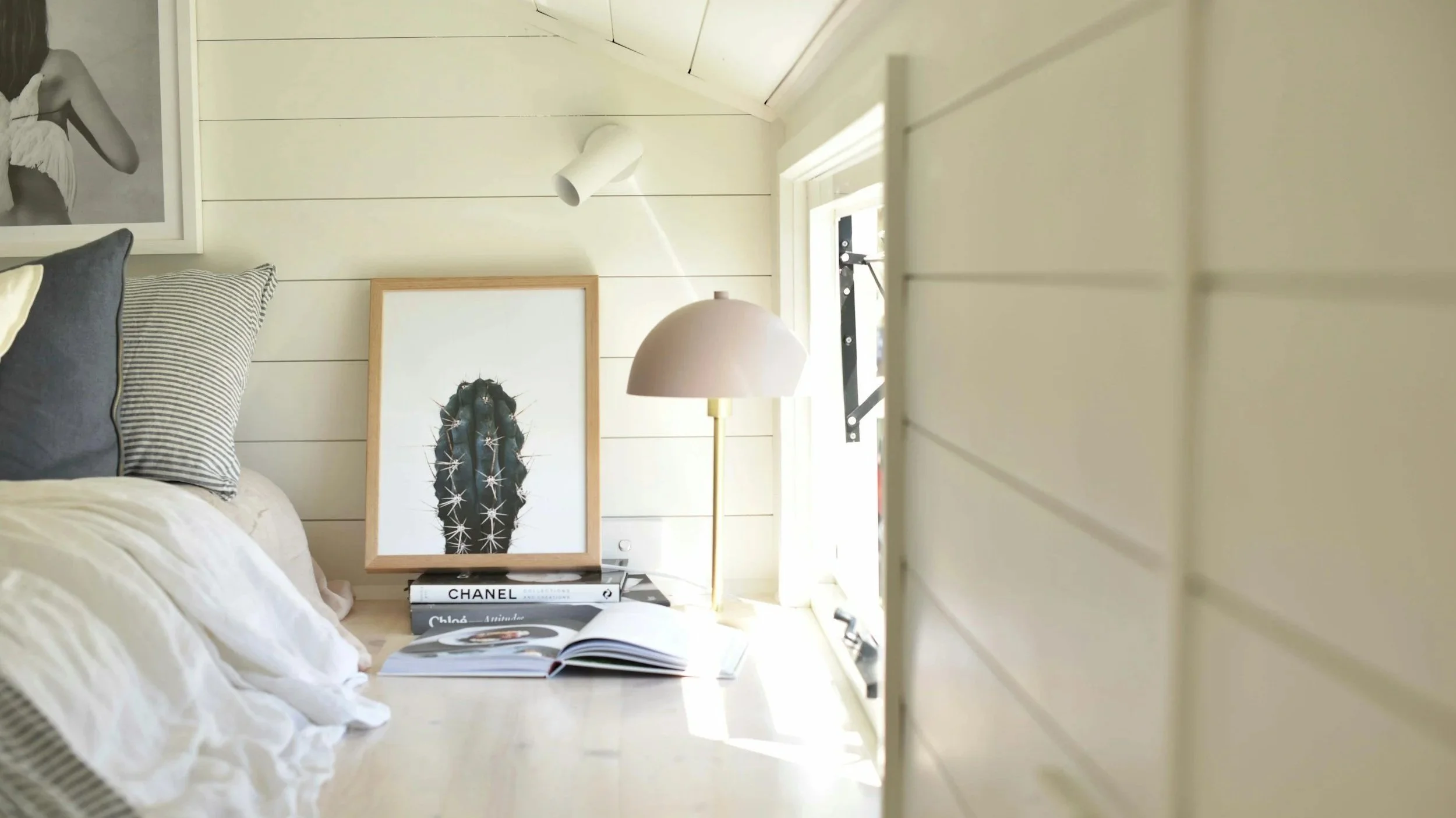
Photo by Kristen Beever via Unsplash
Have you ever chosen a paint colour you loved in the store… only to paint the room and wonder why it suddenly looks completely different? Maybe the beige looks grey. The white feels yellow. The soft green suddenly reads blue. Or the room feels darker than you expected, even though the colour looked light on the swatch. You’re not imagining things, and you didn’t necessarily choose the wrong paint colour.
What you’re seeing is the powerful effect of lighting on paint colour. Paint reacts to the light in your home, the direction your windows face, the time of day, the type of bulbs you use, and even what colours surround it. The exact same paint colour can look warm, cool, bright, muted, cosy or stark depending on the space it’s in. The perfect recipe for overwhelm and stress!
Once you understand how lighting works, choosing a paint colour becomes far less confusing and far more predictable. In this guide, you’ll learn why lighting changes how paint colours appear, how natural light affects colour in different room orientations, what LRV means, and more…
Let’s get into it…
Why Lighting Changes Paint Colour

Paint itself doesn’t create colour, it reflects light. When light hits a painted surface, some wavelengths are absorbed, and others are reflected back to your eyes. That reflected light is what you perceive as colour. If the quality, direction or temperature of the light changes, the colour you see changes too.
This is why a colour can feel warm in one room and cool in another, why a white can look creamy in the evening but crisp during the day, and also why a neutral can suddenly reveal green, pink, or purple undertones.
Lighting influences the brightness of a paint colour (how light or dark a colour feels), its warmth or coolness, which undertones become more visible, and the overall mood of the space. Understanding lighting helps you predict how a colour will behave instead of guessing.
Natural Light: Room Direction Matters (Northern vs Southern Hemisphere)

One important detail many paint guides overlook is that room orientation behaves differently depending on which hemisphere you live in. If you live in the Northern Hemisphere (such as the United States, Canada, or Europe), the sun tracks across the southern part of the sky. If you live in the Southern Hemisphere (such as Australia or New Zealand), the sun tracks across the northern part of the sky.
This means that the brightest and darkest room directions are reversed depending on where you live. To make this easy, here’s how natural light typically behaves in both hemispheres, and what it means for a paint colour.
Northern Hemisphere (United States, Canada, Europe)
North-facing rooms: these rooms receive cooler, indirect light for most of the day. This means that colours may appear slightly greyer or bluer, warm tones can feel muted or dull, and white can feel crisp or even slightly cold. In these rooms, it is recommended to choose warmer neutrals or subtle warm undertones to balance the cool light, avoid overly cool greys unless you intentionally want a cooler look, and test your colours carefully as they often appear darker and colder than expected.
South-facing rooms: these rooms receive the strongest, brightest, and most consistent natural light throughout the day. This means that warm tones can become more golden or creamy, cool colours stay balanced and fresh, and whites can feel bright, airy, and clean. These spaces give you more flexibility with colour choices, especially soft greys and balanced neutrals can perform beautifully. However, be cautious with very warm creams and beiges as the light will enhance their tones and they may feel overly warm or yellow.
East-facing rooms: these rooms receive warm sunlight in the morning and cooler light in the afternoon. In these spaces, the mood can shift noticeably across the day, with colours appearing warm and welcoming early in the day, and cooler or flatter later on. To help, choose colours that look balanced in both warm and cool light, avoid tones that only look good at one time of the day, and most importantly, always observe samples in the morning AND in the afternoon to ensure your chosen colour fits the style and mood you’re after.
West-facing rooms: these rooms receive cooler light earlier in the day and strong warm light in the afternoon and evening. It means that colours can feel muted or flat in the morning, with their warmth amplifying later in the day. Warm tones may also appear richer or more golden in the evening. For this reason, balanced neutrals and softened colours tend to perform best in these spaces.
Southern Hemisphere (Australia, New Zealand)

In the Southern Hemisphere, the sun tracks across the northern sky, so the light behaviour is essentially reversed.
North-facing rooms receive the strongest, brightest natural light throughout the day, making warm tones more golden or creamy, and cool tones more balanced and fresh. These spaces offer more flexibility with colour choices, where warm creams and beiges will look even warmer, and soft greys and muted neutrals can help beautifully balance the warm light.
South-facing rooms receive soft, indirect light for most of the day. Grey or blue undertones may become more visible, and warm colours may appear more muted and neutral. In these spaces, choose warmer neutrals to balance the cool light, and avoid overly cool greys unless you are after a crisp, cool feel.
East-facing rooms behave similarly in both hemispheres with warm, soft light in the morning, and cooler light later in the day. Here, carefully choose colours that feel balanced across lighting changes and observe paint samples in both morning and afternoon light.
West-facing rooms also behave similarly in both hemispheres, with cooler light earlier in the day and strong, warm light later in the afternoon. Here, warm tones can intensify later in the day, so be mindful of overly warm colours; balanced neutrals usually perform best.
Artificial Lighting: Warm vs Cool Bulbs
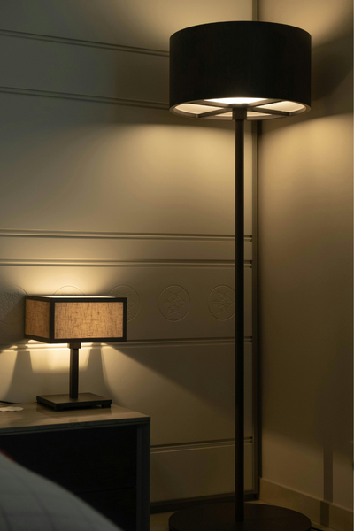
Natural light isn’t the only factor; artificial lighting also plays a huge role, especially in the evening when most people are home. Light bulbs come in different colour temperatures:
Warm light (2700K–3000K), which is yellow, soft, and cosy, enhances warm undertones (cream, beige, yellow), and can make warm whites look creamier.
Neutral to cool light (3500K–4000K+), which is brighter, crisper, and slightly blue, enhances cool undertones (grey, blue), and can make warm colours feel dull or muddy.
What Is LRV (And Why It Matters With Lighting)
LRV stands for Light Reflectance Value. It measures how much light a paint colour reflects on a scale from 0 (black) to 100 (white). In simple terms, colours with a high LRV reflect more light and feel brighter, while colours with a low LRV absorb more light and feel deeper, darker. Knowing the LRV of a colour will help you determine how bold or light a colour will feel once it’s on your walls.
In low-light rooms, low-LRV colours can feel heavy, moody, or too dark without the proper natural or artificial lighting. In brighter rooms, however, these low-LRV colours can feel richer and more dramatic. High-LRV colours are great to help brighten darker or dimly-lit spaces. Lighting can also make a mid-tone colour feel much lighter or darker than expected.
Common Mistakes People Make When Choosing Paint Colours

Understanding these mistakes can save you time, money and frustration.
Choosing paint in the store only
Paint chips are viewed under store lighting, which is very different from home lighting.
Testing tiny swatches
Small samples don’t show how colour behaves across large surfaces or different walls.
Ignoring room orientation
Room direction has a bigger impact than most people realise.
Not observing colours at different times of day
Morning, afternoon and evening light can dramatically change a colour.
Forgetting light bulb temperature
Your evening lighting may completely change the look of the paint.
Choosing whites without checking undertones
White paint still has undertones that react strongly to lighting.
How to Choose the Right Paint Colour for Your Lighting

Step 1: Identify your room direction: Notice whether the room faces north, south, east or west.
Step 2: Check your lighting: Note what type of bulbs you use and whether the room feels warm or cool at night.
Step 3: Choose undertones intentionally: Select colours that balance your lighting rather than fight it.
Step 4: Test large samples: Paint large sample boards or sections of your walls.
Step 5: Observe over time: Look at the colour in the morning, afternoon, and evening with artificial lighting.
Step 6: Compare against your fixed elements: View the paint colour next to your flooring, cabinetry, tiles, and furniture.
This process removes most of the guesswork.
Making Confident Paint Decisions
Once you understand lighting, paint selection becomes far less overwhelming. Instead of hoping a colour works, you start choosing colours based on how they’ll actually behave in your space. This leads to fewer surprises, better flow between rooms, and a home that feels cohesive and intentional.
Lighting doesn’t make paint unpredictable; it simply adds context.