Paint Colour Review: Westhighland White SW 7566 by Sherwin-Williams
This post may contain affiliate links, which means I may earn a small commission if you purchase through them, at no extra cost to you.
If you’ve ever stood in front of a white paint sample wondering why something so “simple” feels so hard to choose, you’re not alone. White paint can be surprisingly complex. A white that looks clean and fresh in one home can suddenly feel creamy, dull, or even slightly grey in another. And most of the time, it comes down to undertones and light.
Westhighland White by Sherwin-Williams is one of those whites that people often fall in love with on the swatch… but then hesitate once it’s on the wall. Is it warm or cool? Will it look too creamy? Will it stay bright enough in darker rooms? And what trim colour actually works best with it?
In this post, I’ll walk you through exactly how Westhighland White behaves in real homes; its undertones, LRV, how it shifts in different lighting, the best white trim pairings, and some beautiful coordinating colours so you can build a cohesive palette with confidence.
If you’re considering Westhighland White for your home (or you’re simply trying to narrow down the endless world of white paint), this guide will help you decide if it’s the right fit for your space.
What are Westhighland White’s undertones?
At first glance, Westhighland White reads as a soft, warm white rather than a crisp or stark one. It has a gentle creaminess to it that gives spaces a cozy, welcoming feel instead of a sharp, modern edge.
The main undertone in Westhighland White is warm yellow, with a very subtle hint of beige. This keeps it from feeling icy or grey, but it also means it can lean warmer than people expect once it’s on the wall, especially in rooms with warm light, timber floors, or south-facing sunlight.
If you love warm whites and want something that feels inviting rather than stark, Westhighland White can be a beautiful choice. If you’re sensitive to yellow or prefer a cleaner, more neutral white, you may want to test it carefully before committing. If that is the case, have a look at Benjamin Moore White Dove, Sherwin-Williams Alabaster, or even Greek Villa.
Love Westhighland White but unsure what to pair it with?
If you want to see how this shade works as part of a whole home, my ready-made whole-house colour palette shows you exactly what colours flow with it from room to room.
What is Westhighland White’s LRV?
LRV (Light Reflectance Value) simply measures how much light a paint colour reflects on a scale from 0 (pure black) to 100 (pure white). Westhighland White has an LRV of 86, which puts it firmly in the bright white category and means that it will reflect a lot of light, helping spaces feel open, fresh, and airy rather than heavy or closed in.
This high LRV makes Westhighland White a great option if you want to visually brighten a space, soften darker finishes, or create a light, uplifting backdrop without going into a stark, clinical white. It’s still warm and soft in character, just with enough brightness to keep rooms feeling fresh and balanced rather than flat or dull.
One thing to keep in mind with a high-LRV white is that it will wash out in extremely bright spaces, losing its warmth and undertones. If you have a very bright, well-lit space, and you want to add warmth or subtle colour to your walls, you may want to consider a paint with a lower LRV to create some depth.
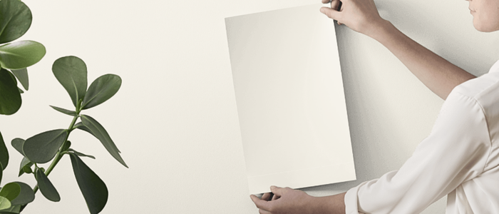
Before committing to a paint colour, I always recommend testing it in your own space. Lighting and undertones can shift more than you expect. Peel-and-stick samples from Samplize make it easy to see how a colour behaves and can be moved around to compare throughout the day.
→ Test Westhighland White at home!
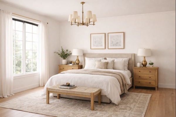
How does Westhighland White behave in different lighting conditions?
Like all white paint colours, Westhighland White can look quite different depending on the type of light in your space, the direction your windows face, and the finishes around it. In rooms with strong natural daylight (large windows, lots of sun exposure, or open-plan spaces), Westhighland White usually reads as a clean, softly warm white. The warmth feels gentle rather than creamy, and the colour stays bright and fresh without looking stark.
In spaces with softer or indirect daylight, the warm undertones become more noticeable. The white can feel slightly creamier and a touch deeper, which can be beautiful if you’re after a cozy, relaxed atmosphere, but it’s something to be aware of if you’re hoping for a very crisp white look.
Under warm artificial lighting (warm LEDs, incandescent bulbs, or evening lighting), the yellow undertone is more likely to show through, giving the colour a warmer, more inviting glow. Under cooler artificial lighting, it tends to look a little cleaner and more neutral.
Because light behaves differently depending on where you live, the size and orientation of your windows, and how much natural light your home receives throughout the day, I always recommend testing Westhighland White on your own walls and observing it in both daytime and evening light before committing.
Best white trim colours
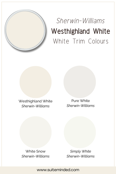
Because Westhighland White has a noticeable warm undertone, the best trim colours are whites that either gently support that warmth or create a clean, subtle contrast without feeling stark. If you’d like a soft, cohesive look, using Westhighland White itself on both walls and trim can create a seamless, calm finish, especially in open-plan spaces or homes where you want minimal visual contrast and a very relaxed feel.
For a slightly cleaner but still harmonious trim option, Sherwin-Williams Pure White (SW 7005) works well. It keeps things feeling fresh and balanced without pulling too cool or looking icy next to Westhighland White.
If you prefer a crisper, brighter contrast on trim, doors, or cabinetry, Sherwin-Williams White Snow (SW 9541) introduces a cleaner white that sharpens architectural lines while still feeling modern and refined.
For the most high-contrast finish, Sherwin-Williams High Reflective White (SW 7757) delivers a very crisp, luminous look. This pairing creates a strong definition and works especially well if you love a bright aesthetic. Just keep in mind that the warm yellow/beige undertones will be more noticeable.
As always, sample your trim colour next to your wall colour and observe it in your own lighting before committing. Whites influence each other more than most people expect once they’re on large surfaces.
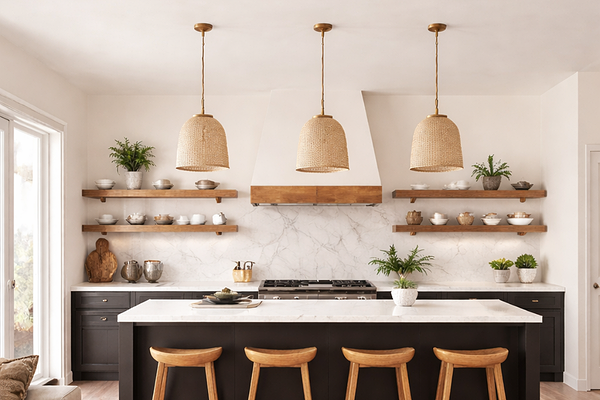
Best materials & finishes to pair with Westhighland White
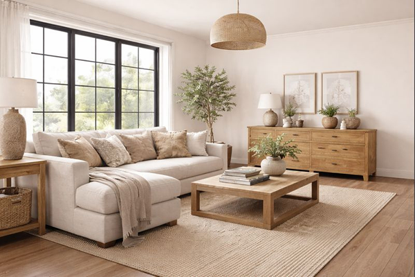
Because Westhighland White has a warm, softly creamy/beige base, it pairs beautifully with natural materials and finishes that echo warmth, softness, and subtle texture.
Timber finishes
Warm and mid-toned timbers work especially well; think oak, maple, or lightly warm walnut. These woods enhance the cozy undertone in the white without making the space feel heavy or yellow. Very red or orange-stained timbers can sometimes push the warmth too far, so it’s worth sampling alongside your existing flooring or furniture.
Stone & benchtops
Soft whites, warm marbles, quartz with gentle beige or taupe veining, and light travertine all complement Westhighland White nicely. Avoid stones that are very icy grey or blue-based if you’re trying to maintain a warm, cohesive feel; they can sometimes clash with the creamy undertone.
Tiles & flooring
Warm whites, soft greiges, natural stone-look tiles, and lightly textured finishes tend to pair best. Handmade or matte tiles can look especially beautiful with this colour, adding depth and character without competing visually.
Metals & hardware
Warm metals such as brushed brass, champagne gold, aged bronze, and soft black sit comfortably alongside Westhighland White. Chrome and polished nickel can still work, but they’ll create a cooler, sharper contrast.
This material mix keeps the colour feeling intentional, balanced, and timeless rather than flat or overly creamy.
What about coordinating colours?

Because Westhighland White is a warm, softly creamy white, it pairs best with colours that either reinforce that warmth or balance it with gentle contrast. Think soft neutrals, natural textures, and a few deeper anchors to ground the palette. For a calm, layered neutral look, warm greiges and light beiges work beautifully. Colours like Sherwin-Williams Accessible Beige or Agreeable Gray create a soft flow from room to room without feeling heavy or dated. These shades are especially good for living spaces, hallways, and open-plan homes where continuity matters. If you’d like to introduce a little more depth, mid-tone taupes and neutrals add structure while still keeping things timeless.
For colour accents, muted blues and olive greens are a lovely contrast to the warmth of Westhighland White. Shades like Evergreen Fog bring in a fresh, calming feel without overpowering the softness of the white.
If you want something moodier or more dramatic, deeper charcoals and inky blues, such as Urbane Bronze or In the Navy, can work beautifully as accent walls, cabinetry, or furniture pieces, grounding the overall palette and adding visual interest.
The key is keeping undertones in harmony; warm whites tend to look best alongside colours that feel balanced, grounded, and not overly cool or stark.
——————
Westhighland White is a beautiful option if you’re drawn to warm, welcoming whites that feel soft rather than stark. When you understand its undertones, brightness, and how it behaves in different lighting, it becomes much easier to decide whether it’s the right fit for your home, and how to pair it confidently with trim and coordinating colours.
If you’d like extra support pulling together a cohesive whole-home colour palette (without second-guessing every decision), you may enjoy my ready-made whole-house colour palettes or my Paint Colour Blueprint, where I walk you step-by-step through choosing colours that work together beautifully. They’re designed to save you time, reduce overwhelm, and help you feel confident before you commit to paint.
Thank you for reading, and happy painting!
Manon xx