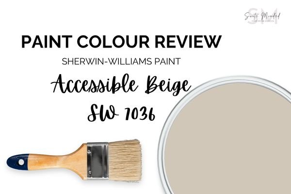
Paint Colour Review: Accessible Beige by Sherwin Williams
This post may contain affiliate links, which means I may earn a small commission if you purchase through them, at no extra cost to you.
Accessible Beige by Sherwin-Williams is a versatile and very popular paint colour known for its warm, neutral tone. It can be described as a light greige (a beige with light grey undertones), which gives it a timeless and sophisticated look.
People generally enjoy Accessible Beige for its warmth, creating a cosy and inviting atmosphere in any room, as well as its versatility, allowing you to pair it with a wide range of colours and making it suitable for various interior design styles.
Because of its neutral nature and subtle undertones, Accessible Beige is often recommended for large areas or open floor plans where continuity and flow are important. Whether it's used on walls, trims, or even as an exterior colour, its adaptability and timelessness make it a favourite among homeowners and designers alike.
Is Accessible Beige the right colour for you? Keep reading to find out how to use it in your home.

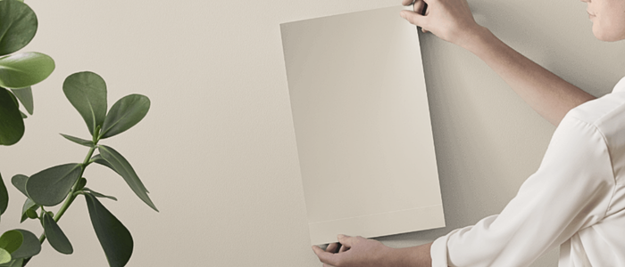
Photo by @withsarale via Plan-Home
Accessible Beige’s LRV
LRV (or Light Reflectance Value) is helpful in determining how much light is absorbed or reflected by a paint colour. It is measured on a scale from 0% to 100%, 0% being absolute black and absorbing all light, and 100% being pure white and reflecting all light. Colours with higher LRVs tend to make a room feel brighter and more spacious, while colours with lower LRVs can create a more intimate or cosy atmosphere.
Accessible Beige has an LRV of 58, which means it is a mid-range colour. It’s not crisp and bright, but not dark either. Instead, it’s a great balance between reflecting enough light and providing a warm, cosy, inviting feel to a room. It is a colour that is versatile enough to work well in both well-lit areas and spaces with limited natural light.
Before committing to a paint colour, I always recommend testing it in your own space. Lighting and undertones can shift more than you expect. Peel-and-stick samples from Samplize make it easy to see how a colour behaves and can be moved around to compare throughout the day.
→ Get your peel-and-stick sample of Accessible Beige!
Accessible Beige in different lighting conditions
Lighting greatly impacts how a paint colour is perceived within a space, whether it be natural or artificial light. Natural light varies throughout the day making colours look slightly different in the morning and the evening. Accessible Beige can appear differently under various lighting conditions due to its undertones.
In bright sunlight such as in a south-facing room, Accessible Beige may appear brighter and more airy showcasing its warm beige tones more prominently. In spaces with cool lighting such as in a north-facing room, Accessible Beige could look slightly cooler and more neutral with its grey undertones more apparent. It can result in a more balanced appearance that can complement cooler colour schemes. In a room with limited natural light, Accessible Beige may appear even darker and more subdued.
Overall, Accessible Beige can be slightly tricky to coordinate depending on the lighting conditions of your space and due to its beige and grey tones. It is then highly important to use samples before fully committing to painting your walls in order to make sure this paint colour is the right one for your space.
Would love Accessible Beige in your home, but don’t know what to pair it with? I've created a ready-made whole-house palette around it; it's the easiest way to see how it plays with other colours throughout a home. Have look at it here!
Where can I use Accessible Beige?
Accessible Beige is a versatile paint colour that can be used successfully throughout your home. In the living room, it is an excellent colour choice to create a welcoming and inviting atmosphere and to provide a warm neutral backdrop for your furniture and decor pieces. In a bedroom, it is an ideal colour to transform your space into a serene and calming environment for maximum relaxation and a restful sleep.
Accessible Beige is also a great colour to consider on kitchen cabinets or walls to add warmth and sophistication to the space. It pairs well with a range of countertop materials and finishes and can help balance out the cooler tones of stainless steel appliances.
Applying Accessible Beige in hallways and entryways can help create a sense of flow and continuity between the different areas of your home. You can use it as a neutral backdrop to showcase artwork or photos for added visual interest.
What about trim colours?

When selecting trim colours to pair with Accessible Beige walls, you have several options that can complement this warm, neutral tone.
For a classic look, you may want to pair Accessible Beige with a crisp white. It will provide a sharp contrast with the light greige tones and add a fresh, bright element to the space. Consider, Sherwin Williams’ Extra White 7006, Pure White 7005, or Benjamin Moore’s Chantilly Lace OC 65, or Simply White OC-117.
If you prefer a softer contrast, use a warmer white for your trims to complement the warmth of Accessible Beige while maintaining a cohesive and harmonious colour palette. Consider whites like Sherwin Williams’ Alabaster 7008, Marshmallow 7001, or Benjamin Moore’s White Dove, or Cotton Balls OC-122.
What coordinating colours work best with Accessible Beige?

Accessible Beige is a neutral paint colour that pairs well with a wide range of other colours. Here are some colour palettes and coordinating hues that you can consider:
Soft Neutrals: Colours within the same family as Accessible Beige, such as soft greiges, warm whites, and creamy off-whites, create a cohesive and harmonious palette. These colours enhance the warmth and depth of Accessible Beige while providing subtle contrast. Consider colours like Creamy SW 7012 or Aesthetic White SW 7035.
Warm Earthy Tones: Rich earthy hues like terracotta, burnt orange, deep browns, and olive greens add warmth and depth to a space with Accessible Beige walls. These colours create a cosy and inviting atmosphere that complements the neutral backdrop. Consider paint colours such as Sable SW 6083, Rookwood Terra Cotta SW 2803, Redend Point SW 9081, or Pewter Green SW 6208.
Soft Blues and Greens: Soft blues and greens with warm undertones, such as sage green, seafoam blue, or dusty teal, create a serene and calming contrast against Accessible Beige. These colours evoke a sense of tranquility and bring a refreshing touch to the space. Consider colours like Retreat SW 6207, Sea Salt SW 6204, Glimmer SW 6476, or Hinting Blue SW 6519.
Warm Grays and Taupes: Warm gray and taupe tones with subtle undertones complement the neutrality of Accessible Beige while adding depth and sophistication to the space. Consider options such as Foothills SW 7514, Urbane Bronze SW 7048, or Warm Stone SW 7032.
Subtle Pops of Color: Adding accents of muted or dusty hues, such as blush pink or soft coral, can infuse personality and visual interest into a space with Accessible Beige walls. These colours provide a subtle pop of colour without overwhelming the neutral backdrop. Consider Nearly Peach SW 6336, Tarnished Trumpet SW 9026, or Innocence SW 6302.
Overall, Accessible Beige by Sherwin Williams is a warm and inviting colour choice. Its versatility and warm neutral tones make it a great backdrop option to consider using throughout your home.
Are you convinced about Accessible Beige?
If you find choosing the right colour for your home stressful and overwhelming, I provide a Custom Interior Colour Palette service. I would love to make this process easier for you and help you create your dream home. And if you need more information about my services or just want to get in touch with me, click here.
Thank you for reading and happy decorating,
Manon xx

Turn your favourite paint colour into a whole-home look.
My Whole-House Colour Palette pairs Accessible Beige with complementary neutrals, accents, and trim shades so every room feels cohesive.
✔ No more guessing, colours are professionally curated
✔ Works with different lighting and styles
✔ Instant digital download so you can start today
→ GET YOUR PALETTE NOW and bring your home’s vision to life.