Benjamin Moore Colour of The Year 2026: Silhouette AF-655

Every year, when Benjamin Moore announces its Colour of the Year, I get a lot of the same questions: Is it livable? Is it just a trend? And will I still love it once it’s on the walls?
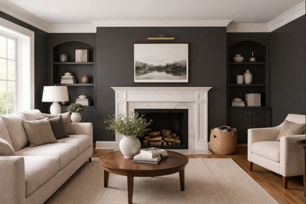
For 2026, Benjamin Moore chose Silhouette (AF-655), and this is not a light, easy neutral. Silhouette is a deep, moody, brown-based colour with a strong sense of warmth and grounding. It’s rich, dramatic, and intentional; the kind of colour that instantly changes the feeling of a space. It’s perfect for creating a cocooning, intimate atmosphere. Depending on the lighting and what you pair it with, it can feel elegant and refined, cosy and comforting, or quietly bold without being overpowering.
In this review, I’ll break down exactly what Silhouette looks like in real homes - its undertones, how it behaves in different lighting, the best trim and coordinating colours, and where it works best. If you’ve been curious about darker paint colours but aren’t sure where to start, this will help you decide whether Silhouette is right for your home.
Silhouette’s undertones

Silhouette is a deep, moody neutral with a strong brown base. It’s not a grey, and it’s not a greige. It sits much closer to a dark espresso or charcoal-brown, which is what gives it that grounded, sophisticated feel.
The undertones are warm and earthy, with subtle charcoal and soft violet notes mixed in. You won’t see purple on the wall, but that slight violet influence helps keep the colour from looking flat or muddy, especially in lower light.
Silhouette’s LRV
If you’re not familiar with LRV (Light Reflectance Value), it’s a scale from 0 to 100 that tells you how light or dark a paint colour looks once it’s up on the wall - 0 being pure black, absorbing all light, and 100 being pure white, reflecting all light. Silhouette has an LRV of 10.18, which places it firmly in the dark colour range. This means it absorbs light rather than reflecting it, giving spaces a deep, cosy, and grounded feel.
It won’t brighten a room, but it does add contrast, depth, and mood, especially when paired with lighter walls, trim, or adjacent spaces.
If you love darker colours but want them to feel balanced, having a clear whole-house colour plan makes a big difference. This is something I walk through step by step in my Benjamin Moore Blueprint, so darker shades like Silhouette feel intentional, not overwhelming.
How does Silhouette look in different lighting?
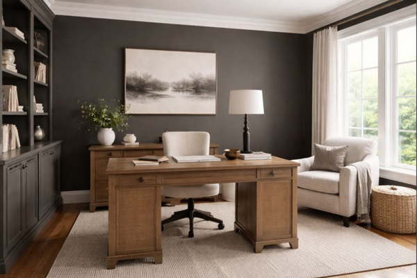
Lighting makes a big difference with a colour as deep as Silhouette. In bright natural light, Silhouette reads warmer and richer, with more of its brown base coming through. It feels refined and grounded rather than heavy, especially when balanced with light trim or flooring.
In lower light or evening light, the colour deepens noticeably. This is where Silhouette becomes more dramatic and cocooning, with its charcoal undertones coming forward. It can feel very cosy and intimate, great for rooms you use mostly at night like bedrooms.
Because Silhouette is so light-absorbing, it tends to look best when it’s part of a thought-out palette, rather than a standalone decision. Pairing it with the right lighter neutrals nearby helps control how dark and heavy it feels from room to room.
Where to use Silhouette?

Silhouette works best when it’s used intentionally, rather than everywhere at once. Because it’s deep and light-absorbing, it really shines in spaces where mood and contrast matter. Some of the best ways to use Silhouette include:
Accent walls to add depth without overwhelming a room.
Bedrooms where you want a calm, cosy, cocooning feel.
Home offices or studies for a grounded, focused atmosphere.
Powder rooms where darker colours feel bold and elevated.
Cabinetry or built-ins, especially when paired with light walls or stone.
Silhouette is usually less suited to open-plan areas unless it’s balanced with lighter neutrals nearby. This is where having a clear colour plan helps so you can enjoy the richness of darker shades while keeping the overall home feeling cohesive.
If you’re drawn to moody colours like Silhouette, you might also enjoy some of my Benjamin Moore whole-house palettes, which show how deeper tones can work alongside softer neutrals.
Best white trim colours

Because Silhouette is so deep, trim colour choice really matters. Lighter trims help keep it looking intentional and polished rather than heavy. Some of the best white paint colours for trims are:
Soft whites if you want contrast without going stark. Think Simply White (OC-117) or White Dove (OC-17).
Clean off-whites with gentle warmth for a calm, cohesive look. Consider colours like Seapearl (OC-19).
Warm whites to enhance Silhouette’s brown undertones and create a soft contrast. Think Cloud White (OC-130) or Swiss Coffee (OC-45).
Very bright or icy whites can feel a bit sharp next to Silhouette, especially in lower light. If you want a softer, more timeless result, leaning slightly warm usually works better.
Best coordinating colours with Silhouette
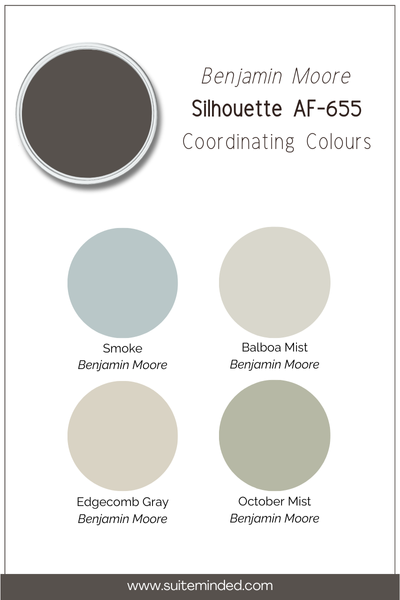
Silhouette works best when it’s balanced with lighter, softer colours that lift and support its depth. Think contrast, not competition. Some colours that pair especially well include:
Warm off-whites and soft whites: These keep things feeling light and prevent Silhouette from becoming too heavy, especially in connected spaces.
Light warm greiges and taupes: Great for nearby rooms or open-plan areas where you want flow without repeating such a dark colour. Think of colours like Balboa Mist (OC-27) or Edgecomb Gray (HC-173).
Soft, muted greens: Sage and olive tones bring out Silhouette’s earthy side and work beautifully in calm, nature-inspired homes. Colours like October Mist (1495) work particularly well.
Dusty blues or blue-greys: Used sparingly, these add contrast without clashing and help Silhouette feel more layered and intentional. Consider colours such as Boothbay Gray (HC-165) or Smoke (2122-40).
Warm wood tones and natural materials: Not a paint colour, but worth mentioning. Light timber, stone, and leather all pair beautifully with Silhouette’s richness.
——————
Silhouette can be a beautiful choice if you love deep, moody colours and want your space to feel calm, grounded, and intentional. It works especially well in rooms where atmosphere matters more than brightness, and when it’s balanced with lighter colours nearby. If you’re drawn to Silhouette but feel unsure about using a colour this dark, that’s completely normal. The key is less about the colour itself and more about how it fits into your overall palette.
If you’d like extra help seeing how Silhouette could work in your home, my Benjamin Moore whole-house palettes show ready-made combinations you can use with confidence. And if you want a step-by-step way to choose colours, including darker shades, without second-guessing, my Benjamin Moore Blueprint walks you through the process from start to finish.
Thank you for reading, and happy painting!
Manon xx