Dulux Australia Colour Forecast 2026: What’s Trending in Colour for Homes
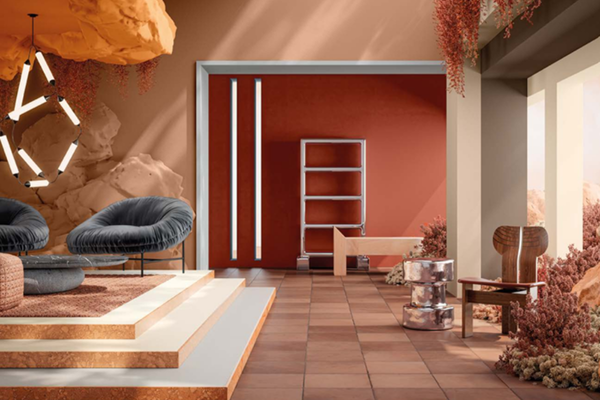
Photo by Dulux Australia
Colour isn’t just decoration, it’s how our home feels. As an interior decorator, I’m constantly watching the major colour forecasts because they reflect what’s happening in the world, in design and in how we want to live. The Dulux Australia Colour Forecast 2026 is no exception: it reveals not just new shades, but new emotional directions for the home.
This year, Dulux presents three curated palettes that evoke a longing for calm, reconnection and authenticity. In this post, I’ll unpack those three palettes (Ethereal, Elemental, Evoke), explore what they mean for whole-house colour planning, and give you actionable tips for how you can apply them in your home.
What Does the Dulux 2026 Colour Forecast Look Like?
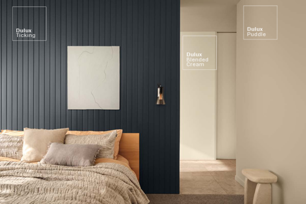
Photo by Dulux Australia
Every year, I look forward to every paint brand’s colour forecasts like it’s a new season of my favourite show. It’s more than just “pretty colours”, it’s a glimpse into how we’re all feeling and what kind of spaces we want to live in.
For 2026, Dulux has clearly tuned into what so many of us are craving right now: calm, connection, and a slower pace. The colours are warmer, softer, and more comforting than the bold contrasts we’ve seen in the past. There’s a lot of focus on natural textures, earthy neutrals, and gentle tones that make you want to exhale the second you walk through the door.
And I love that. Because choosing paint colours isn’t just about keeping up with trends; it’s about shaping how your home feels. If your home has been feeling a little flat or chaotic lately, these new palettes are an invitation to pause, reconnect, and bring some harmony back into your spaces.
The Three Palettes in the Dulux 2026 Forecast
Dulux has grouped this year’s colours into three palettes: Ethereal, Elemental, and Evoke. Each one has its own mood and personality, so as we go through them, notice which one you feel drawn to. That’s usually a sign your home is asking for something.
1. Ethereal - Soft • Light • Restful

Photo credit: Dulux Aus
Ethereal is all about creating a sense of calm and quiet beauty. Think soft greens, gentle mauves, blush tones, and creamy pastels that feel like a slow morning with sunlight coming through sheer curtains.
This palette is lovely if you want your home to feel like a retreat. It’s especially beautiful in bedrooms, reading corners, nurseries, or any spaces where you want to switch off and unwind.
To make Ethereal work in a real home (not just a styled photo shoot), pair it with natural textures. Think light woods, linen or cotton fabrics, woven rugs, and soft lighting. It’s a palette that says: “Breathe. Rest. You’re home.”
2. Elemental - Natural • Warm • Grounded

Photo creadit: Dulux Aus
This palette is grounded in warm neutrals (think greiges, warm whites, muted browns, and sandy beiges) - colours that evoke nature, peace, and relaxation. This is the “whole-house” palette for most people. It works almost anywhere because it’s calm, versatile, and timeless.
Use Elemental for main living areas, kitchens, hallways, and open-plan spaces. Add in some texture so your home feels layered rather than flat. Think timber floors or cabinetry, stone benchtops, textures, fabrics like boucle or heavy linen.
If you want your home to feel warm, inviting, and “settled,” Elemental is your palette.
3. Evoke - Rich • Expressive • Personal

Photo credit: Dulux Aus
Evoke is where we bring in mood - deeper greens, terracotta tones, olive, chocolate, and warm rust tones that have presence and add character.
This palette is perfect for adding personality without going neon or loud. It’s confident, but still earthy. I love Evoke for home offices, cosy living rooms, dining rooms, hallways that need character, powder rooms, or a feature wall done intentionally.
The key to using this palette well is balance. Choose one rich colour, pair it with warm neutrals from Elemental, and let lighting do the rest. Too many deep colours in one room can feel heavy; one or two is usually enough to create a beautiful atmosphere.
Evoke is for anyone who wants their space to feel cosy with style.
How to Use These Palettes in a Whole-House Colour Scheme
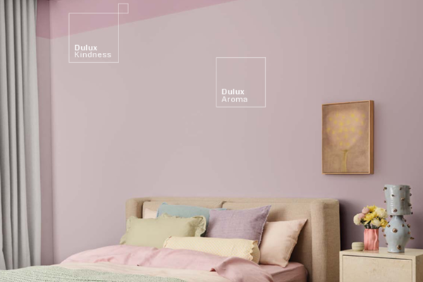
Photo by Dulux Australia
Now, this is where things get fun because it’s not just about choosing colours you love, it’s in how you use them together across your home.
One thing I always tell my clients is: your home should feel like one connected story, not a collection of separate rooms. And that’s where these three palettes really shine, you don’t have to pick just one. In fact, I think they’re designed to work together. Here’s how:
Start with Your Foundation
Your wall colour + trim colour are the backbone of your home. For most homes, a warm neutral from the Elemental palette makes a beautiful base; it’s soft, timeless, and ties everything else together without competing. This colour can become the main one in your main living room, hallways, trims, and open-plan spaces. It keeps your home feeling calm and cohesive from the moment you walk in the door.
Then Select Where You Want Mood or Softness
Once your foundation is set, you can then layer personality. If you want softness, bring in Ethereal colours in the rooms where you rest, such as bedrooms, guest rooms, nurseries, or quiet/reading corners.
If you want character or coziness, bring in Evoke tones where connection and conversation happen, such as a dining room, lounge, home office, media room, or even a hallway. Just one feature wall, a painted cabinet, or even a door in an Evoke colour can add depth and character without overwhelming the space.
Keep One Thing Consistent Across the Whole Home
This is the secret to flow. Choose one colour, such as the trim colour, to make your home feel unified, even if each room has its own mood. It’s like the spine holding the whole house together.
And Remember: Light Changes Everything
The same colour will look completely different in a north-facing vs south-facing room, a big open living space vs a small cosy corner, or even matte finish vs semi-gloss. So always test your colours with real samples, on the actual wall, before committing. Your home’s light is unique to you.
My Take (and What I’d Recommend If We Were Sitting Down Together Over Coffee)
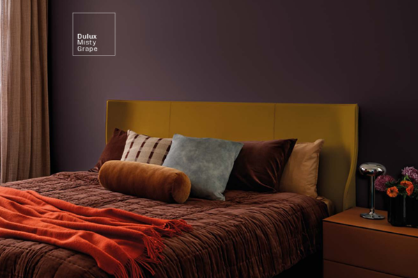
Photo by Dulux Australia
If we were chatting about this in person, I’d probably say all three palettes are beautiful, but they each serve a different emotional purpose. And the right choice really comes down to how you want your home to feel.
Elemental is the most timeless and versatile.
If you want your home to feel calm, inviting and grown-up, this is your anchor. It’s the palette you can live with for years without feeling the need to repaint every trend cycle. Most homes will benefit from starting here.
Ethereal is beautiful, but softer than people expect.
In bright, sunny spaces, it can feel light and dreamy. But in darker or south-facing rooms, it can lean cool or even a bit washed out. So if you’re drawn to Ethereal, just be prepared to test samples on the actual walls and observe them throughout the day.
Evoke is the most emotionally expressive.
It has warmth, depth, and character, and it can make a room feel incredibly cozy, but it needs intention. This palette shines when you choose one or two hero colours, you support them with warm neutrals, and you use lighting well (artificial and natural). If you’re not feeling 100% confident yet about choosing a bold colour in your space, that’s okay. Using Evoke in smaller doses, such as in artwork, home decor pieces, or soft furnishings, is a beautiful way to start.
————————
The Dulux 2026 Colour Forecast isn’t just about new shades to try. It’s a reflection of what so many of us are craving at home right now: calm, warmth, and depth. Whether you’re drawn to the softness of Ethereal, the grounded warmth of Elemental, or the cozy richness of Evoke, the most important thing is choosing colours that support the way you want to live. Your home doesn’t need to be perfect. It just needs to feel like yours.
If you’re planning to repaint soon or you’re in that stage where you have 23 swatches taped to your wall and you can’t tell the difference anymore, you’re not alone. Colour is emotional, and it’s completely normal to second-guess it. The good news is: when you choose a cohesive palette that flows from room to room, everything becomes easier. Your home instantly feels more intentional. More you.
If you’d like help creating that, that’s exactly what I do. You can explore my ready-made whole-house palettes or custom colour consults to walk you through choosing colours with confidence.
For now, just take a moment to notice which palette made you feel something.
Thank you for reading, and happy painting.
Manon xx