Our Favourite Sherwin-Williams Blue Paint Colours For Your Kitchen Cabinets

I love a blue kitchen! They’re stylish yet timeless, bold yet calming, and they look beautiful in everything from coastal to modern spaces. Blue has this natural versatility that makes it feel both classic and fresh, depending on the shade you choose and what you pair it with. Whether you love the idea of soft, breezy blue cabinets that brighten your space or deep navy tones that add instant sophistication, there’s a Sherwin-Williams colour that fits perfectly.
In this post, I’m sharing my favourite Sherwin-Williams blue paint colours for kitchen cabinets, from light and airy tones to rich, moody hues. You’ll find notes on undertones, best pairings, and how each shade transforms a kitchen’s overall feel, so you can find your perfect match with confidence.
Why Blue Works Beautifully in Kitchens
Blue is one of those colours that instantly changes the atmosphere of a kitchen. It brings a sense of calm and balance, something we could all use a little more of in the heart of the home. Depending on the shade, it can feel breezy and relaxed, grounded and sophisticated, or quietly elegant without trying too hard.
What makes blue so versatile is how well it pairs with different finishes and materials. Soft powder blues look gorgeous with warm brass and white marble, while navy tones stand out beautifully against crisp white walls or natural oak floors. Even mid-tone blues can strike the perfect balance between light and depth, making a kitchen feel welcoming but not overly bright.

How to Choose the Right Blue for Your Kitchen Cabinets
Choosing the right blue might sound simple, until you realise how many different shades there are. Some lean green, others feel grey, and a few are so deep they almost look black. The key is understanding the undertone, lighting, and the overall look you want to create.
1. Start with undertones.
Every blue has a personality. Green-blue tones feel a little earthy and natural, while grey-blues are softer and more neutral. True navy blues add depth and drama without overwhelming the space. Pay attention to whether a blue feels warm or cool; that small detail makes a big difference once it’s on your cabinets.
2. Think about your kitchen’s lighting.
Light changes everything. North-facing kitchens tend to have cooler, shadowy light, which can make blue shades appear darker and more muted. South-facing kitchens, on the other hand, bring out warmth and brightness, perfect for deeper or moodier blues. If your kitchen doesn’t get much natural light, lighter or mid-tone blues will help keep it feeling open and airy.
3. Balance with other finishes.
Consider your wall colour, backsplash, and countertops. A bold navy might look stunning next to white quartz and brass hardware, while a soft blue-grey pairs beautifully with warm wood tones or marble-look benchtops. If you’re unsure, test two or three shades together and see how they interact with your lighting and materials.
4. Always test before you commit.
Paint colours can surprise you once they’re on a larger surface. Try Sherwin-Williams’ Peel & Stick samples or paint a few cabinet doors before deciding. Seeing how the colour shifts throughout the day is the best way to find your perfect blue.
If you love the look of blue kitchen cabinetry, I recently created a Coastal Kitchen palette featuring four Sherwin-Williams blue cabinet colours, along with coordinating walls, countertops, backsplash ideas, and finishes to help you visualise the full design.
The Best Light Blue Cabinet Colours
Light blue kitchen cabinets have a special way of making a space feel fresh and peaceful. Here are two of my favourite Sherwin-Williams light blues that always deliver a timeless, effortless feel:
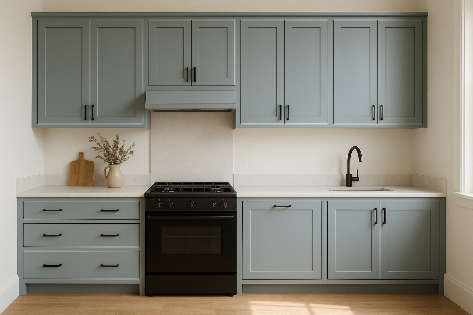
Sherwin-Williams Moonmist (SW 9144)
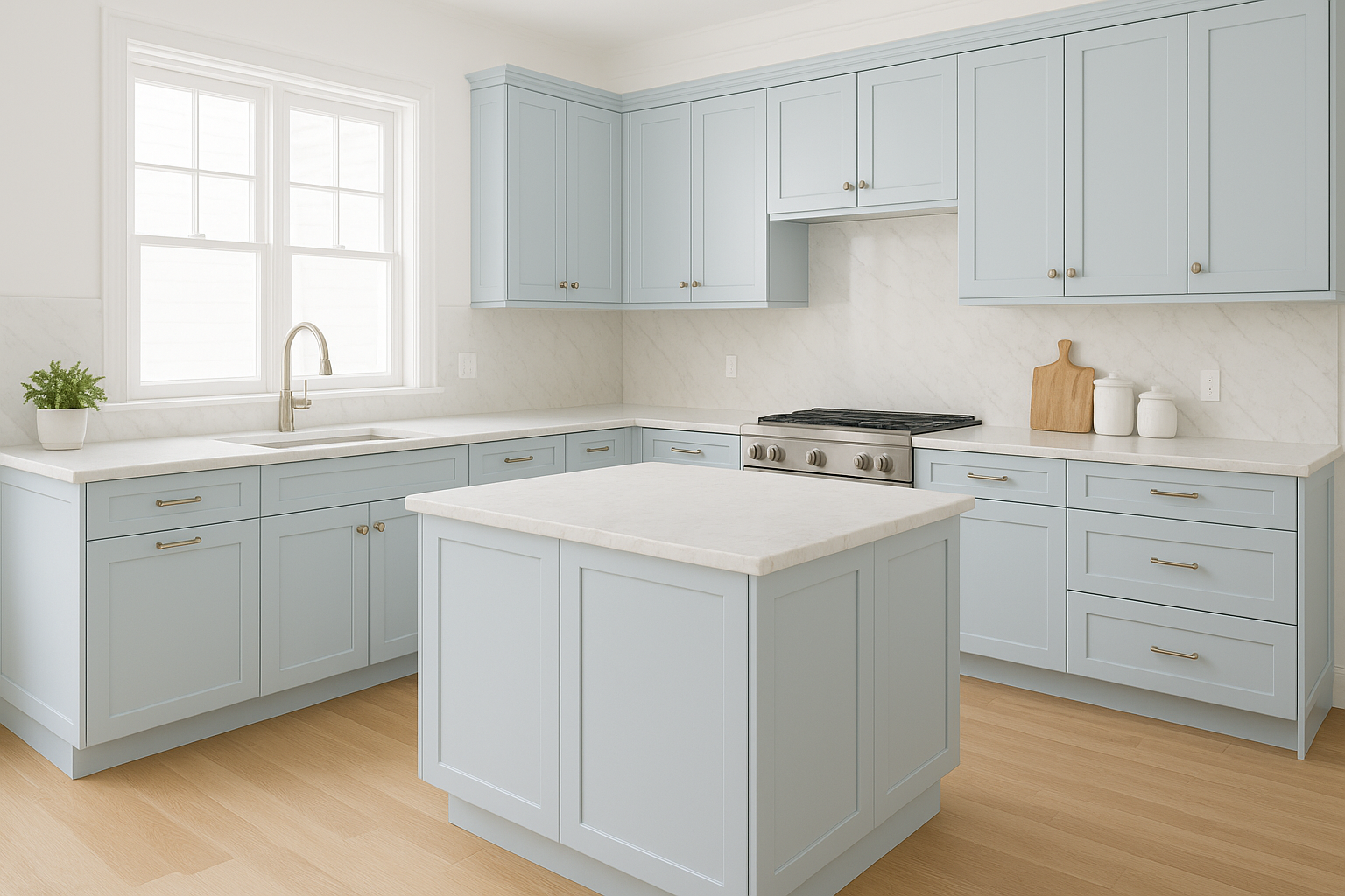
Moonmist SW 9144 kitchen cabinets
Moonmist is a soft, misty blue with a gentle touch of grey. It feels clean and calm, but not sterile, making it a beautiful choice for kitchens where you want a sense of ease and simplicity. Because of its subtle grey undertone, Moonmist works beautifully with cool whites like Pure White (SW 7005) or Extra White (SW 7006) on walls and trim. For hardware, brushed nickel or warm brass both pair effortlessly, and it looks stunning next to light marble or white quartz countertops. Moonmist is especially lovely in smaller or dimly lit spaces where you want colour without heaviness.
Sherwin-Williams Hinting Blue (SW 6519)
Hinting Blue SW 6519 kitchen cabinets
Hinting Blue is another soft, breezy blue that looks beautiful with its balanced undertones. It has just enough depth to stand out against white walls or subway tiles without overpowering the room. Hinting Blue pairs beautifully with warm metals like brushed gold or champagne bronze, and it complements both cool grey and warm beige tones, which means it’s easy to blend into a whole-house palette. Use it if you want your kitchen to feel light, open, and quietly happy, bringing a gentle pop of personality while staying timeless.
The Best Mid-Tone Blue Cabinet Colours
If you love the idea of blue cabinets but want something with a little more depth, mid-tone blues are the sweet spot as they bring warmth and personality without feeling too dark. These two Sherwin-Williams shades strike the perfect balance between fresh and refined:
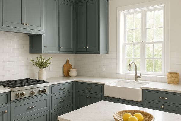
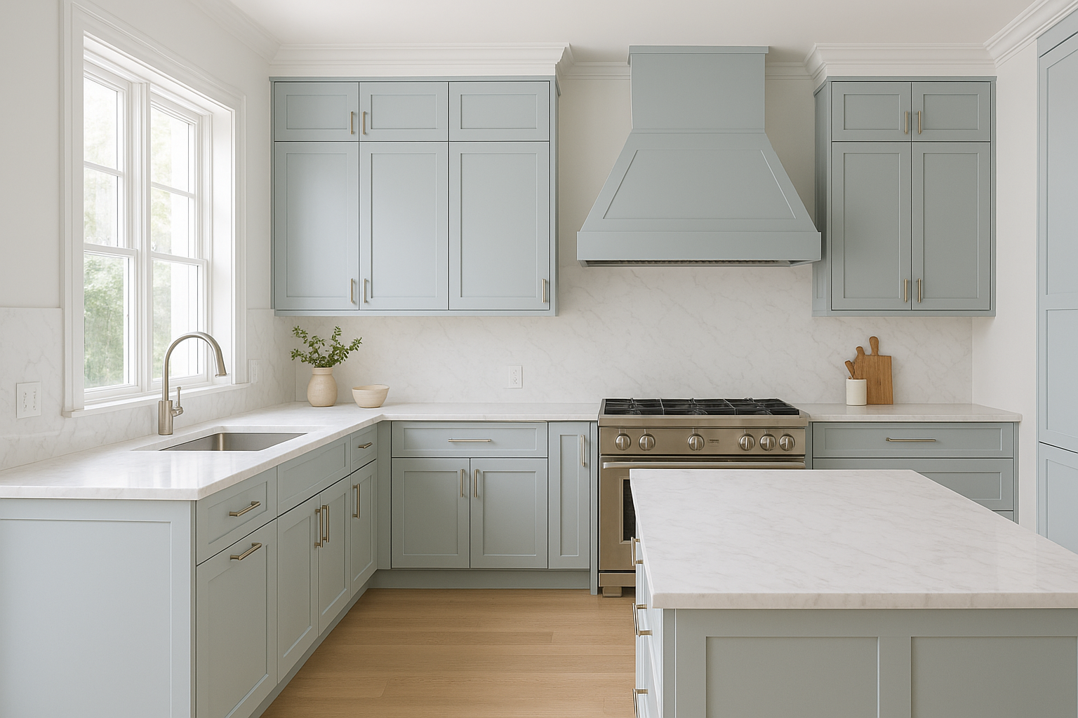
Sherwin-Williams Smoky Azurite (SW 9148)
Smoky Azurite SW 9148 kitchen cabinets
Smoky Azurite is one of those colours that instantly makes a kitchen feel elevated. It’s a medium blue with a touch of grey that keeps it grounded and sophisticated. In bright light, it leans slightly cool and airy; in lower light, it deepens into a moody, slate-like tone that feels cozy and calm. It pairs beautifully with white quartz or marble countertops, brass hardware, and warm oak or walnut floors. It also complements wall colours like Alabaster (SW 7008) or Drift of Mist (SW 9166) if you want a soft, seamless transition between cabinetry and walls. Smoky Azurite is perfect for kitchens where you want a touch of colour and contrast; something stylish but still understated.
Sherwin-Williams Faded Flaxflower (SW 9146)
Faded Flaxflower SW 9146 kitchen cabinets
For a slightly livelier mid-tone blue, Faded Flaxflower is a standout. It’s a gentle, dusky blue with a whisper of grey and violet undertones that give it a sophisticated, almost vintage charm. It’s colourful enough to make a statement, but still feels calm and collected. It shines in both modern and transitional kitchens, pairing beautifully with brushed gold or matte black hardware and light oak or stone benchtops. It also coordinates well with soft whites like Egret White (SW 7570) or Greek Villa (SW 7551). If you want a kitchen that feels creative, welcoming, and quietly unique, Faded Flaxflower adds just the right amount of character without being overpowering.
The Best Dark Blue Cabinet Colours
If you’re drawn to rich, dramatic hues that make a statement, dark blue is the way to go. These shades add incredible depth and contrast while still feeling classic and grounded. They bring that “wow” factor to a kitchen but in a way that still feels timeless, not trendy. Here are two Sherwin-Williams favourites that never fail to impress:
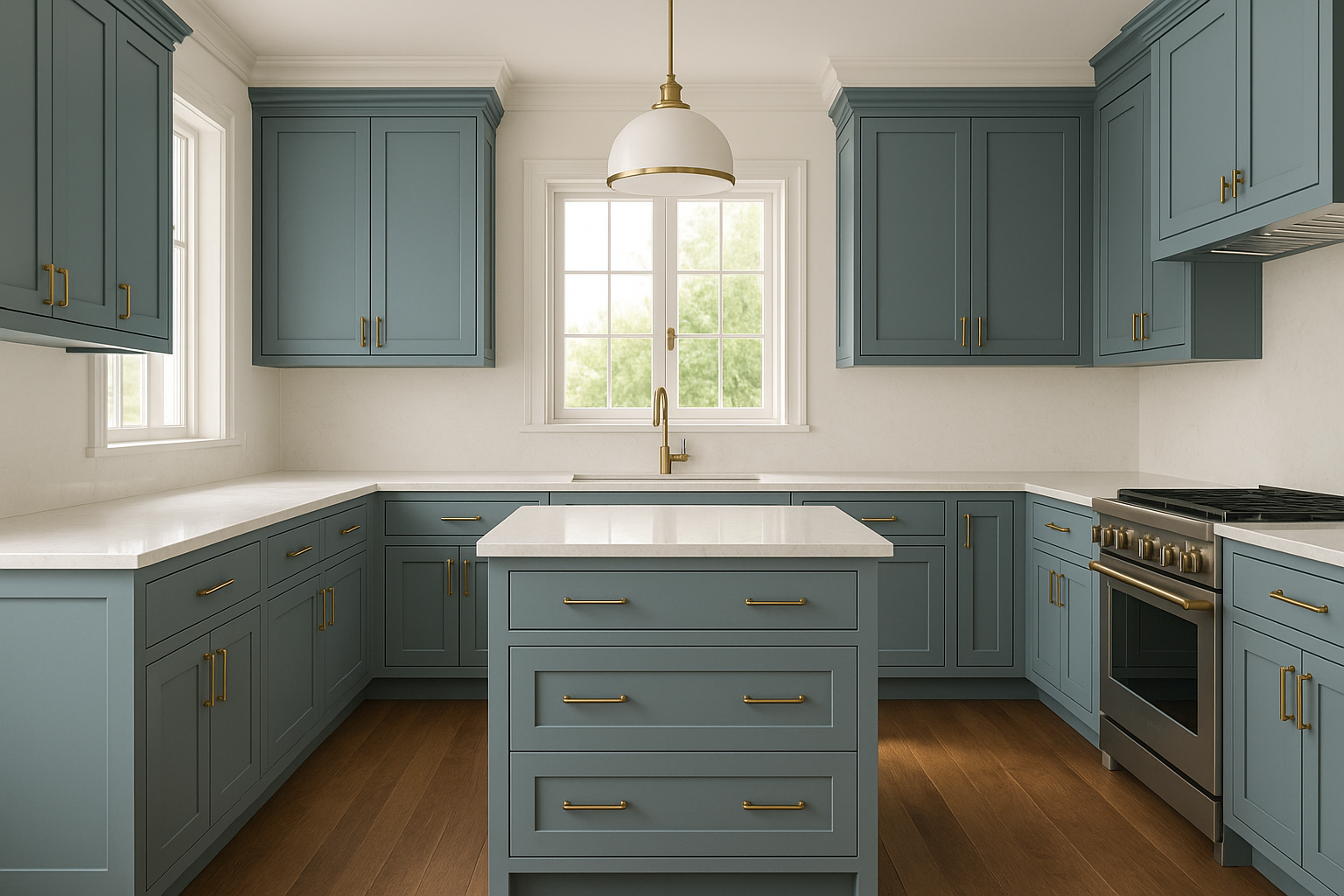
Sherwin-Williams Charcoal Blue (SW 2739)
Charcoal Blue SW 2739 kitchen cabinets
Charcoal Blue is the perfect bridge between navy and charcoal grey - a sophisticated, modern blue that feels moody without being too heavy. It has a subtle grey undertone that keeps it elegant and versatile, which means it can lean coastal, contemporary, or even traditional depending on your styling. It pairs beautifully with warm metals like brass or gold, as well as natural oak, marble, or light quartz countertops. It’s stunning when paired with Pure White (SW 7005) on walls or trim for crisp contrast, but it also looks rich and layered next to warm neutrals like Accessible Beige (SW 7036). If you want that sophisticated, designer look, Charcoal Blue delivers it effortlessly.
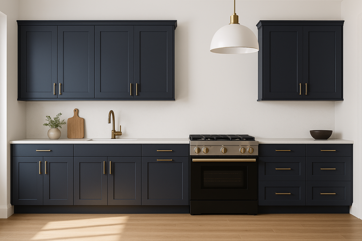
Sherwin-Williams Naval (SW 6244)
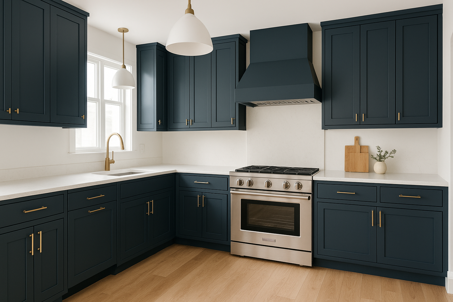
Naval SW 6244 kitchen cabinets
Naval is Sherwin-Williams’ ultimate navy - deep, timeless, and beautifully saturated. It was even named the 2020 Colour of the Year, and it’s easy to see why. It brings a sense of calm confidence to a space, feeling both classic and contemporary at the same time. It pairs perfectly with brass or champagne hardware, white quartz, or light oak floors, and looks incredible with crisp white walls like Snowbound (SW 7004) or soft warm whites like Greek Villa (SW 7551). For a little extra drama, pair it with matte black accents or darker stone benchtops. If you want a kitchen that feels timeless, grounded, and effortlessly elegant, Naval is a foolproof choice.
——————
If you're drawn to blue kitchen cabinetry and want a clear, designer-guided way to bring the look together, my Coastal Kitchen palette walks you through four Sherwin-Williams blue cabinet colours paired with complementary finishes and styling ideas for a cohesive coastal kitchen. It’s designed to take you from inspiration to a fully realised space with confidence.
→ Explore the Coastal Kitchen palette here.
And if you still need a little extra guidance, my Sherwin-Williams Whole House Colour Palettes and Home Paint Colour Blueprint are the perfect place to start. They’ll help you see how different hues work together, choose coordinating whites and neutrals, and build a home that feels beautifully cohesive.
Thank you for reading, and happy painting!
Manon xx