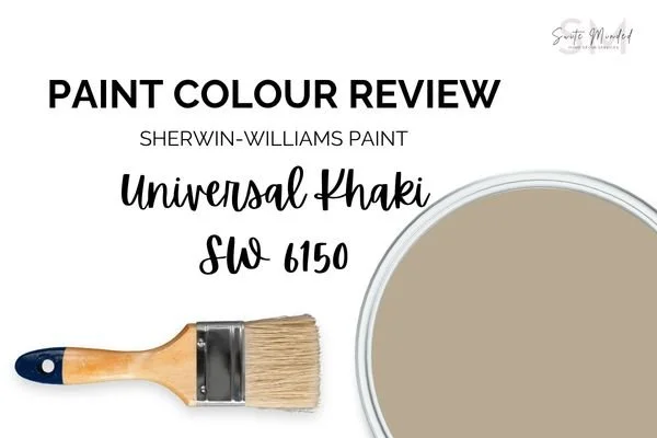
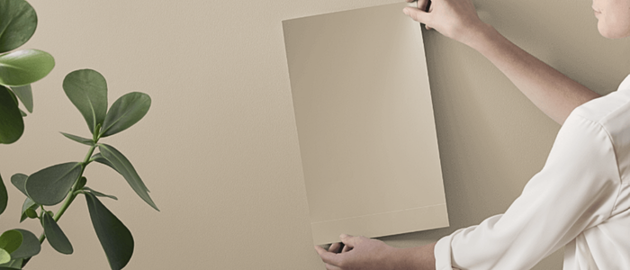
Paint Colour Review: Universal Khaki SW 6150 - Sherwin-Williams Color Of The Year 2026
This post may contain affiliate links, which means I may earn a small commission if you purchase through them, at no extra cost to you.
Why you’ll love it
✓ Warm, earthy, versatile
✓ Works in most lighting
✓ Easy to coordinate with warm whites & earthy tones
What to look out for
X Can feel heavy in dark rooms
X Avoid cool, stark whites
X Not ideal as a backdrop neutral - best in a single room or an accent tone
Every year, Sherwin-Williams announces a Color of the Year that sets the tone for interiors everywhere, and 2026 is all about Universal Khaki SW 6150. At first glance, it may look like a simple neutral, but there’s so much more going on beneath the surface. Universal Khaki is grounded, approachable, and has just enough warmth to make any room feel welcoming without ever feeling heavy.
In this post, I’ll walk you through everything you need to know about this versatile shade: its undertones, LRV, how it reacts in different lighting, the best whites and colours to coordinate it with, and where it really shines in the home. If you’ve been looking for a colour that feels both timeless and current, Universal Khaki might just be the one.
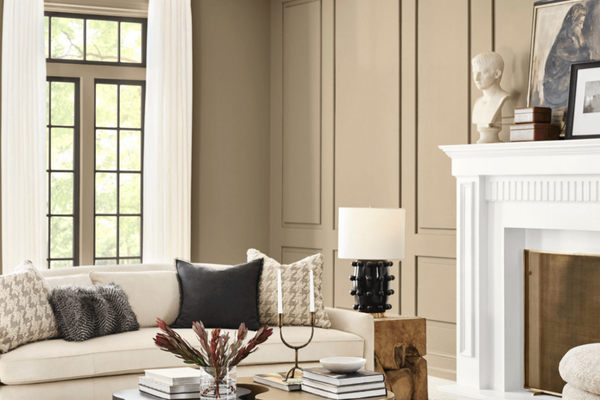
Photo via sherwinwilliams.com
If you’re working on choosing a whole-house palette, you might also like The Confident Home Colour Blueprint, my step-by-step guide to pulling everything together with confidence.
What are Universal Khaki’s undertones?
When it comes to undertones, Universal Khaki is one of those colours that keeps things interesting. At its core, it’s a warm tan with a soft, earthy quality, but it has just enough yellow mixed in to keep things interesting. In some spaces, you’ll notice a subtle greenish cast peeking through, especially in natural light, which is what gives it that organic, grounded feel. Other times, it leans a bit more golden, bringing a cosy warmth to the room.
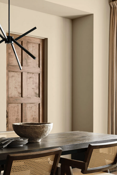
Photo via sherwinwilliams.com
What is Universal Khaki’s LRV?
Universal Khaki has an LRV of 40, which puts it right in that mid-range sweet spot. If you’re not familiar with LRV (Light Reflectance Value), it’s a scale from 0 to 100 that tells you how light or dark a paint colour looks once it’s up on the wall - 0 being pure black, absorbing all light, and 100 being pure white, reflecting all light. With an LRV of 40, Universal Khaki isn’t too dark or too light; it sits comfortably in the middle, making it versatile for almost any space.
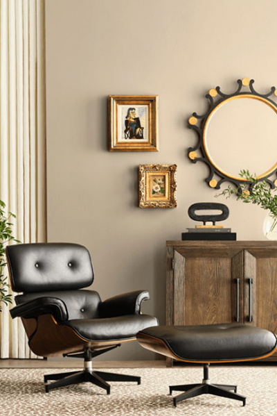
Photo via sherwinwilliams.com
In brighter rooms with lots of natural light, it can look softer and a little lighter than you might expect. In dimly lit rooms or spaces that don’t receive a lot of light, it will deepen and feel cosier, giving off that warm, grounded vibe it’s known for. I like to think of its LRV as a built-in mood shifter - it has enough depth to feel sophisticated, but not so much that it overwhelms a room.
If you’re unsure how this colour will look in your home, it’s always recommended to test it first. Peel-and-stick samples from Samplize are easy to use and move around, so you can see how it behaves in your own home before making a final decision.
→ Get your peel-and-stick sample of Universal Khaki!
How does Universal Khaki look in different lighting conditions?
One of the things I like most about Universal Khaki is how much it changes depending on the light. In a north-facing room, where the light is cooler and a bit muted, Universal Khaki can show more of its muted green side. It feels calm and earthy, almost like a soft backdrop that lets your furniture and decor really shine.
In south-facing rooms, with their warm, golden light, this colour warms right up. You’ll notice more of its warm tan and yellow undertones coming through, making the space feel inviting and sunlit. It’s such a lovely option if you want warmth without going full-on yellow or creamy.
In east-facing spaces, the morning light makes Universal Khaki feel fresh and slightly brighter, while in the afternoon it softens into a muted, grounding tone. West-facing rooms are the opposite: cooler in the morning and then rich and cosy in the afternoon and evening, when the warm sunset light enhances its undertones.
Photo via sherwinwilliams.com
Where to best use it in your home?
Universal Khaki can work in just about any room, depending on the look you’re going for. In a living room, it creates that perfect balance of cosy and sophisticated, giving you a neutral backdrop that still feels interesting. In a bedroom, it brings a sense of calm and grounded warmth, especially if you layer it with soft textiles and natural materials like linen or wood. And if you’re thinking about kitchens or dining rooms, Universal Khaki pairs beautifully with crisp white trim or creamy cabinetry, instantly making the space feel warm and inviting without being overpowering.
One of my favourite ways to use it is on exterior walls. It has enough depth to hold up against bright sunlight, but its earthy undertones keep it feeling natural and timeless. Whether indoors or out, Universal Khaki has that rare ability to feel both current and classic, which is probably why it earned the title of Colour of the Year.
Best white trim colours
Because Universal Khaki sits right in that earthy, mid-range zone, it pairs best with whites that feel soft and welcoming rather than stark.
If you want something classic and creamy, Sherwin-Williams Alabaster (SW 7008) is always a winner. It has just enough warmth to blend seamlessly with Universal Khaki without looking too yellow. Another favourite is Greek Villa (SW 7551), which is slightly brighter but still carries a gentle warmth that plays beautifully against tan colours.
For a crisper look, you could go with Pure White (SW 7005). It’s clean and versatile, but it has a touch of softness that keeps it from feeling too harsh. If you prefer a slightly more muted, antique look, Dover White (SW 6385) can be a lovely pairing as well; it leans warmer and creates a more traditional, cosy vibe.
The trick is to avoid super cool, blue-leaning whites, since they can clash with Universal Khaki’s earthy base. Stick to warm or balanced whites, and you’ll have a trim colour that frames it beautifully every time.
What about coordinating colours?
Because Universal Khaki sits in that earthy, grounded zone, it plays well with both warm and cool tones. If you want to keep things soft and airy, try pairing it with gentle blues or blue-greens like Sleepy Blue (SW 6225) or even a warm, slightly muted green such as Garden Gate (SW 6167). These hues balance out the warmth in Universal Khaki and create a really calming, natural feel.
For something warmer and cozier, you can lean into its golden undertones with muted beiges or lighter tans to create a layered, tonal look that feels comfortable and timeless. And if you’re after a little contrast and drama, try a navy blue, a dark teal, a deep brown, or a rich burgundy to make Universal Khaki pop while still keeping the overall palette grounded and sophisticated.
Neutrals are always safe, but with a colour like this, you don’t have to be afraid to mix in a little personality.
——————
Universal Khaki SW 6150 really does live up to its name. It’s a colour that feels at home just about anywhere. With its earthy balance of tan, yellow, and soft green undertones, it adapts beautifully to different lighting and pairs effortlessly with a wide range of hues. Whether you’re after a cosy living room, a grounded bedroom, or a welcoming entryway, this shade brings that timeless, versatile quality we all look for in a wall colour.
If you’re feeling inspired but not quite sure how to pull it all together in your own home, I’ve got you covered. My whole house paint colour palettes take the guesswork out of creating a cohesive scheme - you’ll get expertly chosen combinations that flow beautifully from room to room. And if you’d like something more personal, my custom colour services are designed to give you a palette that feels completely unique to your home and style.
Choosing paint doesn’t have to be stressful; you just need the right guide. So whether you go with Universal Khaki or something else, you’ll be able to move forward with confidence and create a space that truly feels like you.
Thank you for reading and happy painting,
Manon xx
