Paint Colour Review: Stowe White By Dulux

Choosing the right white paint can feel a little overwhelming; there are just so many to pick from, and they all seem to look slightly different once they’re up on the wall. If you’ve been on the hunt for a white that feels soft, natural, and not too stark, Dulux Stowe White might just catch your eye. It’s one of those versatile shades that works beautifully in a range of spaces, with enough warmth to feel inviting but still light enough to keep things fresh and airy.
In this review, we’ll explore its tones and undertones, how it behaves in different lighting, its LRV, the best whites to pair it with for trims, and some of my favourite coordinating colours to help you bring it to life in your own home.
What are Stowe White’s undertones?
When you first look at Stowe White, it comes across as a gentle, soft white with a subtle warmth to it. It doesn’t lean icy or crisp, so you won’t find those sharp blue undertones that cooler whites often carry. Instead, there’s a whisper of yellowish beige and a touch of grey in the background that helps soften the colour, giving it a natural and grounded feel. These undertones make it really versatile - it won’t read too yellow, and it avoids the flatness of a pure brilliant white. Depending on your lighting, those soft, muted notes may come forward more, making it feel like a calm, muted off-white that works well in both contemporary and classic interiors.

What is Stowe White’s LRV?
Stowe White has an LRV of 82, which puts it firmly in the lighter end of the spectrum. If you’re not familiar with Light Reflectance Value, it’s a useful little number from 0 to 100 that shows how much light a colour reflects, 0 being pure black absorbing all light, and 100 being a true, brilliant white reflecting all light. At 82, Stowe White reflects a generous amount of light, so it will naturally brighten up a room, but it doesn’t hit that super-bright, almost stark territory that higher LRVs can bring. Instead, it keeps things feeling soft, calm, and welcoming. In well-lit rooms, it will feel fresh and airy, while in dimmer spaces, it still holds its brightness without looking dingy or flat. That balance makes it a reliable choice if you’re after a white that feels easy to live with every day.
How does Stowe White look in different lighting exposures?
In Southern Hemisphere homes, such as in Australia or New Zealand, Stowe White has a lovely way of adapting to the unique light conditions. In north-facing rooms, where the light is bright and warm all day, you’ll see more of its gentle yellow-beige undertone coming through, which creates a soft and welcoming backdrop without feeling too yellow or creamy. South-facing rooms, on the other hand, get cooler, greyer light, and this is where Stowe White’s balance really shines; it keeps the space from feeling too stark or chilly, adding just enough warmth to stay comfortable. East-facing rooms will highlight its freshness in the morning with a clean, airy look, before softening down as the day goes on. West-facing rooms tend to bring out more warmth in the late afternoon sun, which gives Stowe White a cosy, mellow glow. It’s one of those colours that works beautifully across different exposures, always staying calm, versatile, and easy to live with.

Where to best use Stowe White?
Stowe White is one of those colours that feels at home just about anywhere, which makes it such a reliable choice. On walls, it creates a soft, fresh backdrop that works beautifully in open-plan living areas, helping spaces flow together without feeling too stark. In bedrooms, it brings a calm and restful vibe, especially when layered with warm textures like timber, linen, and natural stone.
Because of its balanced undertones, Stowe White also shines in kitchens and bathrooms, where it pairs easily with both warm and cool finishes. Think marble or quartz countertops, timber cabinetry, brushed brass or black hardware. It’s equally lovely for hallways and entryways, where its light reflectance value (82) helps bounce light and make smaller spaces feel brighter and more open.
If you’re looking for a colour that can carry through your whole home, Stowe White is a safe and versatile pick. It transitions smoothly between different rooms and exposures, creating a cohesive look that doesn’t overwhelm or clash with other finishes.
White trim colours with Stowe White

When it comes to trims, you’ll want something that complements Stowe White’s softness without clashing with its undertones. For a seamless, subtle look, you can actually use Stowe White on both walls and trims, just switch up the sheen. A low-sheen or matte finish on the walls paired with a semi-gloss on the trims creates enough contrast to define the space while keeping everything cohesive.
If you’d prefer a crisper contrast, pair Stowe White with Dulux White Polar Quarter. It’s a clean, gentle white that sharpens up trims and ceilings without feeling too stark against Stowe White’s soft warmth. Another beautiful option is Dulux Natural White, which sits slightly warmer but still gives that classic trim contrast in a way that feels timeless and versatile. For homes that lean more traditional or where you want a softer, enveloping look, Dulux Whisper White can also work beautifully. It carries just a hint of warmth, so trims feel gentle and inviting rather than sharp or cold.
What about coordinating hues?
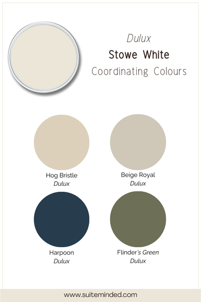
Stowe White is one of those whites that plays really well with others, which makes it easy to build a whole palette around. If you love a soft, layered neutral look, try pairing it with something like Dulux Hog Bristle Half to add depth while keeping things calm and harmonious. For a bit more contrast, earthy mid-tones such as Dulux Sandy Day or Dulux Beige Royal create a cosy balance, grounding Stowe White without overwhelming it.
If you’re drawn to greens, you’ll be happy to know that Stowe White pairs beautifully with muted, nature-inspired shades. A colour like Dulux Spanish Olive adds an organic, tranquil feel, while deeper greens such as Dulux Woodland Grey bring in a bold yet balanced edge.
For accents, Stowe White also works wonderfully with cooler, moodier tones. Try a soft blue-grey or a deeper, moody navy such as Dulux Oceanic for contrast that still feels sophisticated. Whether you’re leaning towards warm, earthy tones or cool, dramatic shades, Stowe White adapts beautifully, making it a versatile foundation for almost any colour scheme.
—————
At the end of the day, Dulux Stowe White is one of those whites that feels calm, versatile, and easy to live with. Its gentle undertones, balanced LRV, and ability to adapt to different lighting make it a beautiful choice if you’re after a soft backdrop that won’t feel too stark or too creamy. Whether you use it as your main wall colour, pair it with crisp trims, or layer it into a broader palette of earthy neutrals and accents, it’s a shade that brings a sense of harmony to any home.
If you’re struggling to decide which paint colour suits your home best or how to build a whole-house colour scheme, you don’t have to figure it out on your own. My ready-made whole-house colour palettes and my step-by-step Confident Home Colour Blueprint are designed to take the guesswork out of choosing colours, showing you exactly how to create flow from room to room. And if you’d like something tailored to your home, I also offer custom services where we can create the perfect palette just for you.
Thank you for reading and happy painting,
Manon xx