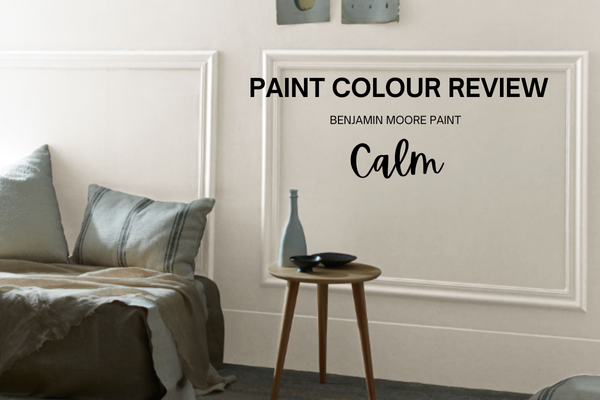
Paint Colour Review: Calm OC-22 By Benjamin Moore
You know that moment when you walk into a room and everything just feels…quiet? The light feels softer, the space feels bigger, and it’s like the whole house takes a deep breath with you. That’s what Calm by Benjamin Moore is meant to do - bring a sense of ease and serenity into your home. But here’s the thing: Calm isn’t your typical foolproof neutral. With its subtle undertones that can shift depending on the light, it’s a colour that can feel beautifully balanced in one house and a little off in another. In the right setting, it’s airy, refined, and almost spa-like; in the wrong one, it can lean unexpectedly cool or flat.
In this review, I’ll share what makes Calm such a special (yet sometimes tricky) shade, how it changes with different exposures, the best trims to pair it with, and the coordinating hues that can help it shine.
What are Calm’s undertones?
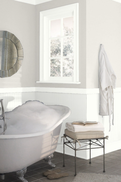
When it comes to undertones, Calm is a little bit of a shapeshifter, and that’s both what makes it beautiful and what makes it tricky. On the surface, it looks like a soft, airy off-white with just a hint of grey. But look closer, and you’ll notice a subtle violet-pink undertone hiding underneath. In the right light, that undertone gives Calm its serene quality. In other situations, though, especially if your room already has a lot of warm finishes or earthy elements, that subtle violet can suddenly stand out more than you expect.
This is why Calm tends to suit homes that lean toward a light, contemporary, or slightly cooler style palette. Pair it with crisp whites, gentle greys, or soft pastels, and it feels perfectly balanced. But in a space filled with golden beiges, warm woods, or terracotta tones, Calm can feel like it’s speaking a slightly different language. It’s one of those colours that really asks you to test it first on your own walls before committing, because those undertones will reveal themselves differently in every home.
What is Calm’s LRV?
LRV, or Light Reflectance Value, is a useful little number on a scale of 0 to 100 that tells us how much light a paint colour reflects or absorbs. 0 is pure black, absorbing all light, and 100 is pure white, reflecting all light. With an LRV of 75.83, Calm sits on the lighter end of the scale, which means it reflects a good amount of light back into the room, helping spaces feel open and airy without being stark white. It’s not the kind of colour that will wash everything out, but it’s also not heavy or grounding; it’s that in-between zone where a room feels soft, fresh, and light-filled.
Because of this, Calm can work beautifully in smaller rooms or spaces that need a little lift, especially if you’re after a more subtle alternative to a bright white. Just keep in mind that its undertones still play a role here: while the high LRV keeps things bright, those sneaky violet-pink notes will shift depending on whether your room gets warm southern light or cooler northern light. It’s one of those shades that can look like a calm, gentle neutral in one moment, and then surprise you with a whisper of colour in another.
How does Calm look in different lighting conditions?
Calm is one of those colours that loves to play with the light, which is why it can feel so different from room to room.
In a bright, south-facing space, the warmth of the sunlight softens its violet undertones and makes it read as a gentle, airy off-white, almost like a soft backdrop that doesn’t demand attention. It feels calm in the truest sense, wrapping the room in a light, soothing glow.
In a north-facing room, though, things shift. The cooler, shadowy light tends to pull out Calm’s grey and violet side, making it feel more muted and sometimes even a little chilly. If you already have cool finishes (like marble, greys, or crisp whites), this can look elegant and sophisticated. But if your style leans warm, it may feel like it’s clashing instead of blending in.
East- and west-facing rooms bring their own surprises. In the morning, an east-facing room will highlight Calm’s soft freshness, while in the afternoon it can look cooler as the light fades. A west-facing space does the opposite: calm and neutral earlier in the day, then warmer and a touch more glowing as the golden evening light comes in.
So while Calm can be beautifully versatile, it really is a colour that changes its personality with the light. That’s why I always recommend testing it on large swatches and moving them around the room at different times of day. It’s the best way to make sure Calm feels like a fit for your home’s unique light story.
Struggling to match this colour with the rest of your home? Undertones and flow can be tricky, but you don’t need to figure it out alone. The Confident Home Colour Blueprint is a proven 7-step guide that helps you confidently create a cohesive whole-house palette. With 76 paint colours and 6 ready-made palettes included, you’ll know exactly which whites, neutrals, and accents work together, without weeks of second-guessing.
Where to use Calm in your house?
Because of its softness and airy feel, Calm is a natural fit for rooms where you want a gentle, serene backdrop. It works beautifully in bedrooms, where its subtle undertones create a restful atmosphere that pairs nicely with crisp white bedding, soft linens, or muted pastels. In living rooms, it can act as that “quiet neutral” on the walls that allows your furniture and décor to shine, especially if you prefer a modern or minimalist style.
Calm is also a lovely choice for bathrooms and home offices. In a bathroom, it feels clean and spa-like, especially against white tiles or marble. In a home office, it creates a light, uncluttered canvas that can help the space feel calmer and more focused. Hallways and transitional spaces are another smart spot for Calm, since its higher LRV helps bounce light around and keeps those in-between areas from feeling too dark.
That said, Calm is not the best match for every setting. In homes with a lot of warm, golden tones (think honey oak, terracotta, or yellow-based beiges), its violet undertones can feel a bit mismatched. In those cases, it’s better to lean into warmer neutrals that speak the same language. But if your style leans toward soft modern, contemporary, coastal, or airy transitional, Calm can feel right at home.
White trim colours with Calm
When it comes to trim, Calm really comes alive when paired with a clean, crisp white that highlights its soft neutrality. Chantilly Lace OC-65 is a perfect choice if you want a sharp, modern contrast. It’s a pure, bright white that keeps Calm looking fresh and helps prevent those violet undertones from feeling too strong. If you prefer something bright but not stark, White Snow SW 9541 is a lovely Sherwin-Williams option. It’s crisp and neutral without leaning too warm, which makes it a great partner for Calm’s shifting undertones. Super White OC-152 is another excellent choice if you want something sleek and polished; a shade that reads clean and sophisticated without being harsh. And if you want the brightest, most reflective option, High Reflective White SW 7757 will give Calm a modern edge and keep your space feeling airy and light-filled.
What I’d generally avoid are whites with too much yellow or creamy depth. Those can exaggerate Calm’s violet undertones and make the pairing feel a little “off.” Sticking with crisp or soft, balanced whites will keep the look calm (pun intended!) and cohesive.
What about coordinating hues?
Pairing Calm with the right coordinating colours is where it really shines and where you can play up its serene personality or give it a little more drama. Because Calm has that delicate violet-pink undertone, it works best when surrounded by colours that either share a similar softness or balance it with a touch of depth.
Greys with blue-green undertones: Try Benjamin Moore Gray Owl or Sherwin-Williams Sea Salt. Both are soft, versatile shades that echo Calm’s cool side without feeling too icy.
Darker blue-greys: These shades bring a sophisticated depth, perfect for accents or adjoining spaces.
Warm greys with similar undertones: Benjamin Moore Chelsea Gray or Sherwin-Williams Repose Gray are wonderful companions that add warmth while staying harmonious.
Purple shades: To highlight Calm’s subtle violet undertone, pair it with muted purples that feel elegant without overpowering.
Taupes: For a grounded, cozy balance, look to taupes like Sherwin-Williams Agreeable Gray, versatile neutrals that play well with Calm.
Dark greens: For bold contrast, deep greens bring richness and depth, making Calm’s light, airy nature stand out beautifully.
Whether you lean soft and subtle or bold and dramatic, these coordinating hues will keep the palette feeling thoughtful, serene, and cohesive.
——————
At the end of the day, Calm by Benjamin Moore is a colour that lives up to its name - light, airy, and serene - but it does ask a little extra thought because of those shifting undertones. In the right home and lighting, it can feel like a soft exhale, creating rooms that are peaceful, refined, and quietly elegant. If you’re drawn to Calm, my biggest tip is to test it generously on your own walls and see how it interacts with your light and finishes throughout the day.
And if choosing paint colours ever feels overwhelming, you don’t have to figure it out alone. My ready-made whole house palettes take the guesswork out of pairing colours, and if you’d like something tailored, my custom colour services can help you create a palette that works perfectly for your style, light, and home. You can also explore my Confident Home Colour Blueprint, which gives you a step-by-step plan to make paint decisions easier and stress-free.
Because your home deserves colours that feel just right; calm, confident, and completely you.
Thank you for reading, and happy painting!
Manon xx


