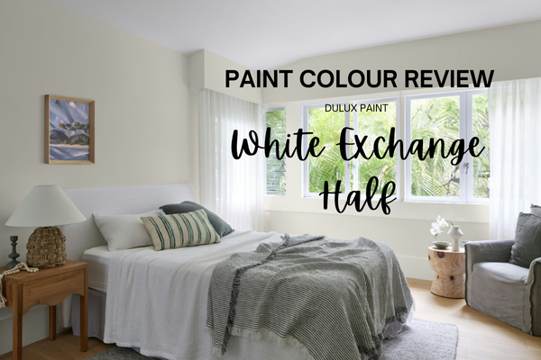
Paint Colour Review: White Exchange Half by Dulux
If you’ve ever stood in front of the paint wall at your local store, staring at what feels like fifty shades of white, you’ll know how overwhelming it can be. Some whites look stark and cold, others lean too yellow, and then there are the ones that somehow shift depending on the light. That’s exactly where I found myself when I first came across Dulux White Exchange Half.
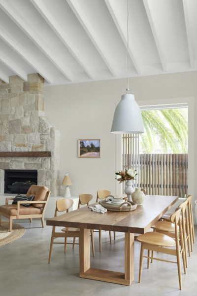
At first glance, it doesn’t scream “look at me!”, but that’s the beauty of it. White Exchange Half is one of those quietly dependable whites that bring a calm, inviting backdrop to a space without feeling flat or sterile. It has just enough warmth to feel soft and livable, but not so much that it clashes with greys or cooler tones.
In this post, I’ll share what makes White Exchange Half so popular (and why I often recommend it), including its undertones, how it reacts to light, what trim colours pair beautifully with it, and some coordinating hues that can help you pull together a whole-house palette. Think of this as your shortcut to knowing if White Exchange Half will work in your home.
What are the undertones of White Exchange Half?
White Exchange Half sits in that sweet spot between crisp and creamy. It’s technically a warm white, but its undertones are quite subtle and muted, which is part of the reason it’s so versatile. You won’t find it leaning overly yellow, peach, or golden like some warmer whites, but there is a soft greige base running through it that keeps it from feeling stark or clinical.
In certain lights, you might notice a gentle warmth that makes it feel cosy and inviting, perfect if you want a white that feels soft without looking too creamy. In cooler, shadowy light (think south-facing rooms in the southern hemisphere or north-facing in the northern hemisphere), those greige undertones can peek through a little more, giving it a muted, calm look.
This balance makes White Exchange Half a real chameleon: warm enough to pair with earthy tones, timber, and natural stone, yet neutral enough to sit comfortably alongside greys and cooler accents.
Watch out for: Because of its underlying beige/greige warmth, White Exchange Half can look a little muddy or dull if it’s paired directly with very crisp, icy whites or cool blue-based colours. In these situations, the contrast can bring out its warmer side more strongly, making it look creamier than you might expect. If your goal is a seamless “all-white” look, you’ll want to be careful about mixing it with ultra-bright whites.

What is White Exchange Half’s LRV?
LRV stands for Light Reflectance Value, which is just a fancy way of saying how much light a colour bounces around the room. On the scale, 0 is pure black (absorbs all light) and 100 is pure white (reflects all light). Dulux White Exchange Half sits in the mid-to-high range of the scale with an LRV of 77. It reflects a good amount of light, which means it will brighten up your space without feeling stark or blinding. Think of it as a soft, diffused glow rather than a sharp, crisp brightness.
Because of this, White Exchange Half works beautifully in spaces where you want a fresh, airy feel but still crave a little warmth and depth. It’s not the type of white that will wash out a room or make it feel sterile. Instead, it creates a gentle, inviting backdrop that makes other colours and textures like timber flooring, stone benchtops, or soft fabrics really shine.
If you have a darker room with limited natural light, White Exchange Half will help lift the space, though it won’t feel as stark as a true, bright white. And in sun-filled rooms, it holds onto its softness and warmth, and doesn’t glare, which is a big win.
How does it look in different lighting conditions?
Lighting plays a huge role in how White Exchange Half shows up, and its gentle beige/greige undertones mean it shifts depending on the time of day and the direction of light.
North-facing rooms in the Southern Hemisphere (countries like Australia and New Zealand) / South-facing rooms in the Northern Hemisphere (such as European countries): These rooms are sun-filled and bright throughout most of the day. In this kind of light, White Exchange Half shows its softer warmth without ever looking harsh or yellow. It feels fresh and glowing, the kind of white that makes a space feel open and inviting.
South-facing rooms in the Southern Hemisphere / North-facing rooms in the Northern Hemisphere: These spaces tend to have cooler, shadowy light. Here, White Exchange Half leans a little more into its greige undertone, giving it a softer, muted appearance. It won’t look icy, but it will feel calmer and more subdued compared to brighter rooms.
East-facing rooms: Mornings bring in warm, golden light, so White Exchange Half can look softer and warmer early in the day. As the sun shifts and the afternoon light turns cooler, it takes on a slightly more neutral, balanced tone.
West-facing rooms: These spaces get cooler, dimmer light in the mornings, so White Exchange Half may appear more neutral or even a touch grey early in the day. But by the afternoon, when the sun pours in with its golden warmth, the colour feels richer and cosier, with its beige undertones shining through.
Overall, White Exchange Half is beautifully adaptable. Its soft warmth makes it forgiving in cooler light, while in sunnier spaces it glows without ever tipping too creamy.
How does it look against similar colours?
When you’re choosing a white, it can be tricky to see the subtle differences until you compare them side by side. White Exchange Half sits in that warm-but-not-creamy family, and its character really shows up when you place it against other popular Dulux whites.
Compared to Vivid White
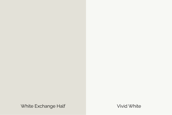
Vivid White is Dulux’s purest, cleanest white with no discernible undertone. Next to Vivid White, White Exchange Half looks noticeably warmer and softer, with its beige/greige undertones standing out more clearly. If you’re after a crisp, modern white, Vivid White wins, but for a more liveable, forgiving white, White Exchange Half feels much gentler.
Compared to Natural White
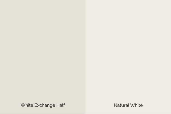
Natural White is another warm white, but it leans creamier and can sometimes bring in subtle yellow undertones. White Exchange Half feels more neutral and balanced in comparison, making it easier to pair with greys or cooler accents.
Compared to Lexicon Half

Lexicon Half is a cool white with a grey-blue base. Put it next to White Exchange Half and you’ll instantly see the warmth in White Exchange Half. Where Lexicon Half feels sharp and modern, White Exchange Half feels softer and more versatile.
Compared to Whisper White

Whisper White is a warm white that’s creamier and richer. By contrast, White Exchange Half looks lighter, fresher, and less creamy, which can make it the more flexible choice for larger spaces or modern homes.
Best white trim paint colours with White Exchange Half
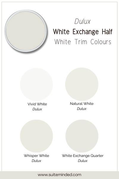
Choosing the right trim colour is just as important as the wall colour itself, it’s what makes the edges crisp, the doors pop, and the ceilings feel finished. With White Exchange Half, you’ve got a few great options depending on the look you’re going for:
Dulux Vivid White: If you want a clean, fresh contrast, pair White Exchange Half walls with Vivid White trim. The brightness of Vivid White sharpens up the edges and makes the softness of White Exchange Half stand out.
Dulux White Exchange Quarter: For a softer, more tonal look, consider using White Exchange Quarter on the trim. Because it’s the lighter version of the same colour family, it creates a seamless flow without a stark contrast.
Dulux Natural White: If you’d like to keep things warm but avoid too much creaminess, Natural White can be a great trim option. It gives a gentle warmth that still feels polished and versatile, particularly in homes with timber features or earthy tones.
Dulux Whisper White: For a richer, cosier vibe, Whisper White trim can frame White Exchange Half nicely. It leans a touch creamier, so it works beautifully in classic, traditional, or country-style homes where warmth is a feature, not a flaw.
Tip: If you’re painting ceilings, Vivid White is usually the safest choice. It keeps the ceiling feeling bright and open, even if your trims are slightly warmer.
What about coordinating hues?

One of the reasons White Exchange Half is such a popular choice is how easily it works with other colours. Its soft warmth and subtle greige undertones make it flexible enough to team with both warm and cool palettes. Here are some beautiful coordinating options:
Soft neutrals: Pair White Exchange Half with Dulux Hog Bristle or Dulux Sandy Day for a warm, layered neutral scheme. These shades sit comfortably alongside its undertones and create a relaxed, natural flow through your home.
Earthy tones: Colours like Dulux Beige Royal bring depth and richness, balancing White Exchange Half’s softness with grounded warmth. Perfect if you’re leaning into organic textures like timber, rattan, or natural stone.
Greys & greiges: To keep things calm and modern, try Dulux Dieskau or Dulux Silkwort. These cooler neutrals highlight the warmth in White Exchange Half without clashing, creating a balanced palette that feels timeless.
Accent colours: For a pop of personality, pair it with muted greens like Dulux Pale Moss or navy tones like Dulux Deep Ocean. These accents add contrast and sophistication without overwhelming the soft backdrop of White Exchange Half.
Pro tip: White Exchange Half really comes to life when layered with natural materials; think oak floors, linen upholstery, jute rugs, or stone benchtops. The softness of the colour lets these textures shine.
———————
If you’re searching for a white that feels calm, soft, and versatile, Dulux White Exchange Half is a standout choice. It’s warm without being too creamy, neutral without feeling cold, and adaptable enough to suit both modern and traditional homes. Whether you use it across your walls, pair it with bright trims, or layer it with earthy tones, it creates a backdrop that feels welcoming and timeless.
If you’d like more help pulling your whole home together, I’ve created ready-made whole-house colour palettes featuring expertly matched paint combinations. You can also explore my services for custom recommendations, or dive into my step-by-step Home Paint Colour Blueprint, which takes the guesswork out of creating a cohesive colour scheme.
Your dream home really can start with the right white, and White Exchange Half might just be it.
Thank you for reading, and happy painting.
Manon xx