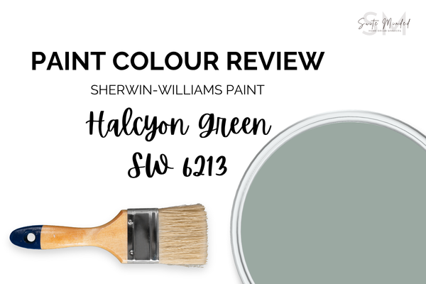
Halcyon Green SW 6213 by Sherwin-Williams - Paint Colour Review
Choosing the right green for your home can feel surprisingly tricky. Some greens lean too grey, others feel too bright, and a few can shift completely depending on the light in your space. If you’ve ever fallen in love with a green paint colour in-store… only to question it once it’s on your walls, you’re definitely not alone.
Halcyon Green SW 6213 by Sherwin-Williams has become such a go-to, relaxing green tone. It sits right in that sweet spot - soft, calming, and versatile, without feeling flat or overly muted. It has just enough depth to add interest, while still feeling easy to live with day-to-day.
In this review, I’ll walk you through exactly what makes Halcyon Green work (and when it doesn’t), including its undertones, how it behaves in different lighting, its LRV, and the best ways to pair it with other colours in your home.
What are the undertones of Halcyon Green?
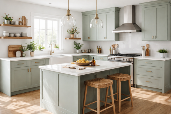
Kitchen cabinets with Halcyon Green
At its core, Halcyon Green is a soft green with noticeable blue undertones. That subtle hint of blue is what gives it that calm, slightly coastal feel, rather than a warm or earthy green. That said, it’s not a bold blue-green either. The undertones are gentle, softly muted by a touch of grey, which means the colour can shift depending on your lighting and surroundings. In some spaces, it will read more green; in others, you might notice that soft blue coming through a little more.
This balance is exactly what makes it so versatile, but it’s also why sampling is key. The undertones will interact with your flooring, furniture, and natural light in a way that’s unique to your home.
What is Halcyon Green’s LRV?
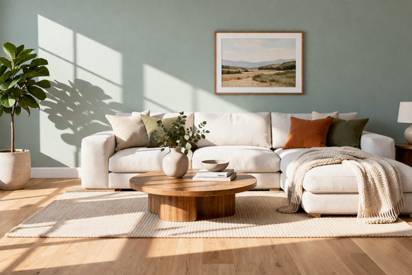
Living room with Halcyon Green walls
LRV stands for Light Reflectance Value. It simply tells you how much light a colour reflects, on a scale from 0 to 100 - 0 absorbing all light (pure black) and 100 reflecting all light (pure white). Halcyon Green has an LRV of 39, which puts it right in the mid-to-low end of the range: not too light, yet not too dark.
In brighter rooms, it can feel soft and slightly airy. In lower light, it deepens and becomes more cocooning. That balance is what makes it so easy to use - it adds depth without feeling heavy or overwhelming.
How does Halcyon Green look in different lighting conditions?
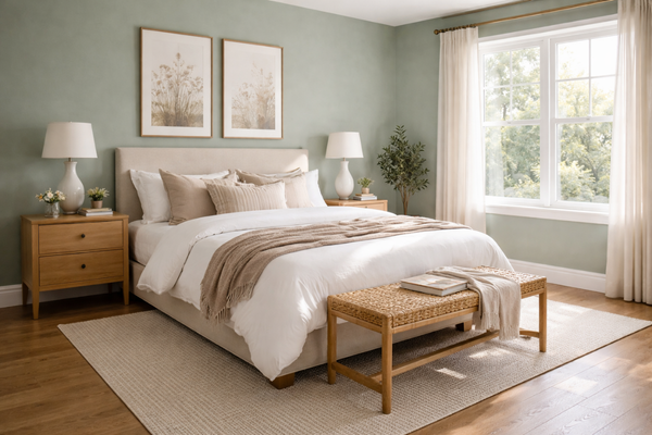
Bedroom with Halcyon Green walls
Lighting is where Halcyon Green really starts to shift.
In north-facing rooms, where the light is cooler and a bit more muted, you’ll likely see more of its blue undertones come through. The colour can feel slightly moodier and more subdued here, but still very calm and sophisticated.
In south-facing rooms, with warmer and more consistent natural light, it softens beautifully. This is where it reads more like a true, gentle green and feels lighter and more relaxed overall.
East-facing rooms tend to bring out a fresher, slightly brighter version of the colour in the morning, while west-facing spaces can make it feel a touch deeper and warmer later in the day.
Because it sits right in that balanced mid-range, Halcyon Green adapts well, but it will never look exactly the same from one room to another. That’s not a flaw, it’s part of its charm… as long as you’ve tested it in your own space first.
Where to best use Halcyon Green
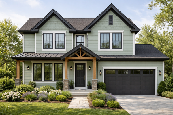
House exterior with Halcyon Green and deep charcoal accents
Because of its balanced depth and soft undertones, Halcyon Green works beautifully in a variety of spaces. It’s a great choice for bedrooms if you want something calming without going too light, and it also works really well in living rooms where you want a bit of colour that still feels easy to live with.
On cabinetry, especially in kitchens or bathrooms, it adds just enough depth and interest without feeling too bold or trendy. It also makes a lovely option for a home office if you’re after a grounded, focused feel.
It can also work beautifully on exteriors, especially when paired with crisp whites or warm neutrals, for a soft, timeless look that doesn’t feel too stark.
Best white trim colours
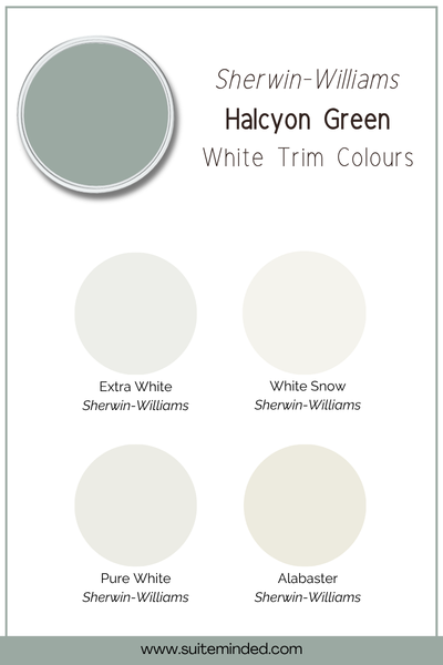
When pairing Halcyon Green with white trim, the key is to choose a white that complements its soft, slightly muted undertones.
Pure White SW 7005 is a great option. It’s bright without feeling stark, and it keeps the overall palette fresh and balanced.
Alabaster SW 7008 works beautifully with its subtle warmth, helping take the edge off and creating a more relaxed, cohesive feel.
White Snow SW 9541 is another great choice as it sits nicely between crisp and soft, without clashing with the cooler undertones.
Extra White SW 7006 can work well, especially in modern spaces, though it will feel a bit crisper against Halcyon Green.
Best coordinating tones
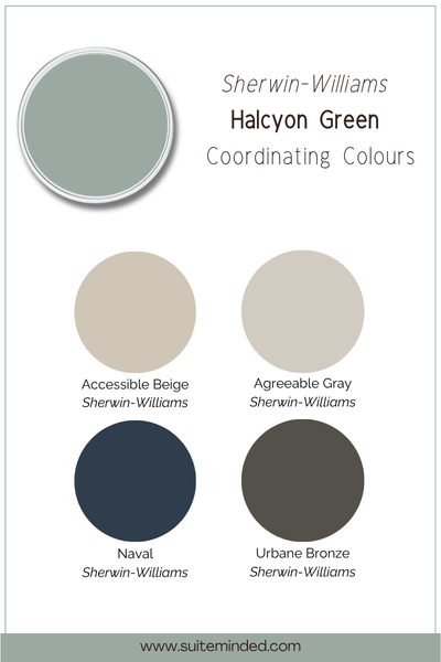
When it comes to coordinating colours, Halcyon Green is surprisingly flexible, as long as you work with its soft, slightly muted undertones.
For a light and airy look, pair it with warm whites and soft neutrals like Alabaster SW 7008 or Shoji White SW 7042. This keeps the palette feeling calm, cohesive, and easy to live with.
If you want a bit more depth, it works beautifully alongside greiges, tans, and muted beiges like Accessible Beige SW 7036. These tones add warmth and balance without competing with the green.
For contrast, deeper shades like Urbane Bronze SW 7048 or even a soft navy or teal can ground the space and create a more layered, designer feel.
And if you want to lean into that fresh, slightly coastal vibe, pairing it with muted blue-greens or dusty blues can create a really soft, tonal look that feels both relaxed and elevated.
————————————
Overall, Halcyon Green is one of those colours that just works. It’s soft, calming, and versatile, with enough depth to add interest without making a space feel heavy.
That said, like any paint colour, it really comes down to how it interacts with your specific space - your lighting, your flooring, and the other finishes in your home. That’s where the difference between “liking a colour” and truly loving it comes in.
If you’re feeling unsure about how to pair it or build a full palette around it, that’s exactly what my curated colour palettes are designed to help with - taking the guesswork out and showing you exactly what works together, room by room.
Thank you for reading, and happy painting!