What Is LRV in Paint Colours (And Why Does It Matter?)
If you’ve ever looked at a paint colour description and noticed a number called LRV, you might have wondered what it actually means… and whether it even matters when choosing paint colours for your home.
The short answer? Yes, it matters a lot more than most people realise.
LRV can completely change how a paint colour feels in a space. It affects how light or dark a room looks, how colours behave throughout the day, and even how cohesive your home feels overall.
But don’t worry, it’s actually much simpler than it sounds.
What does LRV mean?
LRV stands for Light Reflectance Value. It’s a measurement used to show how much light a paint colour reflects versus absorbs. The scale goes from 0 to 100:
0 = absolute black (absorbs almost all light)
100 = pure white (reflects almost all light)
So, the higher the LRV, the lighter and brighter the colour tends to appear. The lower the LRV, the deeper and moodier the colour will usually feel. For example:
A soft white might have an LRV around 85
A warm greige may sit around 60
A deep charcoal could be closer to 10
Why LRV matters in real homes
This is where things get important.
A paint colour never looks exactly the same from one home to another because every space has different lighting conditions. That’s why two people can use the exact same paint colour and end up with completely different results.
LRV helps you predict how a colour may behave in your space before you commit to painting.
Higher LRV colours
Colours with a higher LRV tend to:
Reflect more natural and artificial light
Feel brighter and more open
Work well in darker rooms
Help small spaces feel larger
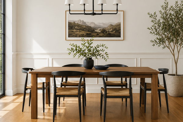
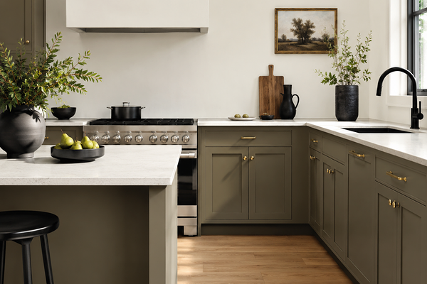
These colours are often popular for hallways, open-plan spaces, rooms with limited natural light, and whole-house base neutrals.
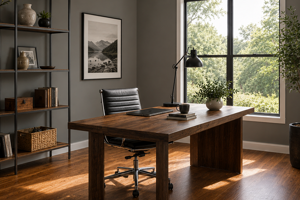
Lower LRV colours
Colours with a lower LRV absorb more light, which can make them feel:
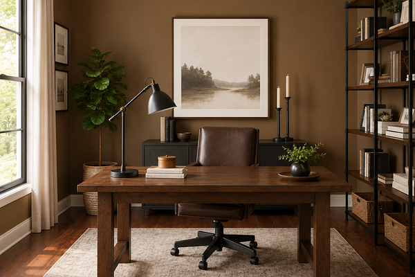
Richer
Moodier
Softer
More grounded
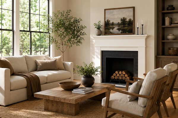
These colours can work beautifully in bedrooms, powder rooms, dining rooms, or spaces where you want more depth and cosiness.
LRV doesn’t tell you everything
This part is important.
LRV tells you how light or dark a colour is, but it does not tell you the undertones. Two paint colours can have almost the exact same LRV and still look completely different because of their undertones.
For example:
One greige may lean warm and beige
Another may lean cool and slightly purple
That’s why LRV should always be used alongside undertones, lighting, flooring, fixed finishes, and the overall feeling you want in your home.
Why paint colours sometimes look “wrong”
A lot of paint colour mistakes actually come down to lighting and LRV. For example:
A colour with a low LRV in a dark room may suddenly feel much heavier than expected
A very high LRV white in harsh sunlight may feel stark or washed out
Mid-range colours can shift dramatically depending on the direction your room faces
This is also why sampling paint colours in your own home is so important.
My advice when choosing paint colours
Instead of focusing only on whether a colour is “warm” or “cool,” pay attention to how light or dark the colour actually is as well. LRV can help you create better balance throughout your home and avoid rooms feeling unexpectedly too dark, too bright, or disconnected from one another.
It’s not about finding the “perfect” number. It’s about understanding how light interacts with colour inside your space.
And once you start paying attention to LRV, paint colours begin making a lot more sense.
Final thoughts
LRV may sound technical at first, but it’s really just a tool that helps you better understand how paint colours behave in real life.
Because choosing paint colours isn’t just about picking a colour you like, it’s about understanding how that colour will actually live inside your home.
As always, I highly recommend testing samples in your own home before committing, as lighting, surrounding finishes, and fixed elements can also influence how a paint colour appears.
If you’d like more help, you can explore my ready-made colour palettes, my Confident Home Colour Blueprint, or my custom colour consultation services designed to help take the stress and guesswork out of choosing paint colours for your home.
Thank you for reading, and happy painting!
Manon xx