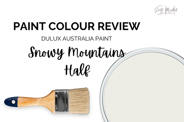
Snowy Mountains Half by Dulux Australia - Paint Colour Review
If you’ve been searching for a soft white paint colour that’s rather neutral - slightly warm without looking too creamy and softly muted without appearing overly cool, Snowy Mountains Half by Dulux might be worth considering. It’s one of those versatile whites that can shift beautifully throughout the day, depending on your lighting, surrounding finishes, and the overall feel you want to create in your home.
In this review, we’ll look at Snowy Mountains Half’s tones and undertones, LRV, how it behaves in different lighting conditions, the best trim colours and coordinating tones, along with the materials and finishes that pair best with it.
What are the undertones of Snowy Mountains Half?
Snowy Mountains Half is a soft white paint colour with a fairly neutral appearance overall, though it carries a subtle warmth that stops it from feeling cold or stark. One of the things that makes this colour feel particularly soft and calming is its slightly muted quality, along with a very gentle hint of green undertone in certain lighting conditions.
That subtle green influence helps balance the warmth and gives the colour a more natural, grounded feel compared to creamy whites that can lean too yellow. It’s not overtly green by any means, but it does contribute to the softness and quiet depth of the colour.
What is Snow Mountains Half’s LRV?
Snowy Mountains Half has an LRV (Light Reflectance Value) of 86, which means it reflects a large amount of light back into a space. This places it firmly within the white category, though its subtle softness prevents it from feeling overly bright or clinical.
Because of its high LRV, Snowy Mountains Half can help rooms feel lighter, airier, and more open, especially in spaces with limited natural light. At the same time, its slightly muted undertones give it a more relaxed and understated look compared to crisp, cleaner whites.
Its balance between brightness and softness is one of the reasons it works so well as a whole-home white, particularly in homes aiming for a calm, natural, or timeless feel.
How does Snowy Mountains Half look in different lighting conditions?
Like most white paint colours, Snowy Mountains Half can shift throughout the day depending on the amount and direction of natural light it receives. While it generally maintains a soft and balanced appearance, lighting can influence colours, and most importantly, how much warmth or softness comes through.
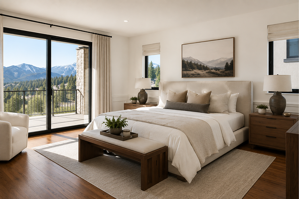
In north-facing rooms, the colour often appears slightly softer, with its subtle creamy warmth becoming more noticeable. The natural daylight helps prevent it from feeling dull while still maintaining a calm and relaxed look.
In south-facing rooms, Snowy Mountains Half tends to look a little more muted and neutral. The cooler light can bring out the soft grey-green influence in the colour slightly more, though it still remains gentle and inviting rather than cold.
East-facing rooms usually bring out the warm softness of the colour in the morning, while west-facing rooms can make it appear warmer and creamier later in the afternoon as the sun becomes richer and more golden.
Best material pairings with Snowy Mountains Half
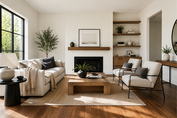
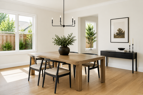
Snowy Mountains Half pairs beautifully with natural and organic materials thanks to its soft, slightly muted appearance. Its subtle warmth and gentle green undertone allow it to work particularly well with finishes that feel calm, earthy, and understated rather than overly crisp or high contrast.
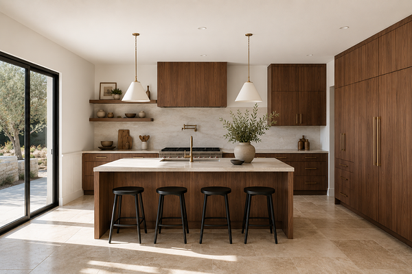
For flooring, this colour works especially well with light to medium oak, warm walnut, natural timber tones, and softer European oak finishes. It can also pair nicely with limewashed woods and slightly weathered textures for a more relaxed feel.
In kitchens and bathrooms, Snowy Mountains Half complements materials like creamy marble, soft white quartz, travertine, limestone, zellige tiles, and warmer concrete finishes.
For metals, brushed nickel, aged brass, champagne bronze, and soft black finishes all work beautifully, depending on the overall style of the home. Its balanced undertones make it versatile enough to suit both warmer and slightly cooler hardware finishes.
If you love Snowy Mountains Half and want to take the guesswork out of pairing it with the rest of your home, I've done the work for you.
My ready-made Snowy Mountains Half Whole-House Colour Palette gives you a complete, cohesive set of colours — walls, trim, accents, and more — all hand-picked to work beautifully with this shade. No more second-guessing, no more paint chip overwhelm. Just a clear, confident direction for your home.
Best trim colours with Snowy Mountains Half
Because Snowy Mountains Half already has a high LRV of 86, I generally recommend either using Snowy Mountains Half itself on trims and woodwork or pairing it with a brighter, cleaner white with a slightly higher LRV for subtle contrast. Using the same colour across walls, trims, and doors can create a very soft, calm, and cohesive look, particularly in homes aiming for a relaxed or minimalist feel.
If you prefer a crisper contrast, Dulux Vivid White is one of the safer options to pair with Snowy Mountains Half. It feels brighter and cleaner without being overly icy, helping maintain the softness of the wall colour.
Personally, I would avoid cooler blue-based whites like Lexicon Quarter alongside Snowy Mountains Half. While Lexicon Quarter is brighter, its cooler undertones can sometimes make Snowy Mountains Half appear greener or slightly duller by comparison, especially in cooler lighting conditions.
What about coordinating tones?
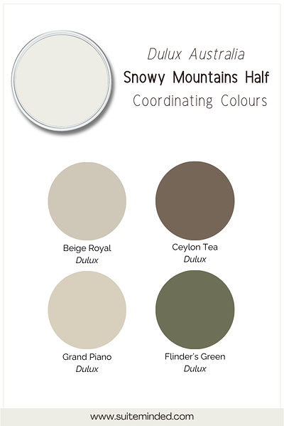
Snowy Mountains Half works particularly well alongside tones that feel natural, earthy, and slightly softened rather than overly bright or heavily saturated.
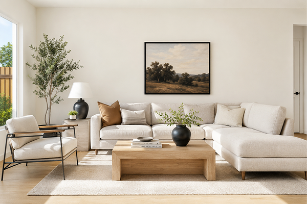
For a calm and tonal palette, Snowy Mountains Half coordinates beautifully with warm greiges, soft beiges, and gentle mushroom tones. Colours with a similar softness help maintain a cohesive and relaxed flow throughout the home.
If you want to introduce a little more depth, deeper earthy tones like olive green, muted charcoal, or warm browns can create beautiful contrasts while still feeling balanced and grounded.
Snowy Mountains Half also pairs particularly well with muted greens and blue-greens thanks to its subtle green undertone.
Final thoughts on Snowy Mountains Half
If you’re looking for a white paint colour that feels soft, balanced, and quietly warm without leaning overly creamy, Snowy Mountains Half can be a beautiful option. Its subtle muted quality and gentle undertones make it especially versatile for creating calm and cohesive interiors that still feel bright and fresh.
As always, I highly recommend testing samples in your own home before committing, as lighting, surrounding finishes, and fixed elements can all influence how a paint colour appears.
If you’d like more help creating a cohesive palette around Snowy Mountains Half, you can explore my ready-made colour palettes, my Confident Home Colour Blueprint, and custom colour consultation services designed to help take the stress and guesswork out of choosing paint colours for your home.
Thank you for reading and happy painting!
Manon xx