The Best Sherwin-Williams Paint Colours for North-Facing Rooms
If you’ve ever tested a paint colour that looked soft and beautiful online, only for it to suddenly look cold, flat, or unexpectedly grey in your home, north-facing light is often the reason why. Cool undertones become stronger, while some warm colours can lose a bit of their softness.
But that doesn’t mean north-facing rooms are impossible to decorate. In fact, with the right paint colour, they can feel incredibly calm, cozy, layered, and inviting. The key is choosing colours that work with the light instead of fighting against it.
In this guide, I’ll walk you through some of my faourite Sherwin-Williams paint colours for north-facing rooms, including warm whites, soft greiges, earthy neutrals, and muted greens that still feel beautiful in cooler light.
Understanding north-facing light
North-facing light tends to feel cooler and more shadowed throughout the day compared to south-facing rooms, which usually receive warm golden sunlight. This cooler light can make paint colours:
look slightly more muted
pull cooler undertones forward
feel flatter or more grey
This is especially noticeable with cool greys, stark whites, icy blue undertones, or violet undertones.
That’s why warm neutrals and softly balanced colours tend to work best in north-facing spaces. They help bring warmth and softness back into the room without feeling overly yellow or heavy.
That said, north-facing rooms can also be incredibly calming. The light is more consistent throughout the day, which often creates a softer and more peaceful atmosphere when paired with the right colours.
What paint colours usually work best in north-facing rooms?
In general, north-facing rooms tend to respond best to warm whites and creamy off-whites, soft greiges, earthy neutrals, muted greens, or warm taupes.
These colours help balance the cooler natural light and prevent the space from feeling too cold or sterile.
That doesn’t mean you can never use cooler colours in a north-facing room. You absolutely can. It just requires a little more intention with undertones, lighting, and surrounding finishes.
The best Sherwin-Williams paint colours for north-facing rooms
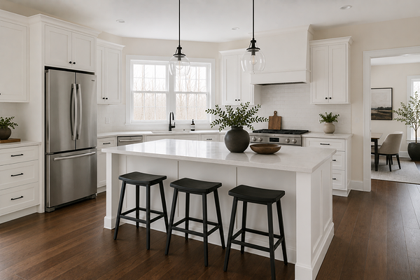
Alabaster SW 7008
Alabaster is one of my favourite whites for north-facing rooms because it has a soft warmth without feeling overly creamy or yellow. In cooler light, it still manages to feel inviting and gentle, which is why it works so beautifully in these spaces to help soften the coolness instead of amplifying it.
Alabaster works especially well if you want a white paint colour that feels warm and relaxed rather than crisp and stark. It is best paired with:
warm woods
soft black accents
natural linen textures
warm brass finishes
Greek Villa SW 7551
Greek Villa is another beautiful option for north-facing rooms, especially if you want something bright but still soft. Compared to cooler whites, Greek Villa has a creamy warmth that prevents it from feeling sterile in shadowed spaces. In north-facing light, it usually reads as a soft, warm white instead of yellow.
This colour works particularly well in homes with:
warm flooring
travertine or beige stone
earthy finishes
If you love light and airy interiors but want to avoid a cold or icy feeling, Greek Villa is a very safe choice.
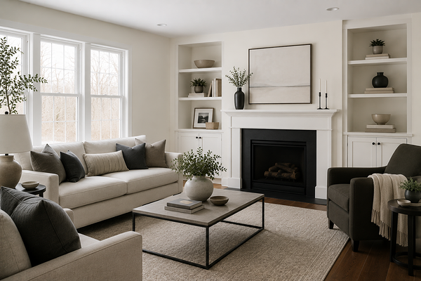
Shoji White SW 7042
Shoji White is one of those colours that almost always feels calm and comforting. It’s a warm off-white with soft greige undertones that help north-facing rooms feel grounded and cozy. In cooler light, Shoji White tends to hold onto its warmth beautifully without becoming too creamy.
This colour is especially nice if:
your room lacks natural warmth
you want a softer alternative to white
you prefer organic, earthy interiors
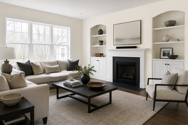
Accessible Beige SW 7036
Accessible Beige is one of the most reliable warm neutrals for north-facing rooms. It’s a slightly muted beige with enough warmth to prevent cooler light from making it feel flat or overly grey. In north-facing rooms, it usually feels soft, balanced, and grounded. It’s a great option if you want warmth without committing to a very beige palette.
This colour works especially well in living rooms, hallways, open-plan homes, and homes with warm wood flooring.
Agreeable Gray SW 7029
Agreeable Gray can work beautifully in north-facing rooms, but lighting becomes very important here. Because north-facing light naturally enhances cool undertones, Agreeable Gray may appear slightly more muted or cooler than expected in darker spaces. However, in rooms with decent natural light, it often still feels soft and balanced.
I especially like it in homes where you want:
a neutral backdrop
a slightly more modern feel
flexibility with furnishings and decor
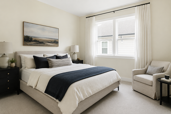
Natural Linen SW 9109

Natural Linen is one of the warmest neutrals on this list, and it can look incredibly beautiful in north-facing spaces. The soft beige warmth helps counteract cooler light and creates a cozy, layered atmosphere without feeling too dark. If your north-facing room tends to feel cold or shadowed, Natural Linen can add a lot of softness and warmth back into the space.
It works especially well with:
creamy trim colours
medium wood tones
earthy decor palettes
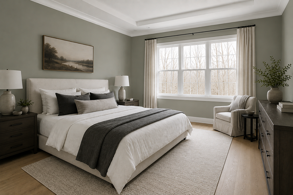
Sea Salt SW 6204
Sea Salt is one of the few cooler-toned colours that often still works beautifully in north-facing rooms. Because it’s muted and softly balanced with green and grey undertones, it tends to feel calming rather than icy. In north-facing light, Sea Salt usually appears slightly more subdued and moody, which many people actually love.
This colour works particularly well in bedrooms, bathrooms, laundry rooms, and coastal-inspired interiors.
The key with Sea Salt is pairing it with warmer surrounding elements so the space still feels balanced overall.
Evergreen Fog SW 9130
Evergreen Fog can look incredibly sophisticated in north-facing rooms. The soft green-grey undertones create depth and moodiness without making the room feel too cold. North-facing light often enhances the earthy side of this colour, which helps it feel grounded and calming.
If you want something slightly moodier while still feeling soft and organic, Evergreen Fog can be a beautiful option.
I especially love it paired with:
brushed brass
creamy whites
textured natural fabrics
Paint colours to be careful with in north-facing rooms
Some paint colours can become noticeably cooler in north-facing light, especially if the room already lacks natural brightness. Colours that can sometimes feel trickier include:
stark bright whites
icy blue-greys
cool-toned greys
colours with violet undertones
That doesn’t mean these colours can never work. It just means they usually require more careful testing before committing to them. If you’re unsure, always test large samples directly in your space before painting an entire room.
Final thoughts
North-facing rooms aren’t impossible to decorate. They simply require a little more intention when choosing paint colours. The right paint colour can help balance cool natural light, soften shadows, and create a room that feels warm, calming, and cohesive instead of cold or flat.
In most north-facing spaces, I find that warm whites, soft greiges, earthy neutrals, and muted greens tend to work the most beautifully because they bring warmth and softness back into the room while still feeling timeless and versatile.
If you'd like help choosing paint colours for your home, I have a few ways I can support you:
→ Whole-House Palettes — ready-made colour schemes, so you know exactly what works from room to room.
→ The Paint Colour Blueprint — my step-by-step guide to choosing colours that work together beautifully, without the overwhelm.
→ Custom Colour Consults — if you'd like personalised help for your specific home and lighting.
Happy painting! Manon xx