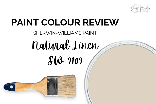
Natural Linen SW 9109 by Sherwin-Williams - Paint Colour Review
You’re looking for a warm neutral beige, but everything ends up looking either too warm, too orange, or a bit off once on the wall? That’s usually when I reach for Sherwin-Williams Natural Linen SW 9109.
It’s soft, warm, and perfectly balanced between beige and greige, without tipping too far in either direction. It adds warmth without heaviness, which makes it such a safe, calming choice for so many homes.
I come back to this one a lot because it adapts well to different lighting and always feels cohesive. In this guide, I’ll walk you through exactly how it behaves - from undertones and LRV to the best white trims and coordinating colours, so you can use it with confidence in your own home.
Not to be mistaken with Benjamin Moore Natural Linen
What are Natural Linen’s undertones?
Undertone-wise, Natural Linen sits in that soft, warm neutral space. It’s a beige colour with an orange base, a hint of yellow, and slightly muted by grey undertones to avoid it tipping into the overly warm category.
It’s not a “tricky” colour, but like most warm neutrals, it will pick up on what’s around it. Pair it with creamy whites and warm finishes, and it feels soft and inviting. Put it next to cooler or crisper tones, and that warmth becomes more noticeable.
Natural Linen’s LRV
LRV (Light Reflectance Value) simply measures how much light a colour reflects - 100 is pure white and reflects all light; 0 is pure black and absorbs all light.
With an LRV of 66, Natural Linen sits comfortably in the light–medium range. It reflects a good amount of light without feeling washed out in bright settings, which is why it works so well as a whole-home neutral. It has enough depth and colour to hold itself on the walls, but it still keeps spaces feeling bright and open.
In simple terms, it won’t feel stark or overly crisp like lighter neutrals or off-whites can; instead, you’ll get a soft, warm glow that makes a room feel calm and inviting.
How does Natural Linen look in different lighting conditions?
When it comes to lighting, Natural Linen is pretty adaptable, but you’ll still notice some subtle shifts.
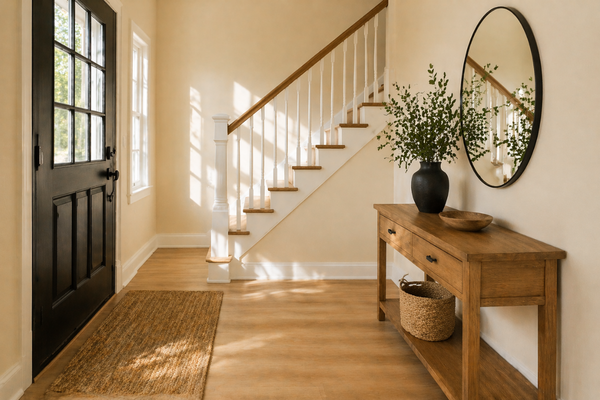
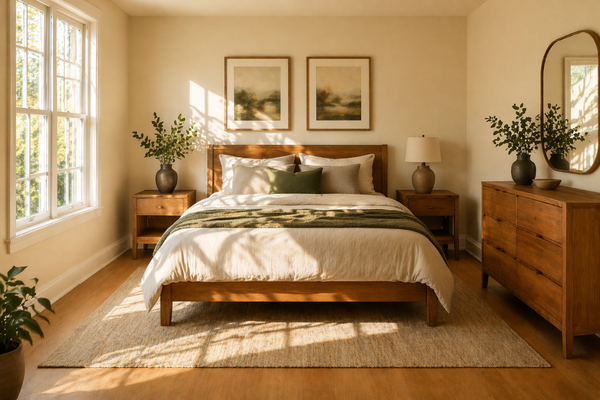
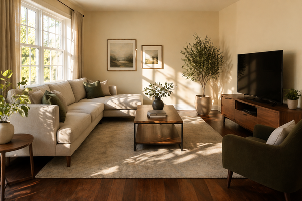
In bright, direct light, its warmth comes through a little more. You might see those soft golden-beige tones more, especially in the middle of the day when the light is brightest. It feels warm and sunlit without turning too yellow or orange.
In softer, indirect light, it quiets down and leans more muted, almost slightly greige. This is where it feels the most calm and balanced. I love using Natural Linen in those settings as its tones help balance the cooler light and bring a needed warmth into the space without going overboard.
And under cooler light (like overcast days or cooler bulbs), that warmth softens even further, while warmer artificial lighting will enhance its cosy, creamy side.
Best material pairings with Natural Linen
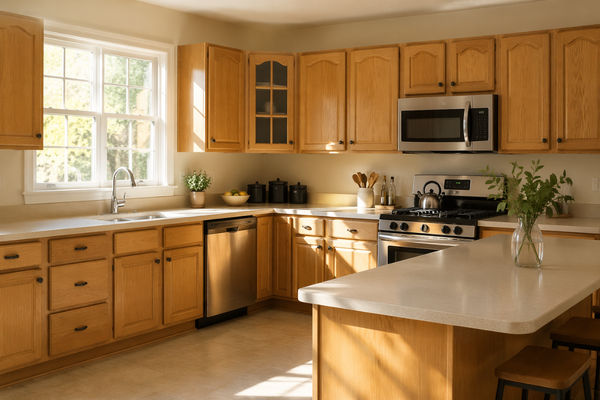
When choosing materials, Natural Linen really shines with anything warm and natural. It pairs beautifully with light to medium woods (think oak, walnut, even honey tones), and it also works really well with warm stone like travertine or creamy marbles. These combinations enhance its softness and keep everything feeling cohesive.
For hardware, I’d lean into warmer finishes like brass, champagne bronze, or even matte black for a bit of contrast. The key is to stay on the warmer side - that’s where Natural Linen feels its best.
Best white trim pairings
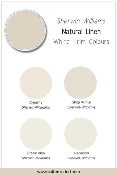
Natural Linen looks best with softer, warmer whites rather than anything too crisp or stark. If you go too bright or cool, the contrast can feel a bit harsh and can make this beige look warmer than it actually is. Softer whites, on the other hand, keep everything feeling smooth and cohesive.
A few of my go-to options:
Alabaster SW 7008: soft, creamy, and very forgiving.
Greek Villa SW 7551: warm but slightly brighter, great if you still want a bit of contrast.
Shoji White SW 7042: a beautiful bridge between white and greige.
Creamy SW 7012: richer and warmer, perfect for a more classic, gently layered look.
All of these will complement Natural Linen without competing with it, and help create that soft, layered feel throughout the space.
Best coordinating tones
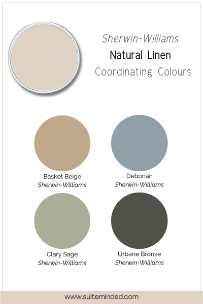
When it comes to coordinating colours, Natural Linen is really easy to work with because it sits right in that soft, warm neutral zone.
It pairs beautifully with other warm neutrals - think creamy whites, darker beiges, and gentle taupes - for a layered, tonal look that feels calm and cohesive.
If you want a bit more contrast, muted greens and dusty blues work really well. They balance out the warmth without clashing, especially those softer, slightly greyed-out tones rather than anything too saturated or crisp.
And for depth, deeper warm browns or even charcoal accents can ground the space and add a bit of structure without taking away from that relaxed, inviting feel.
——————
If you’re looking for a warm neutral that feels soft, balanced, and easy to live with, Natural Linen SW 9109 is one of those colours that rarely disappoints. It brings warmth without heaviness, adapts beautifully, and works with a wide range of finishes and tones. Make sure to always sample your colours properly before committing!
If you’re still unsure how to use it in your own home, or what to pair it with, that’s exactly what I can help you with.
Not sure what to do next?
Want done-for-you colour combinations? → Browse whole-house palettes
Want a full plan for your home? → Get the Blueprint
Want personalised help tailored to your space? → Work with me
Need a bit of reassurance before committing? → Get my Quick Colour Fix
Thank you for reading, and happy decorating!
Manon xx