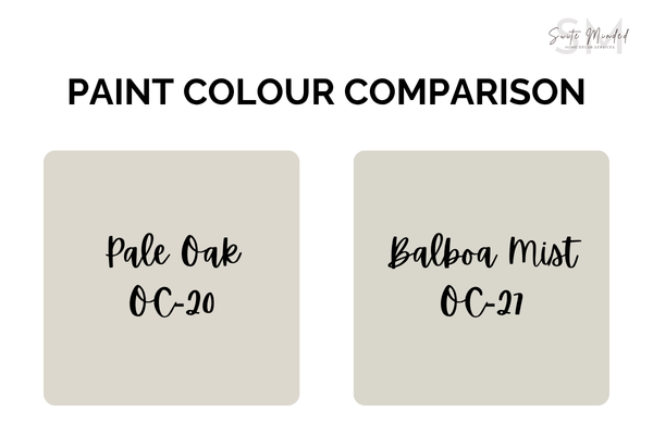
Pale Oak OC-20 vs Balboa Mist OC-27 - Which Greige Should You Choose?
Benjamin Moore Pale Oak and Balboa Mist are some of the most loved soft neutrals out there. At first glance, they can look almost identical, but once you start sampling them at home, that’s when the confusion kicks in.
I’ve had many clients go back and forth between the two, wondering why one suddenly looks warmer, cooler, or just… off. The truth is, while they sit in the same family, they behave quite differently depending on your lighting, finishes, and overall palette.
So in this post, I’ll walk you through exactly how Pale Oak and Balboa Mist compare, what sets them apart, how they show up in real spaces, and which one might actually work best for your home.
Pale Oak OC-20 Overview
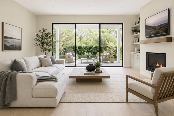
Living room with BM Pale Oak walls
Pale Oak is a soft, light greige with a subtle taupe undertone and a gentle warmth that keeps it feeling inviting rather than cold or flat. It’s slightly muted, but there’s also a hint of softness underneath that can lean slightly pink or violet in certain lighting conditions. Nothing overwhelming, but just enough to give it that “lived-in”, cosy feel.
With an LRV of around 68, Pale Oak sits firmly in the light range, which means it reflects a good amount of light and can almost read like a warm off-white in brighter spaces. In lower or softer light, though, you’ll start to see more of its greige depth come through, which is where it really shows its personality. What I love about Pale Oak is how adaptable it is. It can feel soft and airy in bright, natural light, and slightly warmer and cocooning in dimmer spaces.
It’s the kind of colour that doesn’t shout for attention. Still, it quietly ties everything together, making it a really reliable whole-home neutral if you want something calm, cohesive, and timeless.
→ Explore the ready-made whole-house palette around BM Pale Oak
Balboa Mist OC-27 - Overview
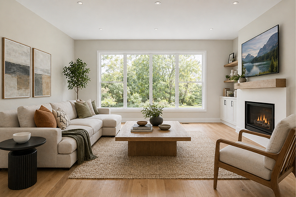
Living room with BM Balboa Mist walls
Balboa Mist sits in that same soft greige family, but with a slightly more refined feel compared to Pale Oak. It’s also a light greige with soft violet undertones that can show up as a subtle pinky or taupe shift depending on the light. This is what gives it that slightly crisper, more modern look.
With an LRV around 65–67, it’s still light and bright, but just a touch deeper. In bright light, it can feel fresh and barely there, while in lower light, you’ll notice more of its soft grey depth.
Balboa Mist tends to read a bit cleaner and more understated overall. It’s still warm enough to feel comfortable, but compared to Pale Oak, it gives you a slightly more tailored, neutral backdrop, especially in spaces where you don’t want too much warmth coming through.
→ Explore the ready-made whole-house palette around BM Balboa Mist
Key differences between Pale Oak and Balboa Mist
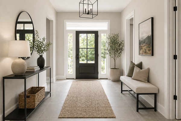
Entryway with BM Balboa Mist walls
At first glance, Pale Oak and Balboa Mist can look incredibly similar, but once you start paying attention, a few key differences really stand out.
Warmth vs coolness:This is the biggest one. Pale Oak leans warmer, with a soft, beige-taupe base that gives it a more relaxed, cozy feel. Balboa Mist, on the other hand, leans slightly cooler, with more grey coming through. It still has warmth, but it feels more subtle and restrained.
Undertones: Pale Oak has warmer undertones, with that faint pink/violet hint that shows up mostly in certain lighting. Balboa Mist also has violet undertones, but because the base is more grey, they tend to read a bit cooler and sometimes slightly more noticeable.
Overall look and feel:Pale Oak feels softer and more lived-in. It has that cozy, almost creamy quality that works beautifully in relaxed, warm-toned homes. Balboa Mist feels cleaner and more tailored. It’s a bit more refined and slightly more modern in the way it reads on the walls.
Light Reflection (LRV):Both are light colours, but Pale Oak (LRV ~68) is just a touch brighter than Balboa Mist (LRV ~65–67). In practice, this means Pale Oak can feel a little more airy, while Balboa Mist has a tiny bit more depth.
How they react to lighting: Pale Oak tends to warm up in lower or softer light, which can make it feel more beige. Balboa Mist tends to shift more grey in cooler or indirect light, and that’s where you’ll see its slightly cooler personality come through.
Which one should you choose?
The best choice really comes down to the look you’re going for and how your space behaves, especially your lighting and finishes. Here’s how I’d think about it:
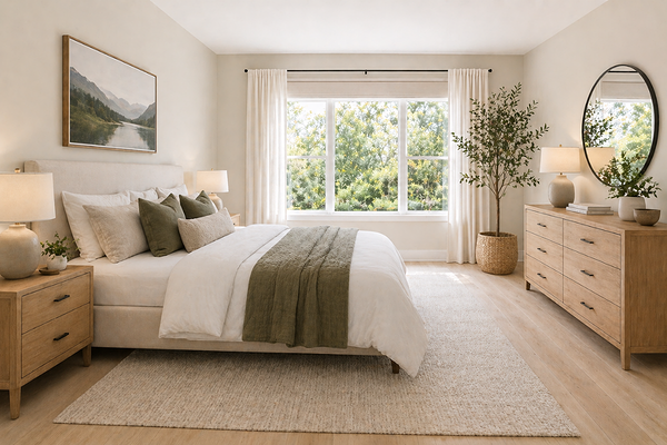
Bedroom with BM Pale Oak walls
Choose Pale Oak if…
You want a warmer, softer, more relaxed feel
Your home has warm elements (timber floors, beige tones, warmer stone)
Your space needs a bit more warmth and coziness
You like that slightly creamy, lived-in look
You don’t mind a subtle pink/violet undertone in certain lighting

Bedroom with BM Balboa Mist walls
Choose Balboa Mist if…
You prefer a cleaner, more neutral, slightly modern look
You have cooler or neutral finishes (marble, grey tiles, warm timber flooring)
You want to avoid too much warmth or creaminess
You like a soft grey-leaning greige
You want something that can read closer to a neutral off-white in brighter spaces
My designer tip
If you’re choosing between Pale Oak and Balboa Mist, don’t focus on the swatch; focus on the feeling you want in your space.
Warm, soft, inviting → Pale Oak
Clean, subtle, more neutral → Balboa Mist
Then look at your finishes:
Warm floors, beige tones → Pale Oak works beautifully
Cool tiles, grey tones → Balboa Mist will feel more balanced
And most importantly, sample, sample, SAMPLE!They can look almost identical on paper, but very different on your walls.
———————
If you’d like help choosing the right white (and building a colour palette that actually flows from room to room), you can explore my whole-house colour palettes or work with me on a custom colour plan. I’ll help you take the guesswork out of it so you can feel confident in your choices before you even open a paint can.
Thank you for reading, and happy decorating!