Paint Colour Review: Shoji White SW 7042 by Sherwin Williams

This post may contain affiliate links, which means I may earn a small commission if you purchase through them, at no extra cost to you.
Choosing the right white paint can be surprisingly tricky with so many options, each with their own unique undertones. Shoji White SW 7042 by Sherwin Williams is one of those soft, warm off-whites that often catch the eye for its subtle elegance and inviting feel. It’s not a stark white, and it’s not overly creamy either. It’s somewhere in that sweet spot that makes a space feel relaxed and lived-in.
In this post, I’m breaking down everything you need to know about Shoji White before you commit to painting. We’ll cover its undertones and overall tone, how it behaves in different lighting, what its LRV really means, which white trim colours pair best with it, and some gorgeous coordinating colours to help you create a cohesive look throughout your home. If you’re considering Shoji White, this guide will help you decide if it’s the one. Let’s get started!
If you’re working on choosing a whole-house palette, you might also like The Confident Home Colour Blueprint, my step-by-step guide to pulling everything together with confidence.
What colour is Shoji White?
Shoji White is often described as a warm white, but it’s really more of a soft, muted off-white with greige undertones, helping it feel grounded and balanced. It doesn’t have the crispness of a true white, and that’s exactly what makes it so inviting. There’s a gentle warmth to it that gives spaces a calm, cozy feel without tipping into yellow or creamy territory.
What’s great about Shoji White is that it sits in that perfect in-between space: not too warm and not too stark. That makes it an excellent backdrop to use throughout your house for a variety of design styles, from modern farmhouse to transitional to soft contemporary. It’s versatile and easy to live with—exactly what you want in a go-to neutral.

Shoji White kitchen cabinets with Iron Ore kitchen island
What is Shoji White’s LRV?
LRV (or Light Reflectance Value) helps determine how much light is absorbed or reflected by a paint colour. It is measured on a scale from 0 to 100, 0 being absolute black and absorbing all light, and 100 being pure white and reflecting all light. Colours with higher LRVs tend to make a room feel brighter and more spacious, while colours with lower LRVs can create a more intimate or cosy atmosphere.
Shoji White has an LRV of 74, which places it in the lighter end of the range. It reflects a good amount of light, making it a great choice for brightening up a space without feeling stark or clinical. It gives you that soft, airy feel but still has enough depth to avoid looking washed out—especially in rooms with lots of natural light. It works beautifully in both small and large spaces, and it holds itself well whether you’re using it as a main wall colour or as a part of a layered neutral palette.
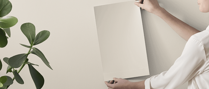
Before committing to a paint colour, I always recommend testing it in your own space. Lighting and undertones can shift more than you expect. Peel-and-stick samples from Samplize make it easy to see how a colour behaves and can be moved around to compare throughout the day.
→ Try Shoji White in your space with Samplize!
How does Shoji White look in different lighting conditions?
Lighting greatly impacts how a paint colour is perceived within a space, whether it be natural or artificial light. Natural light varies throughout the day making colours look slightly different in the morning and the evening, which is why it’s essential to use samples before fully committing to a paint colour so you can see how colours look at various times of the day and you can decide if a paint colour is the right one for your space.
In rooms with plenty of natural light, especially in south-facing rooms or in afternoon western light (warm and golden), Shoji White tends to show more of its warm, beige undertones. It can take on a slightly creamy look but, thanks to subtle muted undertones, it still feels balanced, not yellow or overly warm. The light brings out its softness and makes it feel inviting and comfortable.
In cooler light, like north-facing rooms or in afternoon eastern light (cool, bluish) that rely mostly on artificial light, Shoji White can lean a bit more muted or slightly greige. This is where its grey undertones subtly come into play, helping it feel more grounded and neutral. It’s still warm-leaning overall, but definitely less creamy than in sunnier spaces.
In low-light rooms, Shoji White can deepen a touch and feel more like a soft greige. It loses some of its brightness but still works beautifully as a neutral backdrop, it just brings a bit more cosiness and moodiness to the space.
Loving the sound of Shoji White? I've used it in a ready-made whole-house palette; it's the easiest way to see how it plays with other colours throughout a home. Have a look at it here!
Best White Trim Colours With Shoji White

Pairing Shoji White with the right white trim colour can really elevate the look of your space. It’s all about creating the right amount of contrast (or not!) depending on the vibe you’re going for. If you want a soft, seamless look, go with a white that’s just a touch lighter and warm-toned. Sherwin Williams Alabaster is a beautiful option. It’s a creamy white that has enough warmth to complement Shoji White without feeling too similar. The two together create a subtle, tone-on-tone effect that feels calm and cohesive. For a little more contrast while still keeping things warm, try Sherwin Williams Pure White. It’s a clean white with very soft, barely-there warmth. It works really well as a trim colour if you want your mouldings and doors to stand out just a bit more. If you’re aiming for a crisp, classic contrast, Sherwin Williams Extra White is a cooler, brighter white that will give you that sharp, fresh edge. It’s less creamy than the other two, so it creates more distinction. Be aware though that with a crisp white like Extra White on the trims, Shoji White will look much warmer and creamier, enhancing its greige base.
No matter which direction you go, just be sure to keep undertones in mind. Shoji White is warm and soft, so pairing it with whites that have cool or bluish undertones can feel a bit off. Sticking with whites that lean neutral or warm will always give you the most harmonious look.
What about best coordinating paint colours?

If you’re going for a warm, earthy palette, Shoji White looks gorgeous alongside muted greens, soft browns, and terracotta tones. Try something like Sherwin Williams Accessible Beige or Evergreen Fog for a natural, grounded feel. These colours add depth and warmth without overpowering the softness of Shoji White.
For a calm, neutral vibe, pair it with gentle greiges or taupes like Sherwin Williams Agreeable Gray or Natural Linen. These combos work beautifully in open-plan spaces and give you that relaxed, pulled-together look.
Want to introduce a bit of contrast? Shoji White also pairs well with rich, moody colours. Think deep navy like Naval, charcoal grey like Urbane Bronze, or even a soft black like Iron Ore. These deeper tones make Shoji White feel lighter and more luminous by comparison, perfect for accent walls, cabinetry, or furniture.
And of course, for a light, breezy palette, mix Shoji White with other soft whites and warm creams like Alabaster or Greek Villa. This kind of tone-on-tone layering creates a serene and airy feel that works especially well in bedrooms, bathrooms, and coastal-inspired interiors.
The key is to stick with colours that share a similar warmth or undertone. Shoji White is gentle and inviting, so coordinating it with colours that have that same soft quality will always feel harmonious.

Turn your favourite paint colour into a whole-home look.
My Whole-House Colour Palette pairs Shoji White with complementary neutrals, accents, and trim shades so every room feels cohesive.
✔ No more guessing, colours are professionally curated
✔ Works with different lighting and styles
✔ Instant digital download so you can start today
→ GET YOUR PALETTE NOW and bring your home’s vision to life.
Shoji White is one of those effortlessly elegant paint colours that brings warmth, softness, and versatility to any space. Whether you’re drawn to cozy neutrals, earthy tones, or a clean modern palette, it’s a colour that adapts beautifully to your style and your home’s unique lighting.
If you’re feeling inspired to use Shoji White but aren’t sure how to pull the whole look together, I’ve got you covered. My digital whole-house paint palettes take the guesswork out of colour selection, offering perfectly coordinated combinations that make your home feel cohesive and beautifully designed from room to room. Or, if you’re after something more personal, check out my custom colour consulting services—I’ll help you find the perfect shades tailored to your space, style, and lighting.
If you have questions, don’t hesitate to get in touch. I’d more than happy to help you create a home you love.
Thank you for reading and happy decorating.
Manon xx