Worldly Gray SW 7043 by Sherwin-Williams - Paint Colour Review

Worldly Gray SW 7043 has built a reputation as one of the more sophisticated colours in Sherwin-Williams' greige family. It’s a tone that is liked for its ability to bring a little more nuance than the usual warm neutrals. Part of what makes it interesting is that it isn't a simple greige; there's a quiet layering of undertones underneath that gives it real depth. If you're considering it for your home, here's an honest look at how it actually behaves.
Undertones
Worldly Gray is a warm greige-taupe at its core, blending grey and beige in a way that feels grounded and subtly earthy. What sets it apart from many other greiges, though, is a subtle hint of green undertone that most people won't immediately identify, but that gives the colour slightly more depth than a straightforward warm grey.
This green undertone tends to stay quiet and barely visible under most conditions, with the warm taupe doing most of the visible work. However, it surfaces more noticeably in certain situations, typically in spaces with cooler or more diffused natural light, or alongside materials and colours that also have a green tone. In those conditions, Worldly Gray can read as a soft, sophisticated grey rather than a classic greige.
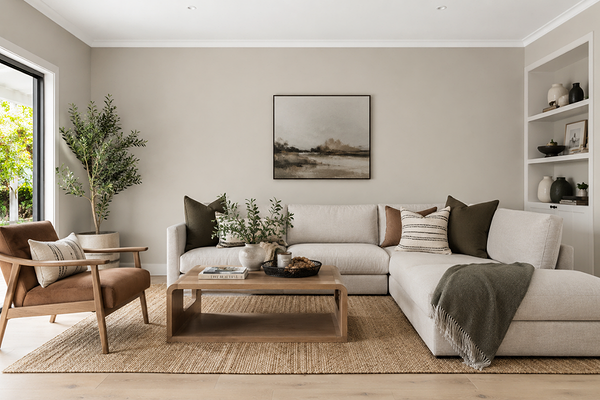
Living room with SW Worldly Gray walls
LRV (Light Reflectance Value)
Worldly Gray has an LRV of 57, placing it solidly in the mid-tone range - lighter than a deeper, more dramatic colour, but with enough depth to hold itself well rather than washed out in bright spaces. It sits just below popular lighter greiges like Agreeable Gray (LRV 60) and Repose Gray (LRV 58), but above deeper, more grounded neutrals like Mindful Gray (LRV 48).
Practically, an LRV of 57 means Worldly Gray reads as a true, balanced mid-tone in most rooms. It works well in rooms with moderate to good natural light, where it brings calm and subtle character. In rooms with limited natural light, it can read a touch deeper and moodier than expected, which can be a wonderful thing in a cosy bedroom or study, but worth anticipating if you wanted something lighter and brighter.
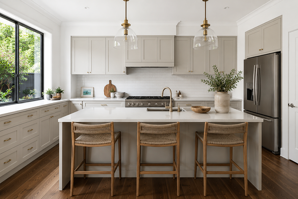
Kitchen cabinetry in SW Worldly Gray
How does Worldly Gray look in different lighting conditions?
Worldly Gray's layered undertones mean lighting plays an important role in which undertones come forward.
In north-facing rooms(US, Canada), which receive cooler, more diffused light, the green undertone tends to be slightly more noticeable. Worldly Gray can read more as a soft grey in this orientation, beautiful for a considered, characterful space, but worth knowing if you were expecting a straightforward warm greige.
In south-facing rooms with strong warm light, the taupe undertone takes the lead. This is generally the light orientation where Worldly Gray looks like a more classic, warm greige.
In east-facing rooms, the warm, direct morning sun brings out Worldly Gray's warmth beautifully. As the light cools and becomes more diffused through the afternoon, the subtle green undertone becomes a little more present.
In west-facing rooms, the warm afternoon and evening light deepens the taupe character and gives Worldly Gray a rich, golden-greige quality that's particularly flattering in living and dining spaces used most in the evening.
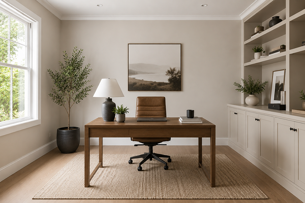
Home office with SW Worldly Gray walls
Best material pairings
Worldly Gray's layered undertones make it pair beautifully with a wide range of natural and earthy materials:
Warm and mid-toned timbers: Oak, walnut, and other warm wood tones echo Worldly Gray's greige base, creating a cohesive, grounded palette. The subtle green undertone also pairs surprisingly well with timber that has a slightly olive or weathered cast.
Honed and textured natural stone: Honed marble, limestone, and travertine in warm or soft grey tones reinforce the quiet, earthy sophistication of Worldly Gray.
Natural and woven textiles: Linen, jute, wool, and boucle in warm neutral tones complement the organic quality of this colour beautifully.
Brushed brass and aged bronze: Warm metallics bring out the greige in Worldly Gray and add a layer of richness without competing with the undertone.
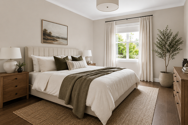
Bedroom with SW Worldly Gray walls
Where to best use Worldly Gray
Worldly Gray's adaptable, mid-tone character makes it a strong fit across a wide range of spaces:
Living and family rooms: Its mid-tone depth gives these high-use spaces a grounded, considered feel without becoming overwhelming or heavy.
Main bedrooms: The warmth of Worldly Gray creates a restful, sophisticated space, perfect in bedrooms.
Home offices and studies: The colour's depth and quiet character look great in focused, calm spaces, particularly when paired with warm timber furniture.
Kitchen cabinetry: As a cabinet colour, Worldly Gray is slightly more distinctive than a standard greige or grey, especially paired with warm brass hardware and natural stone benchtops.
Exteriors: Worldly Gray translates well to exterior render, weatherboard, and brick homes, particularly those with natural stone or timber that share its warmth.
Where to use it with caution: very small, north-facing rooms where the green undertone may become more pronounced than desired, and spaces with strong pink or red-toned fixed finishes, where some tension between the undertones can emerge.
Best white trim colours
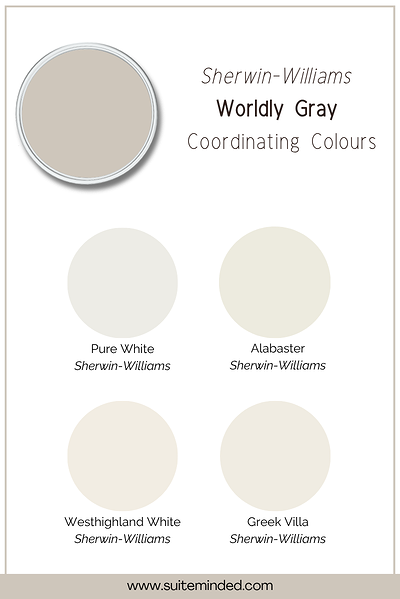
Worldly Gray's layered undertones mean the trim choice deserves a little extra thought.
A soft, warm white with the faintest hint of cream tends to work best as it echoes the warm base of Worldly Gray while staying neutral enough not to fight its undertones, creating a balanced, harmonious finish. Some possible options here are Alabaster SW 7008, Greek Villa SW 7551, Westhighland White SW 7566, or even Pure White SW 7005 for a little more contrast.
Avoid stark, cool, blue-based whites as they will create too much contrast and can make the green undertone in Worldly Gray look more pronounced and slightly murky by comparison. A true white with no undertone at all can also work well if you'd like a crisper, more contemporary contrast, as long as it's not strongly cool-leaning.
Best coordinating colours
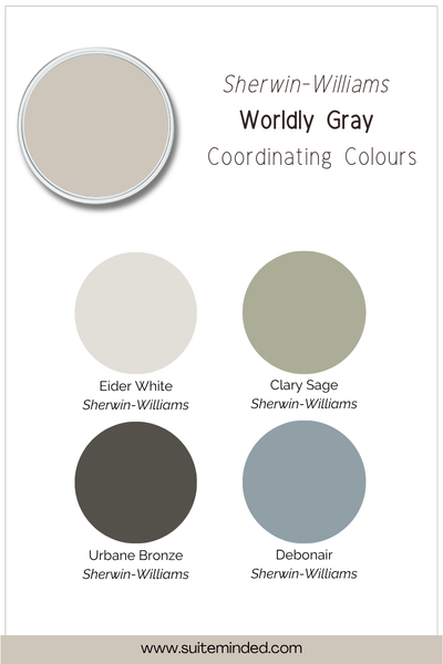
Worldly Gray's character makes it very versatile when it comes to building out a palette. Here's what works beautifully:
Soft warm whites and creams: A gentle off-white on trims, or adjoining walls, keeps the palette feeling light and cohesive, echoing the warmth in Worldly Gray.
Muted sage and olive green: Given Worldly Gray's own green undertone, soft sage and olive tones are a particularly natural and harmonious pairing.
Deep, warm charcoal: A rich charcoal with brown or green undertones (rather than blue) grounds the palette beautifully as an accent wall or cabinetry colour.
Warm terracotta and clay: Used sparingly in furnishings or accent pieces, earthy terracotta tones bring a lovely organic warmth that complements Worldly Gray.
Dusty blue tones: A muted, grey-leaning blue creates a classic, calming contrast with Worldly Gray, particularly effective in bedrooms or living spaces.
Final thoughts on SW Worldly Gray
Sherwin-Williams Worldly Gray has a quiet, layered character that stands out, with subtle undertones that give it a depth and sophistication that other neutrals can lack. With an LRV of 57, it has enough colour to feel intentional, but is also light enough to stay liveable and soft.
Because its undertones shift subtly with light and orientation, it's well worth sampling properly before committing, ideally with an A3-sized swatch, viewed at different times of day and against your existing finishes.
Curious whether Worldly Gray is the right fit for your home, or want help building a full palette around it? I'd love to help.
Check out my Colour Review Service if you’d like expert advice on whether this layered greige is the right fit for your light and orientation.
Book a full colour consultationif you'd like personalised colour recommendations based on your home, your finishes, and your style.
Thank you for reading, and happy painting!
Manon xx