Repose Gray SW 7015 by Sherwin-Williams - Paint Colour Review

If you've spent more than five minutes researching paint colours online, you've almost certainly come across Repose Gray. It's one of Sherwin-Williams' most popular neutrals, and for good reason. But popularity doesn't mean it's right for every home. Before you commit, here's everything you actually need to know.
Repose Gray’s undertones
Repose Gray carries two undertones: a soft violet and a subtle hint of green. That’s what gives it its quality. It doesn’t sit still the way a straightforward warm beige would. In most lighting conditions, Repose Gray reads as a clean, elegant greige. But in certain lights, one of those undertones will surface and shift the whole feel of the room. You’ll see how Repose Gray can shift depending on lighting conditions in the next section.
Neither undertone is a dealbreaker, but knowing they're there means you can work with them intentionally rather than being caught off guard after your second coat dries.

Bedroom with Repose Gray walls
Repose Gray’s LRV
Repose Gray has an LRV (Light Reflectance Value) of 58. This puts it firmly in the medium-light range; it's not a deep colour, but it's not a near-white either.
What does that mean practically? In a well-lit room, Repose Gray will feel airy and open without reading stark or washed out. It holds its colour well, which is something a lot of very light greys (LRV 65+) struggle to do in bright natural light. In a room with limited natural light, it will still read as a grey tone rather than fading into a murky non-colour, but you'll want to pay attention to bulb temperature, because warm-toned incandescent or halogen bulbs can amplify that violet undertone in the evenings.
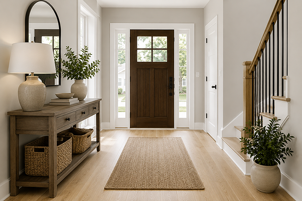
Entryway with Repose Gray walls
What does it look like in different lighting conditions?
North-facing rooms: This is where you need to be most careful. Without warm sunlight to balance it, the violet undertone in Repose Gray can take over, and the colour can shift toward a muted lavender-grey. You’ll need to warm up the space with warm-toned lighting and warm wood or earthy textiles to bring it back toward neutral.
South-facing rooms: This is where Repose Gray looks its best. In rooms with strong, warm lighting exposure, it reads warm, sophisticated, and genuinely neutral. Its undertones are balanced, the space feels inviting, subtly earthy, and elegant.
East-facing rooms: Morning light brings a warm, golden quality that fits Repose Gray well. In the afternoon, when the light flattens, it settles into a cooler, truer grey. Generally, an easy direction for this colour.
West-facing rooms: Similar to east but in reverse; afternoons and evenings are warm and golden, which is lovely. However, morning light can feel a little flat. Overall, another friendly direction.
Artificial lighting: Warm white bulbs (2700K–3000K) keep Repose Gray in its best range. Cooler daylight bulbs (5000K+) will push the violet undertone forward and can make the colour feel cold.
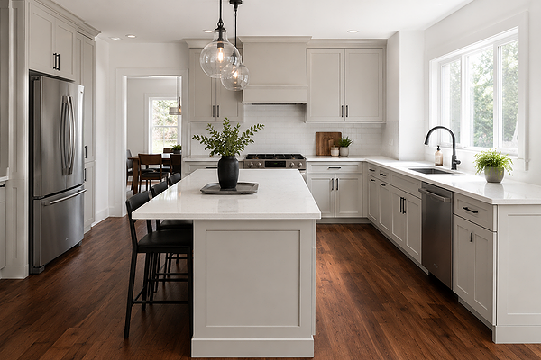
Kitchen with Repose Gray cabinets
Best material pairings with Repose Gray
Timber and wood tones: Mid-tone warm woods are the sweet spot; think white oak, honey-toned hardwood floors, and walnut cabinetry. These warm tones counterbalance the violet undertone and keep Repose Gray inviting and neutral. Avoid very cool or grey-washed timbers, which can amplify its cooler side and make a space feel cold.
Stone and tile: Soft, warm-white marble is a classic pairing. Warm beige or greige tiles work well too. Stay away from tiles with heavy blue or purple undertones, which will intensify the violet undertone in Repose Gray rather than balance it.
Metals: Brushed brass, warm gold, and aged bronze all work beautifully with Repose Gray. Brushed nickel and chrome are fine, but can tip the colour cooler in rooms with limited natural light. Matte black is a strong, modern choice that adds contrast without fighting the undertones.
Soft furnishings: Warm-toned textiles like camel, rust, terracotta, cream, and warm taupes are great pairings. They don't just look good; they neutralise the violet undertone and help the colour read more neutral. Cool-toned blues and purples may intensify the violet shift.

Living room with Repose Gray walls
Where to best use Repose Gray
Open-plan living areas: This is where Repose Gray looks best. Its medium LRV means it won't wash out in bright, large spaces, and its neutral greige base creates a beautiful backdrop that flows naturally in open spaces.
Hallways and transition spaces: Because Repose Gray is balanced and sits in the middle of the range, it works well in connecting spaces. It doesn't clash with most adjacent colours, which makes it a good choice for hallways and other transition spaces.
Bedrooms: The slightly muted tones of Repose Grey mean it works well in calm, restful spaces.
Kitchen cabinets: Repose Gray has become a go-to for painted cabinetry. It adds character without tipping too dark or heavy, and it pairs well with both white and warm stone countertops.
Where it can struggle: very dark rooms with no natural light, spaces with heavy blue or purple fixed finishes, and rooms with cool grey undertones throughout (flooring, tile, stone) where there's no warmth to balance the colour.
Best white trim colours
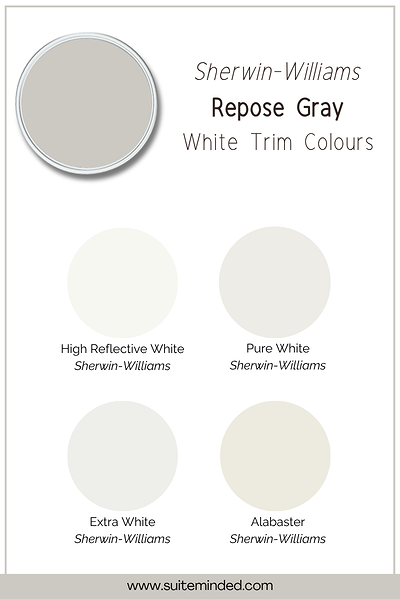
Trim colour choice can make or break Repose Gray, because the wrong white paint colour will either fight its undertones or look dingy beside it.
SW Pure White (SW 7005): A clean, slightly warm white that provides a crisp contrast without going stark, and doesn’t clash with the violet undertone. This is the most versatile choice and a safe starting point.
SW Alabaster (SW 7008): A warmer, creamier white that creates a softer, more cohesive feel alongside Repose Gray. It minimises contrasts and lets the two colours sit harmoniously together.
SW Extra White (SW 7006): For those who want a crisper, brighter contrast. Extra White is cool and clean, so it works best in south-facing rooms where Repose Gray reads warm; in cooler light, this combination can feel a little cold.
What to avoid: Bright, blue-white trims. These will fight the violet undertone and create an uncomfortable tension. If you love a very crisp white, stick to Extra White and pair it only in well-lit, warm-light rooms.
Best coordinating colours with Repose Gray

Deeper warm greiges: Slightly warmer and deeper than Repose Gray. Used in an adjacent room or on an accent wall, it adds depth without breaking the flow of a cohesive whole-home palette.
Soft warm whites and creams: Creamy whites and warm off-whites sit naturally alongside Repose Gray. They pair well with its greige base and keep the overall palette feeling warm and inviting.
Deep navy blues: For a high-contrast accent, rich navy tones create a sophisticated, dramatic pairing with Repose Gray. Think feature walls, built-ins, or a powder room where you want real impact.
Muted greens and soft sages: Because Repose Gray carries that hint of green, muted green tones can look harmonious for adjacent rooms or accents.
Warm terracotta accents: Warm earthy tones actively counterbalance the violet undertone and bring out the warmest, most grounded side of Repose Gray.
Conclusion
Repose Gray is a versatile, sophisticated neutral that works across a huge range of spaces and styles. However, its violet and green undertones mean it can shift dramatically depending on your light conditions, and getting the material and trim pairings right makes all the difference between a stunning neutral and a room that feels slightly off. As always, it’s highly recommended to test and sample your colour properly in your home before committing to it.
If you're considering Repose Gray and want to make sure it's going to work with your specific light, finishes, and layout, that's exactly what I'm here for.
Ready to build a full palette around Repose Gray? Browse my Sherwin-Williams colour palettes in the shop - each one is designed to take the guesswork out of coordinating colours, trim, and accents.
Prefer a personalised recommendation? Book a virtual colour consultation, and I'll help you work through whether Repose Gray is right for your space, or find the neutral that actually is.
Thank you for reading, and happy decorating!
Manon xx