Struggling with Grey Timber Floors? Here Are the Best Colours to Pair with Them
Grey timber flooring can feel like a safe, modern choice… until you try to decorate around it.
If you’ve ever found that your paint colours suddenly look too cold, too flat, or just slightly “off” against your floors, you’re not imagining it. Grey timber has a way of pulling everything in a cooler direction, which can make creating a cohesive, inviting space a bit more challenging.
The good news? Once you understand what’s happening underneath the surface, it becomes much easier to choose colours that actually work.
Understand grey timber (and why it’s tricky)
Grey timber flooring isn’t just “grey.” Most of the time, it carries cool undertones such as blue, green, or even a slight violet cast, especially in artificial or lower light.
That’s where things start to get tricky.
Because the floor covers such a large surface area, it influences how every other colour in the room is perceived. Overly warm colours can suddenly look dull, muddy, or just off, while cooler colours can sometimes feel sharp or sterile if there’s no balance.
Another thing to watch for is that some grey floors have a slightly washed-out or desaturated look, which means highly saturated wall colours can feel disconnected rather than cohesive.
So instead of thinking “what grey paint matches my grey floor,” it’s more about how to balance the coolness of the floor while still keeping the space feeling warm and inviting.
(If you’re in the middle of choosing colours for your whole home, this is exactly the kind of situation I walk through step-by-step inside my Blueprint)
A simple rule of thumb
When working with grey timber floors, think in terms of balance, instead of matching them. A good rule to follow is to pair them with slightly warm, muted, or soft neutrals to bring warmth back into the space.
This doesn’t mean going fully warm (like yellow beiges or orange tones), but rather choosing colours that sit in that soft, muted, balanced middle ground, often called greiges or warm-leaning neutrals.
If you go too cool, the space can feel flat and cold. If you go too warm, it can clash and feel disconnected.
This is where sampling becomes really important - colours that look perfect online can shift completely once they’re up against your flooring.
The best colours to pair with grey timber flooring
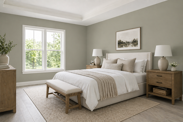
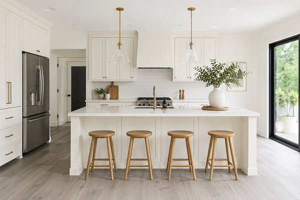
1. Soft greiges (your safest starting point)
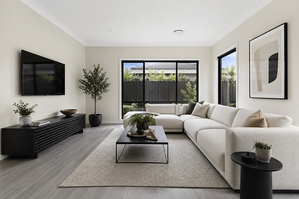
These are the easiest and most reliable options. Think colours that blend grey and beige, like SW Agreeable Gray, BM Balboa Mist, or BM Edgecomb Gray.
They gently warm up the space without fighting against the coolness of the floor.
Why they work: They bridge the gap between warm and cool, creating a natural, cohesive flow.
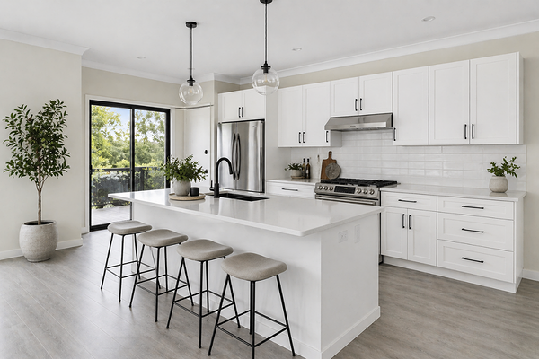
2. Warm whites (to soften the overall look)
Crisp, cool whites can feel too stark next to grey floors, so this is where warm whites shine. Be mindful not to choose overly warm or creamy whites with too much yellow undertones - think softly warm and slightly muted.
Look at shades like Sherwin-Williams Snowbound, Benjamin Moore White Dove, or Dulux Australia Natural White. SW Alabaster is probably as warm as I would go in terms of whites.
Why they work: They keep the space light and airy, while adding just enough warmth to counterbalance the flooring.
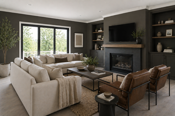
3. Muted earthy tones (for depth and interest)
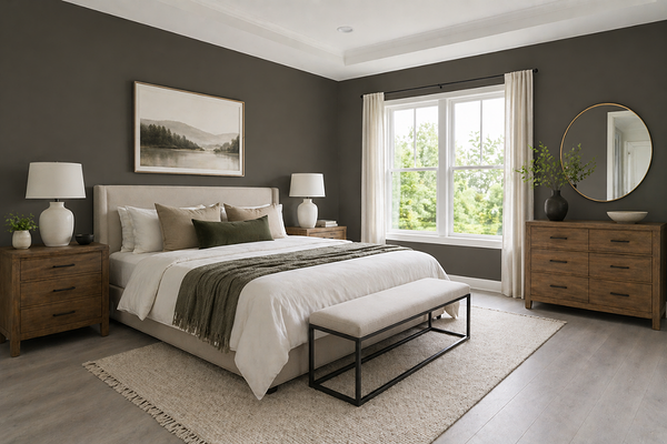
If you want more personality, muted earthy tones work beautifully with grey timber.
Think soft greens like SW Evergreen Fog, deep charcoals like SW Urbane Bronze, or warm taupes.
Why they work: These colours add depth and colour without feeling too heavy or overly saturated.
4. Soft, dusty blues (used carefully)
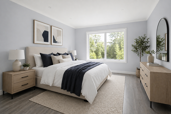
Blue can work, but it needs to be softened and muted with grey undertones instead of overly saturated. Avoid icy or bright blues.
Think of colours like SW Meditative, BM Exhale, or Dulux Australia Blue Balm.
Why they work: They complement the coolness of the floor while still feeling calm and cohesive; just make sure there’s enough warmth elsewhere in the room to balance out (furniture, textiles, wood tones).
Designer tips
1. Don’t ignore your fixed finishes
Grey flooring doesn’t exist in isolation. Your cabinetry, countertops, and furniture all play a role in how colours will read. Always consider the full picture.
2. Bring warmth in through materials
If your walls are leaning neutral, use warm woods, linen textures, and soft fabrics to balance the coolness of the floor. This makes a huge difference.
3. Test in your actual lighting
Grey floors can shift a lot depending on the light, especially between natural and artificial lighting. Always sample your paint colours on the wall before committing.
4. Avoid “too perfect” matching
Trying to match your wall colour exactly to your floor usually falls flat. Contrast (done softly) creates a much more layered and intentional look.
———————
If you’re trying to figure out colours for your whole home, this is where things can start to feel overwhelming. If you want a clear, step-by-step way to choose colours that actually flow together (without second-guessing everything), you can check out my Confident Home Colour Blueprint.
Or, if you’d rather have someone look at your specific space, lighting, and finishes, my custom colour services are there to help you get it right the first time.
Thank you for reading, and happy decorating!
Manon xx