Dieskau by Dulux Australia - Paint Colour Review
If you've been scrolling through paint chips looking for that elusive soft, sophisticated neutral - one that's not quite grey, not quite beige, but somehow perfectly both - Dieskau might have already caught your eye. It's one of Dulux Australia's most talked-about greiges, and for good reason. But like all complex neutrals, it comes with nuance. Let's dig in.
Dieskau’s undertones
Dieskau is a greige, a soft blend of grey and beige, but what makes it interesting (and occasionally tricky) is its undertone. Underneath the surface, it has a subtle violet-purple note. It’s not overly present, but it does shape how this colour behaves across your home.
The best way to see it? Hold your Dieskau sample next to a true white like Dulux Vivid White. That comparison pulls the undertone forward and shows you exactly what you're working with. You'll notice it shifts away from the warm greige colour and leans into something a little cooler and more refined.
Dieskau’s LRV
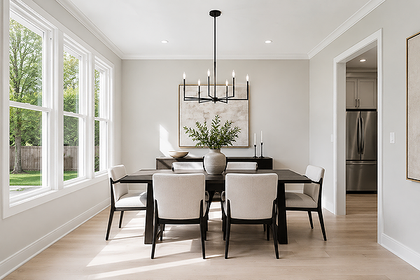
Dining room with Dieskau walls
Dieskau has an LRV (Light Reflectance Value) of 62, which puts it comfortably in the light-to-mid range. To give you a sense of scale: pure white sits at 100, and most colours we'd call "light" fall somewhere between 55 and 75. At 62, Dieskau is light enough to keep a room feeling open and airy, without washing out in bright light or falling into the off-white range.
In practical terms, this means it has enough colour to hold itself well in a very bright, luminous space, while still doing all the things we want a light neutral to do: reflecting light, making spaces feel larger, and playing well with natural timber and stone.
It's a good LRV for whole-house use, and it's particularly forgiving in rooms that don't get as much natural light. It won't turn murky in a darker hallway the way a lower-LRV greige might.
Lighting effects
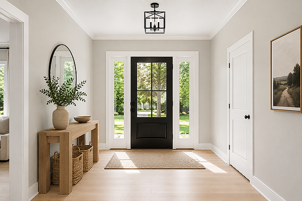
Entryway with Dieskau walls
This is where Dieskau becomes a little more complex. In bright natural light, especially in rooms with north-facing windows, Dieskau is gorgeous. The greige base comes forward, it reads fresh and light, and that violet undertone is subtle enough to feel sophisticated rather than obvious.
In lower light (think south-facing rooms, hallways, or spaces where artificial lighting dominates), the violet-purple undertone becomes more present. It can give a slightly mauve quality that some people love, and others find unexpected. Under cool light, artificial or natural, it tends to lean a little more grey.
Dieskau doesn’t look bad in these conditions, but it can look noticeably different from your sample chip if you tested it in a sunlit room and then painted a dim one. The advice I always give: test your sample in the actual room, at different times of day, and live with it for at least 48 hours before you commit.
Where to use it
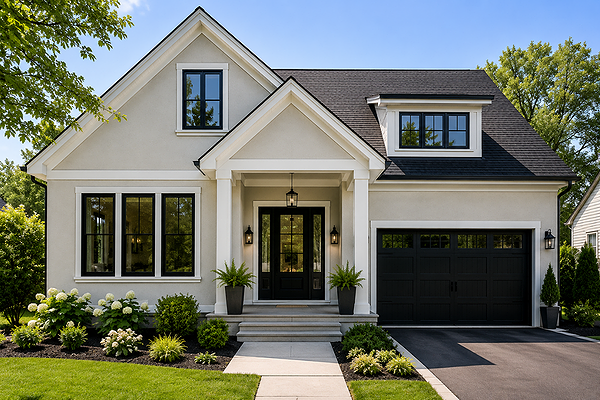
House exterior with Dieskau walls
Dieskau is one of those colours that genuinely works across the whole home, which is part of why it's so popular.
Living and dining rooms are its sweet spot. It adapts well to changing light conditions, and its greige character pairs beautifully with natural timbers, linen, soft greys, and stone benchtops.
Bedrooms are another strong choice, particularly for main bedrooms. That quiet, slightly cool undertone creates a restful atmosphere without feeling cold or clinical.
Hallways and entry spaces benefit from Dieskau's neutral quality. It's the kind of colour that ties rooms together as you move through a home.
Exteriors are also great for Dieskau. It works particularly well as a body colour on contemporary or Hamptons-style homes, especially when paired with crisp white trims.
The one room where I'd proceed with care is a bathroom that relies heavily on artificial lighting. The combination of warm globe lighting and the violet undertone can push Dieskau into mauve territory more than you might expect.
Best white trim colours
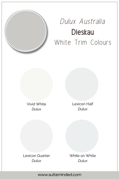
Because Dieskau carries that subtle violet-purple undertone, your trim choice matters more than it might with a simpler warm greige. The key is to avoid white paint colours that have a strong yellow or cream lean, as those will clash with the cool feel of Dieskau. What you want is a white that either reads clean and crisp, or has a slightly cool feel.
Dulux Vivid White is the safest, most reliable choice. It's a pure, clean white with no strong undertone of its own, and it lets Dieskau do its thing without competing.
Dulux Lexicon Half or Lexicon Quarter are also beautiful options. They have a soft, cool quality that pairs well with Dieskau’s undertones.
Dulux White on White is worth considering if you want something just a touch warmer than Vivid White, but still firmly in the clean-white camp. It won't introduce any of the yellow warmth that could cause conflict.
What to avoid: anything too creamy or yellow-based, like antique whites or warm off-whites. They'll fight the undertone and the pairing will feel slightly off.
Best coordinating colours
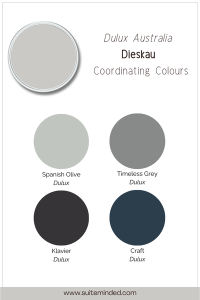
Klavier is a warm, dark grey that can be a great, deeper tonal partner. If you're looking to add depth to a space, such as a feature wall, cabinetry, or an exterior accent, Klavier gives you that without introducing a completely different colour family.
Stepney is a warm mid-toned greige that sits in a similar family to Dieskau. It’s useful if you're working across an open-plan space and want some tonal variation without things feeling disjointed.
For accent and contrast, think about colours that echo the subtle violet-purple undertone without overwhelming it: dusty mauves, soft sages, warm navy blues, and muted burgundies all feel at home here. Nothing too saturated, nothing too sharp.
Material pairings
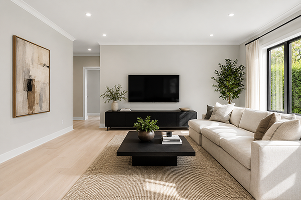
Living room with Dieskau walls
Dieskau's greige base and violet undertone make it more selective about materials than a purely warm neutral, but when you get it right, the combinations are genuinely beautiful.
Timber works when it has a cool-to-neutral tone. Think grey-washed oak, whitewashed floorboards, or timber with an ash quality. Warm orange-toned timbers like red gum or honey oak can create tension because those warm orange tones will fight the violet note in Dieskau.
Stone and tiles in cool whites, soft greys, and greige tones are a natural fit. Marble with grey veining, concrete-look tiles, and light limestone all sit beautifully alongside Dieskau. Again, watch out for tiles or benchtops with a strong beige-yellow lean.
Metals: brushed nickel, chrome, gunmetal, and soft pewter all complement the cooler character of Dieskau. Brass and gold can work, but opt for an aged or brushed finish rather than a bright polished one.
————————
Dieskau is not the most straightforward greige on the Dulux chart; that violet undertone means it needs a bit of thought before you paint. But if you do the work upfront (test your sample, check your fixed finishes, and choose your trim carefully), it's the kind of colour that genuinely elevates a space.
Ready to go deeper? Book a Colour Review if you've got a shortlist of paint samples and want expert feedback, or book a full virtual consultation if you're starting from scratch.
Thank you for reading, and happy painting!
Manon xx