How to Tell If Your Wall Paint Colour Is Too Cool for Your Space
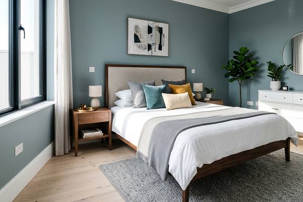
Sometimes, a paint colour can look beautiful online, in-store, or even on a tiny swatch, but once it’s painted across the walls, the room suddenly feels cold, flat, or off.
This is especially common with cool greys, icy whites, and blue-based neutrals. While cool paint colours can work beautifully in some homes, they don’t always suit every space, lighting condition, or style of interior.
If your room feels “off” and you can’t quite explain why, your wall colour may simply be too cool for the space. Here are some signs to look out for.
The room feels cold instead of calm

A calm room should feel relaxing, soft, and inviting. But when a paint colour is too cool, the space can start to feel emotionally cold instead. You may notice that:
the room feels stark or sterile
the walls feel harsh in the evening light
the space lacks warmth or comfort
This often happens with cool greys or crisp whites that contain strong blue, violet, or icy undertones.
Your walls look blue or grey in certain lighting

Undertones become much stronger once paint is on large walls. A colour that looked like a “soft neutral” on a paint chip can suddenly appear noticeably blue, grey, or even purple, depending on the lighting in your home. This is especially common in:
darker spaces
rooms with limited natural light
homes with cool artificial lighting
Cool paint colours tend to become even cooler in shadows, which is why they can sometimes feel completely different throughout the day.
Your flooring or furniture suddenly looks wrong
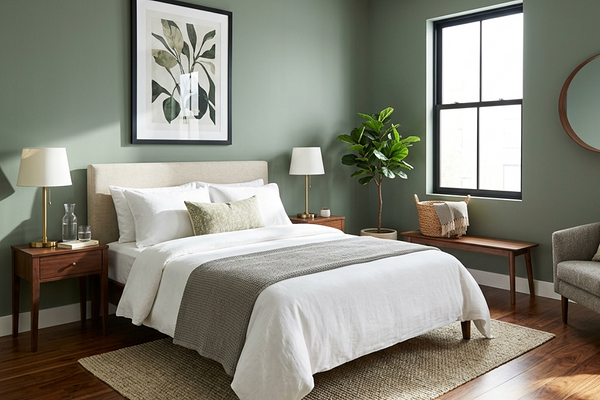
Paint colours don’t exist in isolation. They interact with everything around them. If your home has warm fixed finishes like oak flooring, terracotta tiles, cream stone, or warm timber accents, a cool wall colour can make those elements suddenly look yellow, muddy, or outdated.
This is one of the biggest signs that the undertones in the paint colour may not be working with the rest of the home.
The space feels flat or lifeless
Sometimes a room technically “matches,” but it still doesn’t feel right. Overly cool colours can absorb warmth and softness from a space, especially if the room already lacks texture, natural light, or layered materials. This can leave the room feeling dull, lifeless, heavy, or muddy.
Many people mistake this for a decorating problem when it’s actually an undertone problem.
The colour changes too much throughout the day
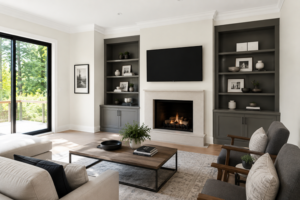
All paint colours shift in different lighting conditions, but overly cool colours often change dramatically. You may notice:
grey paint looking blue or even slightly purple in the evening
white paint turning icy
greige colours losing all their warmth in shadow
This is why testing paint colours in your actual home is so important. A colour that works beautifully in one home can feel completely different in another.
What to do if your paint colour feels too cool
The good news is that you don’t always have to repaint immediately. Sometimes you can soften the space by:
using warmer light bulbs
adding natural textures like linen, timber, and woven materials
layering softer lighting instead of relying only on overhead lights
But if the room still feels cold or uncomfortable, you may simply need a warmer foundation colour. Consider a soft, warm white, creamy neutral, warmer greige, or a taupe with a subtle warmth.
Final thoughts
If a paint colour feels “off,” you’re probably not imagining it. Paint colours are heavily influenced by lighting, undertones, flooring, furniture, and the overall atmosphere of a home. A colour that looks beautiful online may simply not suit your particular space.
The goal isn’t to choose the trendiest paint colour. It’s to create a home that feels comfortable, balanced, and inviting to live in every day.
And if you’re struggling to figure out why a colour isn’t working, sometimes a second set of eyes can make all the difference.
At Suite Minded, I offer personalised paint colour services designed to help you create a calm, cohesive home with colours that work beautifully with your lighting, flooring, finishes, and overall style. Whether you need help choosing the right white paint, creating a whole-house palette, or simply narrowing down a few options, my services are designed to remove the stress and guesswork from the process.
Thank you for reading, and happy painting!
Manon