Vivid White by Dulux Australia - Paint Colour Review
Ask almost any Australian painter or builder what white they default to, and there's a very good chance Dulux Vivid White will come up. It's been a staple on new builds, rentals, and renovations for decades. It's clean, it's bright, it's widely available, and it plays well with almost everything. But just because it's popular doesn't mean it's automatically the right white for your home. Here's an honest look at what Vivid White actually does, and when you might want to consider something else.
Undertones
Vivid White is about as close to a true, neutral white as you can get in a paint range. It has no dominant undertone - no warm yellow, no cool blue, no hint of green or pink. What you see is what you get: a clean, crisp white that reads as white in almost any context. Most whites have a noticeable lean in one direction, which is why so many people paint a wall 'white' and end up with something that reads yellow, grey, or lavender. Vivid White sidesteps that entirely.
That said, as with all whites, depending on what surrounds it, Vivid White can appear to shift slightly:
Next to warm materials such as timber floors, terracotta tiles, or warm-toned furniture, Vivid White can read slightly cooler by contrast. This is a visual effect rather than a true undertone, but it's worth being aware of in warm, earthy interiors.
In rooms flooded with warm natural light, the warm light can cast a very soft golden glow across Vivid White walls. Again, this is light behaviour rather than undertone, but the room will feel slightly warmer than the paint chip suggests.
The takeaway: Vivid White's neutrality is its greatest asset, but it's still worth considering what it's sitting next to in your specific space.
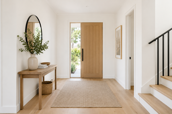
Entryway with walls in Dulux Vivid White
LRV (Light Reflectance Value)
With an LRV of 94, Vivid White is one of the highest-reflectance whites in the Dulux range. It’s about as bright as a paint can practically get while still being a real, paintable colour.
What does this mean in practice? It means Vivid White reflects almost all the light that hits it, which makes rooms feel larger, brighter, and more open. In a smaller or darker room, the high reflectivity helps maximise whatever natural light is available, making it a sensible choice for small bathrooms, hallways, and south-facing rooms that don't get a lot of sun.
The flip side of a very high LRV is that bright whites can sometimes feel stark or clinical, particularly in large open spaces with a lot of natural light. If your home already feels very bright and you're looking for something with a little more warmth or softness, a white in the LRV 80–88 range with a slight warmth might suit you better.
Consider these other Dulux whites:
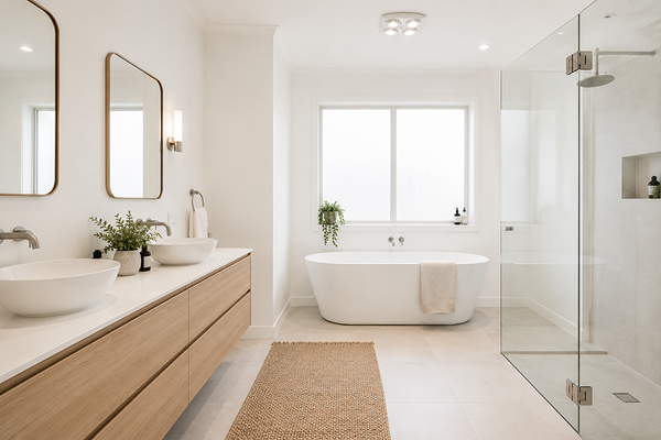
Bathroom with walls in Dulux Vivid White
Lighting effects
Because Vivid White has no strong undertone, its behaviour under different lighting conditions is more about the light itself than the paint. Here's what to expect:
In south-facing rooms, which receive less direct sun, Vivid White stays clean and true. It won't go yellow or grey; it simply looks like white, which is exactly what most people want in a naturally cooler space. The high LRV makes the most of indirect light.
In north-facing rooms with abundant warm light, Vivid White can feel almost luminous in the middle of the day. If the room gets strong afternoon sun, it may feel intensely bright, something to factor in if you're sensitive to glare or planning a bedroom that needs to feel more restful.
In east-facing rooms,the morning light gives Vivid White a fresh, crisp quality. As the light fades through the day, it settles into a clean, neutral white, never muddy, never off.
In west-facing rooms,the warm afternoon and evening light is where Vivid White can feel its most inviting. The golden-hour light softens it beautifully and prevents the brightness from feeling cold or stark.
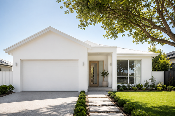
House exterior with walls in Dulux Vivid White
Best material pairings
Vivid White's neutrality makes it the ideal white to pair with almost everything, but here's where it really shines:
Cool-toned stone: White marble, grey granite, and cool-veined stone are natural companions. Vivid White doesn't introduce any warmth that would clash with cooler stone tones, keeping the palette cohesive and sophisticated.
Crisp white joinery and cabinetry: When walls and cabinetry are both in Vivid White (or a very similar high-LRV white), the result is a seamless, expansive quality that works especially well in kitchens and bathrooms.
Matte black and charcoal accents: The contrast between Vivid White and deep, dark accents in hardware, tapware, frames, or feature walls is one of the most classic and effective combinations in contemporary Australian interiors.
Light-toned timbers: Blonde timber, Tasmanian oak, and light-stained floors sit comfortably alongside Vivid White without creating a jarring contrast. Darker or more orange-toned timbers can create more contrast, which may or may not suit the look you're going for.
Concrete and raw plaster: The industrial qualities of raw concrete or unpainted plaster sit surprisingly well against a clean, true white like Vivid White, letting the texture of the material do the talking.
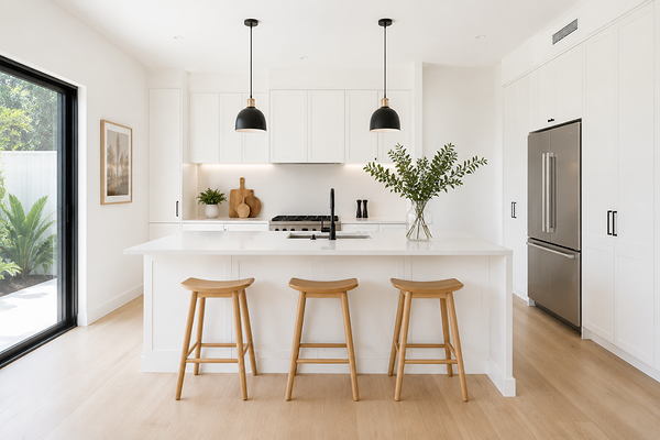
Kitchen with walls and cabinets in Dulux Vivid White
Best use cases
Vivid White's versatility means it appears in almost every room type, but there are certain contexts where it's a particularly strong choice:
Ceilings throughout the home: Vivid White is one of the most widely used ceiling whites. Its high LRV maximises the perception of height, and the clean, neutral profile means it works above almost any wall colour without creating an undertone clash.
Kitchens: A bright, clean white in a kitchen feels hygienic, fresh, and timeless. Vivid White on walls or cabinetry is a classic choice that won't date.
Bathrooms: Particularly in smaller bathrooms, the high reflectivity of Vivid White helps the space feel larger and more light-filled. It pairs beautifully with white tiles and chrome or matte black tapware.
New builds and rentals: As a builder's and landlord's white, Vivid White is hard to beat. It's versatile, broadly appealing, easy to touch up, and works with almost any furniture or decor a tenant or buyer might bring in.
Trims, architraves, and skirting boards: Vivid White in a semi-gloss or gloss finish is a reliable and popular choice for trims throughout the home. It creates a clean contrast between walls and trims without introducing any warmth or coolness.
Exteriors: Vivid White is a popular exterior choice for render, weatherboard, and brick homes. It photographs beautifully, holds its brightness well over time, and creates an excellent contrast with dark rooflines, timber accents, or landscaping.
Where to use it with caution: very large, sun-drenched living areas where an LRV of 94 might feel too stark or glaring, and spaces where you want warmth or character. Vivid White's neutrality and brightness, while an asset in many ways, won't add any cosiness on its own.
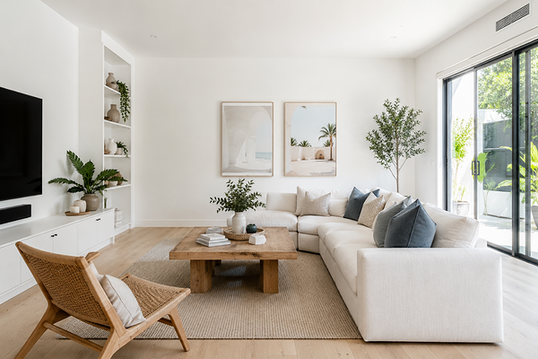
Living room with walls in Dulux Vivid White
Best white trim colour
The most common approach is to use Vivid White on the walls and trims as well, simply in a different sheen: semi-gloss or gloss on architraves, skirting boards, and door frames against a flat or low-sheen wall finish. This creates a clean, cohesive result where the definition between wall and trim comes from the sheen difference rather than a colour shift.
Avoid cool-toned or bright blue-white trims alongside Vivid White walls as the similarity in value without a true colour match can look like an accidental mismatch and make your space feel off.
Best coordinating colours
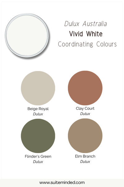
Because Vivid White has no undertone to work around, it's one of the most flexible bases for a whole-home palette. It coordinates with virtually everything, but here are the directions that work especially well:
Soft warm neutrals: Pale greiges, warm linen tones, and soft earthy colours create a layered, tonal palette alongside Vivid White.
Cool mid-tone greys: A clean, cool or neutral grey pairs well with Vivid White for a contemporary palette. The absence of undertone in the white means it won't create conflict with the grey.
Deep, moody hues: Navy, forest green, deep charcoal, and rich terracotta all pop against Vivid White. The high-contrast combination is bold and dramatic. It is particularly effective in open-plan homes where you want to add colour to one or two feature walls.
Soft sage and dusty greens: Muted, grey-toned greens sit beautifully alongside a clean white, making the space feel fresh and organic.
Black and charcoals: Black doors, black window frames, or a deep charcoal feature wall against Vivid White walls is a timeless combination that suits many design styles.
Final thoughts on Dulux Vivid White
Dulux Vivid White is genuinely one of the most versatile, reliable whites available. Its true neutral profile and high LRV of 94 make it a strong choice for ceilings, trims, kitchens, bathrooms, and new builds, and it coordinates effortlessly with almost any colour palette. The fact that it has no real undertone is a genuine asset.
That said, 'popular' and 'right for your home' aren't always the same thing. If your space is very bright and you're craving warmth or softness, a white with a slight warm lean might serve you better. It's still worth sampling it large in your actual space, as high-LRV whites can feel very different at scale to how they look on a chip.
Want help deciding whether Vivid White is the right white for your home, or working out what to pair it with? I can help with that.
Browse my Dulux Australia whole-home palettesto see Dulux colours in complete colour schemes, ready to download and take to the paint store.
Book a virtual colour consultationif you'd like personalised colour recommendations based on your home, your finishes, and your style, including which white is actually the best fit for your space.
Have a question about Vivid White? Leave it in the comments, and I'll do my best to help.
Thank you for reading, and happy decorating!
Manon