Dulux White on White: An Honest Colour Review
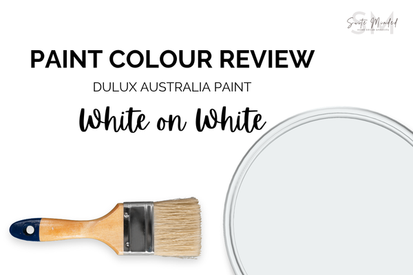
White on White is one of those paint names that sounds almost self-explanatory. It's bright, it's clean, and it reads unmistakably as white. But the detail that changes everything about how to use it is the undertone: Dulux White on White has a real, active blue undertone that sets it apart from warm, creamy, or neutral whites in ways that matter enormously once it's on your walls. Get that right, and it becomes a polished, contemporary white. Underestimate it, and you may find a room that feels colder and more clinical than you intended. Here's the full picture.
Undertones
White on White has a visible blue undertone, giving it its distinctive crispness and clarity, and separating it from warmer Dulux whites like Natural White or Antique White USA.
That blue undertone is most visible in two situations: alongside warm-toned colours or materials, where the cool contrast becomes very apparent; and in rooms with naturally cool or diffused light, where it can push the colour toward feeling noticeably chilly. White on White is a genuinely versatile pairing for cool-toned palettes, think soft greys, dusty blues, and charcoals, where its own coolness creates cohesion. Where it can struggle is alongside warm-toned wall colours, timbers, or stone, where the temperature difference can feel jarring and off.
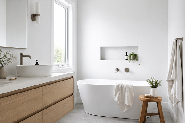
Bathroom with Dulux White on White walls
LRV (Light Reflectance Value)
White on White has an LRV of 87, placing it firmly in the bright-white category. It has just a touch more body than a near-maximum white like Dulux Vivid White (LRV 94), giving it enough weight to feel like a deliberate choice while still delivering the bright, open, high-reflectance feel that people aim to achieve with a white like this.
In practical terms, it means White on White will make rooms feel larger, brighter, and more open, a quality amplified by the blue undertone. It’s a great colour to add to a well-lit contemporary home where it can feel genuinely expansive and sophisticated.
As always with bright, cool whites, more light isn't always better. In a large room with significant natural light and cool-toned finishes, White on White can feel clinical or stark rather than airy. If you're working in a space like this, it's worth asking whether you want maximum brightness or something that reads as more intentional and liveable. If that’s the case, a white with a slightly warmer lean might serve you better.
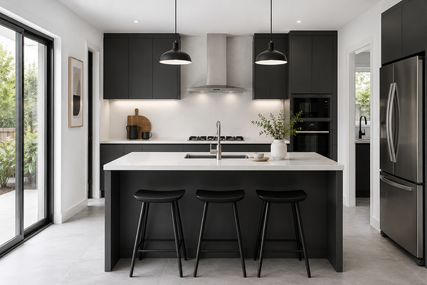
Kitchen with Dulux White on White walls
How does it look in different lighting conditions?
The blue undertone in White on White means lighting has a great influence on whether this colour feels crisp and fresh or cold and unwelcoming.
In south-facing rooms (which receive cooler, more diffused light), White on White can read quite cold. The blue undertone is amplified, and the colour can feel quite stark or uninviting, particularly in a bedroom or living space where warmth and comfort are wanted. This is its most challenging light orientation, and worth sampling very carefully before committing.
In north-facing rooms with strong, warm natural light, White on White is at its best. The warmth of the sun tempers the blue undertone and the colour reads as a clean, luminous white. This is the orientation where it earns its reputation.
In east-facing rooms, the warm morning sun keeps White on White feeling fresh and airy early in the day. As the light becomes cooler and more diffused through the afternoon, the blue undertone becomes more apparent. The room shifts from crisp and bright in the morning to noticeably cooler by late afternoon.
In west-facing rooms, the warm afternoon and evening light is what saves this otherwise cool-leaning white. The golden afternoon sun softens the blue undertone considerably, giving White on White a clean, bright quality.
Under artificial lighting: this is where White on White requires the most care. Cool white or daylight globes (4000K+) amplify the blue undertone significantly, pushing the colour into even colder territory and making a room feel rather clinical. Warm white globes (2700–3000K) do the most to tone down the blue and bring the colour closer to a clean, neutral white. These are strongly recommended if White on White is your wall colour, particularly in bedrooms and living areas.
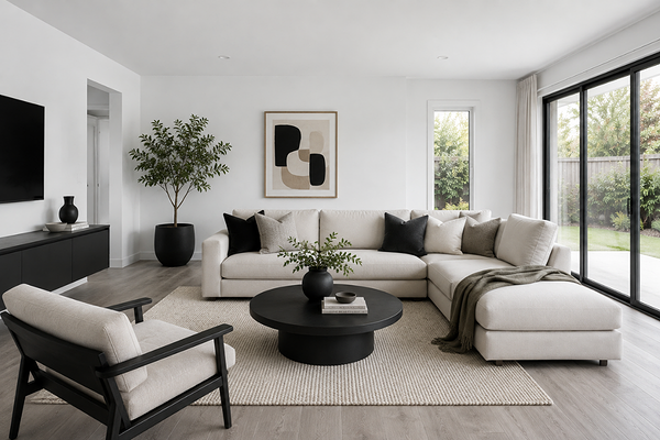
Living room with Dulux White on White walls
Best material pairings
White on White's cool, crisp quality makes it most harmonious with materials that share its clean character:
Cool-toned stone: White marble with grey or blue-grey veining, honed bluestone, and similar cool-toned stones are natural companions. They create a seamless, sophisticated palette without the undertone clash.
Polished concrete: The clean quality of White on White complements the industrial feel of concrete and raw plaster finishes for a contemporary look that warmer whites can’t achieve.
Matte black and dark charcoal: High contrast is where White on White shines - deep matte black in tapware, fixtures, frames, or cabinetry is a sharp contrast that suits contemporary and minimalist interiors particularly well.
Cool-toned or grey-washed timbers: White-washed, grey-stained, or naturally pale and cool-toned timbers sit comfortably alongside White on White without creating undertone clash. Avoid very warm, orange-toned timbers, where the temperature contrast can feel awkward.
Brushed nickel and chrome: Cool metallic finishes like brushed nickel, chrome, and stainless steel are natural partners for a cool-toned white.
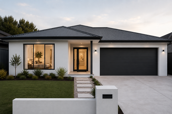
House exterior with Dulux White on White walls
Best use cases
White on White performs best where its bright, cool, clean character is an asset, such as in:
Contemporary and minimalist interiors: White on White is an excellent fit for clean-lined, modern spaces where the goal is a sophisticated palette. Its crisp quality reinforces contemporary architecture and design without feeling fussy.
Kitchens: A cool, bright white reads as clean and hygienic in a kitchen, particularly in well-lit spaces, and the blue undertone pairs beautifully with stainless steel appliances, chrome tapware, and cool-toned stone benchtops.
Bathrooms: Particularly in bathrooms with cool-toned tiles, chrome fixtures, and good lighting, White on White creates a spa-like freshness that feels intentional and refined.
Ceilings in contemporary homes: As a ceiling white in a home with cool-toned wall colours like soft greys or dusty blues, White on White creates cohesion and keeps the palette feeling unified and considered.
Trim and joinery in modern spaces: On architraves, skirting boards, and door frames in a contemporary home with cool-toned walls, White on White in semi-gloss or gloss creates a crisp, clean boundary without introducing warmth that might feel out of place.
Exteriors in warm climates: In strong sun, White on White's blue undertone is toned down considerably, and the colour reads as a clean, bright white with a fresh, contemporary quality. It suits rendered or weatherboard homes with cool-toned accents particularly well.
Where to use it with caution: south-facing rooms with little natural light, spaces with warm-toned fixed finishes where the blue undertone will create temperature tension, and bedrooms or living areas where warmth and comfort are the primary goal. In these spaces, a warmer or more neutral white like Natural White is likely to serve you better.
Best white trim colours
When White on White is used as a wall colour, the trim needs to either match it closely or step slightly brighter, but it should stay on the cool or neutral side of the white spectrum. Pairing it with a warm, creamy, or yellow-leaning trim will create an immediate undertone clash that makes both colours look off.
The most straightforward approach is to use White on White itself on the trims in a higher sheen, like semi-gloss or gloss against a flat or low-sheen wall finish. This creates a seamless, contemporary result where the contrast between wall and trim comes from sheen rather than colour.
If you want a brighter trim, a true, neutral white or a slightly cool-leaning bright white works well - something that sits at LRV 90 or above without introducing warmth, such as Dulux Vivid White.
Best coordinating colours
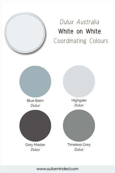
White on White's cool character means it coordinates most naturally with colours on the cooler or more neutral end of the spectrum. Here's what works beautifully:
Soft cool greys: A light to mid-tone grey that leans cool or neutral is one of the most natural pairings for White on White.
Dusty blue and soft slate: Muted, greyed-down blues are a particularly harmonious match for a cool white as they share blue undertones, creating cohesion.
Sage and grey-green: A cool, desaturated sage or grey-green pairs beautifully with White on White. The muted quality of these greens suits the clean crispness of the white without introducing warmth.
Deep navy and charcoal: For a high-contrast palette, a deep navy or neutral charcoal against White on White delivers a bold result, particularly effective in kitchens, bathrooms, and studies.
Pale blush and cool mauve: For a softer, more romantic palette, a cool-toned blush or dusty mauve can pair beautifully with White on White without creating tension.
Final thoughts on Dulux White on White
Dulux White on White is a genuinely beautiful white in the right space - bright, crisp, and contemporary, with a blue undertone that gives it a clarity and polish that warmer whites simply can't replicate. In a well-lit home with cool or neutral finishes, it can be a standout choice.
The key is to sample it generously in your space, at different times of day, and definitely under your artificial lighting at night, before committing. Pay particular attention to how it reads alongside your fixed finishes, and consider your orientation carefully. In the right conditions, White on White is excellent. In the wrong ones, it can be the reason a room feels colder than it should.
Curious whether Vivid White is the right fit for your home, or want help building a full palette around it? I'd love to help.
Check out my Colour Review Service if you’d like expert advice on whether this cool white is the right fit for your light and orientation.
Book a full colour consultationif you'd like personalised colour recommendations based on your home, your finishes, and your style.
Thank you for reading, and happy painting!
Manon xx