Mindful Gray SW 7016 by Sherwin-Williams - Paint Colour Review
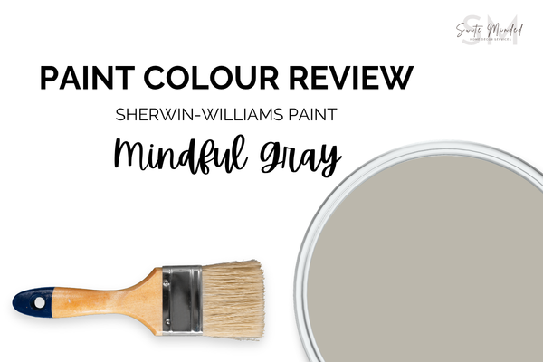
If you've been hunting for a warm grey that doesn't read too brown and doesn't go cold on you, Sherwin-Williams Mindful Gray has probably come up more than once. It's one of those colours that lands on every 'top neutral' list. But before you roll it on your walls, there are a few things you should know about how it actually behaves in a real home. Let's dig in.
Mindful Gray’s undertones
Mindful Gray sits firmly in greige territory, a blend of grey and beige that leans warm without committing fully to either. It has a primary taupe/violet undertone with a subtle hint of green, which gives it that signature soft, earthy quality. These undertones are quiet enough that most people won't consciously notice them, it just reads as warmth.
What makes Mindful Gray so liveable is that it avoids the two pitfalls that make greys tricky: it doesn't go icy or blue in natural light, and it doesn't turn muddy brown in low light. The taupe undertone is warm enough to feel cosy, but the grey base keeps it from feeling dated or heavy.
One thing to watch: if your space has a lot of pink or reddish tones in the fixed finishes (think terracotta floors, warm timber, or brick), the hint of violet in Mindful Gray can become more apparent. It's not a dealbreaker, but it's worth testing with a large sample before you commit.
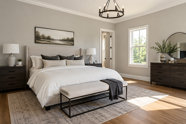
Bedroom with SW Mindful Gray walls
LRV (Light Reflectance Value)
Mindful Gray has anLRV of 48, which places it right in the middle of the scale - not light, not dark, but genuinely mid-tone. This means the colour has enough depth to feel intentional and grounded, but it also reflects enough light to avoid making a room feel heavy or closed in.
Most popular light greys/greiges like Repose Gray (LRV 58) or Agreeable Gray (LRV 60) sit significantly higher on the scale. Mindful Gray is noticeably deeper than both, which is exactly what gives it that settled, sophisticated quality. In a large, well-lit room, it will feel soft and grounded. In a smaller or darker room, it can feel a bit moodier, something to factor in if you're considering it for a windowless bathroom or north-facing bedroom.
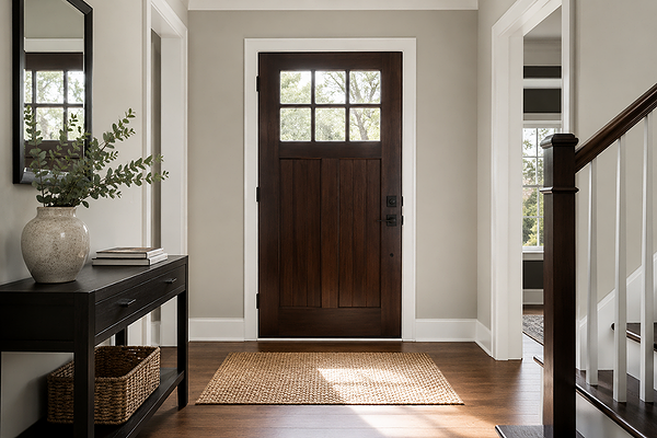
Entryway with SW Mindful Gray walls
How does Mindful Gray look in different lighting conditions?
Lighting is where Mindful Gray earns its reputation; it handles a wide range of light conditions better than most mid-tone greys.
In north-facing rooms, it stays warm and grounded. The grey base keeps it from reading too beige, while the taupe undertone prevents it from going cool or flat. This is one of the rare greys that genuinely works in low-light north-facing spaces.
In south-facing rooms with abundant warm light, it can lean a touch more beige. Still very pretty, but worth sampling if you were hoping for more grey than greige.
In east-facing rooms, morning light brings out the warmth beautifully. In the afternoon, it settles into a cooler, more neutral tone, which is a lovely shift if you use the space throughout the day.
In west-facing rooms, afternoon and evening light is where Mindful Gray shines. The warm golden light pulls out the taupe tones and gives it a rich, inviting depth that's hard to beat in a living or dining space.
Under artificial lighting: warm white bulbs (2700–3000K) enhance the cosiness and push the taupe forward. Cool white bulbs (4000K+) pull it back toward true grey and give it a more modern edge. Either works; it just depends on the mood you're going for.
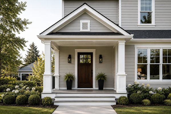
House exterior with SW Mindful Gray walls
Best material pairings
Mindful Gray's warm-neutral base makes it incredibly versatile with materials. Here's what works especially well:
Warm-toned timbers: Honey oak, walnut, and medium-toned wood floors all sit beautifully against Mindful Gray. The shared warmth creates cohesion without the palette feeling monotone.
Natural textiles: Jute, linen, cotton, and wool all feel at home against Mindful Gray. The earthy undertone connects naturally with organic materials and woven textures.
Brushed metal finishes: Brushed brass, aged bronze, and warm gold hardware add depth without competing. Brushed nickel and matte black also work well for a cleaner, more contemporary feel.
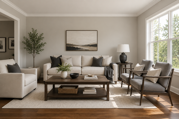
Living room with SW Mindful Gray walls
Best use cases
Because of its mid-tone depth and warm-neutral character, Mindful Gray is exceptionally flexible. It works well in:
Open-plan living and dining areas: Its depth helps define large spaces without making them feel heavy. It reads as intentional and sophisticated.
Main bedrooms: The warmth and depth of Mindful Gray create a genuinely restful atmosphere, calm without being sterile.
Hallways and entries: A mid-tone like this anchors transitional spaces and gives them a finished, considered quality that lighter colours can sometimes lack.
Home offices: It strikes the right balance between focus and comfort, structured enough to feel professional, warm enough to not feel clinical.
Exterior use: Mindful Gray translates beautifully to exteriors, particularly on homes with warm stone, brick, or timber accents.
Where to use it with caution: very small, dark rooms where the mid-tone depth could feel a bit heavy, and spaces with a lot of existing cool-toned finishes, where the warm undertone may create tension and make the space feel “off”.
Best white trim colours
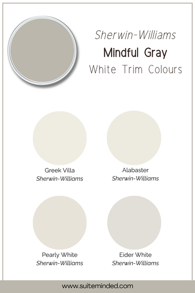
Choosing the right white trim for Mindful Gray is important; the wrong white can make the undertones look muddy or pull the whole palette off balance.
The whites that work best are those with a soft, creamy warmth, or light off-whites with the faintest hint of yellow or beige. Think Eider White SW 7014 or even Pearly White SW 7009. These share just enough warmth to create harmony without blending into the wall colour.
A warm white with slight yellow undertones is the ideal companion. Think Alabaster SW 7008 or Greek Villa SW 7551. It bridges the gap between the wall colour and the neutral without feeling stark.
If you prefer a crisper finish, a warm-leaning white with very soft muted undertones can also work, creating a more tonal, layered effect rather than a high-contrast border.
The key is to avoid stark, blue-based, cool whites, which will create too much contrast and make Mindful Gray look warmer and muddier than it actually is.
Best coordinating colours
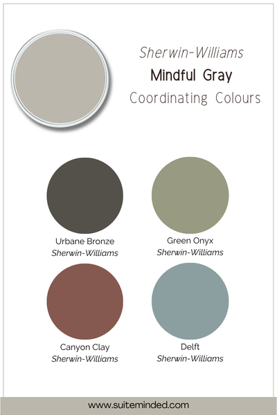
Mindful Gray's warm, earthy character means it plays well with colours that either echo its warmth or offer a quiet contrast. Here are the palettes it works with beautifully:
Muted sage and eucalyptus greens: A grey-toned green reads as sophisticated alongside Mindful Gray. The earthy feel in both colours creates a quietly organic palette.
Deep charcoal or almost-black: For contrast, a rich, warm-toned charcoal, one with brown or grey-green tones, works beautifully as an accent wall or cabinetry colour.
Dusty blush and terracotta: Soft, muted pinks and terracottas bring warmth and a hint of organic colour. These work best as accent tones in textiles or accessories rather than whole walls.
Warm navy and teal: A warm, slightly greyed navy or teal is a classic pairing for greige, bringing depth and a hint of drama.
Final thoughts on SW Mindful Gray
Sherwin-Williams Mindful Gray earns its place as a favourite for a reason. It feels warm and liveable, works well across changing light conditions, and pairs naturally with a wide range of materials and palette directions. With an LRV of 48, it has enough depth to feel sophisticated and grounded, without demanding that the rest of the room revolve around it.
If you're drawn to it, trust your instincts, but do take the time to sample it large (at least an A3 sheet) in your actual space, at different times of day.
If you're considering Mindful Gray and want to make sure it's going to work with your specific light, finishes, and layout, that's exactly what I'm here for.
Want a ready-made whole-house palette? Browse my Sherwin-Williams colour palettes in the shop - each one is designed to take the guesswork out of coordinating colours, trim, and accents.
Prefer a personalised recommendation? Book a virtual colour consultation, and I'll help you work through whether Mindful Gray is right for your space, or find the neutral that actually is.
Thank you for reading, and happy decorating!
Manon xx