Paint Colour Review: Pearly White SW 7009 by Sherwin-Williams
Thinking about painting your home in a soft, timeless white? Sherwin-Williams Pearly White SW 7009 is one of those shades that feels effortlessly elegant yet still warm and inviting. It’s a versatile white that doesn’t come off as stark or cold, which is why many love it for walls, trim, and even cabinetry.
In this post, we’ll dive into what makes Pearly White stand out: its tones and undertones, how it behaves in different lighting, its LRV (so you know exactly how light or bright it will feel), and the best white trim colours and coordinating hues to pair with it. We’ll also talk about the spaces where Pearly White truly shines, so you can decide if it’s the right fit for your home.
What are the undertones of Pearly White?
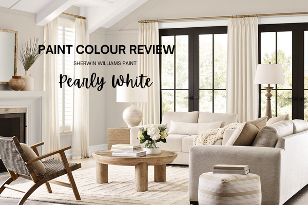
Pearly White might look like a simple white at first glance, but it’s not a flat, bright white. It has soft, subtle undertones that give it its inviting feel. There’s a touch of muted warmth with a hint of yellow, along with the tiniest whisper of grey to keep it from looking too creamy or too warm. These undertones make Pearly White feel cosy and calm, rather than cold or stark, which is why it works so beautifully in homes where you want a soft, airy backdrop that still feels lived-in.
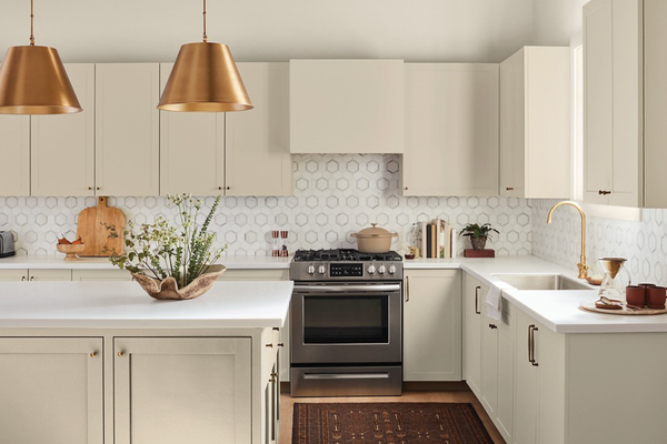
Image via sherwinwilliams.com
If you’re working on choosing a whole-house palette, you might also like The Confident Home Colour Blueprint, my step-by-step guide to pulling everything together with confidence.
What is Pearly White’s LRV?
LRV or Light Reflectance Value is a number from 0 to 100 that tells you how much light a paint colour reflects. 0 means it is pure black and absorbs all light, and 100 is pure white and reflects all light. Pearly White has an LRV of 77, which means it’s a pretty light shade, but not the brightest white. Instead, it sits comfortably in the off-white range. It reflects enough light to keep a room feeling bright and open, but it still has enough softness to avoid feeling stark or sterile. It’s the kind of neutral that adds a gentle glow, making it a great choice for spaces where you want light, airy walls without them looking too white and stark.
How does Pearly White look in different lighting conditions?
Pearly White is one of those shades that can shift a little depending on the light, which is part of its charm. In north-facing rooms or afternoon eastern light, where the natural light is cooler and more muted, Pearly White can lean a touch greyer, giving the space a soft, calm vibe. In south-facing rooms or afternoon western light, where warm sunlight floods in, it feels warmer and creamier, almost glowing without looking too yellow or creamy.
In the evenings or in spaces with artificial lighting, Pearly White tends to pick up more of its soft undertone, looking almost beige, which can make the room feel cosy and inviting. If you’re after a crisp, pure white look, make sure your lighting is on the cooler side, or balance it with fresh trim and décor.
Testing it in different rooms and at different times of day is key to making sure Pearly White is the right colour for your space.

Image via sherwinwilliams.com
Where to best use Pearly White?
Pearly White works almost anywhere, thanks to its soft warmth and versatility. It’s perfect for living rooms, bedrooms, and hallways where you want a bright, airy feel without things looking too stark. Its subtle warmth also makes it a favourite for open-plan spaces, helping tie different areas together with a cohesive, light backdrop. Because it isn’t a glaring, cool white, Pearly White is also beautiful on kitchen cabinets and bathroom walls, where you want a fresh, clean look that still feels inviting.
If you’re looking for a white that feels timeless but not cold, Pearly White is a safe and stylish choice for nearly any room in your home.
Best white trim colours with Pearly White
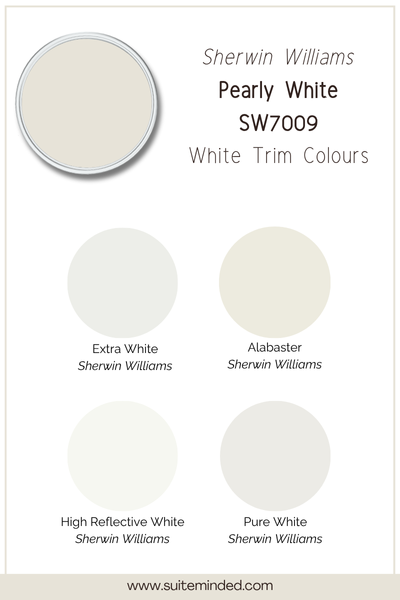
When it comes to trim, you’ll want a white that complements Pearly White’s soft, slightly warm undertone so everything feels cohesive. Here are a few of the best Sherwin-Williams options:
Pure White (SW 7005): A versatile, slightly warm white that blends seamlessly with Pearly White for a soft, cohesive look.
Extra White (SW 7006): A brighter, cleaner white that adds gentle contrast, making Pearly White walls feel warmer in comparison.
Alabaster (SW 7008): A creamy, cozy white that leans a bit warmer, perfect if you want your trim to have a softer, more traditional feel.
High Reflective White (SW 7757): The brightest, most neutral white in Sherwin-Williams’ lineup. It works if you want a sharp, modern contrast, especially in contemporary spaces.
For a calm, tone-on-tone look, you could even use Pearly White itself on the trim, which creates a soft, understated vibe.
Quick tip: No matter which white you choose, use a satin or semi-gloss finish on trim. It helps the details pop, makes cleaning easier, and gives a polished contrast to matte or eggshell walls.
What about coordinating colours?
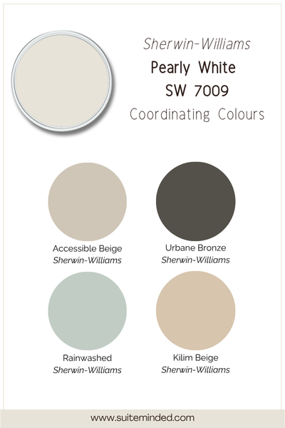
Pearly White is soft and versatile, which makes it easy to pair with a wide range of colours. Depending on the look you’re after, here are a few beautiful coordinating hues to consider:
Soft neutrals: Colours like Agreeable Gray SW 7029 or Accessible Beige SW 7036 create a calm, layered neutral palette. Perfect for open-concept spaces where you want a subtle flow from room to room.
Moody contrast: Deep shades like Urbane Bronze SW 7048 bring a dramatic edge, working beautifully on interior doors, accent walls, or built-ins.
Muted blues and greens: Hues like Sea Salt SW 6204 give a soft, coastal or spa-like vibe, especially in bathrooms and bedrooms.
Warm earth tones: For a cosier, grounded palette, pair Pearly White with shades like Kilim Beige SW 6106 or Cavern Clay SW 7701.
These combinations let Pearly White act as a flexible backdrop, so you can lean either airy and light or add depth with richer colours.
Quick tip: When building a palette, use Pearly White on walls as a backdrop, then bring in coordinating hues on cabinetry, furniture, or accent walls for balance.
——————
Pearly White is a white that feels fresh yet warm, making it a beautiful choice for almost any home. Whether you’re using it on walls, trim, or cabinetry, its soft undertones and versatility make it easy to style with a range of colours and finishes.
If you’re feeling unsure about how to pull everything together, or want help creating a cohesive whole-house palette around Pearly White that feels custom to your style and space, I can help. I offer custom colour consulting as well as ready-made whole-house colour palettes designed to make choosing paint stress-free.
You can explore my palettes here or learn more about my custom services here so you can feel confident in every paint choice you make.
Thank you for reading, and happy painting.
Manon xx