Paint Colour Review: Cloud Cover OC-25 By Benjamin Moore

Looking for a soft, effortless white that feels fresh but never stark? Take a look at Benjamin Moore’s Cloud Cover (OC-25). This light, airy neutral is known for its ability to brighten a space while still feeling calm and inviting. But here’s the thing, choosing a paint colour isn’t as simple as it looks. Undertones, lighting, and the mood you want to create all play a huge role in how a colour like Cloud Cover will actually look in your home. Will it lean warm or cool? Will it feel too bright in a brightly-lit room or just right? And how do you make it work with your trim, furniture, and other colours in your space?
In this post, we’ll break down everything you need to know about Cloud Cover OC-25: its undertones, LRV (light reflectance value), how it behaves in different lighting conditions, where it works best, and the trim and coordinating hues that make it shine. By the end, you’ll know whether this softly sophisticated tone is the perfect fit for your home or if you should keep looking.
What are Cloud Cover’s undertones?
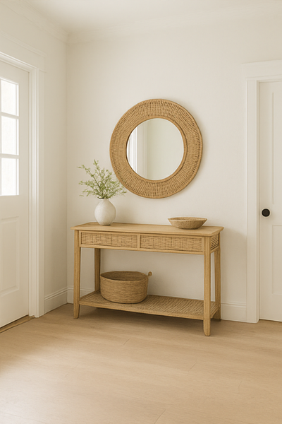
At first glance, Cloud Cover looks like a clean white, almost off-white, but look closer, and you’ll notice it carries a subtle grey undertone, keeping it from feeling harsh or stark. Despite this undertone, it doesn’t lean cool or warm; it stays rather neutral and well-balanced. Its coolness or warmth is, instead, influenced by adjacent tones and materials, like your flooring, countertops, and trim. With a light and fresh feel, Cloud Cover works beautifully in modern, coastal, and airy interiors.

What is Cloud Cover’s LRV?
In simple terms, LRV (or Light Reflectance Value) measures how much light a colour reflects, on a scale from 0 (pure black and absorbing all light) to 100 (pure white and reflecting all light). Cloud Cover has an LRV of 80.28, which puts it in the “light and bright” category, edging slightly into the off-white range. This high LRV means it reflects plenty of light in a room, making spaces feel open and airy without being too stark or clinical.
Cloud Cover works beautifully in rooms that need a lift, like darker hallways, smaller bedrooms, or spaces with limited natural light. It reflects enough light to make those areas feel brighter, yet its soft grey undertones help prevent it from looking too stark in sunnier rooms.

How does Cloud Cover look in different lighting conditions?
One of the reasons Cloud Cover is so popular is its ability to shift subtly depending on the light, without ever feeling like a completely different colour. Still, its cool grey undertones and high LRV mean lighting can make a noticeable difference.
North-facing rooms: These spaces tend to have cooler, softer light, which can make Cloud Cover’s grey undertones more visible. It will look like a crisp, airy white, but may feel a touch cooler, especially during the day.
South-facing rooms: Warm, golden sunlight will soften Cloud Cover, balancing its cool undertones and making it feel warmer and brighter. This is where it looks closest to a clean, fresh white without leaning too cold or too warm.
East-facing rooms: The warm morning light will enhance its brightness and make it feel fresh and inviting, while the cooler, bluish light in the afternoon can bring out its cooler, greyer side.
West-facing rooms: The warm glow of afternoon light will bring a hint of warmth to Cloud Cover, creating a softer, more balanced white by evening.
If your space is naturally dark or relies mostly on artificial lighting, expect Cloud Cover to read a little cooler and softer, while still brightening up the space. Pairing it with warm accents, like wood tones, warm lighting, or earthy fabrics, can help create a cosy balance.
Struggling to match this colour with the rest of your home? Undertones and flow can be tricky, but you don’t need to figure it out alone. The Confident Home Colour Blueprint is a proven 7-step guide that helps you confidently create a cohesive whole-house palette. With 76 paint colours and 6 ready-made palettes included, you’ll know exactly which whites, neutrals, and accents work together, without weeks of second-guessing.
Where to best use Cloud Cover?
Cloud Cover is one of those versatile whites that can work almost anywhere, but it really shines in spaces where you want a light, airy backdrop that feels calm and timeless.
Open-plan living areas: Its soft, fresh tone helps create a cohesive flow between rooms without feeling too stark or flat.
Bedrooms and nurseries: Cloud Cover’s gentle grey undertones make it a soothing choice for restful spaces, especially when paired with soft fabrics and natural textures.
Hallways and smaller rooms: With its higher LRV, Cloud Cover reflects plenty of light, making narrow or dimly lit areas feel brighter and more open.
Ceilings and trim: If you prefer a subtle, seamless look, Cloud Cover can also be used on ceilings and trim, creating a soft, enveloping feel.
Cloud Cover is especially well-suited to homes with warm wood tones, brass or black hardware, and enough natural light to keep it feeling bright and inviting
What is the best white trim colour?

Choosing the right trim colour can make or break how Cloud Cover looks in your home. Because it has a soft grey undertone, pairing it with the right white will help it look crisp and intentional, not mismatched. Here are some Benjamin Moore whites that complement Cloud Cover beautifully:
Chantilly Lace (OC-65): A bright, clean white with very little undertone. It creates a sharp, fresh contrast against Cloud Cover, perfect for a crisp, modern look.
Simply White (OC-117): A soft, slightly warm white. If you want to keep your trim bright but add a touch of warmth (especially in cooler spaces), Simply White balances Cloud Cover’s cooler undertones nicely. However, I wouldn’t go much warmer than this.
White Heron (OC-57): A light, cool-leaning white with subtle grey undertones, making it a natural partner for Cloud Cover if you prefer a low-contrast, harmonious look.
Sherwin-Williams Pure White (SW 7005): A versatile, balanced white with a barely-there warmth, creating a great bridge against Cloud Cover that won’t clash.
If you want a seamless, low-contrast look, you can also use Cloud Cover on both walls and trim but switch up the sheen (e.g., matte for walls, satin or semi-gloss for trim) so the finishes subtly define each surface without introducing another colour.
What about coordinating hues?
Cloud Cover’s soft, cool-leaning tone makes it easy to pair with a variety of colours, from serene neutrals to deeper accent shades. Here are some hues that work beautifully alongside it:
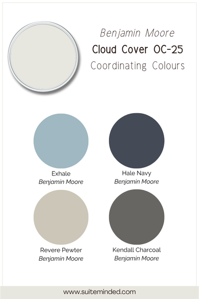
Darker greys and charcoal like Kendall Charcoal HC-166 to ground Cloud Cover and create a nice contrast.
Deep navy blues like Hale Navy HC-154 to add contrast and depth.
Warm greiges like Revere Pewter HC-172 to balance out Cloud Cover’s undertones.
Try a medium blue-grey like Exhale AF-515, or a darker muted green.
For a cohesive whole-home palette, try combining Cloud Cover as your main wall colour with one or two softer neutrals for secondary spaces, and add a darker hue as a bold accent for cabinetry, furniture, or exterior details.
——————
Cloud Cover OC-25 is a fresh, airy white with soft grey undertones that keep it from feeling too stark. It brightens spaces beautifully while staying calm and timeless, making it a great choice for living rooms, bedrooms, and whole-home palettes.
Not sure if it’s right for your space? Sample it first, and if you want help building a stress-free, cohesive colour scheme, check out my ready-made paint palettes or The Home Paint Colour Blueprint to make choosing colours simple.
Thank you for reading, and happy painting.
Manon xx