Accessible Beige vs Agreeable Gray: Which One Is Better for Your Home?
If you’ve been stuck choosing between Accessible Beige and Agreeable Gray, you’re definitely not alone. These two Sherwin-Williams paint colours are some of the most loved neutrals out there because they’re soft and versatile. But despite how often they get compared, they actually create very different feelings in a home.
One leans warmer and earthier. The other feels slightly fresher and more balanced. And depending on your lighting, flooring, fixed finishes, and overall style, one may work beautifully while the other could suddenly feel too beige, too grey, too warm, or even slightly washed out.
So if you’re trying to decide between the two, this guide will help you understand the real difference between them and where each colour tends to work best.
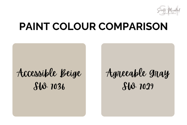
Quick overview: Accessible Beige vs Agreeable Gray
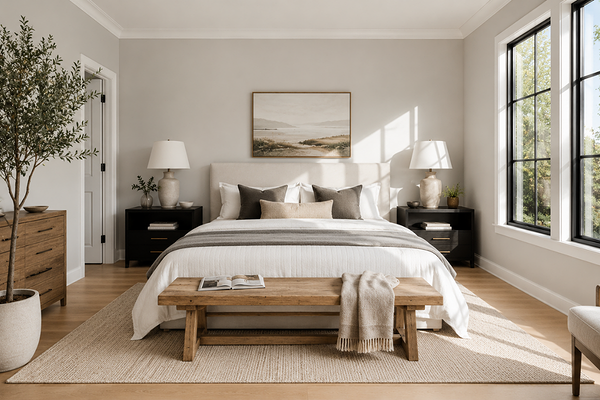
Accessible Beige (SW 7036)
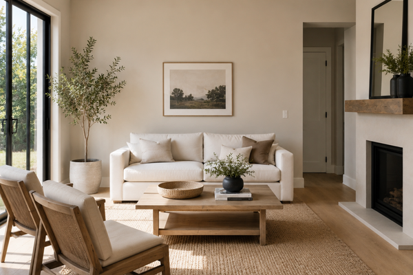
Accessible Beige is a warm beige paint colour with soft, muted grey undertones and a subtle earthy warmth. Despite the name, it’s not a traditional beige. It sits comfortably between beige and grey, but it definitely leans warmer overall, with a strong beige base.
It has an inviting, grounded feel that works especially well in homes with warm wood tones, natural textures, creamy whites, and a softer, more relaxed aesthetic.
LRV: 58
If you’re wondering what LRV means, this blog post is for you ↓
What Is LRV in Paint Colours (And Why Does It Matter?)
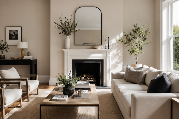
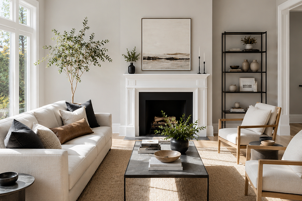
Agreeable Gray (SW 7029)
Agreeable Gray is a greige that feels slightly cooler and more balanced compared to Accessible Beige.
It still has warmth, which is why it became so popular in the first place, but it carries a softer grey influence that can feel a little cleaner and more neutral overall.
LRV: 60
If Accessible Beige feels cozy and earthy, Agreeable Gray tends to feel softer, airier, and slightly more modern.
Undertones: the biggest difference between them
This is really where the two colours start separating themselves.
Accessible Beige undertones
Accessible Beige has warm taupe-beige undertones with a subtle earthy base. In many homes, it can pick up hints of tan, soft olive, or muted warmth depending on the lighting and surrounding finishes. Because of that warmth, it usually feels more organic and comforting.
It tends to pair beautifully with:
Warm oak flooring
Creamy whites
Travertine
Natural stone
Brass or bronze hardware
Earthy textures and fabrics
If your home already has warmth in the flooring, cabinetry, or fixed finishes, Accessible Beige often feels very natural and cohesive.
Love Accessible Beige but not sure what colours to pair it with?
→ Check out this ready-made mini whole-house paint palette centred around Accessible Beige.
Agreeable Gray undertones
Agreeable Gray sits more evenly between warm and cool.
It still has warmth, but the grey influence is much more noticeable. In some lighting conditions, especially cooler natural light, it can appear more grey than beige.
Compared to Accessible Beige, Agreeable Gray usually feels:
Softer
More muted
Slightly cleaner
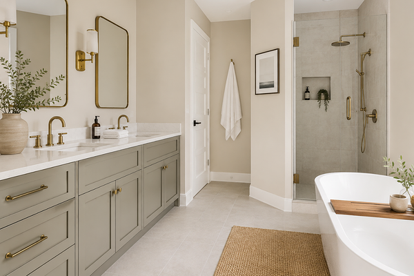
It works especially well in homes with cooler whites, marble finishes, grey flooring, black accents, and soft modern styling.
One thing to remember is that Agreeable Gray can sometimes look a touch flat or washed out in very bright lighting if the space lacks warmth elsewhere.
You love Agreeable Gray but you’re not sure how to use it in your home and are afraid of mixing undertones.
→ Check out this whole-house paint palette centred around Agreeable Gray.
How lighting affects each colour
Lighting changes everything with paint colours, and both of these colours shift more than people often expect.
Accessible Beige in different lighting
Accessible Beige usually becomes warmer as natural light increases.
In south-facing or west-facing rooms, it can feel beautifully soft and cozy without becoming overly warm. In lower-light spaces, it tends to feel richer and deeper.
In north-facing rooms, however, some of its earthy undertones can become more noticeable. This is where you may start seeing slightly taupe or more muted undertones appear.
Agreeable Gray in different lighting
Agreeable Gray tends to shift more noticeably between grey and beige depending on the light.
In warm afternoon light, it can feel soft and warm. In cooler or overcast lighting, it often leans more grey. In some rare cases, you can even see a touch of violet peak through, especially in lower light settings.
This flexibility is part of why so many people love it, but it can also surprise homeowners who expected it to feel consistently warm.
In very bright spaces, Agreeable Gray can sometimes feel lighter and less grounded than expected, especially if paired with crisp white finishes.
Where each colour works best
Best uses for Accessible Beige
Accessible Beige works beautifully when you want warmth, softness, and a more welcoming feel throughout the home.
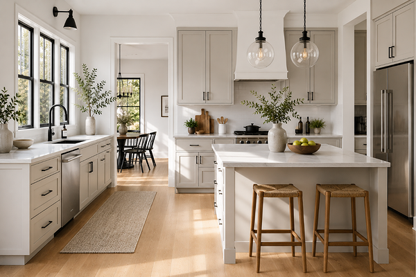
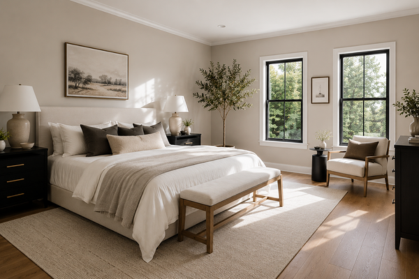
It tends to work especially well in living rooms, open-plan spaces, bedrooms, homes with warm timber flooring, Mediterranean, organic modern, farmhouse, or traditional interiors.
It also works very well as a whole-house colour because the warmth helps rooms feel connected and cohesive.
If your home already contains a lot of warm fixed finishes, Accessible Beige is usually the easier colour to work with.
Best uses for Agreeable Gray
Agreeable Gray is often the safer choice if your home sits somewhere between warm and cool finishes.
It works especially well in modern homes, homes with mixed undertones, spaces with marble or cooler countertops, hallways and open spaces, or homes with a brighter white trim.
It’s also a great option if you want a soft neutral backdrop without committing too heavily to warmth.
So… Which one should you choose?
Honestly, neither colour is universally “better.” It really depends on the feeling you want your home to have.
Choose Accessible Beige if:
You love warm, cozy interiors
Your home has warm flooring or earthy finishes
You want softness and comfort
You prefer creamy, organic neutrals
Choose Agreeable Gray if:
You want a more balanced greige
Your home has cooler or mixed finishes
You prefer a softer modern look
You want something that feels slightly fresher and lighter
From a designer perspective, I often find that Accessible Beige feels more intentional in homes that already carry warmth naturally, while Agreeable Gray tends to be the more flexible “middle ground” neutral when homeowners are unsure which direction to take.
The biggest mistake people make with both colours is choosing them based on photos online instead of testing them properly in their own lighting.
Even two homes with the same paint colour can look completely different.
So before committing, always sample both colours in multiple areas of your home and look at them throughout the day. That’s usually when the right choice becomes much clearer.
—————————
If you’d like more help, you can explore my ready-made colour palettes, my Confident Home Colour Blueprint, or my custom colour consultation services designed to help take the stress and guesswork out of choosing paint colours for your home.
Thank you for reading, and happy painting!
Manon xx