Berkshire White by Dulux Australia - Complete Paint Colour Review

Not every white is neutral and Berkshire White is proof of that. It commits fully to warmth with a lovely, creamy, yellow-toned base. In the right home and the right light, that foundation is exactly what makes it so beautiful. But a white this warm is not for every space, and understanding its yellow undertone is the difference between a result that feels gloriously sun-drenched and one that reads unexpectedly buttery. Here's what you need to know.
Undertones
Berkshire White has a clear yellow undertone, more so than most whites that describe themselves as warm or creamy. It sits closer to a true cream than to an off-white, and the yellow is present enough to be visible on a paint chip rather than only revealing itself at full wall scale. That yellow undertone is warm and honeyed, buttery, giving Berkshire White its inviting character.
One important thing to understand is that, because the yellow undertone is clear and active rather than subtle, it will respond strongly to the light and finishes in your space, as we’ll see in the next part. So, be wary of using Berkshire White if you have cool-toned finishes. Grey stone benchtops, cool-toned floor tiles, stainless steel appliances, and blue- or grey-based wall colours will all create a temperature clash with Berkshire White's yellow undertone. The contrast between cool finishes and a warm yellow-cream white can make the white look dingy or off rather than warm and inviting.
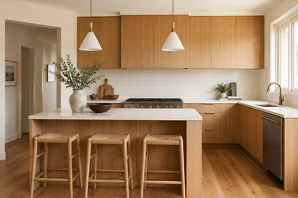
Kitchen with Berkshire White on walls and trims, honey oak cabinets
LRV (Light Reflectance Value)
Berkshire White has a Light Reflectance Value or LRV of 87, which places it in the bright end of the white spectrum. It has the same LRV as Dulux White on White, though the two colours could hardly feel more different. While White on White is crisp and cool, Berkshire White reads as genuinely warm and creamy. This is a useful reminder that LRV tells you how much light a colour reflects, not how it feels, and undertones matter enormously with whites.
In practical terms, Berkshire White is bright enough to keep rooms feeling light and open, while its warmth ensures it never tips into the clinical or stark territory. In a room with good natural light, it will feel genuinely luminous and sun-filled. In a room with limited natural light, it brings its own warmth to compensate, which is one of its genuine strengths.
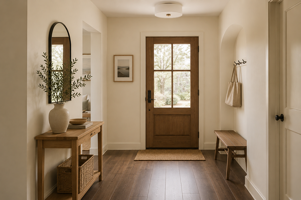
Entryway with Berkshire White on walls and trims
How does it look in different lighting conditions?
Berkshire White's clear yellow undertone means it is more responsive to light than a more neutral white would be, and the results can be quite different across orientations.
In north-facing rooms, which receive the most direct, warm sunlight, Berkshire White is at its most golden and luminous, but also at its most yellow. The warm light amplifies the yellow undertone and the colour can read as noticeably cream by midday. For those who love a warm, sun-drenched interior, this is a wonderful choice. For those who wanted a warm white rather than a cream, it's worth sampling carefully at peak sun before committing.
In south-facing rooms, which receive cooler, more diffused indirect light, Berkshire White's yellow undertone reads more neutral and toned down. The cooler light removes the golden, honeyed feel, making it look more like a yellow-tinted white than a creamy warm white in this orientation. This is one to sample very carefully in a south-facing space, particularly if the room also has cool-toned finishes.
In east-facing rooms, Berkshire White glows beautifully in the warm morning light, rich, honeyed, and inviting. As the light cools and becomes more diffused through the afternoon, the yellow becomes a little more straightforward and less golden, though the colour remains warm throughout. An east-facing kitchen or breakfast room in Berkshire White can be lovely in the morning.
In west-facing rooms, the warm afternoon and evening light is another excellent context for Berkshire White. The golden-hour light deepens the yellow undertone into something rich and honeyed, making the room feel warm and welcoming. A west-facing dining or living space in Berkshire White can look beautiful in the evenings.
Under artificial lighting: warm white globes (2700–3000K) are the ideal companion as they deepen the creamy warmth and create a beautifully inviting atmosphere. Cool white or daylight globes (4000K+) are best avoided as they can make Berkshire White look flat, more obviously yellow, and rather outdated. If you need brighter functional lighting in a kitchen or bathroom, try to balance it with warm pendants or under-cabinet lighting to maintain the warmth Berkshire White is there to deliver.
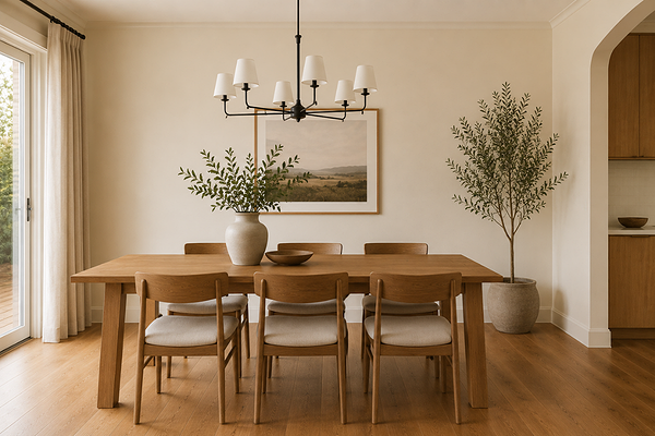
Dining room with Berkshire White on walls and trims
Best material pairings
Berkshire White's warm, creamy yellow undertone calls for materials that share its richness. It is most at home in spaces where the finishes are warm-toned throughout:
Warm and honey-toned timbers: Honey oak, warm pine, Tasmanian oak, and similar timbers are Berkshire White's most natural companions. The shared yellow warmth creates a cohesive, enveloping look that feels genuinely inviting.
Cream and ivory stone: Warm white marble, cream limestone, ivory travertine, and similar warm-toned stones echo the creamy quality of Berkshire White beautifully. These pairings work especially well in kitchens and bathrooms where stone benchtops or tiles are the dominant fixed finish.
Aged brass and warm gold: The yellow undertone in Berkshire White makes it a natural partner for warm metallic finishes, like aged brass tapware, antique gold hardware, and unlacquered brass fittings.
Terracotta and warm ceramic: Terracotta floor tiles, warm ceramic splashback tiles, and earthy pottery all sit harmoniously with Berkshire White. The earthy red-orange tones in these materials are in the same warm family and create a palette that feels grounded and considered.
Painted timber joinery and shiplap: Berkshire White on cabinetry, shiplap, or beadboard panelling delivers a creamy, traditional warmth that suits farmhouse, coastal, and heritage-style Australian homes particularly well.
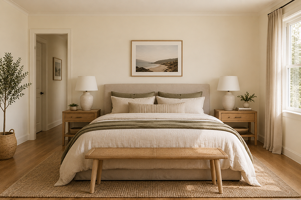
Bedroom with Berkshire White on walls and trims
Best use cases
Berkshire White's warmth and creaminess make it ideally suited to spaces and styles where comfort, character, and inviting atmosphere are the priority:
Kitchens with warm finishes: On cabinetry or walls in a kitchen with warm timber, cream stone, and brass hardware, Berkshire White delivers a classic, timeless result that feels both fresh and inviting.
Living and family rooms: As a wall colour in a well-used family space with warm timber floors and natural furnishings, Berkshire White creates the kind of background that makes a room feel immediately comfortable and lived-in.
Bedrooms: The warmth and creaminess of Berkshire White make it a genuinely restful bedroom choice, particularly in north- or west-facing rooms where the light will keep the yellow reading as honeyed warmth rather than flat. Paired with warm linen bedding and timber furniture, it creates a beautiful retreat.
Coastal and farmhouse-style homes: Berkshire White is a natural fit for the relaxed warmth of coastal and farmhouse interiors, particularly in homes with natural timber, rattan, linen, and terracotta.
Trims and joinery in warm-toned rooms: Used on skirting boards, architraves, and door frames alongside warm wall colours, Berkshire White creates a soft, tonal result rather than a stark white contrast.
Exteriors in warm climates: On weatherboard, render, or brick, Berkshire White reads as a rich, warm cream that suits homes with terracotta roofs, warm sandstone, or timber accents beautifully.
Where to use it with caution: south-facing rooms with cool-toned finishes, where the yellow undertone will read more plainly and less warmly than intended; contemporary or minimalist homes with grey, white, or cool-toned palettes; and spaces with stainless steel, cool stone, or blue-grey fixed finishes, where the temperature clash will work against both the colour and the finishes.
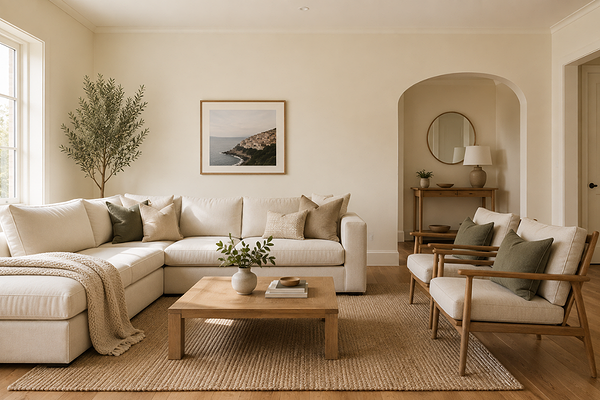
Living room with Berkshire White on walls and trims
Best white trim colours
Trim selection is particularly important for Berkshire White, because its clear yellow undertone means the wrong white trim will create an immediate and unflattering contrast. The most common mistake is pairing it with a bright, cool, or neutral white as the temperature difference will make Berkshire White look dingy or more yellow by comparison.
The safest and most beautiful approach is to use Berkshire White itself on the trims in a semi-gloss or gloss finish. The sheen difference provides all the definition needed between wall and trim without any undertone conflict, and the result is a seamlessly warm, cohesive space.
If you'd prefer a brighter trim, look for a warm cream or ivory white with its own yellow or beige lean, one that sits a touch higher in LRV than Berkshire White but shares its warmth rather than contrasting with it, like White Polar Quarter.
Best coordinating colours
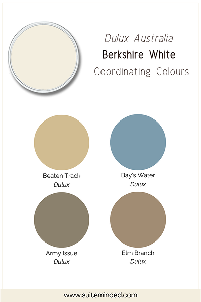
Berkshire White's warm, creamy yellow character coordinates most naturally with colours that share its organic, earthy warmth. Here's what works beautifully:
Warm greiges and sandy taupes: Soft greige and taupe tones echo the warm base of Berkshire White and create a gently layered palette that feels cohesive and settled.
Warm sage and yellow-green olive: Greens that share the yellow warmth of Berkshire White, like warm sage or soft olive tones, feel naturally at home alongside it.
Terracotta tones: Earthy reds, burnt oranges, and terracotta tones are some of Berkshire White's most flattering accent companions for a palette that feels rich and grounded.
Dusty blue and soft slate: A muted, warm-leaning blue can work as a quiet contrast against Berkshire White, particularly in soft furnishings or an accent wall. The key is to keep the blue well desaturated and warm enough that it doesn't create a sharp temperature clash with the yellow.
Warm blush and soft peach: In furnishings, artwork, or textiles, soft warm pinks and peachy tones sit naturally alongside Berkshire White's yellow-cream base as the shared warmth makes them feel cohesive and gentle.
Final thoughts on Dulux Berkshire White
Dulux Berkshire White is a white that knows exactly what it is: warm, creamy, and yellow-toned. In a home with warm finishes, good natural light, and a palette that leans earthy and organic, it's one of the most inviting whites you can put on a wall. With an LRV of 87, it has the brightness to keep rooms feeling light and open, while its clear yellow undertone ensures every room it touches feels immediately welcoming.
The key is to be honest with yourself about whether your space is right for it. Sample it generously, at least A3 size, on the actual wall, and look at it in the morning, at midday, and in the evening under your artificial lighting. Pay particular attention to how it reads alongside your fixed finishes. In the right conditions, Berkshire White is genuinely beautiful. In the wrong ones, the yellow undertone will let you know.
Want to know if Berkshire White is the right white for your home, or need help building a warm palette around it? I'd love to help.
Check out my Colour Review Service if you’d like expert advice on whether this warm white is the right fit for your light and orientation.
Book a full colour consultation if you'd like personalised colour recommendations based on your home, your finishes, and your style.
Thank you for reading, and happy painting!
Manon xx