Annapolis Gray HC-176 By Benjamin Moore - Paint Colour Review
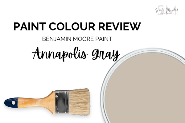
Annapolis Gray by Benjamin Moore is one of those colours that gets slightly overlooked in favour of other more popular greige tones, but I think it deserves a lot more attention than it gets. It’s not a loud colour. It’s not going to stop you in your tracks on a paint chip. But put it on a wall, step back, and there’s somehting quietly compelling about it that’s hard to put your finger on. It has depth. It has warmth. And it has just enough complexity to keep it interesting. Let’s break down exactly why.
Undertones
Annapolis Gray is a greige at heart - a classic blend of grey and beige that makes it feel grounded and warm without committing fully to either. Its primary undertone is taupe, which gives it that earthy, slightly dusty quality. But here's the thing about taupe: it almost always carries a hint of violet or mauve with it, and Annapolis Gray is no exception.
That violet quality is what makes this colour taupe/greige rather than plain beige or straightforward grey. The taupe and the violet work together in balance, giving Annapolis Gray a beautiful soft, almost powdery quality. It will read as a warm neutral in most conditions - you’re not going to walk into a room and think ‘purple’. But you may notice it slightly more in cooler or more diffused light.
One thing to keep in mind: because of the violet in the taupe, Annapolis Gray can occasionally feel like it's pulling slightly mauve in rooms that have a lot of pink-toned fixed finishes, like warm terracotta, rosy brick, or pink-veined stone. It's not dramatic, but it's worth being aware of. Sample it alongside your specific finishes before you commit, as you would with any colour this nuanced.
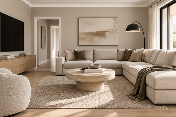
Contemporary living room with BM Annapolis Gray walls
LRV (Light Reflectance Value)
Annapolis Gray has an LRV of 50.72, which puts it right in mid-tone territory. It's not trying to be light and airy, and it's not trying to be dramatic and moody. It just settles comfortably into that in-between space where it feels present and grounded without being heavy.
If you're familiar with other colours I've reviewed, this sits just a touch above Mindful Gray (LRV 48) and below the popular lighter greiges like Revere Pewter (LRV 55.05), Repose Gray (LRV 58), Edgecomb Gray (LRV 63.09), or Agreeable Gray (LRV 60). Annapolis Gray has noticeably more depth than those lighter options.
In a well-lit room, it will feel warm and grounded - the kind of colour that anchors a space without competing with anything else in it. In a room with limited natural light, it can read a touch deeper, which can actually be really beautiful in a dining room or bedroom where you want that cocooning feel.
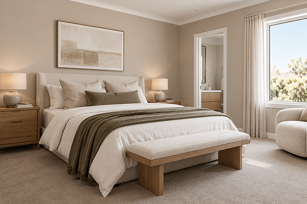
Bedroom with BM Annapolis Gray walls
How does it look in different lighting conditions?
This is where Annapolis Gray gets really interesting because its taupe-violet undertones mean it shifts character more noticeably across different light conditions than a simpler greige would.
A quick note for my readers: I'm covering both Northern Hemisphere (US & Canada) and Southern Hemisphere (Australia) orientations here, since BM is available in both the US and Australia, and the light rules are flipped between the two.
If you're in the US or Canada:
North-facing rooms receive cooler, more diffused light, and this is where the violet in the taupe becomes most noticeable. Annapolis Gray can read with a soft, slightly muted mauve quality in these conditions, which is still very beautiful, but worth sampling carefully if you were expecting a warmer, more straightforward greige.
South-facing rooms get strong, warm natural light, and this is where Annapolis Gray shows its warmest, most grounded side. The taupe takes the lead, the violet softens into the background, and the colour reads as a rich, settled greige. This is arguably its most flattering showing.
East-facing rooms get warm direct morning light that brings out the taupe beautifully; great for a bedroom or kitchen you use in the mornings. As the afternoon light cools, the violet quality becomes a little more present, giving the colour a subtle shift across the day.
West-facing rooms are treated to warm afternoon and evening light that deepens the taupe and gives Annapolis Gray a rich, enveloping quality; particularly lovely in dining rooms and living spaces used later in the day.
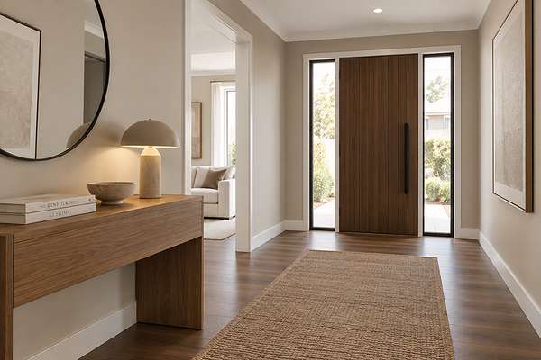
Entryway with BM Annapolis Gray walls
If you're in Australia:
North-facing rooms receive the most direct, warm sunlight in Australia, and this is where Annapolis Gray is at its warmest and most grounded. The taupe leads, the violet sits quietly in the background, and the colour feels rich and settled. A great orientation for this one.
South-facing rooms get cooler, more diffused indirect light, and this is where the violet in the taupe becomes a little more apparent. It won't look purple, but it will read with a softer, slightly more muted quality that's still very lovely; just be sure to sample it in this light before committing.
East-facing rooms enjoy warm direct morning sun that flatters the taupe warmth beautifully early in the day. As the light cools through the afternoon, the subtle violet quality becomes a little more visible.
West-facing rooms get that gorgeous warm afternoon and evening light that deepens the taupe and makes Annapolis Gray feel especially rich and inviting - one of the loveliest orientations for this colour if you use the space in the afternoon or evening.
Under artificial lighting: warm white globes (2700–3000K) are my recommendation here, as they bring out the taupe warmth and keep the violet reading as subtle rather than active colour. Cool white or daylight globes (4000K+) can push the violet forward more than you'd expect, giving the colour a slightly cooler, more mauve quality in the evenings.
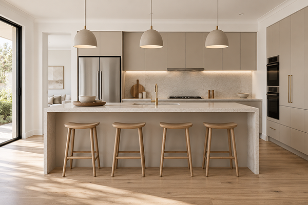
Kitchen with BM Annapolis Gray cabinets
Best material pairings
Annapolis Gray's earthy, muted warmth makes it genuinely versatile with materials, but it really sings alongside things that share its grounded, organic character:
Warm and mid-toned timbers: Walnut, oak, and warm-toned hardwood floors are a natural match. The shared warmth creates cohesion without the palette feeling monotone, and the taupe base in Annapolis Gray keeps the timber from reading too orange or yellow by contrast.
Honed natural stone: Honed marble, limestone, and travertine in warm white or soft grey tones are beautiful alongside Annapolis Gray.
Brushed brass and aged bronze: The taupe undertone in Annapolis Gray plays beautifully with warm metallic finishes. Brushed brass tapware, aged bronze hardware, and warm gold light fittings all add richness without competing.
Concrete and raw plaster: The muted, slightly dusty quality of Annapolis Gray makes it a surprisingly good companion for raw, textured surfaces. Concrete floors, plaster walls, and similar finishes share the same quietly sophisticated character.
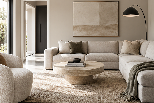
Living room with BM Annapolis Gray walls
Best use cases
Annapolis Gray is one of those colours that works across a lot of different spaces with a flexibility that brighter or more saturated colours don't always have:
Living and dining rooms: At mid-tone depth, Annapolis Gray gives these main living spaces a sense of definition and warmth without making them feel heavy.
Main bedrooms: The muted warmth of Annapolis Gray creates a genuinely restful atmosphere in a bedroom: calm, grounded, and sophisticated without being boring. I especially love it in a bedroom with warm timber furniture and linen bedding.
Home offices and studies: The depth and quiet character of this colour work beautifully in a workspace; it's present enough to feel intentional, and calm enough to help you focus.
Entryways and hallways: A mid-tone greige in a transitional space instantly makes a home feel more polished, and Annapolis Gray can do this really well.
Kitchen cabinetry: As a cabinet colour, Annapolis Gray offers something more nuanced than a plain grey or a straightforward greige. Paired with warm brass hardware and a natural stone benchtop, it's a really beautiful kitchen palette.
Exteriors: Annapolis Gray translates really well to exteriors, particularly on rendered homes, weatherboard, or brick with warm stone or timber accents. It reads as a confident, sophisticated mid-tone that holds its own at full scale.
Where I'd use it with a little more caution: rooms with very limited natural light where the depth of a mid-tone can start to feel heavy, and spaces with strongly pink or warm red- or orange-toned fixed finishes where the violet in the taupe can occasionally create some tension.
Best white trim colours
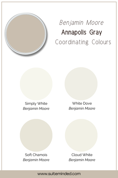
Getting the white trim right with Annapolis Gray is really important because the taupe-violet undertones mean the wrong white can either make the colour look muddier or push the violet forward more than you intended.
My recommendation is to reach for a soft, warm white with a gentle cream lean to echo the warmth in the taupe without being strongly yellow. This kind of trim creates a harmonious boundary that lets Annapolis Gray do its thing without introducing any temperature clash. Think colours like BM White Dove, BM Soft Chamois, or BM Cloud White.
If you want a crisper, more contemporary contrast, a true neutral white with no strong undertone like BM Simply White can also work well, giving you a clean boundary without the coolness of a blue-based white, which is what you want to avoid here. A strongly cool or bright white trim will create too much contrast and can make the violet in the taupe read more prominently by comparison, which tends to feel unintentional rather than considered.
Best coordinating colours
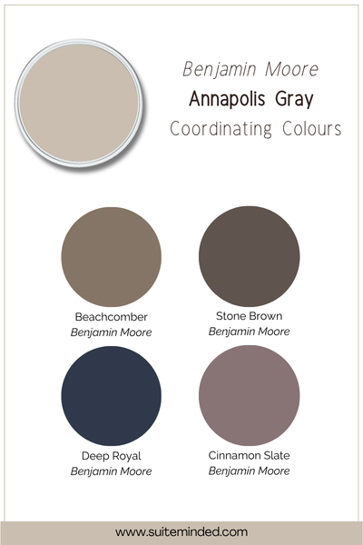
Here's what I love with Annapolis Gray:
Soft warm whites and creams: A gentle off-white on ceilings, trim, or adjoining walls is the most cohesive and flattering direction. It keeps the palette feeling light and airy while letting Annapolis Gray anchor the space.
Dusty mauve and soft blush: Given the violet quality in the taupe, muted mauve and dusty blush tones feel genuinely at home alongside Annapolis Gray. They're in the same family, and used in furnishings or soft accents, they create a palette that feels cohesive and quietly feminine.
Muted sage and warm olive: A desaturated, earthy green is a classic and beautiful companion for a taupe greige. It adds an organic dimension to the palette without competing with the warmth of Annapolis Gray. Keep the green warm and muted rather than cool or vivid, and it'll sit perfectly.
Deep, warm charcoal: For contrast and grounding, a rich charcoal with warm brown undertones anchors the palette beautifully.
Soft dusty blue and slate: A muted, grey-leaning blue creates a calm, layered palette alongside Annapolis Gray. The violet in the taupe creates a natural bridge between the two colours. Make sure to keep the blue soft and desaturated.
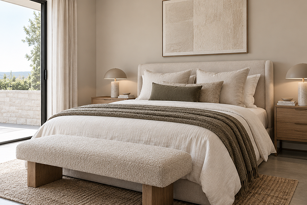
Master bedroom with BM Annapolis Gray walls
Final thoughts on BM Annapolis Gray
If you've been on the hunt for a greige that has a little more personality than the more popular ones, Annapolis Gray is genuinely worth your attention. The taupe-violet balance gives it a soft complexity, and it has enough depth to feel like a real, considered colour choice rather than a safe default.
As always, please sample it large before you commit - an A3 sheet minimum, on the actual wall, at different times of day. Mid-tones like this can look quite different at chip scale versus full wall, and because the taupe-violet balance shifts with the light, you really want to see it in your specific space before you roll with it.
Thinking about using Annapolis Gray in your home and want to make sure you get the palette right around it? I've got you.
Check out my Colour Review Service if you’d like expert advice on whether this complex greige is the right fit for your light and orientation.
Book a full colour consultationif you'd like personalised colour recommendations based on your home, your finishes, and your style.
Thank you for reading, and happy painting!
Manon xx