Raindance 1572 by Benjamin Moore - Paint Colour Review
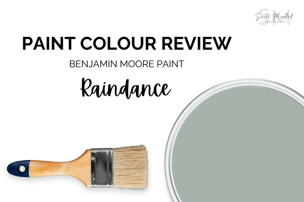
Raindance by Benjamin Moore is a lovely tone that feels both fresh and restful, the one you find inside a really beautiful old house somewhere in the English countryside. It's green, but it's not garden green. It's got blue in it, but it's not blue. It's muted and dusty and a little bit dreamy. It's one of my favourite kinds of accent colour to work with. Let me tell you why, and what to watch out for.
Undertones
Raindance is a soft, muted green at its core, but the subtle hint of blue undertone is what gives it that hazy quality. The green is earthy and muted rather than bright or botanical. There’s no yellow in it, which is what keeps it from reading as a warm sage or olive green.
The blue undertone stays largely in the background, but it’s doing important work. It’s what gives it a slight coolness and the sense of depth that stops Raindance from feeling flat. In cooler, more diffused light, it becomes a little more present, pushing the colour toward a soft blue-grey-green that's genuinely stunning. In warm light, the blue recedes, and the green takes over, giving the colour a softer, more organic feel.
One thing to be aware of: because Raindance has no yellow in it, it won't warm up the way olive and sage greens do in direct light. It's a cool-leaning green, and pairing it with warm-toned materials is what adds the warmth rather than the colour itself. Keep that in mind when you're planning the rest of your palette.
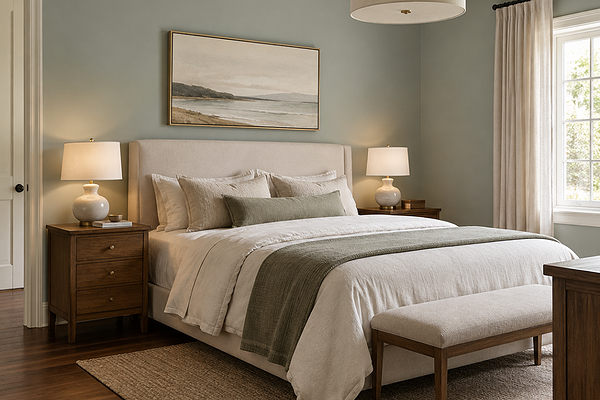
Bedroom with BM Raindance walls
LRV (Light Reflectance Value)
Raindance has an LRV of 43.47, which puts it firmly in the mid-tone range. It has a noticeable depth and reads as an intentional and grounded colour without tipping into dark or dramatic.
In a well-lit room, it can look wonderful as it deepens and enriches in a way that feels luxurious and elegant. In a room with limited natural light, it can feel quite immersive, so it’s worth knowing about your light situation before going all-in on four walls.
That said, Raindance is still very liveable as a full-room colour in the right space. It just needs good natural light or a thoughtful artificial lighting plan to show off its best qualities. Get that right, and it's one of the most beautiful colours you can put in a room.
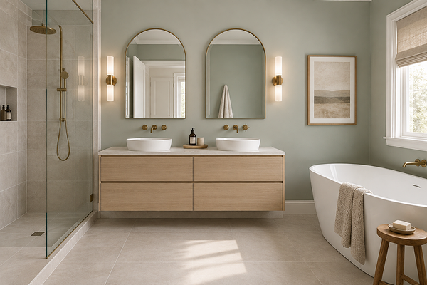
Bathroom with BM Raindance walls
What does it look like in different lighting conditions?
Raindance is a genuinely light-sensitive colour. The balance between the green and blue shifts meaningfully depending on what kind of light your room gets. Since Benjamin Moore is available in both the US and Australia, here's how it plays out in both hemispheres.
In the US/Canada: north-facing rooms bring the blue undertone forward, and Raindance reads with a cool, slightly grey-green quality that looks beautiful and serene, but cooler than you might expect. South-facing rooms with warm direct sun are where the green takes the lead, and the colour feels its warmest and most grounded. West-facing rooms catch the warm golden-hour light beautifully - one of the loveliest lighting for this colour.
In Australia: north-facing rooms get the most direct warm sun, which brings out the green and keeps the blue quietly in the background. It’s warm, grounded, and really lovely. South-facing rooms receive cooler, more diffused light that pushes Raindance toward a softer blue-grey-green, which is still beautiful but worth sampling carefully. East-facing rooms glow warmly in the morning and shift slightly cooler through the afternoon.
Under artificial lighting: warm white globes (2700–3000K) bring out the green and keep the colour feeling organic and inviting in the evenings. Cool white or daylight globes (4000K+) push the blue undertone forward and can make Raindance feel noticeably cooler and more grey-green, which is not necessarily a bad result, but a different one. I'd recommend testing both in your space before you decide.
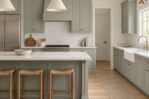
Kitchen with BM Raindance cabinets
Best material pairings
This is where the fun really starts with Raindance. Because it's a cool-leaning green, the materials you choose alongside it are what bring the warmth.
Warm and mid-toned timbers: Oak, honey, walnut, and warm hardwood floors are the most natural companion for a colour like this. The contrast between the cool, muted green and the warm richness of timber works every single time.
Aged brass and warm gold: Brass against a muted green is a classic pairing for a reason. The warmth of the metal balances the cool of the green in a way that feels elegant and considered.
Natural stone with warm veining: Warm white marble, travertine, or limestone with honey or gold veining creates a beautiful counterpoint to Raindance's cool green.
Matte black and dark charcoal: For a more contemporary take, matte black fixtures and frames create a sharp contrast against Raindance that feels modern and intentional.
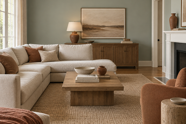
Living room with BM Raindance walls and terracotta accents
Best use cases
Raindance is one of those colours that I genuinely think works almost anywhere, as long as the light is there to support it. Here's where it really shines:
Bedrooms: This might be my favourite use for Raindance. The calm, muted quality of the colour creates such a genuinely restful atmosphere. Paired with warm linen, timber, and brass, it's a bedroom combination I'd have in my own home in a heartbeat.
Living rooms: In a well-lit living room, Raindance creates an enveloping feel that makes a space look designed rather than just decorated.
Studies and home offices: The focus and calm that this colour creates makes it a brilliant choice for a workspace. It's stimulating enough to keep you present, and calming enough to keep you from feeling overwhelmed.
Powder rooms and bathrooms: Raindance is an ideal colour to add to walls or a vanity in a bathroom, creating an instantly relaxing, serene, and spa-like atmosphere.
Kitchen cabinetry: On cabinetry or an island, Raindance is a sophisticated alternative to the more popular navy or sage kitchens. Paired with warm stone benchtops and brass hardware, it's a kitchen palette that feels genuinely elegant, luxurious, and subtly coastal.
Exteriors: Raindance translates beautifully to exteriors, particularly on rendered homes or weatherboard with warm stone or timber accents.
Where I'd be a little more careful: rooms with very limited natural light, where the depth of LRV 43.47 can start to feel heavy; and spaces with predominantly cool-toned fixed finishes, where the blue undertone can push the colour into feeling more cold than calm.
Best white trim colours
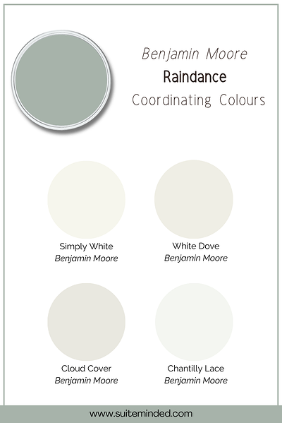
The trim choice with Raindance can really make or break the result, so it's worth thinking about carefully. The biggest decision is whether you want warmth or contrast, and both are valid approaches depending on the look you're going for.
My personal favourite with a muted green like this is a soft, warm white with a faint yellow undertone. It adds warmth that the green itself doesn't bring, and the result is a pairing that feels inviting and harmonious rather than sharp. Think of soft whites like BM White Dove or BM Cloud Cover.
If you want more contrast and a crisper, more contemporary result, a true neutral white with no strong undertone works well alongside Raindance. Just avoid cool or blue-based whites, which will amplify the blue undertone in the green and create a cold, slightly clinical feeling. Think of whites like BM Simply White and BM Chantilly Lace.
Best coordinating colours
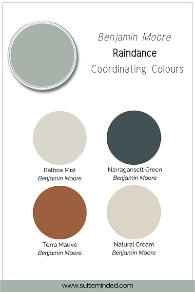
Here's where I really love working with Raindance. Its muted, dusty green-blue base opens up some genuinely beautiful palette directions:
Warm off-whites and soft creams: A warm white on ceilings, trim, and adjoining walls adds the warmth that Raindance doesn't bring on its own.
Warm caramel, honey, and tan tones: In timber accents, leather furnishings, or woven textiles, these warm earthy tones are the most flattering companions for Raindance.
Deep, moody navy or teal: For a layered palette, a deep navy or teal in a neighbouring room or as a cabinetry colour creates a sophisticated tonal connection with Raindance.
Dusty terracottas: The complementary contrast between a muted green and a soft terracotta is one of my favourite palette combinations. It’s earthy, organic, and genuinely beautiful. Used in soft furnishings or as an accent, terracotta brings a warmth that makes Raindance feel even more special.
Soft, warm charcoal: A deep, warm-toned charcoal grounds the palette beautifully and gives it a sense of depth and confidence — on a feature wall, cabinetry, or in furnishings, it's a really strong companion for Raindance.
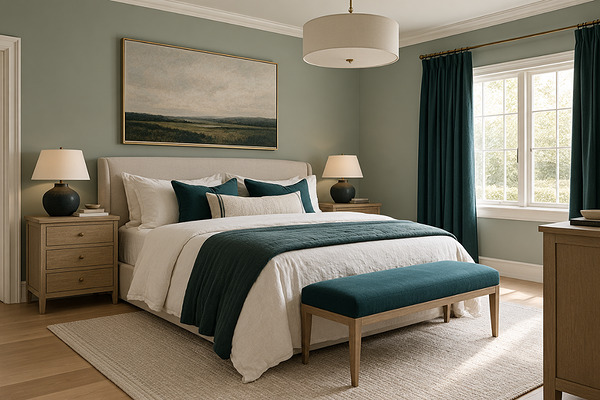
Bedroom with BM Raindance walls and teal accents
Final thoughts on BM Raindance 1572
Raindance is one of those colours that I genuinely think is having a moment right now, and for very good reason. It has a depth that so many of the more popular greens and sages don't quite manage, and with an LRV of 43.47 it's rich enough to add real colour and presence without looking overly dramatic or moody.
As always, please sample it large before you commit, and pay close attention to how your light quality affects the balance between the green and the blue. That shift is part of what makes this colour so beautiful to live with, but you want to know what you're signing up for.
Want to build a full palette around Raindance or make sure it's the right fit for your space? I'd love to help.
Check out my Colour Review Service if you’d like expert advice on whether this layered greige is the right fit for your light and orientation.
Book a full colour consultation if you'd like personalised colour recommendations based on your home, your finishes, and your style.
Thank you for reading, and happy painting!
Manon xx