Celery SW 6421: A Complete Review of Sherwin-Williams’ 2027 Colour Of The Year

Sherwin-Williams just dropped their 2027 Colour of the Year, and… it’s a green! Specifically, it’s Celery SW 6421, a soft, airy, yellow-toned green that sits somewhere between a pale sage and a fresh herb garden. After years of warm neutrals dominating every interior, there’s something quite refreshing about this bright-but-not-loud green. But as always, a Colour of the Year announcement and whether that colour actually works in your home are two very different conversations. Let me break it down for you.
Undertones
Celery is a soft green with a clear yellow undertone. It’s what gives the colour its freshness and energy, and what separates it from the cooler, greyer sage greens that have been everywhere over the last few years. Think more sunlit herb garden.
Sherwin-Williams describes Celery as sitting between an airy pastel and a grounded herbal hue, and that’s actually a pretty accurate description. It’s not a pastel, and it’s not an olive green that reads as earthy and dark either. It occupies a lovely in-between space that makes it much more versatile than you might expect.
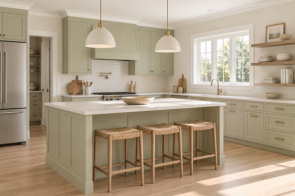
Kitchen with SW Celery on cabinets
LRV (Light Reflectance Value)
Celery has an LRV of 71, which places it in the lighter end of the range - noticeably lighter than a deep sage or olive, but with a little more depth than a very pale or pastel green. One of the things I find most interesting about this colour is it’s light enough to feel airy and open, but deep enough to read as a real, considered colour choice rather than a hint of green that you have to squint to see.
In practical terms, Celery will keep rooms feeling bright and open, particularly helpful if you’re nervous about committing to a green and worried it might make a space feel smaller or darker. It won’t. It has enough reflectivity to hold its own in rooms with moderate natural light, and in a well-lit space it will feel genuinely luminous and fresh.
Celery gets interesting in smaller spaces with less natural light because, even though it’s on the lighter side, the yellow-green combination can start to feel more intense than it does on a large, well-lit wall. As always, sampling large is non-negotiable. What reads as a soft, airy green on a chip can feel like more of a statement on a wall.
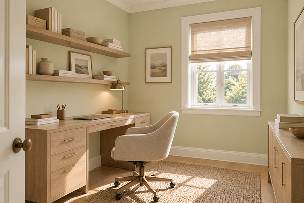
Home office or study with SW Celery on walls
How does it look in different lighting conditions?
Celery's yellow undertone makes it noticeably light-sensitive; the balance between fresh and warm shifts depending on your orientation.
North-facing rooms with cool or more diffused light bring the green forward and tone down the yellow, giving Celery a soft, more classic quality. Still lovely, just less zingy and lively.
South-facing rooms with warm direct sun are where the yellow activates, and the colour really shows itself. It looks fresh, energised, and genuinely gorgeous.
West-facing rooms catch that golden hour light beautifully, deepening the yellow-green tones into something warm and inviting in the evening.
East-facing rooms get a beautiful crisp, sunny quality in the morning, showing the gorgeous warmth of Celery. That warmth softens and tones down slightly through the afternoon.
Under artificial lighting: warm white globes (2700–3000K) deepen the yellow and keep Celery feeling warm and inviting in the evenings. Cool white or daylight globes (4000K+) push the green forward and can make the colour feel crisper and cooler - not bad, just different. Avoid very warm, amber-toned bulbs below 2700K, which can make the yellow tip into territory that reads more lime than celery.
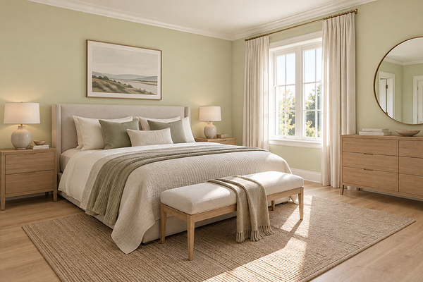
Bedroom with SW Celery on walls
Best material pairings
This is where Celery gets really fun to work with. The warm yellow-green base means it pairs beautifully with materials that share its organic, natural character:
Warm and light-toned timbers: Blonde oak, warm pine, and light-toned hardwoods are some of the most natural companions for Celery. The shared warmth and organic quality create a palette that feels fresh and nature-inspired without trying too hard.
Cream and warm white stone: Warm white marble, limestone, and travertine in cream or ivory tones sit beautifully alongside Celery, echoing the yellow undertone and keeping the combination feeling cohesive.
Brushed brass and warm gold: Warm metallic finishes complement Celery's yellow undertone beautifully.
Matte black for contrast: If you want a more graphic, contemporary feel, matte black fixtures and frames create a sharp contrast against Celery that reads as bold and intentional. It's a combination that works particularly well in kitchens and bathrooms.
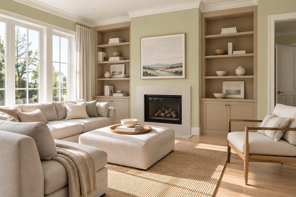
Living room with SW Celery on walls
Best use cases
One of the things I genuinely love about Celery is how flexible it is. It doesn't demand a particular style or setting; it works across a really wide range of spaces and styles:
Living rooms: As a full-room wall colour in a well-lit living space, Celery creates a fresh, uplifting atmosphere that's rare in a neutral-dominated palette. It reads as energised without being overwhelming.
Kitchens: On cabinetry or walls in a kitchen with warm timber and brass, Celery is a genuinely exciting alternative to the more popular white or grey kitchen. It brings freshness and personality without being overwhelming.
Bedrooms: Softer and more restful than it sounds, Celery creates a calm, nature-inspired bedroom atmosphere. It is particularly beautiful paired with warm linen and timber furniture.
Powder rooms and feature spaces: As a full-colour statement in a small space, Celery is playful and confident without being too much.
Cabinetry, built-ins, and accents: If a full room feels like a lot, Celery on a kitchen island, built-in shelving, or a bathroom vanity is a brilliant way to bring the colour in at a scale that feels considered without being too committed to it.
Where I'd think carefully: rooms with cool-toned fixed finishes where the yellow undertone may feel at odds with the rest of the space; and very small or poorly lit rooms where an LRV of 71 with a yellow-green combination could feel more intense than expected.
Best white trim colours
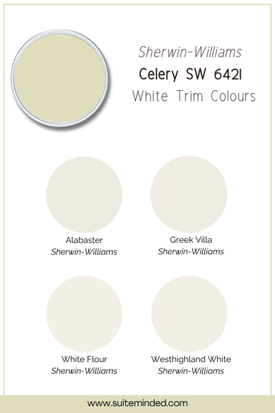
Trim selection with Celery is important, and the yellow undertone means you need to stay warm. A cool or blue-based white trim will clash with the yellow-green and make the wall colour look more acidic than it actually is, which is not the look anyone's going for.
The best approach is a soft, warm white with a faint cream lean to echo the warmth of the yellow undertone, creating a harmonious boundary that lets Celery shine. Think whites like Alabaster SW 7008, Greek Villa SW 7551, or Westhighland White SW 7566.
Sherwin-Williams themselves suggest White Flour SW 7102 as a coordinating lighter neutral, which has that soft, warm quality that works beautifully as a trim alongside Celery. If you want something slightly crisper, a true neutral white with no strong lean can also work - just steer clear of anything cool, grey-based, or stark bright white.
Best coordinating colours
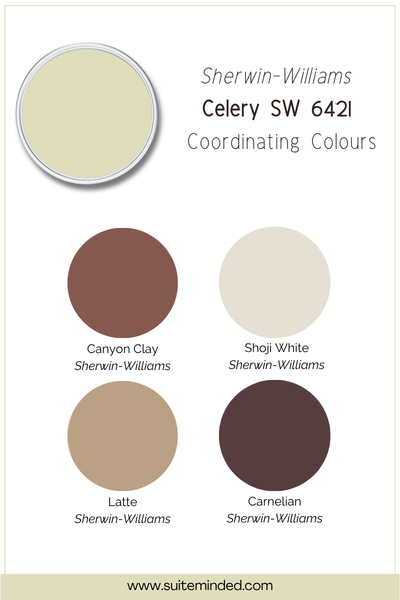
Celery's warm yellow-green base gives it a surprisingly broad palette range to work with. Here's what I love alongside it:
Soft warm whites and creams: The most essential pairing; a warm off-white on ceilings and trim keeps the palette feeling fresh and cohesive rather than overly green. This is the foundation of almost any Celery palette.
Deep earthy greens: Deeper, more grounded greens, like Artichoke SW 6179 or Cocoon SW 6173 from SW's own coordinating palette, create a tonal, layered scheme that feels nature-inspired and sophisticated. Used on cabinetry or in an adjoining room, they give the palette depth without changing direction.
Warm caramel and honey tones: In timber tones, accents, leather furniture, or woven textiles, warm caramel and honey tones are very flattering companions for a yellow-leaning green. The warmth they bring is exactly what Celery needs to feel grounded and liveable.
Dusty terracotta and warm clay: A muted terracotta is a stunning complement to Celery. The warm red-orange sits opposite the yellow-green on the colour wheel in a way that feels energised and organic rather than overly contrasting. Used in soft furnishings or as an accent, it brings a beautiful warmth to the palette.
Deep plum and rich burgundy: For a bolder, more expressive direction, deep plum and burgundy tones, like Plum Brown SW 6272 from SW's own Celery collection, create a rich contrast that's unexpected and gorgeous. Not for the faint-hearted, but absolutely worth considering if you love a more daring palette.
Soft lavender and dusty purple: SW's own coordinating palette includes Potentially Purple SW 6821 as a softer accent, and it works beautifully. The cool purple sits in quiet contrast to the warm yellow-green and adds a playful, unexpected touch to the scheme.
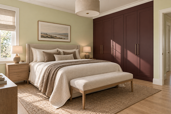
Bedroom with SW Celery on walls and burgundy accent
Final thoughts on SW Celery SW 6421
I'll be honest, when a Colour of the Year is announced, my first instinct is always to look past the marketing and ask whether it's actually a great colour to live with. And with Celery, the answer is yes. It's genuinely well-balanced, it's fresh, and with an LRV of 71, it's approachable enough that it doesn't require a perfectly curated home to look good. The yellow undertone gives it life and warmth, and the green keeps it grounded. It's a colour that makes sense for where interiors are heading right now.
That said, it's not for every home or every light condition, and the yellow undertone is the variable that will make or break it in your specific space. Sample it large, A3 minimum, and look at it across a full day before you commit. If it sings in your light, you're in for something really special.
Excited about Celery and want to build the right palette around it for your home? I'd love to help.
Check out my Colour Review Service if you’d like expert advice on whether this layered greige is the right fit for your light and orientation.
Book a full colour consultation if you'd like personalised colour recommendations based on your home, your finishes, and your style.
Thank you for reading, and happy painting!
Manon xx