Dulux Australia Colour Forecast 2027: My Full Breakdown of Every Palette
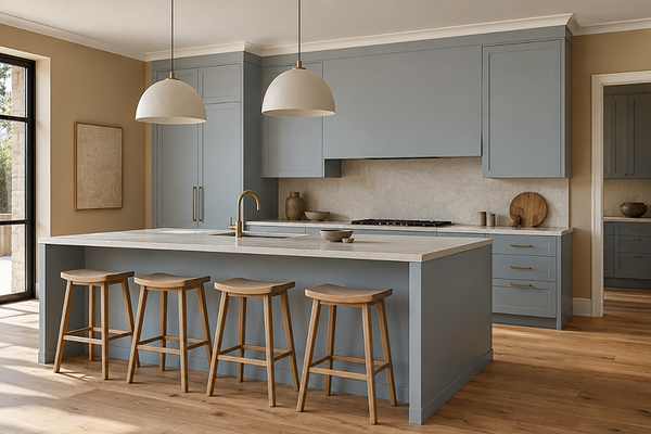
Kitchen with Blue Balm cabinets and Buttercookie walls
Every year I look forward to Dulux Australia's Colour Forecast, and 2027 is definitely interesting. Where some years feel like a gentle evolution of what came before, this one feels like Dulux took a proper swing. The three palettes are each doing something completely different, and doing it so well. There's something in here for almost every kind of home and style, and I want to walk you through all of it.
The overarching theme for 2027 is connection and authenticity through colour. The idea is that our homes should reflect who we actually are, not just what's trending on a mood board - which is exactly what I aim to achieve and bring through Suite Minded. Let's get into it.
Palette One: Sensory
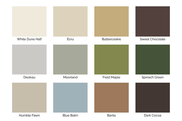
Dulux Australia Colour Forecast 2027 - Sensory Palette
This is my favourite. Sensory is inspired by Japandi design style and the quiet rituals of everyday life. It's a palette about finding comfort in simplicity, and the colours reflect that beautifully.
The palette is built around botanical greens (Moorland, Field Maple, and Spinach Green) which give it a grounded, nature-inspired quality. These aren't bright or saturated greens; they're muted, complex, and comforting. Alongside them sit rich earthy browns (Sweet Chocolate and Dark Cocoa) that add depth and warmth, and a light coastal blue called Blue Balm that lifts the palette without taking it off course. Rounding it all out are Barite, a muted tan, and Buttercookie, a warm wheat tone that adds the kind of cosiness that makes a space feel immediately like home.
What I love about Sensory is that it's the kind of palette that works when the light is low and the room is quiet, and it looks just as beautiful in the middle of the day. It's deeply suited to homes that lean into natural materials, textured finishes, and a beautiful, unfussy warmth.
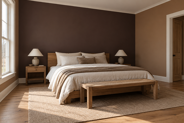
Bedroom with Barite walls and Sweet Chocolate accent wall
Key colours to know:
Moorland: a muted, grounded botanical green that sits beautifully on walls, cabinetry, and exterior renders.
Blue Balm: a soft, light coastal blue that is definitely a hit in this collection. Understated, serene, and really versatile.
Buttercookie: a warm wheat tone that ties the whole palette together and works beautifully as a wall colour.
Sweet Chocolate: a rich earthy brown that I can already see appearing on kitchen cabinetry and feature walls all over Australia.
Who is Sensory for? It's for anyone who feels a little exhausted by the constant change of trends and just wants their home to feel calm and considered. It's for the homes with linen sofas and timber floors and a few well-chosen art pieces. It's for people who want colour without noise and drama.
Palette Two: Play
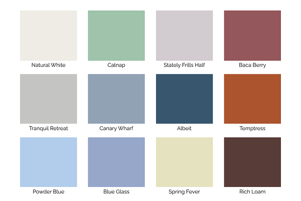
Dulux Australia Colour Forecast 2027 - Play Palette
This one is fun. Play is the palette that Dulux has clearly designed for people who want to be a little more adventurous with colour. It's a palette that celebrates individuality in the best possible way.
The colour story here is unexpected pairings done with real confidence. Spring Fever, a soft yellow-green pastel, sits alongside Baca Berry, a lively rich brownish red, and Temptress, a vibrant burnt orange - combinations that shouldn't work on paper but absolutely do in practice. Canary Wharf, a medium muted blue, and Catnap, a mid-tone spearmint, add freshness to the mix. And grounding all of that playfulness are Albeit, a deep navy, and Rich Loam, a warm chocolate brown.
This is the palette for people who walk into a colour consultation and say 'I want something interesting but I don't know where to start.' Play allows to be bold with colour without being chaotic. Every colour in it is curated to work within the collection, so even the more daring combinations feel cohesive.
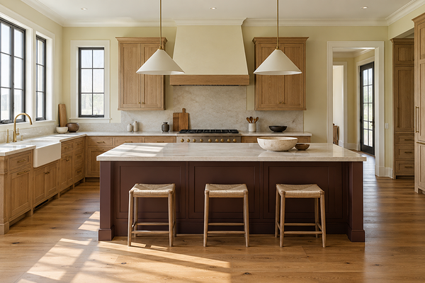
Kitchen with Spring Fever walls and Rich Loam kitchen island
Key colours to know:
Canary Wharf: a dusty blue that I think is going to become a very popular blue this year. It's bold but muted, and works brilliantly as a feature wall or cabinetry colour.
Catnap: a mid-tone spearmint that's fresher and more interesting than a standard sage. I love the idea of this in a bathroom or laundry.
Spring Fever: a soft yellow-green pastel that's lighter and airier than Sensory's botanical greens. Lovely in a bedroom or kids' space.
Rich Loam: the warm brown anchor of the palette. It's the kind of colour that feels deeply luxurious and elegant.
Who is Play for? For the people who have been doing the same thing with colour for years and are quietly craving something that actually reflects their personality. It's for creative households, for those who want to make a statement on a feature wall, and for anyone who's been Pinterest-saving bold interiors without quite having the confidence to go for it. This palette gives you a starting point.
Palette Three: Treasure
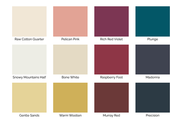
Dulux Australia Colour Forecast 2027 - Treasure Palette
Treasure is the one that made me stop and think about my dream home. It's opulent, dramatic, and full of character with jewel-toned richness. If Sensory is about quiet comfort and Play is about joyful expression, Treasure is about creating spaces that feel truly special.
The palette opens with deep berry shades, Raspberry Fool and Rich Red Violet, that have a velvety, immersive quality that would be stunning in a dining room or study. Gentle Sands and Warm Woollen bring warmth and luminosity in gold and yellow tones, balancing the deeper shades beautifully. Precision adds depth, Plunge is a striking teal that acts as a bold contrast, and Pelican Pink, a coral-pink shade, gives the whole palette a sense of personality.
This is the most aspirational of the three palettes, and it's meant to be. Dulux describes it as favouring depth over decoration, and that's exactly right. Treasure is for people who want their homes to tell a story, who are drawn to heritage and richness and aren't afraid of colour that demands attention.
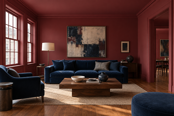
Living room with Raspberry Fool walls and navy blue accents
Key colours to know:
Plunge: a striking teal that would be absolutely stunning on cabinetry, a front door, or a dining room. One of my personal favourites from the entire 2027 forecast.
Raspberry Fool: a deep, rich red that feels luxurious and intimate. Perfect for a bedroom or powder room where you want a full-colour immersion.
Pelican Pink: a coral-pink that gives Treasure a sense of warmth and energy.
Gentle Sands: a warm sandy tone that works as a softer entry point into the Treasure palette. Beautiful on walls alongside natural timber and aged brass.
Who is Treasure for? For the homeowners who want their space to feel genuinely curated, who look at hotel lobbies and antique stores and historic buildings and want that same sense of richness in their own home. It's also a great palette to dip into selectively: even one Treasure colour used intentionally on a feature wall or in a single room can bring something really special to an otherwise neutral home.
My overall take on the 2027 Dulux Forecast
What I appreciate most about this year's forecast is that it genuinely offers three different entry points into colour, at three very different levels of commitment. Sensory is for those who want beauty and colour without risk. Play is for those who want to go out of their comfort zone. And Treasure is for those who are ready to commit fully to something deeply luxurious.
Across all three palettes, a few broader themes emerge that I think are worth noting. There's a clear move away from the safe neutrals that have dominated interiors for years; not an abandonment of warmth, but a desire for colour that does something more. There's also a strong nature-inspired thread running through everything, which makes sense for where we are collectively right now. And there's a sense throughout the whole collection that the Dulux team genuinely wants Australians to trust themselves with colour more and to stop defaulting to white.
The colours I'm most excited to see in real homes? Plunge and Spring Fever for the bold moves. Moorland and Buttercookie for the considered ones. And Murray Red and Sweet Chocolate for the people who didn't know they needed a rich, deep colour moment until now.
Want help bringing the 2027 Dulux Forecast into your home?
Forecasts are exciting, but they can also be a little overwhelming, especially when you're trying to figure out which palette actually suits your home, your light, and your existing finishes. That's exactly where I come in.
Browse my Dulux Australia whole-home palettes to see colours in complete colour schemes that you can take straight to the paint store.
Book a virtual colour consultation if you'd like personalised colour recommendations based on your specific home, your orientation, and your style - including how to work any of the 2027 Dulux colours into a palette that actually works for you.
Which palette are you most drawn to? I'd love to know.
Thank you for reading, and happy decorating!