White Beach Quarter by Dulux Australia - Paint Colour Review
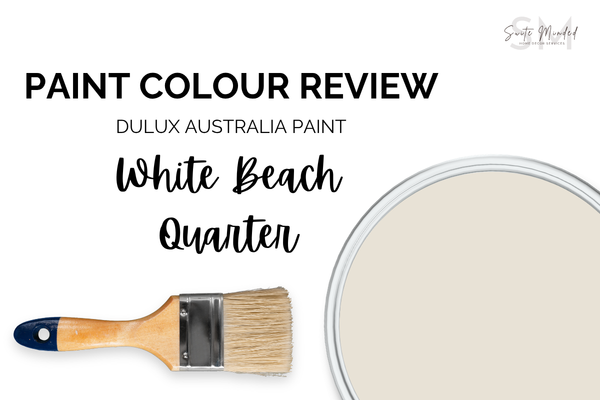
White Beach Quarter by Dulux Australia sounds like sun-warmed sand, bleached timber, driftwood, and the kind of relaxed, effortless interior that makes you feel like you’re permanently on holiday. And it certainly delivers! This is a colour with a clear sense of identity, and when applied in the right space, it’s exactly as beautiful as the name suggests. Let me walk you through what’s actually going on with this colour and whether it’s the right fit for your home.
Undertones
White Beach Quarter is a warm, creamy off-white with a subtle beige undertone - and I want to stress that word subtle, because this is one of those colours where the undertone is doing its job quietly in the background rather than being overly present. At first glance, you might read it as a simple warm white, but spend more time with it, and you start to notice the slight beige-creaminess underneath, creating a warmth that feels organic and grounded rather than overly peach or yellow.
Because the beige undertone is warm rather than grey, White Beach Quarter holds up better than cooler off-whites in warm, direct, bright sunlight. Where a grey-leaning white can feel cold and flat under the intensity of our sun, the warmth in White Beach Quarter absorbs that light and reflects it back in a way that feels inviting and enveloping.
One thing to keep in mind: because the beige undertone is present (even if subtle), White Beach Quarter can read slightly warmer than you may expect in rooms that already have a lot of warm-toned fixed finishes like honey timber floors, warm brick, terracotta tiles. That additional warmth layered on can occasionally push the colour into feeling slightly heavier than intended. It’s not a dealbreaker, but it’s worth sampling carefully in those spaces.
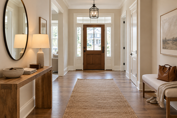
Entryway with Dulux White Beach Quarter on walls
LRV (Light Reflectance Value)
White Beach Quarter has a Light Reflectance Value of 79, which places it comfortably in the bright off-white category. It’s lighter than a true off-white or cream, which tend to sit in the LRV 65-75 range, but sits a meaningful step below the very bright whites like Vivid White (LRV 94) or White on White (LRV 87). White Beach Quarter has enough reflectivity to keep rooms feeling open and airy, but enough body that the warm undertone has something to work with.
In practical terms, that LRV of 79 means White Beach Quarter will brighten a room without the potential intensity or glare of a brighter white. In Australia, where the light can be strong and unforgiving, that slight step back from maximum brightness can be genuinely useful - the colour absorbs just enough light that the room feels warm and comfortable rather than blinding at midday.
It’s also worth noting that White Beach Quarter has enough depth to make the beige undertone visible and present, which is part of what makes it feel like more than just a plain white.
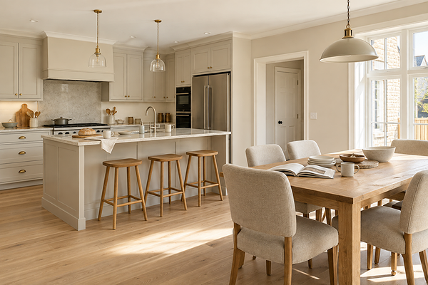
Kitchen with Dulux White Beach Quarter on walls
How does it look in different lighting conditions?
Here’s how White Beach Quarter behaves across different light orientations:
In north-facing rooms which receive the most direct, warm sunlight, White Beach Quarter is at its most glorious. The warm light deepens the beige undertone and the colour takes on a sun-warmed, honeyed quality. If you have a north-facing living room or kitchen, this colour will feel like it was made for it.
In south-facing rooms with their cooler, more diffused indirect light, the beige undertone sits a little more quietly, and the colour reads as a softer, more neutral warm white. It’s still very pretty, and the warmth prevents it from ever going cold, but it’s a gentler version of itself. It’s worth sampling in this orientation, particularly if your south-facing space also has cool-toned finishes.
In east-facing rooms, the warm morning sun brings out the beige beautifully. As the light cools and diffuses through the afternoon, it settles into a softer, quieter warm white.
In west-facing rooms, the warm afternoon and evening light is where White Beach Quarter feels the most golden, relaxed, and beautiful. For a west-facing living space or dining room, this is one of the most fitting colours you could put on the walls.
Under artificial lighting: warm white globes (2700-3000K) are the natural partner here, deepening the beige undertone and making the colour feel more inviting and cosy in the evenings. Cool white or daylight globes (4000K+) bring the colour back toward a more neutral warm white, which can work in kitchens and bathrooms where a brighter result is useful. Avoid very amber globes below 2700K as they can push the beige into feeling heavier and more yellow than intended.

House exterior with Dulux White Beach Quarter on walls and crisper white trims
Best material pairings
White Beach Quarter pairs well with a specific kind of materials - an organic, natural, texture-forward palette that defines coastal and relaxed contemporary interiors:
Blonde and light-toned timber: Blonde oak, Tasmanian oak, and similar light-toned hardwoods are the most natural companions for White Beach Quarter. Their shared warmth creates a palette that feels cohesive and effortless.
Rattan and woven textures: Rattan furniture, woven pendant lights, jute rugs, and similar natural materials feel completely at home alongside White Beach Quarter.
Warm white and sandstone: Warm white marble, sandstone, travertine, and similar stones in cream and sandy tones echo the beige undertone beautifully. These pairings work especially well in kitchens and bathrooms where the stone is the dominant fixed finish.
Brushed brass and aged gold: Warm metallic finishes echo the warmth of White Beach Quarter and add a quiet luxuriousness without competing. Brushed brass tapware, aged gold hardware, and warm pendant fittings all sit beautifully here.
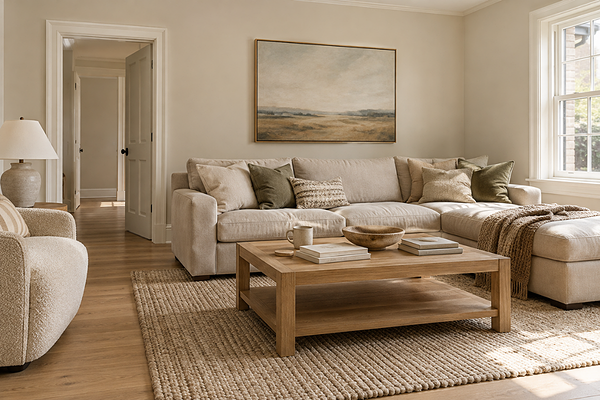
Living room with Dulux White Beach Quarter on walls
Best use cases
White Beach Quarter is the kind of colour that suits a wide range of spaces, but there are a few contexts where it really comes into its own:
Coastal and relaxed contemporary homes: In a home with timber floors, rattan furniture, natural textiles, and easy indoor-outdoor flow, White Beach Quarter is a beautiful choice. It’s the colour that ties the whole aesthetic together without trying to dominate it.
Open-plan living and dining areas: The brightness and warmth of White Beach Quarter make it a great choice for large, open spaces where you want the walls to feel light and airy, while still having enough presence to anchor the room.
Bedrooms: The soft, warm quality of White Beach Quarter creates a genuinely restful bedroom atmosphere - calm and enveloping without being heavy. Paired with linen bedding and warm timber furniture, it’s really lovely.
Hallways and transitional spaces: White Beach Quarter can make hallways feel welcoming and warm from the moment someone walks in.
Exteriors: On weatherboard, render, or brick, White Beach Quarter reads as a warm, sandy white. It’s particularly beautiful on homes with timber accents, natural stone, or lush green landscaping where the earthy warmth of the colour connects to its surroundings.
Where to use it carefully: spaces with cool-toned furnishings and finishes, or a contemporary monochromatic palette, where the sandy beige undertone may feel slightly at odds with the direction of the rest of the room.
Want a second opinion on your own space?
A Colour Review gives you personalised advice on whether White Beach Quarter suits your home, plus what to pair it with.
Best white trim colours
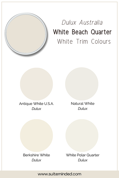
Trim selection with White Beach Quarter is actually pretty forgiving because the beige undertone is subtle enough that it doesn’t clash dramatically with most white, but getting it right still makes a noticeable difference.
The most seamless approach is to use White Beach Quarter itself on the trim in a semi-gloss finish. The sheen difference gives you all the definition you need between wall (usually in a flat or low sheen finish) and trim, and the result is a soft, cohesive warmth throughout the room. This is my recommendation for bedrooms, living rooms, and anywhere you want the colour to show without interruption.
If you prefer a slightly brighter trim, reach for a warm white with a gentle cream or beige lean. Dulux Vivid White is too stark and cool alongside White Beach Quarter, but something like Natural White, White Polar Quarter, Berkshire White, or Antique White U.S.A. can work nicely, giving you a clean contrast without the temperature clash.
Avoid anything with a cool, grey, or blue undertone - alongside the warmth of White Beach Quarter, it will look like a mistake rather than a contrast.
Best coordinating colours
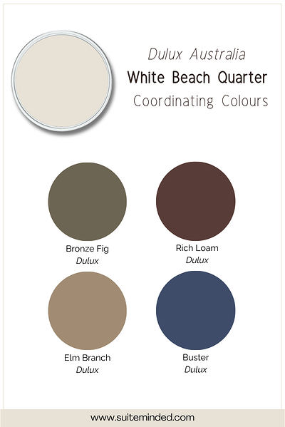
White Beach Quarter's warm quality gives it a lovely natural palette range to work with. Here's what I love alongside it:
Warm greiges and neutral tones: A slightly deeper warm greige, beige, or taupe on an accent wall, in cabinetry, or in an adjoining room creates a tonal, layered palette that feels very cohesive with White Beach Quarter. It’s the most natural direction for this colour.
Coastal blues and soft aquas: A muted, warm-leaning blue is a classic and beautiful complement to a sandy warm white.
Warm sage and botanical greens: A muted, yellow-leaning sage or olive green in soft furnishings, cabinetry, or on a feature wall brings a lovely organic depth alongside White Beach Quarter.
Terracotta tones: Used in accents or soft furnishings, earthy terracotta tones are another natural companion to White Beach Quarter.
Warm charcoal and deep browns: For contrast and grounding, in cabinetry, furniture, or on a feature wall, a deep, warm-toned charcoal or rich espresso brown anchors the palette without fighting the warmth of White Beach Quarter.
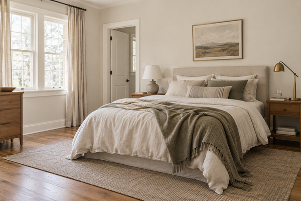
Bedroom with Dulux White Beach Quarter on walls
Final thoughts on Dulux White Beach Quarter
White Beach Quarter is bright enough to be practical across a wide range of spaces, and the subtle beige undertone gives it that quiet depth that stops it from feeling like a generic white.
As always, sample it large in your actual space, at different times of day, and under your artificial lighting in the evening. The undertone shifts subtly with the light, and you want to know exactly how it's going to behave in your specific room before you commit.
Excited about White Beach Quarter and want to build the right palette around it for your home? I'd love to help.
Check out my Colour Review Service if you’d like expert advice on whether this warm off-white is the right fit for your light and orientation.
Book a full colour consultation if you'd like personalised colour recommendations based on your home, your finishes, and your style.
Thank you for reading, and happy painting!
Manon xx