BM Webster Green HC-130: An Honest Review of Benjamin Moore's 2027 Colour of the Year
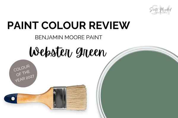
Webster Green HC-130 is a rich, moody, forest-like green that sits with an LRV of just 20, making it one of the most daring Colour of the Year picks we’ve seen in a while. This is not a colour you’ll accidentally choose. It makes a statement the moment you walk into a room. But as with every dramatic colour, the real question is whether it actually works in real homes, and how to use it well if it does. Let’s get into it.
Undertones
Webster Green is a deep, classic green with a subtle blue undertone, giving it depth and a slightly cool quality that stops it from reading as a simple forest or hunter green. Benjamin Moore describes it as balancing the stability of blue and the warmth of yellow - it’s a green that feels grounding and considered rather than overly rustic.
The blue undertone isn’t overly present; it sits quietly in the background, but you’ll notice it most clearly when placed alongside warm-toned finishes - timber, brass, cream tones. On its own, Webster Green reads as a rich, slightly muted green with real depth, but next to warm materials, the blue undertone comes forward just enough to keep the colour from feeling too heavy. There’s also a very subtle yellow warmth underneath the blue, which is part of what makes Webster Green feel timeless and elegant.
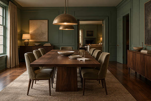
Dining room with BM Webster Green on walls and trims
LRV (Light Reflectance Value)
With an LRV of 20, Webster Green is definitely a dark colour. Not the darkest green you’ll find in the range, but firmly in that category of colours that absorb far more light than they reflect. For context, I reviewed Narragansett Green (LRV 9.14) previously in this blog, and Webster Green is a meaningful step lighter - it has more reflectivity and is more versatile as a full-room colour. But it’s still a deep, immersive colour that will make rooms feel more enveloping and closed in than a mid-tone or light colour would. That’s not a bad thing, but it’s worth knowing.
In well-lit rooms with strong natural light, Webster Green can add a gorgeous, rich depth that makes the space feel luxurious. In rooms with limited natural light, it will feel genuinely dark - which can be beautiful in a dining room or study with good artificial lighting, but is harder to pull off in an everyday living space where you need the room to feel functional and inviting at all hours of the day.
Webster Green also works beautifully at smaller applications such as on trim, doors, or built-ins, where this deep green becomes the feature colour. You don’t have to go all-in on four walls to get the full impact.
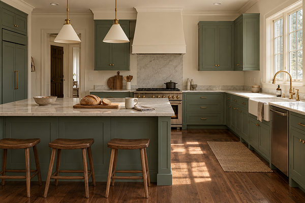
Kitchen with BM Webster Green on cabinets
How does it look in different lighting conditions?
Webster Green is one of those colours where getting the lighting right is essential. Since Benjamin Moore is available in both the US/Canada and Australia, here’s how it plays out in both:
In the US/Canada
North-facing rooms receive cooler, more diffused light, which will push Webster Green toward a slightly more blue-green reading. Plan your artificial lighting carefully in this orientation.
South-facing rooms with warm direct sun are where Webster Green comes alive. The warmth activates the yellow undertone beneath the blue, and the colour reads as rich, saturated, and inviting.
East-facing rooms show a fresh, slightly cool quality in the morning that deepens through the afternoon.
West-facing rooms are stunning in the evening, the warm golden light giving Webster Green a beautiful depth.
In Australia
North-facing rooms get the most direct warm sunlight, which is the best context for Webster Green. The warm light deepens the colour beautifully and brings forward that underlying warmth beneath the blue.
South-facing rooms receive cooler, indirect light that will push the blue undertone forward and make the colour feel slightly cooler and more shadowy. Still beautiful, but sample carefully.
East-facing rooms glow in the mornings with that warm green depth.
West-facing rooms are a treat in the late afternoon when the golden light makes the colour look exceptional.
Artificial lighting is critical with a colour this dark. Warm globes (2700-3000K) are essential - they bring out the warmth beneath the blue and prevent the colour from reading as cold or flat in the evening. Layered lighting is your best friend here: a mix of ceiling fixtures, floor lamps, and wall sconces gives you control over how the colour reads at different times of the day. Cool or daylight globes (4000K+) will push the blue undertone forward significantly and make Webster Green feel colder than it should - avoid them in rooms where this is the primary wall colour.
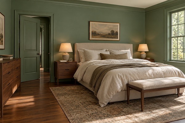
Bedroom with BM Webster Green on walls
Best material pairings
Webster Green has an affinity with rich materials:
Warm and dark timbers: walnut, dark oak, and warm-toned hardwood floors are the most natural companions for Webster Green. Together, they create one of the most classic, beautiful combinations in interior design.
Aged and unlacquered brass: brass against a deep green is a pairing that never goes out of style. The warmth of aged brass sits in beautiful contrast to the coolness of Webster Green, adding richness and luxury.
Warm white and cream marble: white or cream marble, particularly with warm veining, creates a stunning, classic contrast against Webster Green. Think green cabinetry with a warm white marble benchtop.
Rich textiles and velvet: Webster Green calls for materials with their own depth and texture. Velvet upholstery, heavy linen drapery, wool rugs, and leather furnishings all feel at home with this dark green.
Matte black: for a more contemporary take, matte black fixtures and hardware create a sharp, tonal-dark palette alongside Webster Green.
Want a second opinion on your own space?
A Colour Review gives you personalised advice on whether Webster Green suits your home, plus what to pair it with.
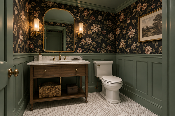
Powder room with BM Webster Green on wainscoting and trims
Best use cases
The beauty of Webster Green is that it works across a surprisingly wide range of applications:
Dining rooms: a full-room treatment in a dining space is one of the best uses for a colour at this LRV, creating an intimate, atmospheric setting.
Studies and home libraries: Webster Green was basically made for a study or a library. The depth and quiet sophistication of the colour is exactly what makes these spaces feel like somewhere you actually want to spend time.
Built-ins, cabinetry, and architectural details: these specific areas are ideal for anyone who is nervous about a full-room application to start.
Front doors: Webster Green on a front door is a perfect application - bold, welcoming, and classic. It works especially well on homes with red brick, stone, or natural timber accents.
Powder rooms and small bathrooms: a full-room application in a small space reads as a real design statement, and Webster Green is a stunning choice for a powder room.
Bedrooms: a full bedroom in Webster Green is a commitment, but in a room with good natural light and warm layered lighting, the cocooning depth creates the perfect sleeping environment.
Where to think carefully: rooms with very limited natural light where the depth of the colour may feel oppressive; and large open-plan living spaces where a full-room application may be more than the space can comfortably carry without very careful lighting planning.
Best white trim colours
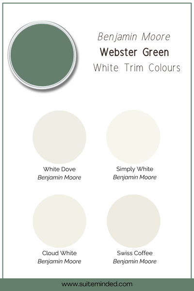
The most classic approach is a warm, soft white trim - and Benjamin Moore’s own coordinating palette points to White Down OC-131, a soft, warm off-white that creates a clean, traditional contrast against the deep green. Other colours include BM White Dove, BM Simply White, or even BM Cloud White for added warmth.
The other direction, and one I think is even more impactful, is to use Webster Green on the trims too, in a higher sheen than the walls. The tonal all-green result is moody, enveloping, and feels luxurious.
What I’d avoid: cool, stark, or blue-based whites. Alongside Webster Green, a cool white would create a jarring contrast that fights rather than frames the colour.
Best coordinating colours
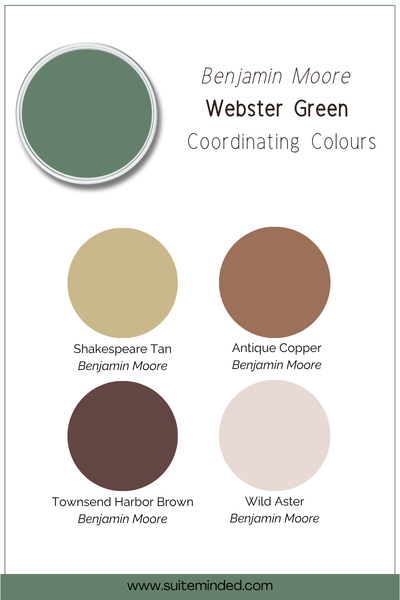
Benjamin Moore released a full eight-colour palette alongside Webster Green for 2027, and it’s a really strong collection. Here’s how I’d use it:
White Down OC-131: A soft, warm off-white that works as a trim or wall colour in an adjoining space. It’s the most straighforward and flattering partner for Webster Green.
Shakespeare Tan 228: A warm, sandy yellow that creates a gorgeous contrast - traditional and rich. Think green dining room opening to a warm golden living room.
Antique Copper 1169: A muted terracotta tone that adds warmth and energy as an accent direction. In soft furnishings or in an adjacent room, it creates a beautiful, earthy contrast.
Townsend Harbor Brown HC-64: A rich, deep brown on cabinetry, timber details, or as a neighbouring room colour - this adds a luxurious, tonal depth that complements Webster Green beautifully.
Wild Aster 1240: A soft, dusty pink that creates a surprisingly sophisticated, unexpected pairing with Webster Green.
Warm caramel and honey tones: Beyond the official palette, warm caramel and honey in timber accents, leather, or woven furnishings are some of the most naturally beautiful companions for a deep classic green.
Final thoughts on BM Webster Green HC-130
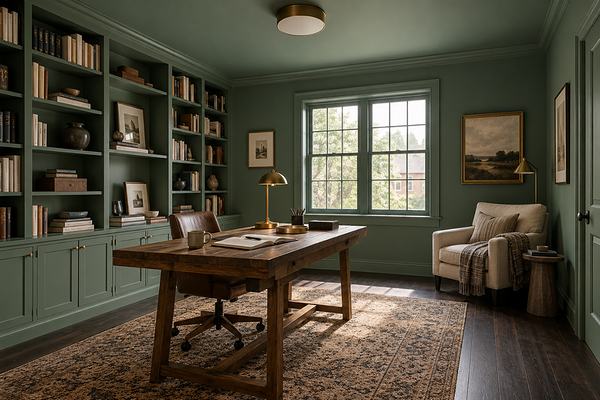
Home office with BM Webster Green on walls, trims, and ceiling
Benjamin Moore made a genuinely bold call for 2027. Webster Green HC-130 is not a crowd-pleasing, everyone-can-do-this kind of colour. It requires good light, thoughtful planning, and the right finishes. But when done right, you get a space that feels truly considered and unique.
My honest advice? Don’t dismiss it because it’s dark, and don’t rush into it because it’s the Colour of the Year. Take the time to understand your light, sample it large on your actual wall, and think carefully about where you want the drama.
Want help working out how to bring Webster Green into your home, or whether your space can handle it? I'd love to help you figure it out.
Check out my Colour Review Service if you’d like expert advice on whether this deep green is the right fit for your light and orientation.
Book a full colour consultation if you'd like personalised colour recommendations based on your home, your finishes, and your style.
Thank you for reading, and happy painting!
Manon xx