Paint Colour Review: Lexicon Quarter by Dulux

If you’re searching for a crisp, clean white that feels fresh and modern, Lexicon Quarter by Dulux might just be the perfect fit. This popular white paint colour is known for its cool, contemporary vibe and its ability to brighten up any space with ease. But like any white, Lexicon Quarter has its own unique tones and nuances that can shift depending on the lighting and surroundings. Keep reading to find out if Lexicon Quarter is the right white for your home.
LEXICON QUARTER AT-A-GLANCE
LRV: 90 (Very bright & reflective)
Undertones: Subtle blue-grey
Best for: Modern, minimal, coastal, contemporary spaces
Works well with: Cool neutrals, greys, soft blues, charcoal
WHAT TO AVOID
Warm, creamy whites: Can clash with Lexicon Quarter’s cool undertone.
Very dark/shaded rooms: May feel too cold without enough natural light.
What colour is Lexicon Quarter?
Lexicon Quarter is a cool, crisp white with a slight blue-grey undertone. This coolness gives it a fresh, modern feel that’s perfect for contemporary homes, minimalist spaces, or anywhere you want a clean and airy look. If you're looking for a soft, warm, cosy white, this might not be the one, but if you want a sharp, architectural white that feels bright and crisp, Lexicon Quarter is a fantastic choice!

Dulux Lexicon Quarter - photo via dulux.com.au
What is Lexicon Quarter’s LRV?
LRV (or Light Reflectance Value) helps determine how much light is absorbed or reflected by a paint colour. It is measured on a scale from 0 to 100, 0 being absolute black and absorbing all light, and 100 being pure white and reflecting all light. The higher the LRV, the lighter and brighter the paint colour. The LRV of a paint colour is an important factor to consider, especially if you're concerned about brightness or creating a specific ambience. Colours with higher LRVs tend to make a room feel brighter and more spacious, while colours with lower LRVs can create a more intimate or cosy atmosphere.
Lexicon Quarter has a very high Light Reflectance Value (LRV) of 90, meaning it reflects a huge amount of light back into a space. This makes it one of the Dulux’s brightest whites, perfect for creating a clean, fresh, and open feel. Because of this high LRV, Lexicon Quarter can make rooms feel bigger, lighter, and more modern, especially in spaces with limited natural light. Because of its subtle blue-grey base, it can sometimes appear cooler, or a touch icy, in spaces with lots of natural light, especially if the light is south-facing. In low-light or shadowed areas, the blue undertone can become a little more noticeable, giving the colour a sharper, almost sleek appearance.
How does Lexicon Quarter look in different lighting conditions?
Lighting greatly impacts how a paint colour is perceived within a space, whether it be natural or artificial light. Natural light varies throughout the day making colours look slightly different in the morning and the evening, which is why it’s essential to use samples before fully committing to a paint colour so you can see how colours look at various times of the day and you can decide if a paint colour is the right one for your space.
Like all paint colours, Lexicon Quarter can shift slightly depending on the lighting in your space. Because it has a cool base and such a high LRV, it tends to look very bright and crisp — but the way its undertones show up can vary:
In north-facing rooms, where the light is cooler and more muted, Lexicon Quarter can look even cooler, sometimes picking up more of its blue-grey undertone. It can feel fresh and sharp, but in some cases may appear a little chilly if not balanced with warmer furnishings or lighting.
In south-facing rooms, which get warmer, brighter light, Lexicon Quarter will still read clean and bright, but the warmth of the sun can soften its coolness slightly, making it feel a touch less icy.
In east-facing rooms, morning light can make Lexicon Quarter feel bright and fresh, while in the afternoon it can cool down and lean more towards its grey-blue side.
In west-facing rooms, it may look cooler earlier in the day and pick up a slight warmth in the golden afternoon light, but overall it will stay crisp compared to warmer whites.
If you love the fresh look of Lexicon Quarter but are worried it might feel too cool in your space, try pairing it with warm-toned lighting (like soft white globes) and natural textures like timber, linen, or warm metals like brass. These elements can help balance the crispness and create a cosy, inviting feel.

Dulux Lexicon Quarter - photo by dulux.com.au
Best trim colour with Lexicon Quarter
For a seamless, modern look, the best trim colour to pair with Lexicon Quarter is actually Lexicon Quarter itself! Using the same colour on both the walls and the trim — just in different finishes (like low sheen for walls and semi-gloss or gloss for trim) — creates a clean, cohesive look that feels fresh and sophisticated and avoids mixing undertones.
If you prefer a little bit of contrast, you could also pair it with a true, crisper white trim, such as Dulux Vivid White. Vivid White is a pure, untinted white with an LRV of 94 that will keep the overall look sharp and modern and create a subtle contrast.
What about coordinating paint colours?
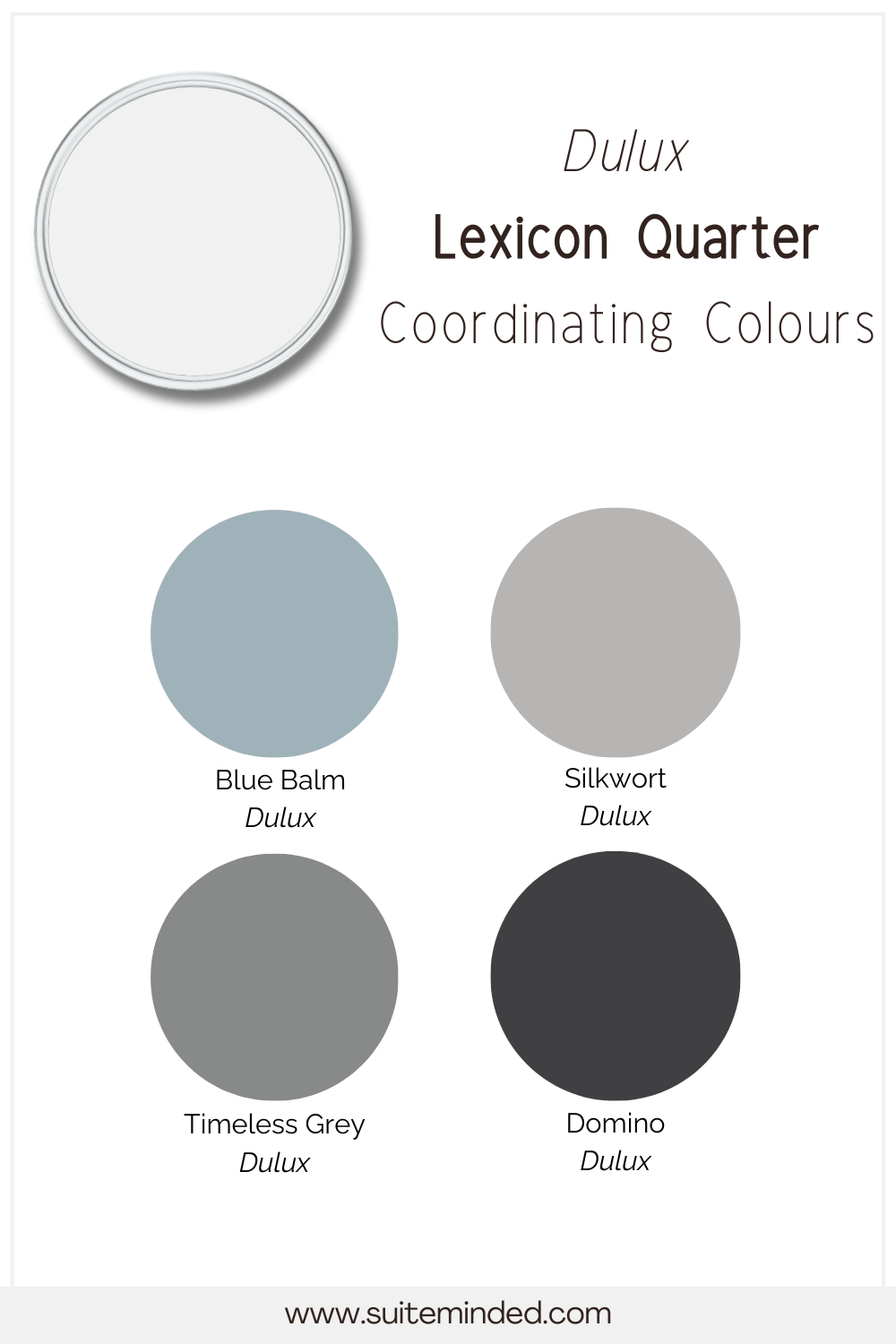
Lexicon Quarter pairs beautifully with a range of colours, especially other cool-toned neutrals, soft blues, greys, and charcoals. Its crisp, fresh base makes it really versatile, whether you want a calm, minimalist look or something a little bolder. Some great coordinating colours include Dulux Silkwort, Malay Grey, soft blues like Dulux Blue Balm or Timeless Grey, or charcoal accents such as Dulux Domino or Plead Guilty working well for feature walls, cabinetry, or doors.
Stick to cooler or neutral tones for the best flow — warmer or creamy colours can clash with Lexicon Quarter’s cool blue-grey undertone.
——————
If you’re looking for a bright, crisp white that feels fresh, modern, and full of life, Lexicon Quarter is definitely a colour to consider. Its cool undertones, high LRV, and versatility make it a beautiful choice for contemporary homes, minimalistic spaces, or anywhere you want to create a clean and airy vibe.
Choosing the right white can feel tricky, but you don't have to do it alone! If you need help pulling together the perfect colour palette for your home, be sure to check out my ready-to-go colour palettes or explore my custom colour consulting services — I’d love to help you create a space you truly love.
Thank you for reading and happy decorating!
Manon xx