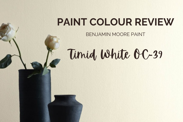
Paint Colour Review: Timid White OC-39 By Benjamin Moore
There are some white paint colours that feel crisp and bright, and others that lean creamy and traditional. Benjamin Moore Timid White (OC-39) sits quietly in between: soft, warm, and understated, without feeling overly yellow. It is often chosen by people who want their home to feel calm and welcoming, but who don’t want a white that looks stark, cold, or clinical on the walls
In this post, I’m breaking down everything you need to know about Benjamin Moore Timid White, from its tones and undertones to how it behaves in different lighting conditions, the best white trim colours to pair with it, and the coordinating shades that work beautifully alongside it. I’ll also share the spaces where Timid White really shines, so you can decide with confidence whether it’s the right white for your home.
What are Timid White’s undertones?
Timid White is a warm white that’s been softened by a quiet grey undertone. It’s not a crisp, bright white; it’s more of a gentle, creamy white that feels calm and lived-in rather than sharp or stark. On walls, Timid White usually reads as soft and creamy, slightly muted, and bright enough to feel fresh and relaxing.
Timid White’s subtle grey undertone is what keeps it from looking overly creamy, buttery, or old-fashioned, and it’s why it can feel a little more “modern white” than some traditional creams. You may also catch the faintest hint of green in some homes, but if it shows up at all, it’s extremely subtle and usually only in certain lighting or surrounding finishes.
What is Timid White’s LRV?
LRV (Light Reflectance Value) simply measures how much light a paint colour reflects on a scale from 0 (pure black) to 100 (pure white). Timid White has an LRV of 82.45, which places it in the bright white category, edging into the off-white range. In real homes, this means it reflects a lot of light without feeling harsh or glaring.
Because its LRV is high, Timid White does a beautiful job of brightening spaces naturally, especially in rooms that don’t get a lot of direct sunlight. It helps rooms feel lighter and more open, while still maintaining that soft, lived-in warmth that makes it feel comfortable and inviting. However, like all high-LRV paint colours, it can wash out slightly in bright, sun-filled rooms, with its undertones appearing more passive.
If you love the idea of a white that feels bright but not stark, and warm without tipping into overly buttery, Timid White offers enough light reflectance to keep your home feeling fresh, while still allowing the colour’s subtle undertones to show up in a soft, natural way.
How does Timid White look in different lighting conditions?
Timid White is a warm white that shifts gently with light, becoming either brighter or more enveloping depending on the space.
In north-facing rooms where the light tends to be cooler or bluish, Timid White beautifully balances out the natural light to subtly warm up the space without turning overly yellow. Its yellow tones may also become more visible on dimly lit walls.
In south-facing rooms where the light tends to be warmer and more golden, Timid White will look light, airy, and clean, with its warmth dialling back slightly in strong natural light.
In east-facing rooms where the light is warm and bright in the morning and cooler in the afternoon, Timid White will feel gently warm and fresh in the morning, then slightly more muted and greyed as the day goes on.
In west-facing rooms with cooler light in the morning and a warmer glow in the afternoon, Timid White leans warmer and richer as the day passes, creating a cosy, cocooning feel.
Overall, Timid White is an adaptable, forgiving white; just be sure to test it in your lighting, especially in the evening when undertones are most noticeable.
Would love Timid White in your home, but don’t know what to pair it with? I've created a ready-made whole-house palette around it; it's the easiest way to see how it plays with other colours throughout a home. Have a look at it here!
Where to best use Timid White
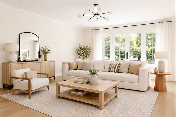
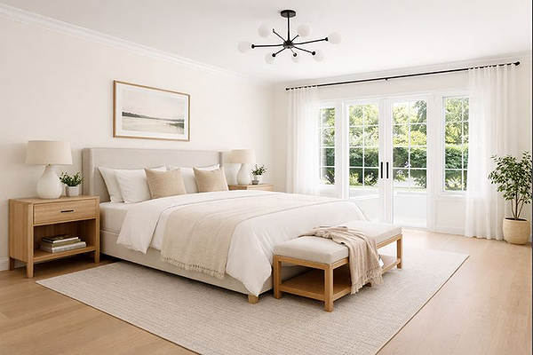
Timid White works best when you want a space to feel soft, warm, and relaxed, rather than crisp or high-contrast. It’s a great choice for classic, transitional, coastal, and lived-in modern homes.
Walls throughout the home
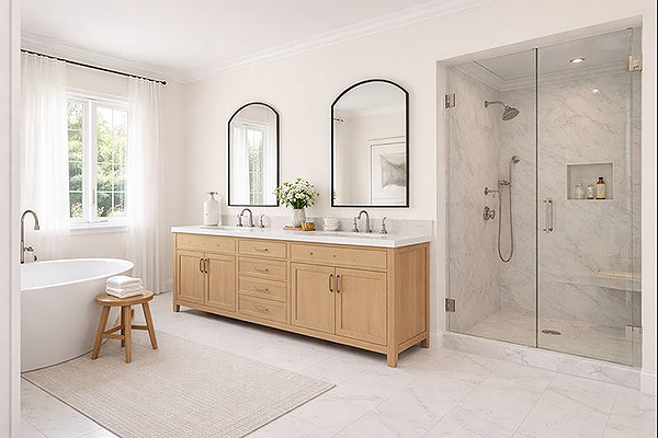
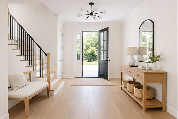
Timid White makes an excellent whole-home wall colour. It keeps spaces feeling light and cohesive while adding warmth without tipping into beige or yellow. Best timber pairings with Timid White are light or European oak, natural oak, and soft honey tones.
Living rooms & bedrooms
In living areas and bedrooms, Timid White feels calming and inviting, especially in softer or lower light. It’s ideal if you want warmth without heaviness.
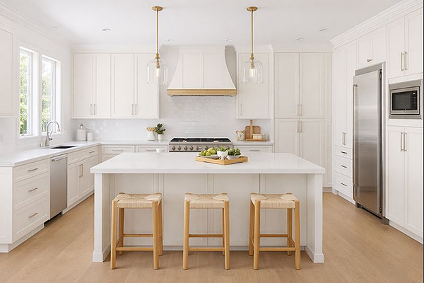
Kitchens & cabinetry
Timid White works beautifully on kitchen cabinets, particularly when paired with warmer materials. It pairs well with natural or lightly veined stone, timber accents or shelving, and brushed brass or matte black hardware.
Hallways & low-light spaces
Thanks to its high LRV, Timid White helps brighten hallways and entryways while still feeling welcoming and soft.
When it may not be the best fit
Timid White may not be ideal if you’re after a very crisp white or if your finishes lean heavily cool and blue-based.
Best white trim colours with Timid White
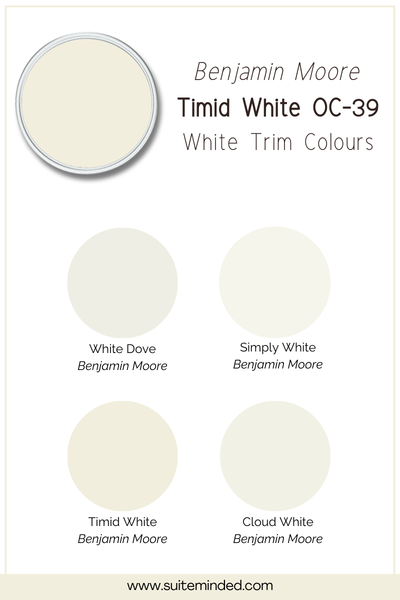
Because Timid White is already a warm, soft white, your trim choice will really affect how the whole space feels. The goal here is to either keep things calm and layered… or add a bit of gentle definition without going too crisp.
Timid White on walls and trim: if you love a soft, seamless look, using Timid White on both the walls and the trim works beautifully. Everything blends together, and the space feels calm, relaxed, and very easy on the eye. This is a great option if you don’t want your trim to stand out or compete with the walls, or if you’re afraid of mixing undertones.
White Dove OC-17: White Dove is one of my favourite trim pairings with Timid White. It’s still warm, but just different enough to give a bit of contrast without making the walls look yellow or heavy.
Simply White OC-117: Simply White gives you a cleaner, brighter contrast while still staying on the warm side. Just keep in mind that it will make Timid White read slightly warmer by comparison, enhancing its yellow tones.
Quick tip: if you’re unsure, stay within the warm white family for trim. Cooler or ultra-bright whites tend to exaggerate Timid White’s warmth more than people expect.
Best coordinating colours
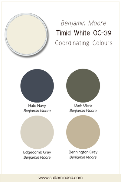
Timid White is happiest when it’s paired with colours that feel soft, warm, and a little muted. Anything too crisp or too cool can make it look creamier by comparison, so the goal is balance rather than contrast.
For adjoining rooms or a whole-home palette, gentle greiges work beautifully. Colours like Benjamin Moore Edgecomb Gray or Gentle Creams keep things calm and cohesive without pulling the walls warm or yellow.
If you want to introduce a bit of colour, muted greens are one of the nicest pairings. Think sage greens or even a muted olive green to add depth and warmth without overpowering the softness of Timid White, especially when paired with timber and natural textures.
For a slightly moodier contrast, soft navy blues like Hale Navy can work really well, as long as they’re used intentionally. They give definition while still keeping the overall palette classic and timeless.
As a general rule, if a colour feels gentle and slightly softened on its own, it will usually sit beautifully next to Timid White.
——————
Timid White is a beautiful choice if you’re drawn to whites that feel warm, soft, and quietly timeless. It’s not about making a statement; it’s about creating a calm, comfortable backdrop that works with your home rather than fighting it.
As always, lighting and surrounding finishes will influence how it reads, so sampling in your own space is key. And if you’d like help choosing coordinating colours, trim whites, and room-by-room combinations with confidence, my Home Paint Colour Blueprint walks you through the entire process step by step, so you’re not guessing or second-guessing your choices.