Paint Colour Review: White Duck Quarter by Dulux

Choosing the right neutral paint colour can feel like hunting for the perfect pair of jeans: you want something timeless, flattering, and versatile, but there are so many subtle differences that it’s easy to get lost. Dulux White Duck Quarter is one of those colours that quietly wins people over. It’s soft without being too passive, warm without looking yellow, and adaptable enough to suit a wide range of styles and spaces.
In this post, we’re going to unpack exactly what makes White Duck Quarter so well-loved. We’ll talk about its tones and undertones, its LRV (Light Reflectance Value), how it changes with different lighting, and where it shines best in your home. I’ll also share some tried-and-true white trim options and coordinating hues so you can confidently pair it with other colours. By the end, you’ll know whether this understated neutral is the right fit for your walls, no paint sample overwhelm required.
What are White Duck Quarter’s undertones?
At first glance, White Duck Quarter reads as a warm, soft neutral off-white, but look a little closer, and you’ll notice a gentle mix of greige (beige and grey) and a whisper of green undertones, which keeps it from feeling too creamy or too cool. These undertones are subtle, but it’s what gives the colour its calm, grounded feel. This balance is also what makes White Duck Quarter so versatile. It’s not stark, not yellow, and it’s not flat; just a soft, easygoing neutral with enough depth to create interest without taking over the room.
What is White Duck Quarter’s LRV?

Photo via dulux.com
In simple terms, LRV or Light Reflectance Value, is a measure of how much light a colour reflects, 0 being pure black and absorbing all light, and 100 being pure white and reflecting all light.
White Duck Quarter sits comfortably in the “light but not stark” zone with an LRV of 78, which puts it in the light range but not at the very bright end of the scale.
What this means in real life is that White Duck Quarter will help a space feel airy and open without reflecting so much light around that it feels clinical. It has enough depth to add softness and character, which is one of the reasons it works so well as a main wall colour. In darker rooms, it won’t magically make them look like a sunroom, but it will still feel gentle and warm. In well-lit spaces, it holds its colour beautifully and doesn’t wash out as much as a crisper white might. Think of it as that sweet spot between fresh and cosy, just enough light to lift a room, with enough body to keep it feeling grounded.
How does White Duck Quarter react to different lighting conditions?
One of the most important things to remember with any paint colour, especially a neutral like White Duck Quarter, is that light changes everything. The same colour can look warmer, cooler, or even slightly different in tone depending on the direction your windows face and where you are in the world.
In the Northern Hemisphere (such as in European countries), north-facing rooms tend to have cooler, softer light throughout the day, which can draw out White Duck Quarter’s muted grey and subtle greenish undertones. South-facing rooms, on the other hand, get more direct, warm light, making the beige warmth feel stronger and more inviting.
In the Southern Hemisphere, it’s the opposite. North-facing rooms enjoy the brighter, warmer light, while south-facing spaces have a cooler, dimmer quality. So if you’re in Australia or New Zealand, expect the warmth to shine more in your north-facing rooms, and the cooler undertones to peek through in your south-facing ones.
The takeaway? White Duck Quarter is wonderfully adaptable, but it’s worth testing a sample on your walls to see which side of its personality your light brings out most.
Would love to use White Duck Quarter in your home? I've used it in a one of my ready-made whole-house palettes; it's the easiest way to see how this colour plays with other tones throughout a home. Have a look at it here!
Where to best use White Duck Quarter in your home?
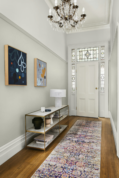
Photo via dulux.com
White Duck Quarter is one of those rare colours that feels right at home in almost any style, whether you’re going coastal, modern farmhouse, minimalist, or something more traditional. Because it’s a warm neutral with just enough depth, it works beautifully as a main wall colour throughout your home, creating a soft, seamless backdrop for your furniture and décor.
In living rooms and family spaces, it gives you that calm, inviting atmosphere without looking bland. In bedrooms, it’s restful and cocooning, especially when paired with soft textures like linen or boucle. It’s also a great choice for hallways and open-plan areas where you want one consistent colour to flow from room to room. If you’re after something warm and welcoming in a kitchen or dining area, it pairs beautifully with both light and mid-tone timber, stone benchtops, and natural fibres. And for exteriors, White Duck Quarter can create a fresh yet grounded look. Just remember to test it in natural daylight, as exterior light tends to make colours appear lighter and cooler.
Its biggest strength? It’s versatile enough to let your décor shine while still adding its own quiet character to the space.
Which white paint colour to use for trims?

White Duck Quarter has enough warmth and depth that it pairs best with whites that feel clean but not icy. The right trim colour will frame it beautifully and help the wall colour stay true without pushing it too warm or too cool.
If you like a soft, seamless look, go for something with a similar warmth, like Dulux Natural White or Dulux Whisper White. It’s bright enough to read as a fresh white on trims, but its subtle warmth means it won’t make White Duck Quarter look muddy in comparison.
For a bit more contrast, Dulux Vivid White is a great choice; it’s crisp and clean without leaning blue, which makes the walls feel warmer by comparison.
Another option is Dulux White Polar Quarter, which has a touch of softness but still delivers that fresh trim effect.
If you’re painting doors, skirting boards, or window frames, using one of these whites will keep the overall look cohesive and let White Duck Quarter’s understated charm shine.
What about coordinating colours?

Because White Duck Quarter is such a balanced warm neutral, it plays nicely with a wide range of colours, from earthy, muted tones to soft pastels and deeper accents. The trick is to choose colours that complement its warm base without clashing with those subtle grey-green undertones.
For a calm, layered neutral palette, try pairing it with Dulux Beige Royal Half or Dulux Linseed for depth, and Dulux Whisper White for lighter contrast. This combination works beautifully in living spaces and bedrooms for a soft, timeless look.
If you want to bring in a hint of colour, muted greens like Dulux Spanish Olive or Dulux Pale Sage are perfect companions. They enhance White Duck Quarter’s natural warmth while keeping the overall feel serene and grounded.
For something bolder, try an inky charcoal like Dulux Domino or a deep navy such as Dulux Deep Ocean. These create a striking contrast for feature walls, cabinetry, or even front doors, without feeling too harsh next to the softness of White Duck Quarter.
Whether you go all-neutral or add a pop of colour, the key is to stick with hues that have a touch of warmth or an earthy base so everything feels harmonious.
——————
Dulux White Duck Quarter is one of those colours that quietly works its magic: warm, adaptable, and endlessly versatile. Its balanced undertones and gentle depth make it a safe yet stylish choice for everything from a cosy bedroom retreat to a light-filled open-plan space. Like all paint colours, its true personality will depend on your home’s lighting and surroundings, so the best way to know if it’s “the one” is to test it on your own walls.
Grab a sample pot, paint it in a few key spots (morning, afternoon, shaded areas), and live with it for a few days. You might just find that White Duck Quarter is exactly the understated, elegant backdrop your home has been waiting for.
If you’d like expert help choosing the perfect colours for your home and putting together a palette that works in every room, I offer custom paint colour consultations and ready-made whole-house colour palettes you can use right away.
Thank you for reading, and happy painting!
Manon xx