Paint Colour Review: Pashmina AF-100 by Benjamin Moore

I have a soft spot for neutrals like Pashmina AF-100. You know the kind: elegant, understated, and endlessly versatile. The kind of paint colour that doesn’t scream for attention, but somehow makes a room feel instantly pulled together. If you’ve been searching for that perfect “in-between” neutral that works almost anywhere, Pashmina might just be it.
I’ve recommended it multiple times to my clients, and every time, it surprises me how beautifully it adapts to different spaces. But like any good neutral, it’s got its quirks. In this post, I’ll walk you through everything you need to know before choosing Pashmina: its undertones, how it reacts to light (a biggie!), where it really shines, and what colours look best alongside it, especially the right white trim, which can make all the difference.
If you’re on the fence or feeling overwhelmed, I hope this helps you feel more confident about whether Pashmina is right for your home. Let’s get into it.
What are Pashmina’s undertones?
Pashmina is what I’d call a complex neutral, in the best possible way. At first glance, it looks like a soft taupe or greige, but if you look closely, you’ll start to see subtle green undertones come through. These green undertones are what set it apart from more traditional beiges or warm greiges. They give it a grounded, slightly earthy feel, without making it look muddy or cool. It’s not a loud or bossy colour, but it does have personality, and its undertones play a big role in how it interacts with the rest of your palette.

What is Pashmina’s LRV?
If you’re not familiar with LRV (Light Reflectance Value), it’s a scale from 0 to 100 that tells you how much light a paint colour reflects. The higher the number, the lighter and more reflective the colour (pure white); the lower the number, the darker and more absorbent (pure black). With an LRV of 44.2, Pashmina AF-100 is right in the mid-tone range. It isn’t too dark, but it’s definitely not light either. It has enough depth to stand out on a wall and create a cozy, grounded feeling, but it won’t make a space feel heavy or overly dark, especially in a room with decent natural light. That said, in smaller or poorly lit rooms, it can read a bit moodier, which may or may not be the vibe you're going for.
Struggling to match this colour with the rest of your home? Undertones and flow can be tricky, but you don’t need to figure it out alone. The Confident Home Colour Blueprint is a proven 7-step guide that helps you confidently create a cohesive whole-house palette. With 76 paint colours and 6 ready-made palettes included, you’ll know exactly which whites, neutrals, and accents work together, without weeks of second-guessing.
How does Pashmina look in different lighting conditions?
Pashmina is one of those colours that really shifts depending on the light, and that’s part of its charm. Because it sits in that perfect taupe-meets-greige zone with subtle green undertones, it behaves differently from room to room and even hour to hour.
In north-facing rooms, where the light tends to be cooler and slightly bluish, Pashmina can lean more grey and muted. The green undertones might peek through more clearly here, giving it a slightly cooler, earthy feel. If you like a moody, elegant look, it’s gorgeous in this kind of lighting.
In south-facing rooms, which get more consistent warm light throughout the day, Pashmina softens and warms up. It reads more like a cozy taupe or greige, with the green undertones taking a backseat. This is where it really shines as a neutral; it feels welcoming and calm without being boring.
In east-facing rooms, the early morning light can make it appear lighter and fresher, but it will cool down in the afternoon as the direct light fades. You’ll see a balance of warm and cool throughout the day.
In west-facing rooms, it might feel a little cooler during the day but really warm up and glow in the late-afternoon light. If your room gets that soft, sunset light, Pashmina can take on a rich, cozy vibe.
This is one of the reasons I always recommend testing Pashmina in your actual space before committing. It’s a nuanced colour, and that’s what makes it beautiful, but lighting can really affect how it shows up on your walls.

Where to use Pashmina?
Pashmina works wonderfully as a whole-room wall colour, especially in spaces where you want a sense of warmth and depth without going too dark. Think living rooms, bedrooms, or home offices. It has just enough contrast to make white trims pop, and it creates a cozy, grounded feeling without overwhelming the space.
Pashmina also makes a stunning cabinet colour. If you want something more interesting than basic white or grey, but still timeless, it’s gorgeous on kitchen or bathroom cabinetry, especially when paired with warm metals like brass or antique bronze, and natural materials like stone or wood.
You can even use it as an accent colour on a feature wall, in a powder room, or behind a headboard to add dimension without going bold. And because it sits in that neutral zone, it plays nicely with a lot of other colours (more on that in a bit!).
What about white trim colours?
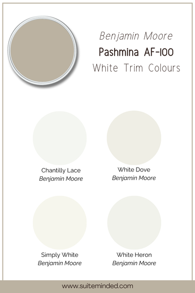
One of the things I love most about Pashmina is how good it looks next to crisp, clean white trim. That contrast really helps define the space and makes Pashmina feel intentional and elevated. Here are some of my favourite Benjamin Moore whites that pair beautifully with it:
Chantilly Lace (OC-65): if you want a bright, clean white with no noticeable undertones, this is a safe bet. It gives a fresh, modern contrast and works in almost any style of home.
White Dove (OC-17): a soft, warm white that’s a bit more relaxed than Chantilly Lace. It pairs beautifully with the warmth of Pashmina without blending in too much. This is a lovely option if you're going for a more traditional or cozy look.
Simply White (OC-117): another warm white, but a touch brighter than White Dove. It creates a subtle, creamy contrast that still feels clean and polished.
Oxford White (869): a slightly cooler white that adds a crisp edge without feeling too stark. It can help bring out Pashmina’s more taupe or grey side in cooler lighting conditions.
Any of these whites will work beautifully with Pashmina, it really just depends on the look you're going for. If you're leaning modern and bright, go with Chantilly Lace. If you want a softer, cozier vibe, try White Dove or Simply White.
Best coordinating colours with Pashmina
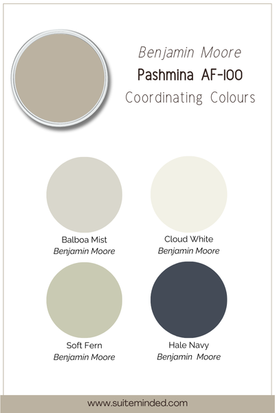
Because Pashmina plays well with a wide range of other colours. You can take it in a warm, cozy direction or lean into contrast and freshness depending on your style. Here are some of my favourite hues to pair with it:
Balboa Mist (OC-27): a lighter greige that creates a soft, tonal look when used in adjacent rooms. It keeps things cohesive while adding subtle variation.
Soft Fern (2144-40): a gentle sage green that brings out the subtle green undertones in Pashmina. Together, they feel earthy and elegant, perfect for a nature-inspired palette.
Cloud White (OC-130): this warm, creamy white works beautifully on walls or trims if you want a softer look overall. It complements Pashmina’s warmth without too much contrast.
Hale Navy (HC-154): for something more bold, navy makes a striking pairing with Pashmina, especially in transitional or modern spaces. It adds contrast and depth while keeping things timeless.
Wood tones: medium to dark wood stains like walnut or white oak enhance Pashmina’s natural, earthy vibe. It looks especially beautiful with wood floors, beams, or furniture.
Whether you’re creating a cozy whole-home palette or just looking for accent colours that feel harmonious, Pashmina makes a beautiful anchor colour. Its versatility makes it easy to layer with both warm and cool tones depending on your lighting and style.
—————
Pashmina AF-100 is one of those special colours that can completely transform a space with its subtle depth and versatility. Whether you’re after a calm, elegant neutral for your living room, a rich cabinet colour in your kitchen, or a cozy, grounding shade for your bedroom, Pashmina has the ability to adapt beautifully.
But if you're still unsure whether it's the right neutral for your home, you're not alone. Choosing paint colours can be overwhelming; there’s so much to consider, from undertones to lighting to how colours work together throughout your space. If you need a little help pulling everything together, I’ve got you covered. I offer custom colour consulting services if you want personalised guidance, or you can explore my collection of ready-made Whole House Paint Colour Palettes for curated, designer-approved colour schemes. And if you’re ready to feel confident choosing colours on your own, my step-by-step system, The Home Paint Colour Blueprint, will walk you through the entire process, room by room.
Whatever path you choose, my goal is to make the journey to your dream home feel less stressful and a whole lot more exciting.
Thank you for reading, and happy painting!
Manon xx