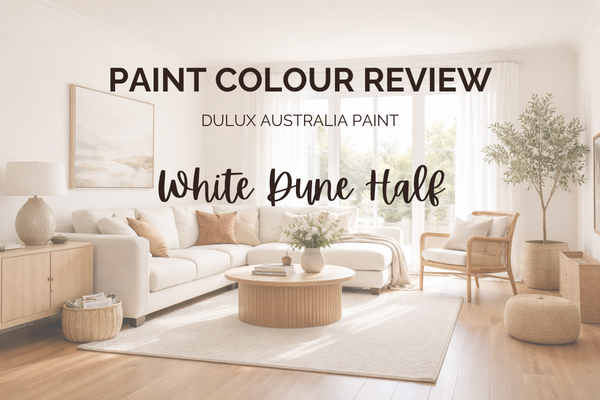
Paint Colour Review: White Dune Half by Dulux Australia
If you’re looking for a warm white that feels soft and effortless, Dulux White Dune Half might be exactly what you’ve been searching for. This is one of those colours that quietly works in the background. It doesn’t shout. It doesn’t demand attention. It simply creates a calm, welcoming base that makes everything around it look better. Think relaxed warmth, gentle light reflection, and that subtle “put-together” feeling without trying too hard.
White Dune Half sits beautifully between a true white and a warm neutral, which is why it can feel so versatile across different homes and lighting conditions. But like any soft neutral, its undertones and depth matter, and understanding them properly is what makes the difference between a colour that feels perfect and one that feels slightly off.
In this review, I’ll walk you through its undertones, how it behaves in different lighting, its LRV, the best white trim pairings, and the colours it coordinates with beautifully, so you can decide with confidence whether it’s the right fit for your home.
What are the undertones of White Dune Half?
Dulux White Dune Half is a soft, warm white with gentle, creamy, slightly beige undertones. It doesn’t lean strongly yellow; it sits in that beautiful in-between space that feels creamy without going over the top. The warmth is subtle and grounded, which is why it often feels calm rather than “buttery” or overly warm.
What I love about White Dune Half is that its undertones are quiet. In most spaces, you won’t immediately think “this is beige.” Instead, it reads as a soft, welcoming white that adds a touch of warmth to the room without overpowering it. Because of those undertones, it pairs especially well with:
warm timbers
natural stone
soft taupes
brushed brass or warm metals
If your home already has warm flooring or furnishings, White Dune Half tends to sit very comfortably alongside them.
Helpful tip: Always test it next to your fixed finishes (flooring, benchtops, tiles). Its warmth will gently pick up whatever is around it, which is exactly why it can look so cohesive when chosen intentionally.
If undertones are something you still find confusing (you’re not alone!), I break them down in a really simple way inside my free guide - it can save you a lot of second-guessing before you commit to a sample pot.
What is White Dune Half’s LRV?
LRV (Light Reflectance Value) simply measures how much light a paint colour reflects on a scale from 0 (pure black) to 100 (pure white). White Dune Half has an LRV of 84, which means it reflects a high amount of light. On paper, that puts it firmly in the “light and airy” category, and in real life, it does exactly that. It brightens a space beautifully without feeling stark or clinical. Because it’s not a crisp, blue-based white, that high light reflectance feels soft rather than sharp.
An LRV of 84 makes White Dune Half a lovely option if:
Your space doesn’t get a huge amount of natural light;
You want walls to feel fresh but still warm;
You’re trying to keep things light without going full bright white.
It will help bounce light around the room, but thanks to those gentle undertones, it won’t feel glaring in brighter spaces either.
Helpful tip: High LRV doesn’t automatically mean “cold.” Undertones matter just as much as the number. White Dune Half reflects a lot of light, but it reflects it warmly.
How does White Dune Half react in different lighting conditions
Lighting is where colours really show their personality. With its LRV of 84, White Dune Half will reflect a lot of light, but thankfully, it doesn’t blow out or feel stark. Here’s how it typically behaves:
In North-facing rooms (beautiful, consistent natural light): This is where White Dune Half shines. The warmth feels soft and balanced, not too yellow. It reads as a creamy-warm white without tipping too beige or buttery.
In South-facing rooms (cooler, shadowed light): The subtle yellow/beige undertones help prevent the space from feeling cold. Instead of turning grey or flat, it holds onto a gentle warmth, slightly muted, which is often exactly what south-facing rooms need.
In West-facing rooms (strong afternoon sun): In the late afternoon, it can look warmer, but not overly golden. Because the undertone is grounded and muted, it tends to feel cosy rather than yellow.
In East-facing rooms (bright mornings, softer afternoons): In the morning light, White Dune Half can look fresh and lightly warm. As the day moves on and the light cools slightly, the warm undertone becomes a little more noticeable, but in a soft, grounded way rather than anything muddy. It tends to feel calm and easy in these spaces.
Artificial lighting at night: Under warm LEDs, White Dune Half feels soft and welcoming. Under very cool lighting, it can flatten slightly, so I always recommend sticking with warm globes (around 2700–3000K) for the most flattering result.
Helpful tip: Always view your sample at different times of day. If you’re building a whole-home palette and want to make sure your colours flow beautifully in every direction of light, that’s exactly what I map out inside my ready-made palettes, so you’re not solving each room in isolation.
Where is White Dune Half best used in the home?
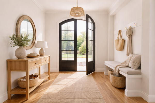
White Dune Half is one of those colours that works beautifully as a whole-home base, especially if you want warmth without committing to a deeper neutral. Here’s where I particularly love using it:
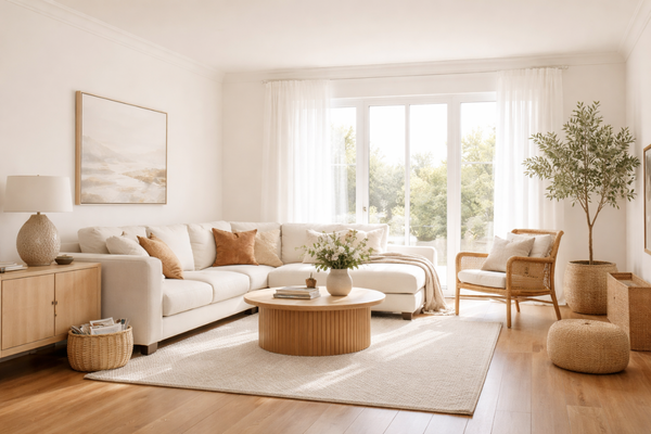
Living rooms & open-plan areas: It creates a relaxed, welcoming backdrop that works beautifully with timber floors, linen sofas, and natural textures. It feels bright but not stark, which is exactly what most open-plan homes need.
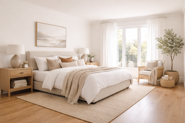
Bedrooms: Its gentle warmth makes it a lovely choice for bedrooms. It feels calm and soft, especially when paired with warm whites, taupes, or muted earthy tones.
Hallways & connecting spaces: If you’re after a seamless flow throughout the home, White Dune Half works very well in hallways. It keeps things light without feeling too sharp against door frames and trims.
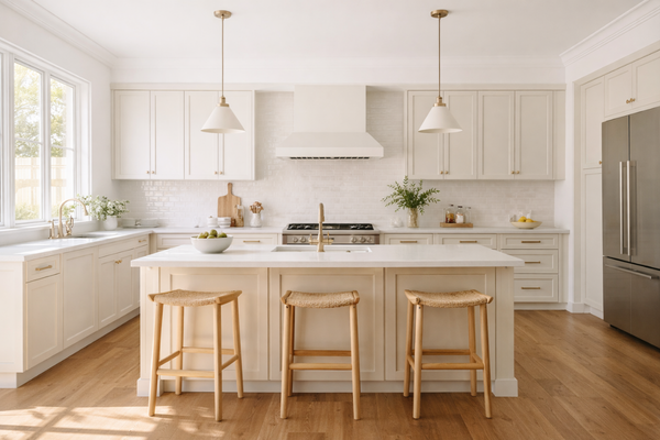
Kitchens (especially with warm finishes): If you have warm stone, timber accents, or brushed brass hardware, White Dune Half can tie everything together beautifully. It keeps the space feeling fresh while complementing those warmer elements.
Where I’d be more cautious? If your home has very cool-toned finishes (cool grey tiles, blue-grey stone, or crisp modern whites), White Dune Half may feel slightly too warm. In those cases, a more neutral or cooler white might sit more comfortably.
Designer perspective: This is a fantastic choice if you want a home that feels cohesive and softly warm rather than high-contrast and ultra-modern.
Best white trim colours with White Dune Half
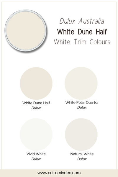
Because White Dune Half is softly warm with subtle beige undertones, your trim choice really matters. If you go too crisp or too cool, the walls can suddenly look more beige or buttery than you expected. The goal is to keep everything feeling cohesive and intentional. Here are the trim options I like pairing with it:
Dulux White Polar Quarter: This is a beautiful option if you want a cleaner trim without it feeling icy. It’s slightly brighter than White Dune Half but doesn’t clash with its warmth, which makes it a lovely, balanced contrast.
Dulux Natural White: If you prefer a softer, low-contrast look, Natural White works beautifully. It keeps the overall feel warm and seamless, perfect if you don’t love strong white trim lines.
Dulux Vivid White: If you want that classic crisp white trim look, Vivid White can work, especially in more modern homes. Just be aware that because it’s quite clean and bright, it will increase contrast and make White Dune Half read slightly warmer by comparison. Some people love that effect; others prefer something softer.
White Dune Half (yes, the same colour!): For a very soft, modern look, you can absolutely use White Dune Half on both walls and trims, just in a different sheen (for example, low sheen on walls and semi-gloss on trims). This creates subtle depth without strong contrast and avoids mixing undertones.
What I would avoid? Very blue-based, ultra-cool whites. They can make White Dune Half feel more beige or slightly muddy than it actually is.
Helpful tip: Lay your trim sample directly over your wall sample and step back a few metres. It’s the contrast between them, not the individual whites, that your eye reacts to most.
What about coordinating colours?
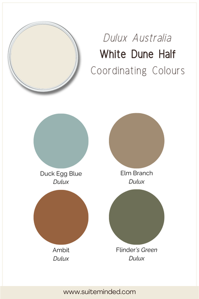
Because White Dune Half has soft yellow/beige undertones, it pairs best with colours that share that gentle warmth. Think earthy, grounded, and natural rather than cool and icy. Here are some combinations I particularly love:
Warm greiges & taupes: Colours with a balanced warm-grey base sit beautifully next to White Dune Half. They add depth without clashing, making them perfect for feature walls, cabinetry, or adjoining rooms.
Soft sage & muted greens: Earthy greens work especially well because they enhance the warmth without competing with it. Think dusty eucalyptus or olive tones rather than bright, blue-based greens.
Warm blues: If you love blue, lean towards softened, slightly greyed-off blues rather than crisp coastal blues. A muted blue can feel calm and sophisticated against White Dune Half.
Terracotta & clay tones: For something richer, earthy clay or muted terracotta accents can create a beautiful Mediterranean warmth, especially in Australian homes with plenty of natural light.
Natural materials: Timber (oak, spotted gum, walnut), linen, travertine, brushed brass. White Dune Half tends to elevate these finishes rather than fight with them.
What I’d avoid? Very cool greys or blue-based whites. They can make White Dune Half feel warmer and slightly more beige by contrast.
Helpful tip: White Dune Half works best when you lean into its warmth rather than trying to neutralise it.
If you’re unsure how to build a full palette around it without mixing undertones by accident, that’s exactly what my whole-home palettes are designed to solve; they take the guesswork out of pairing so everything flows naturally from room to room.
Final thoughts on White Dune Half
Dulux White Dune Half is one of those quietly reliable colours. It’s light, warm, and versatile; bright enough to freshen a space, but soft enough to feel welcoming rather than stark. If you love homes that feel calm, cohesive, and gently warm (not ultra-modern and high-contrast), this colour can be a beautiful foundation.
As always, sample it in your own lighting and compare it against your fixed finishes; that’s where the real decision happens.
And if you’d like help building a full palette around it so everything flows seamlessly from walls to trims to adjoining rooms, I offer custom colour services where I select paint colours to fit your style, your home, its features and particular lighting conditions.
Thank you for reading, and happy painting!
Manon xx