Snowbound SW 7004 by Sherwin-Williams - Paint Colour Review
If you’ve been searching for a Sherwin-Williams white paint colour that feels soft, warm, and inviting without turning too creamy or yellow, there’s a good chance you’ve come across Snowbound SW 7004. It’s one of those whites that seem simple at first, but once you start testing it in real spaces, you quickly realise it can shift quite a bit depending on the lighting, surrounding finishes, and even the direction your room faces.
In this review, I’m going to walk you through Snowbound’s undertones, LRV, lighting effects, the best white trim pairings, materials that work beautifully with it, and some of the best coordinating paint colours to help you decide whether it’s the right fit for your home.
What are the undertones of Snowbound?
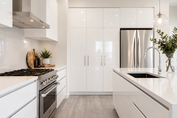
Kitchen with SW Snowbound walls and crisp white cabinets
Snowbound is a soft white paint colour with subtle grey undertones and a gentle taupe-violet softness underneath. That might sound strange at first for a white paint colour, but it’s exactly what gives Snowbound its calm, muted feel compared to brighter or crisper whites.
In most homes, the grey undertones are what you’ll notice first. They help tone down the brightness and stop Snowbound from looking stark or overly clinical. But depending on the lighting, surrounding finishes, and time of day, you may also notice a slight pinkish, taupe, or violet warmth peeking through, although it’s quite subtle.
What is Snowbound’s LRV?
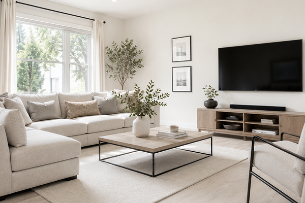
Living room with SW Snowbound walls
LRV stands for Light Reflectance Value, which measures how much light a paint colour reflects back into a space on a scale from 0 to 100. The higher the number, the more light the colour reflects.
With an LRV of 83, Snowbound is considered a bright white paint colour, but it’s not an ultra-crisp or stark white. Its softer undertones help balance out the brightness, giving it a more muted and gentle appearance compared to cleaner whites like Extra White or Pure White. Because of this, Snowbound can still brighten a room beautifully while feeling a little softer and more relaxed overall.
How does Snowbound look in different lighting conditions?
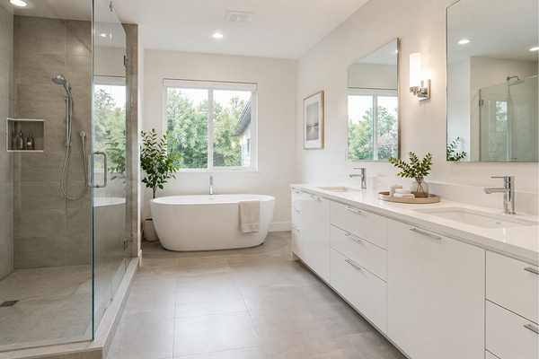
Bathroom with SW Snowbound walls
Like most white paint colours, lighting has a huge impact on how Sherwin-Williams Snowbound will look in your home. This is one of those colours that can shift more than people expect, which is why it’s always worth testing properly before committing to it throughout a space.
North-facing rooms
In north-facing rooms, Snowbound tends to look cooler and slightly more muted. The grey undertones become more noticeable here, and the colour can feel softer and less creamy overall. In darker north-facing areas, you may also notice a faint taupe-violet softness coming through.
South-facing rooms
South-facing light brings out the warmest side of Snowbound. This is usually where the paint looks the softest, brightest, and most inviting. The warmth in the natural light can gently highlight its softness without making it feel overly yellow or creamy.
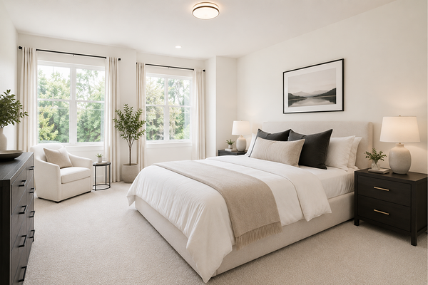
Bedroom with SW Snowbound walls
East-facing rooms
In east-facing rooms, Snowbound often looks brighter and slightly warmer in the morning sunlight, then becomes more muted and grey throughout the afternoon as the light cools down.
West-facing rooms
West-facing light can make Snowbound feel warmer later in the day, especially in the afternoon and evening when golden light fills the room.
Where to best use Snowbound
Snowbound works especially well in bedrooms, living rooms, and open-plan spaces where you want a soft white that still feels warm and inviting rather than stark or overly crisp. Its muted undertones help create a calm, relaxed atmosphere. Because of its tricky undertones, I would avoid it on kitchen cabinetry, ceilings, and exteriors.
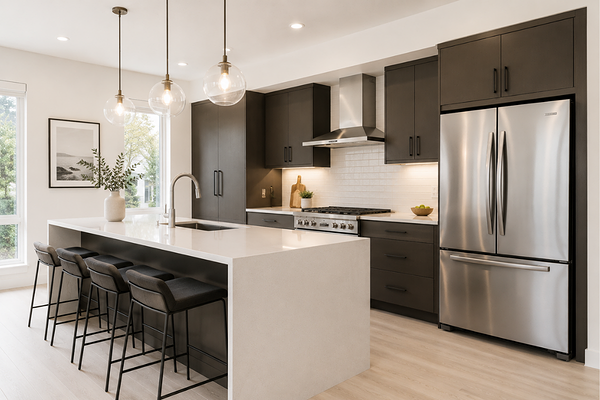
Kitchen with SW Snowbound walls and SW Urbane Bronze cabinets
Best material pairings with Snowbound
Because Snowbound has soft grey and subtle taupe-violet undertones, I personally think it looks best alongside materials that feel light, muted, and slightly softened rather than overly warm or heavily yellow-toned. The goal is to lean into its calm, gentle look rather than fighting against it. Think:
Soft white or lightly veined quartz countertops
Light oak flooring with a muted or neutral finish
Soft greige or taupe stone
Brushed nickel or matte black hardware
White linen textures and natural fabrics
I would generally avoid very golden oak, orange-toned timber, or heavily creamy beige materials with Snowbound, as they can sometimes make its cooler violet-grey undertones feel more noticeable.
Best white trim pairings
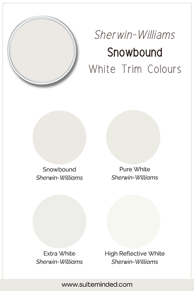
If you love a soft, seamless look, Snowbound actually works beautifully on both walls and trims. Using the same colour throughout creates a tonal feel and allows its undertones to stay balanced.
If you want Snowbound to look a little more off-white on the walls, I would pair it with a crisper, brighter white trim colour with a slightly higher LRV. Some beautiful white trim pairings include:
Sherwin-Williams Pure White: still soft but slightly cleaner and brighter
Sherwin-Williams Extra White: crisp and bright for more contrast
Sherwin-Williams High Reflective White: ultra-bright and clean
Sherwin-Williams Snowbound: for a monochromatic, tone-on-tone look
Best coordinating colours with Snowbound
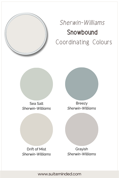
Because of its undertones, Snowbound usually pairs best with muted, calm colours rather than anything overly warm, golden, or highly saturated. It works beautifully in soft whole-house palettes where everything feels layered and cohesive. Think blue-greys and blue-greens like Sherwin-Williams Sea Salt or Evergreen Fog, greys with soft violet undertones, light greiges with similar undertones like SW Drift of Mist, taupes, or dark charcoals like SW Urbane Bronze for contrast through cabinetry or accents.
Overall, I would avoid overly warm colours with yellow, creamy, or beige undertones.
———————
If you’d like help choosing the right white (and building a colour palette that actually flows from room to room), you can explore my whole-house colour palettes or work with me on a custom colour plan. I’ll help you take the guesswork out of it so you can feel confident in your choices before you even open a paint can.
Thank you for reading, and happy decorating!
Manon xx