Paint Colour Review: Sensible Hue SW 6198 by Sherwin-Williams
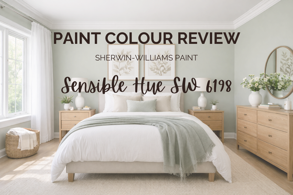
If you’ve ever found yourself wanting a soft green that feels calm, grown-up, and easy to live with, but not too grey and not too sage, then Sensible Hue SW 6198 by Sherwin-Williams might be exactly what you’re looking for. It’s one of those colours that quietly transforms a space - it has a gentle, nature-inspired feel that works beautifully in today’s homes, especially if you’re leaning toward warm neutrals, soft earthy tones, or a relaxed transitional style.
But as with any paint colour, the magic (or the mistake) is in the undertones and lighting. Does it lean grey? Does it go minty? Does it feel warm or cool? And most importantly, will it actually work in your space? In this review, I’ll walk you through everything you need to know before committing to it: its undertones, LRV, how it behaves in different lighting conditions, the best rooms to use it in, and which whites and coordinating colours make it shine.
Let’s break it down properly, so you can feel confident before you ever pick up a paint brush.
What are the undertones of Sensible Hue?
Sensible Hue is a soft, muted green with a noticeable grey influence. The grey in it is what keeps it feeling calm, grounded, and sophisticated rather than too botanical or minty. Some people see it more as a grey-green, but I guess that is open to interpretation. To me, its green influence is stronger than its grey undertones, which is why I characterise it as a mued green rather than grey.
Undertone-wise, it’s not icy cold or overly warm. Overall, it’s a rather balanced green, muted, gently earthy, and easy to live with, which is important if you’re pairing it with warm whites, wood tones, or other earthy neutrals.
What is the LRV of Sensible Hue?
LRV (Light Reflectance Value) simply measures how much light a paint colour reflects on a scale from 0 (pure black) to 100 (pure white). Sensible Hue has an LRV of 46, which places it right in the mid-range. What that means in practical terms is that it’s neither light and airy nor dark and moody. It sits comfortably in the middle, with enough depth to feel intentional and grounded, but not so dark that it overwhelms a room.
If you’re using it throughout multiple rooms, just keep in mind that it won’t behave like a pale neutral. It has presence. But that’s also what makes it feel rich and considered rather than washed out.
Choosing colours for more than one room?
The Confident Home Colour Blueprint shows you how to build a complete colour plan, so you’re not guessing one space at a time.
→ Explore the Colour Blueprint
How does Sensible Hue behave in different lighting conditions?
Lighting makes a noticeable difference with Sensible Hue, as it does with most mid-tone greens.
North-facing rooms: This is where the grey undertone becomes more prominent. The colour can feel slightly cooler and more muted, almost softer and dustier. It won’t turn icy, but it will lose a bit of its warmth.
South-facing rooms: In warmer, brighter light, the green comes forward beautifully. It feels more organic and earthy, with that subtle warmth helping it feel balanced rather than sharp.
East-facing rooms: Expect it to feel fresher in the morning light, then a little more subdued as the day goes on. It maintains its calm character but may look slightly deeper in the afternoon.
West-facing rooms: In the late afternoon and evening, the warmth in the light enhances its earthy undertone, making it feel richer and a touch more enveloping.
Artificial lighting also matters. Warm bulbs (2700–3000K) will enhance its softness and warmth, while cooler bulbs can pull forward the grey and make it feel a bit flatter. Overall, Sensible Hue is quite adaptable, but like all greens, sampling in your specific lighting is key before committing.
Where to best use Sensible Hue in your home?
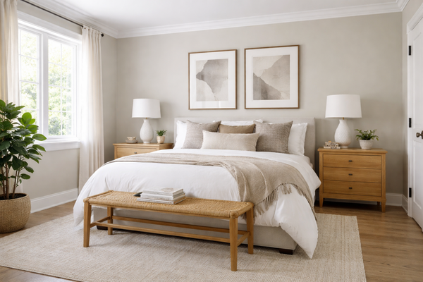
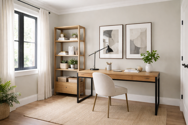
Because of its balanced depth and muted softness, Sensible Hue works best in spaces where you want calm with character. It’s beautiful in bedrooms, where its earthy undertone creates a restful, cocooning feel without going dark or heavy. It also works really well in home offices or reading nooks where it has enough depth to feel intentional and focused, but it’s not distracting.
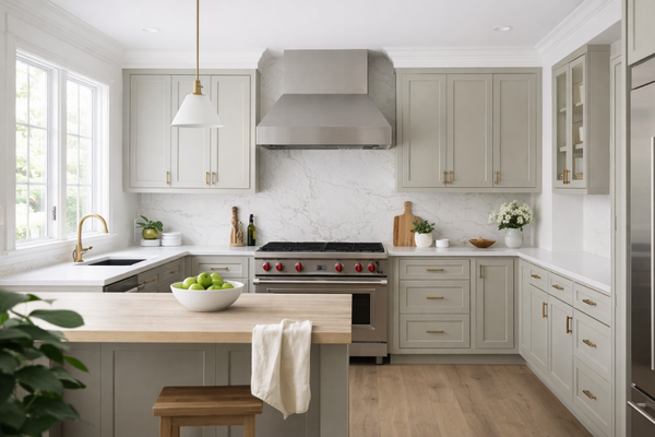
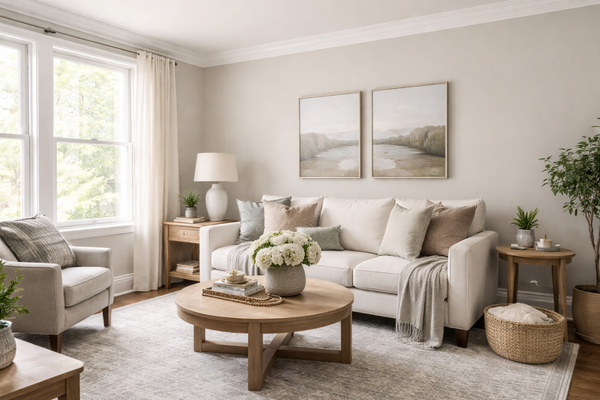
In living rooms, especially those styled with warm woods, natural fibres, linen, and layered neutrals, it can act as a soft statement colour. It pairs particularly well with oak, walnut, rattan, and brushed brass finishes. You could also use it on kitchen cabinetry or a vanity if you want something more interesting than beige or greige, but still timeless and easy to live with.
Where I’d be more cautious? Very small, low-light rooms, unless you’re intentionally going for a moodier, enveloping feel. With an LRV of 46, it does have presence, so it’s not going to disappear into the background.
Best white trim colours with Sensible Hue
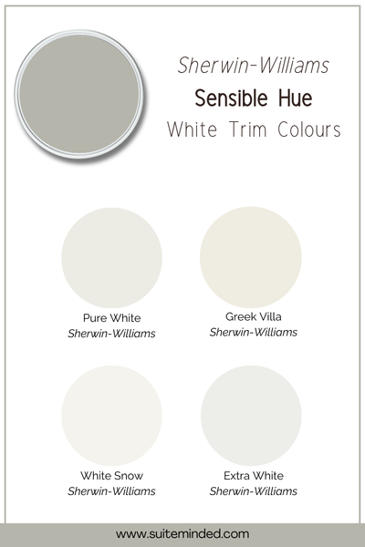
When pairing trim with Sensible Hue, the key is choosing a white paint colour that either gently complements its warmth or creates a crisp, tailored contrast, depending on the look you’re after.
If you want a clean and fresh contrast, Extra White SW 7006 or White Snow SW 9541 will give you that brighter framing effect. Both are cooler, crisper whites, so they’ll highlight the softness of Sensible Hue and make the green feel slightly more muted and refined.
For a softer, more cohesive look, Pure White (SW 7005) or Greek Villa (SW 7551) are beautiful options. Pure White is gently balanced, which makes it incredibly versatile. Greek Villa leans warmer, and that subtle creaminess works especially well if you’re layering in warm woods, brass, or earthy neutrals.
If your home already leans warm and relaxed, I’d personally gravitate toward Pure White or Greek Villa. If you prefer sharper contrast and a slightly more modern edge, Extra White or White Snow will give you that crisp definition.
Best coordinating tones
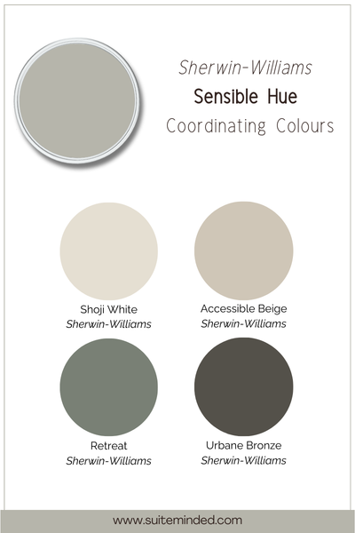
Because Sensible Hue is a muted, earthy green with a soft grey base, it pairs beautifully with other warm, grounded tones.
For a calm, cohesive whole-home feel, look to warm neutrals like Accessible Beige, Natural Tan, or even a soft greige. These keep everything feeling layered and intentional without competing with the green.
If you’d like a little contrast, deeper shades like Urbane Bronze or a rich charcoal can add depth and sophistication, especially in adjacent rooms or on cabinetry.
For something slightly lighter and fresher, creamy whites and warm off-whites such as Pearly White or Shoji White work beautifully to lift the palette while still keeping that organic, earthy vibe.
Overall, Sensible Hue works best with colours that feel natural and slightly muted. Think warm woods, soft greiges, dusty blues, and earthy neutrals - tones that feel collected rather than high-contrast or overly bright.
—————————
If you’re drawn to calm, earthy interiors and want a green that feels timeless rather than trendy, Sensible Hue is a beautiful option to consider. It has enough depth to feel intentional, but enough softness to stay easy to live with, especially when paired with the right lighting and supporting colours.
If you want help turning Sensible Hue into a cohesive, whole-home colour scheme (without second-guessing every choice), my ready-made Sherwin-Williams palettes and Confident Colour Blueprint walk you through exactly how to use it with confidence, from walls and trim to adjoining rooms.
Because choosing paint should feel calm and considered, not overwhelming.
Thank you for reading, and happy painting.
Manon xx