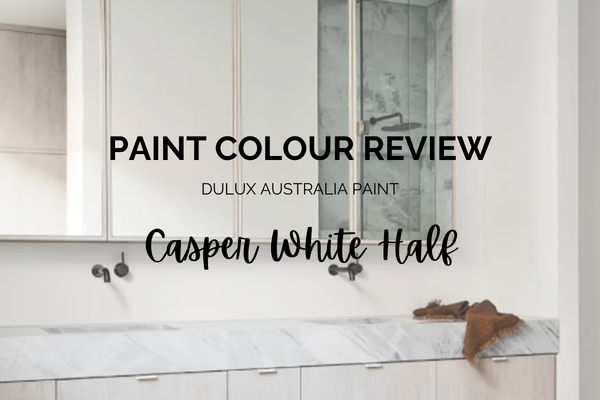
Casper White Half by Dulux Australia - Paint Colour Review
If you’re considering Dulux Australia Casper White Half for your home, this blog post is for you. It’s one of those soft, easy whites that many homeowners are drawn to when they want something light and fresh, but not stark or clinical.
The challenge with white paint colours, though, is that they’re never “just white.” Every white has undertones. Every white reacts differently to lighting. And the way it pairs with your trim, flooring, and furnishings can completely change how it feels in a space.
Casper White Half sits in that sweet spot between warm and neutral, making it a popular choice for modern homes. But is it the right white for your lighting? Does it lean creamy or crisp? And what trim colours and coordinating shades work best with it?
In this detailed colour review, I’ll break down Casper White Half’s undertones, Light Reflectance Value and what that means, how it behaves in different lighting, the best white trim pairings, and the most beautiful coordinating hues to create a cohesive home palette.
So before you commit to a sample pot, let’s look at what Casper White Half really does on the wall, because with white paint, the details matter.
What are the undertones of Casper White Half?
Casper White Half is a bright, clean-looking white, but it’s not a sharp, icy one. What makes it feel so calm and “easy” is that it’s gently muted.
The main undertone in Casper White Half is soft grey, which slightly tones down the brightness and gives it that relaxed, modern feel (rather than a crisp, stark white like Vivid White that can feel a bit more clinical). It still reads as white on the wall, but it has a quiet softness that takes the edge off.
There’s also a barely noticeable hint of green sitting underneath that grey. Most people won’t immediately point it out, but you may notice it in certain conditions, particularly in rooms with lots of greenery outside (trees, gardens), near overly warm or yellow-based tones, or in softer, shaded light where undertones become more visible.
The good news is: this hint of green is subtle. It doesn’t usually “turn green,” but it can add a slightly fresh, airy quality that works beautifully, especially if you love calming neutrals, soft coastal palettes, or anything that leans quietly modern.
If you’re choosing Casper White Half, you’re essentially choosing a true white look… just with a touch more softness and sophistication than a plain bright white.
→ Read this blog post about Dulux Australia Whisper White
What is Casper White Half’s LRV?
LRV stands for Light Reflectance Value. It measures how much light a paint colour reflects into a room on a scale from 0 (pure black) to 100 (pure white). At 81, Casper White Half sits firmly in the bright white category and reflects a generous amount of light. This means it will help brighten darker rooms, feel fresh and open in smaller spaces, and enhance natural light.
However, an LRV of 81 is slightly lower than ultra-bright, crisp whites that sit in the mid-to-high 80s or even 90s. That small difference is important. It’s what gives Casper White Half its softness.
Because it’s subtly muted by grey undertones, it doesn’t bounce light back in a harsh or glaring way. Instead, it reflects light gently, which is why it often feels calmer and more livable than a stark, crisp white.
How does Casper White Half look in different lighting conditions?
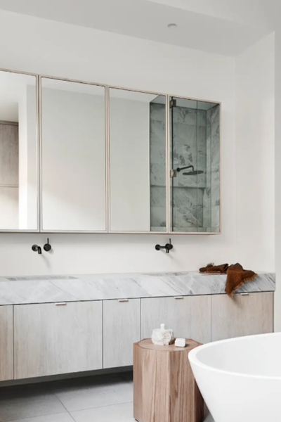
Photo via dulux.com.au
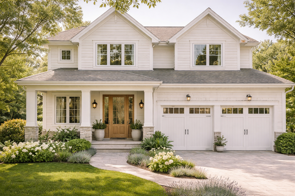
Lighting has a huge impact on white paint, especially in Australia, where natural light tends to be stronger and clearer than in many other parts of the world. Here’s how Casper White Half behaves depending on orientation:
North-Facing Rooms
North-facing rooms receive warm, consistent light throughout the day. In this setting, Casper White Half looks bright and clean, softly balanced, and gently warmed by the sunlight. Its grey undertones soften slightly, helping it feel fresh without ever looking stark.
South-Facing Rooms
South-facing rooms get cooler, indirect, more diffused light. Here, Casper White Half will lean slightly cooler, show more of its soft grey base, and may occasionally reveal a subtle green nuance in shaded areas. It stays bright, but feels a little more muted.
East-Facing Rooms
Warm in the morning, cooler in the afternoon. Casper White Half will look light and airy in morning sun, and more neutral-grey later in the day. It adapts well to this orientation.
West-Facing Rooms
Cooler in the morning, warm and intense in the afternoon. In strong late-afternoon light, it appears crisp and bright, slightly warmed, and clean against timber and natural stone. Its grey undertone helps prevent it from feeling too yellow in golden light.
Overall, Casper White Half handles light beautifully. It’s bright enough to lift a space, but softened just enough to avoid glare, even in strong sun.
When is Casper White Half a good choice?
Casper White Half works beautifully when you want a bright white that still feels calm and livable. Because it’s softened by grey (with that whisper of green), it suits homes that lean modern, relaxed and neutral, rather than overly warm or heavily traditional. Here are its best use cases:
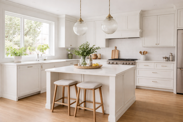
Modern and contemporary homes where its muted undertone keeps it from feeling stark, making it ideal for clean lines, minimal styling and layered neutrals.
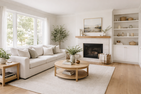
Coastal and light-filled interiors where its subtle softness pairs beautifully with light oak flooring, linen textures, soft greys, and muted blue greens. It feels fresh without being cold.
Homes with grey or cool-toned finishes. If you have cool stone benchtops, grey tiles, brushed nickel, or chrome fixtures, Casper White Half will sit more comfortably rather than a creamy, yellow-base white.
Open-plan living areas, where it can help large spaces feel bright and cohesive without glare.
When It Might Not Be Ideal
It may not be the best choice if you have strong yellow or cream finishes, you love very warm, buttery whites, or you’re after an ultra-crisp, almost blue-white look. In those cases, it may either feel slightly cool or subtly reveal that green-grey undertone more than you’d like.
Casper White Half is essentially a balanced, softened bright white. It’s not dramatic. It’s not trendy. It’s quietly versatile, and that’s exactly why it works in so many homes.
What are the best white trim colours for Casper White Half?
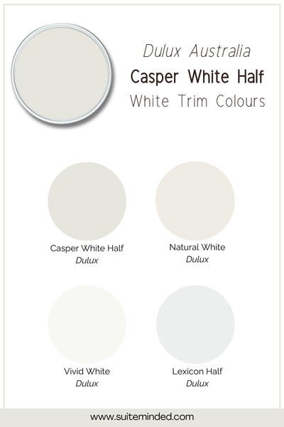
When choosing a trim colour, the goal is simple: you either want to keep things seamless and soft, or create a gentle contrast without fighting the undertones. Because Casper White Half is muted by grey with a subtle green nuance, pairing it with the wrong white can make it suddenly look warmer or slightly green in comparison. Here are the safest and most effective options:
Vivid White: If you want a clean, classic contrast, Dulux Vivid White works beautifully. It adds definition to skirting boards and architraves, keeps trims looking sharp, and doesn’t introduce unwanted creaminess.
Natural White: For a softer, lower-contrast look, Dulux Natural White can work, particularly in homes that lean slightly warmer overall. However, because Natural White carries more warmth, it will make Casper White Half appear a touch cooler by comparison. This pairing works best when your home already has some warm elements balancing it.
Casper White Half on trim as well (monochromatic look): If you prefer a seamless, modern feel, using Casper White Half on walls, trim, and ceilings creates a soft, cohesive result. It removes visual breaks and keeps the space feeling open.
Lexicon Quarter: It is noticeably cooler and crisper, so it will create a stronger contrast, and it may make Casper White Half appear slightly warmer or subtly greener by comparison. This pairing works best in homes with cooler finishes (concrete, cool stone, grey tiles) where that crisp contrast feels intentional. If your home leans warm, Lexicon Quarter may feel a little too cool next to it.
What to avoid
Try to avoid pairing it with very creamy, yellow-based whites, as they can make Casper White Half look cooler, emphasise its subtle green-grey undertone, and create a slight visual clash.
If you’re unsure, always sample your wall and trim colours together; whites are highly comparative. The key with Casper White Half is balance.
What colours coordinate well with Casper White Half?
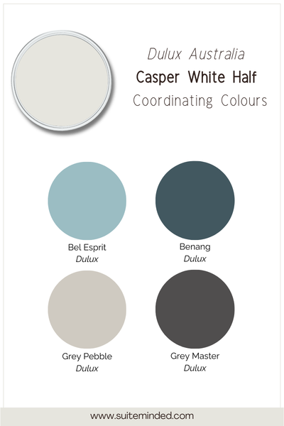
Thanks to its high LRV (81) and muted undertones, Casper White Half is surprisingly versatile. It acts as a clean backdrop without overpowering other colours, but the shades you pair with it will influence whether the space feels warm, cool, coastal or contemporary. Here are the combinations that work best:
Soft greys and greige: Think light greys, warm greige tones, or concrete-inspired neutrals. This combination creates a calm, modern feel that works especially well in open-plan homes.
Muted blue-greens: That subtle hint of green in Casper White Half actually becomes an advantage when paired with sage greens and soft coastal blue-greens.
Charcoal and deep navy: For contrast, deeper tones like charcoal or navy work beautifully. Casper White Half stays bright and fresh against darker cabinetry or feature walls, while its softness prevents the contrast from feeling too harsh.
Natural timber and warm textures: Although it leans slightly cool, Casper White Half works well with light oak flooring, timber accents, woven textures, and linen and natural fibres.
Colours to be careful with
Very creamy, yellow-based beiges can make Casper White Half look slightly cooler or subtly greener by comparison.
If your finishes are heavily warm (travertine, strong cream tiles, golden oak flooring), sample carefully to make sure the undertones don’t compete.
Casper White Half works best when you treat it as a balanced, modern white, not a warm cream and not a stark blue-white.
Is Dulux Casper White Half the right white for you?
Casper White Half is not a trendy white. It’s not overly warm. It’s not icy and dramatic. It’s balanced. It offers a bright, clean look without the glare of a stark white and works comfortably with cool finishes, creating a calm, modern backdrop for everyday living.
That said, like all whites, it’s comparative. Pair it with very warm creams, and it may appear cooler. Place it in shaded rooms, and you’ll see more of its grey base. Style it with soft timbers and muted blue-greens, and it will feel fresh, relaxed and effortless.
The key is sampling it in your own space, next to your flooring, cabinetry and trim, and observing it throughout the day.
Need help building a whole-home colour scheme?
If you’re drawn to Casper White Half but feel unsure about what to pair it with, you’re not alone. Choosing the right white is one step. Making sure it works with your flooring, cabinetry, lighting, and overall style is where it can start to feel overwhelming.
If you’d prefer a ready-made solution, my carefully curated whole-home colour palettes take the guesswork out of coordinating whites, neutrals and accent shades so everything flows beautifully from room to room.
And if you’d like something more tailored, I also offer personalised colour consultations. Whether it’s a single room or your entire home, I help you choose colours that suit your light, your finishes and your vision, so you can move forward with confidence.
You can explore my palettes HERE.
Or learn more about custom colour services HERE.
Thank you for reading, and happy painting!
Manon xx